
In this tutorial, you will learn how to use synthetic data to explore and validate a machine-learning model that was trained on real data. Synthetic data is not restricted by any privacy concerns and therefore enables you to engage a far broader group of stakeholders and communities in the model explanation and validation process. This enhances transparent algorithmic auditing and helps to ensure the safety of developed ML-powered systems through the practice of Explainable AI (XAI).
We will start by training a machine learning model on a real dataset. We will then evaluate and inspect this model using a synthesized (and therefore privacy-preserving) version of the dataset. This is also referred to as the Train-Real-Test-Synthetic methodology. We will then inspect the ML model using the synthetic data to better understand how the model makes its predictions. The Python code for this tutorial is publicly available and runnable in this Google Colab notebook.
Train model on real data
The first step will be to train a LightGBM model on a real dataset. You’ll be working with a subset of the UCI Adult Income dataset, consisting of 10,000 records and 10 attributes. The target feature is the income column which is a Boolean feature indicating whether the record is high-income (>50K) or not. Your machine learning model will use the 9 remaining predictor features to predict this target feature.
# load original (real) data
import numpy as np
import pandas as pd

df = pd.read_csv(f'{repo}/census.csv')
df.head(5)
And then use the following code block to define the target feature, preprocess the data and train the LightGBM model:
import lightgbm as lgb
from lightgbm import early_stopping
from sklearn.model_selection import train_test_split

target_col = 'income'
target_val = '>50K'

def prepare_xy(df):
    y = (df[target_col]==target_val).astype(int)
    str_cols = [
        col for col in df.select_dtypes(['object', 'string']).columns if col != target_col
    ]
    for col in str_cols:
        df[col] = pd.Categorical(df[col])
    cat_cols = [
        col for col in df.select_dtypes('category').columns if col != target_col
    ]
    num_cols = [
        col for col in df.select_dtypes('number').columns if col != target_col
    ]
    for col in num_cols:
        df[col] = df[col].astype('float')
    X = df[cat_cols + num_cols]
    return X, y

def train_model(X, y):
    cat_cols = list(X.select_dtypes('category').columns)
    X_trn, X_val, y_trn, y_val = train_test_split(
        X, y, test_size=0.2, random_state=1
    )
    ds_trn = lgb.Dataset(
        X_trn,
        label=y_trn,
        categorical_feature=cat_cols,
        free_raw_data=False
    )
    ds_val = lgb.Dataset(
        X_val,
        label=y_val,
        categorical_feature=cat_cols,
        free_raw_data=False
    )
    model = lgb.train(
        params={
            'verbose': -1,
            'metric': 'auc',
            'objective': 'binary'
        },
        train_set=ds_trn,
        valid_sets=[ds_val],
        callbacks=[early_stopping(5)],
    )
    return model
Run the code lines below to preprocess the data, train the model and calculate the AUC performance metric score:
X, y = prepare_xy(df)
model = train_model(X, y)
Training until validation scores don't improve for 5 rounds
Early stopping, best iteration is: [63] valid_0's auc: 0.917156
The model has an AUC score of 91.7%, indicating excellent predictive performance. Take note of this in order to compare it to the performance of the model on the synthetic data later on.
Explainable AI: privacy concerns and regulations
Now that you have your well-performing machine learning model, chances are you will want to share the results with a broader group of stakeholders. As concerns and regulations about privacy and the inner workings of so-called “black box” ML models increase, it may even be necessary to subject your final model to a thorough auditing process. In such cases, you generally want to avoid using the original dataset to validate or explain the model, as this would risk leaking private information about the records included in the dataset.
So instead, in the next steps you will learn how to use a synthetic version of the original dataset to audit and explain the model. This will guarantee the maximum amount of privacy preservation possible. Note that it is crucial for your synthetic dataset to be accurate and statistically representative of the original dataset. We want to maintain the statistical characteristics of the original data but remove the privacy risks. MOSTLY AI provides some of the most accurate and secure data synthesization in the industry.
Synthesize dataset using MOSTLY AI
Follow the steps below to download the original dataset and synthesize it via MOSTLY A’s synthetic data generator:
- Download
census.csvby clicking here, and then save the file to disk by pressing Ctrl+S or Cmd+S, depending on your operating system.

- Navigate to your MOSTLY AI account, click on the “Synthetic Datasets” tab, and upload
census.csvhere.
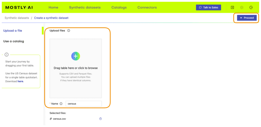
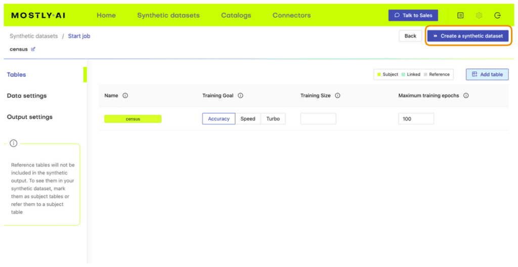
- Synthesize
census.csv, leaving all the default settings.
- Once the job has finished, download the generated synthetic data as a CSV file to your computer.
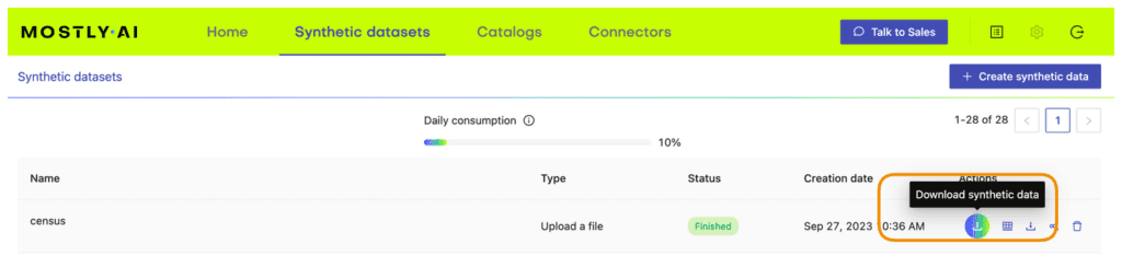
- Access the generated synthetic data from wherever you are running your code. If you are running in Google Colab, you will need to upload it by executing the next cell.
# upload synthetic dataset
if is_colab:
    import io
    uploaded = files.upload()
    syn = pd.read_csv(io.BytesIO(list(uploaded.values())[0]))
    print(f"uploaded synthetic data with {syn.shape[0]:,} records and {syn.shape[1]:,} attributes")
else:
    syn_file_path = './census-synthetic.csv'
    syn = pd.read_csv(syn_file_path)
    print(f"read synthetic data with {syn.shape[0]:,} records and {syn.shape[1]:,} attributes")
You can now poke around and explore the synthetic dataset, for example by sampling 5 random records. You can run the line below multiple times to see different samples.
syn.sample(5)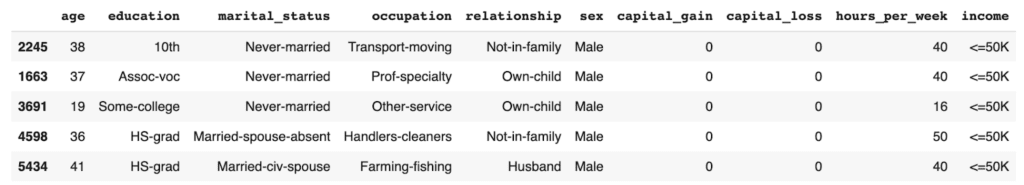
The records in the syn dataset are synthesized, which means they are entirely fictional (and do not contain private information) but do follow the statistical distributions of the original dataset.
Evaluate ML performance using synthetic data
Now that you have your synthesized version of the UCI Adult Income dataset, you can use it to evaluate the performance of the LightGBM model you trained above on the real dataset.
The code block below preprocesses the data calculates performance metrics for the LightGBM model using the synthetic dataset, and visualizes the predictions on a bar plot:
from sklearn.metrics import roc_auc_score, accuracy_score
import seaborn as sns
import matplotlib.pyplot as plt

X_syn, y_syn = prepare_xy(syn)
p_syn = model.predict(X_syn)
auc = roc_auc_score(y_syn, p_syn)
acc = accuracy_score(y_syn, (p_syn >= 0.5).astype(int))
probs_df = pd.concat([
    pd.Series(p_syn, name='probability').reset_index(drop=True),
    pd.Series(y_syn, name=target_col).reset_index(drop=True),
], axis=1)
fig = sns.displot(data=probs_df, x='probability', hue=target_col, bins=20, multiple="stack")
fig = plt.title(f"Accuracy: {acc:.1%}, AUC: {auc:.1%}", fontsize=20)
plt.show()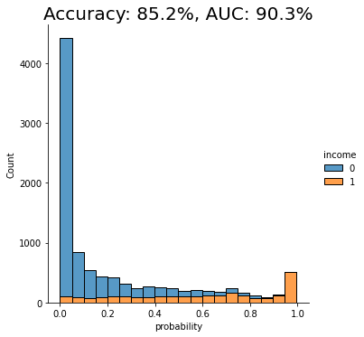
We see that the AUC score of the model on the synthetic dataset comes close to that of the original dataset, both around 91%. This is a good indication that our synthetic data is accurately modeling the statistical characteristics of the original dataset.
Explain ML Model using Synthetic Data
We will be using the SHAP library to perform our model explanation and validation: a state-of-the-art Python library for explainable AI. If you want to learn more about the library or explainable AI fundamentals in general, we recommend checking out the SHAP documentation and/or the Interpretable ML Book.
The important thing to note here is that from this point onwards, we no longer need access to the original data. Our machine-learning model has been trained on the original dataset but we will be explaining and inspecting it using the synthesized version of the dataset. This means that the auditing and explanation process can be shared with a wide range of stakeholders and communities without concerns about revealing privacy-sensitive information. This is the real value of using synthetic data in your explainable AI practice.
SHAP feature importance
Feature importances are a great first step in better understanding how a machine learning model arrives at its predictions. The resulting bar plots will indicate how much each feature in the dataset contributes to the model’s final prediction.
To start, you will need to import the SHAP library and calculate the so-called shap values. These values will be needed in all of the following model explanation steps.
# import library
import shap
# instantiate explainer and calculate shap values
explainer = shap.TreeExplainer(model)
shap_values = explainer.shap_values(X_syn)
You can then plot the feature importances for our trained model:
shap.initjs()
shap.summary_plot(shap_values, X_syn, plot_size=0.2)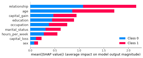
In this plot, we see clearly that both the relationship and age features contribute strongly to the model’s prediction. Perhaps surprisingly, the sex feature contributes the least strongly. This may be counterintuitive and, therefore, valuable information. Without this plot, stakeholders may draw their own (possibly incorrect) conclusions about the relative importance of the sex feature in predicting the income of respondents in the dataset.
SHAP dependency plots
To get even closer to explainable AI and to get an even more fine-grained understanding of how your machine learning model is making its predictions, let’s proceed to create dependency plots. Dependency plots tell us more about the effect that a single feature has on the ML model’s predictions.
A plot is generated for each feature, with all possible values of that feature on the x-axis and the corresponding shap value on the y-axis. The shap value is an indication of how much knowing the value of that particular feature affects the outcome of the model. For a more in-depth explanation of how shap values work, check out the SHAP documentation.
The code block below plots the dependency plots for all the predictor features in the dataset:
def plot_shap_dependency(col):
    col_idx = [
        i for i in range(X_syn.shape[1]) if X_syn.columns[i]==col][0]
    shp_vals = (
        pd.Series(shap_values[1][:,col_idx], name='shap_value'))
    col_vals = (
        X_syn.iloc[:,col_idx].reset_index(drop=True))
    df = pd.concat([shp_vals, col_vals], axis=1)
    if col_vals.dtype.name != 'category':
        q01 = df[col].quantile(0.01)
        q99 = df[col].quantile(0.99)
        df = df.loc[(df[col] >= q01) & (df[col] <= q99), :]
    else:
        sorted_cats = list(
            df.groupby(col)['shap_value'].mean().sort_values().index)
        df[col] = df[col].cat.reorder_categories(sorted_cats, ordered=True)
    fig, ax = plt.subplots(figsize=(8, 4))
    plt.ylim(-3.2, 3.2)
    plt.title(col)
    plt.xlabel('')
    if col_vals.dtype.name == 'category':
        plt.xticks(rotation = 90)
    ax.tick_params(axis='both', which='major', labelsize=8)
    ax.tick_params(axis='both', which='minor', labelsize=6)
    p1 = sns.lineplot(x=df[col], y=df['shap_value'], color='black').axhline(0, color='gray', alpha=1, lw=0.5)
    p2 = sns.scatterplot(x=df[col], y=df['shap_value'], alpha=0.1)

def plot_shap_dependencies():
    top_features = list(reversed(X_syn.columns[np.argsort(np.mean(np.abs(shap_values[1]), axis=0))]))
    for col in top_features:
        plot_shap_dependency(col)

plot_shap_dependencies()
Let’s take a closer look at the dependency plot for the relationship feature:
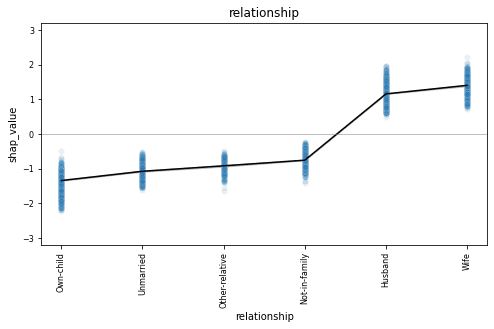
The relationship column is a categorical feature and we see all 6 possible values along the x-axis. The dependency plot shows clearly that records containing “husband” or “wife” as the relationship value are far more likely to be classified as high-income (positive shap value). The black line connects the average shap values for each relationship type, and the blue gradient is actually the shap value of each of the 10K data points in the dataset. This way, we also get a sense of the variation in the lift.
This becomes even more clear when we look at a feature with more discrete values, such as the age column.
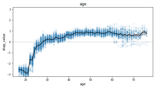
This dependency plot shows us that the likelihood of a record being high-income increases together with age. As the value of age decreases from 28 to 18, we see (on average) an increasingly lower chance of being high-income. From around 29 and above, we see an increasingly higher chance of being high-income, which stables out around 50. Notice the wide range of values once the value of age exceeds 60, indicating a large variance.
Go ahead and inspect the dependency plots for the other features on your own. What do you notice?
SHAP values for synthetic samples
The two model explanation methods you have just worked through aggregate their results over all the records in the dataset. But what if you are interested in digging even deeper down to uncover how the model arrives at specific individual predictions? This level of reasoning and inspection at the level of individual records would not be possible with the original real data, as this contains privacy-sensitive information and cannot be safely shared. Synthetic data ensures privacy protection and enables you to share model explanations and inspections at any scale. Explainable AI needs to be shareable and transparent - synthetic data is the key to this transparency.
Let’s start by looking at a random prediction:
# define function to inspect random prediction
def show_idx(i):
    shap.initjs()
    df = X_syn.iloc[i:i+1, :]
    df.insert(0, 'actual', y_syn.iloc[i])
    df.insert(1, 'score', p_syn[i])
    display(df)
    return shap.force_plot(explainer.expected_value[1], shap_values[1][i,:], X_syn.iloc[i,:], link="logit")

# inspect random prediction
rnd_idx = X_syn.sample().index[0]
show_idx(rnd_idx)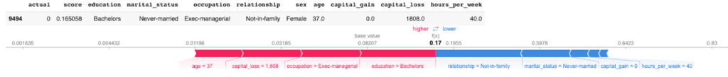
The output shows us a random record with an actual score of 0, meaning this is a low-income (<50K) record. The model scores all predictions with a value between 0 and 1, where 0 is a perfect low-income prediction and 1 is a perfect high-income prediction. For this sample, the model has given a prediction score of 0.17, which is quite close to the actual score. In the red-and-blue bars below the data table, we can see how different features contributed to this prediction. We can see that the values of the relationship and marital status pushed this sample towards a lower prediction score, whereas the education, occupation, capital_loss, and age features pushed for a slightly higher prediction score.
You can repeat this single-sample inspection method for specific types of samples, such as the sample with the lowest/highest prediction score:
idx = np.argsort(p_syn)[0]
show_idx(idx)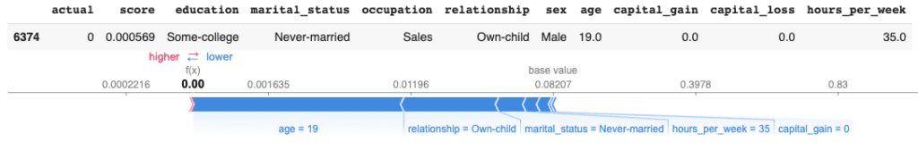
Or a sample with particular characteristics of interest, such as a young female doctorate under the age of 30:
idx = syn[
    (syn.education=='Doctorate')
    & (syn.sex=='Female')
    & (syn.age<=30)].sample().index[0]
show_idx(idx)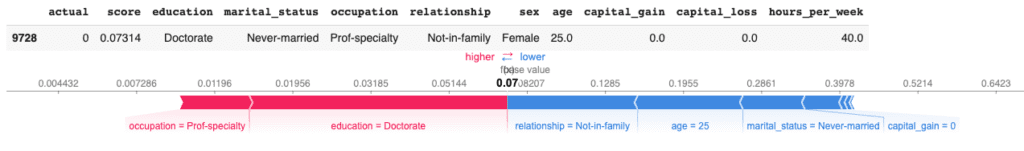
You can also zoom back out again to explore the shap values across a larger number of samples. For example, you can aggregate the shap values of 1,000 samples using the code below:
shap.initjs()
shap.force_plot(explainer.expected_value[1], shap_values[1][:1000,:], X.iloc[:1000,:], link="logit")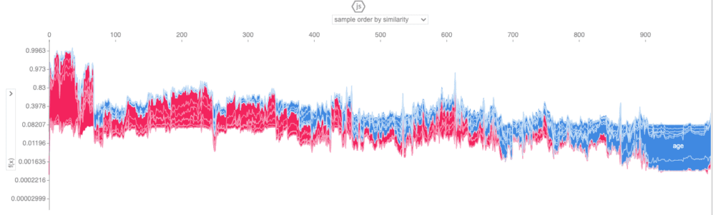
This view enables you to look through a larger number of samples and inspect the relative contributions of the predictor features to each individual sample.
Explainable AI with MOSTLY AI
In this tutorial, you have seen how machine learning models that have been trained on real data can be safely tested and explained with synthetic data. You have learned how to synthesize an original dataset using MOSTLY AI and how to use this synthetic dataset to inspect and explain the predictions of a machine learning model trained on the real data. Using the SHAP library, you have gained a better understanding of how the model arrives at its predictions and have even been able to inspect how this works for individual records, something that would not be safe to do with the privacy-sensitive original dataset.
Synthetic data ensures privacy protection and therefore enables you to share machine learning auditing and explanation processes with a significantly larger group of stakeholders. This is a key part of the explainable AI concept, enabling us to build safe and smart algorithms that have a significant impact on individuals' lives.
What’s next?
In addition to walking through the above instructions, we suggest experimenting with the following in order to get even more hands-on experience using synthetic data for explainable AI:
- replicate the explainability section with real data and compare results
- use a different dataset, eg. the UCI bank marketing dataset
- use a different ML model, eg. a RandomForest model
You can also head straight to the other synthetic data tutorials: