
MOSTLY AI’s new intuitive user interface is not just a pretty face, it’s now even faster to generate synthetic data.
The user interface revamp of MOSTLY AI’s pioneering synthetic data platform was the collaborative work of many - from a dedicated user group of four, to the product and engineering teams at MOSTLY AI. Our aims: to make it more visually appealing and reflective of the refreshed brand, and faster to use. The user group was made up of two data scientists, a Chief Technology Officer, and a Head of Informatics Laboratory, all of whom were using the platform for the first time. The following blog post unpacks the approach taken, and shares top tips from MOSTLY AI on how to create the best user experience for data science, specifically around onboarding.
Before we get going, keep this in mind in terms of the difference between UI and UX: “User Interface is the space where interactions between humans and a product occur, while User Experience is an emotional outcome after interactions with a product.”
Customers at the heart
The best user experiences are built in a data-driven way with a deep understanding of users’ needs and expectations.
“As a business that places customers at the heart, we kept in mind throughout the design process that people don’t buy products, they buy better versions of themselves,” says Maria Behan, UX Designer at MOSTLY AI. “And we know the power of someone like a data scientist or analyst being able to generate synthetic data quickly and easily. Data that can be shared and consumed, or pumped into a machine learning model, in a privacy-safe way across and outside an organization.”
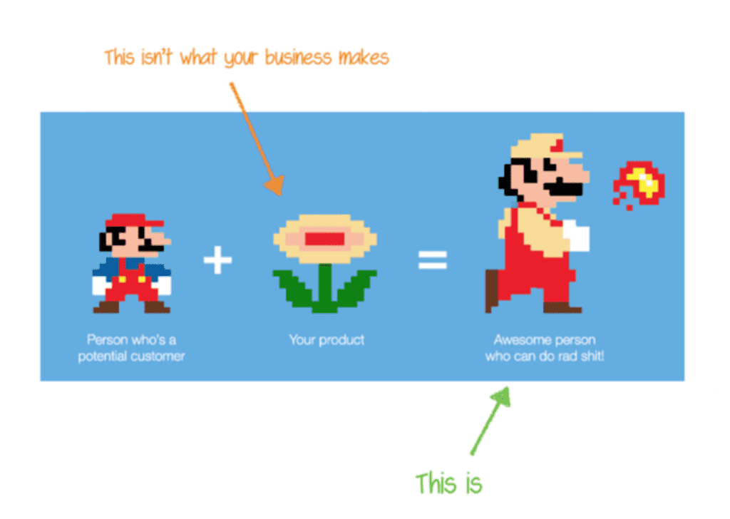
Like Mario (taking things in his stride, above), MOSTLY AI’s end users want to “get (rad) shit done”, a desire directly reflected by one of the business’s redefined values. They have numerous tools they use each day, and they spend a lot of time waiting for and preparing data. The new improved user interface is designed to make data scientists, analysts, and others feel like synthetic data superheroes. It’s a celebration of privacy meeting innovation, and tying the knot in a free-forever way.
A focus on onboarding
The best user experiences for data scientists start at the beginning, helping to build confidence in the mind of the user.
The behavior and usability tests were conducted over a number of virtual feedback sessions. The tests revealed that users felt a bit “lost in the maze” on logging in to start their first synthetic data generation. They weren’t finding things as quickly as we wanted them to, and the UI was text-heavy compared to the simplicity users can now enjoy.
MOSTLY AI’s goal has always been to make synthetic data generation easy and accessible - not only for data scientists, but any and all professionals that deal with data. This is echoed by our vision: that data should empower all people to build a smarter and fairer future together for the benefit of everyone.
What were the key changes to the UI?
Changes were guided by the user journey and included the clustering of certain functionality
To make synthetic data generation easier than ever, and boost the lovability of the platform, the following key changes were made to the UI:
- A splash of lime! The application of MOSTLY AI’s refreshed brand, which was launched mid-2022, creates a vibrant and inviting visual experience.
“We wanted to make the generation of synthetic data as quick and easy as possible. At the same time, for those looking for more advanced functionality, it’s still there, just a layer or two down through features like hover-over info buttons.” Maria Behan, UX Designer at MOSTLY AI.
- Switching from a vertical to a horizontal menu bar, that’s now consistently visible throughout the user journey.
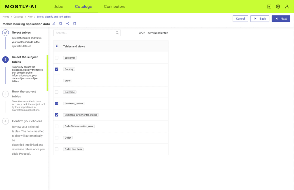
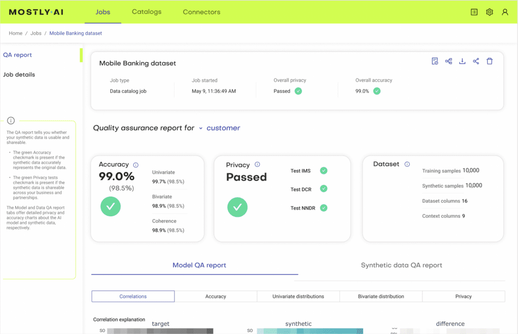
- A stepper (as shown below), so users know exactly where they are in the process of catalog creation.
Boom! Synthetic data generation that’s faster than ever
MOSTLY AI describes their new UI as a ‘big step up’ from what they had before
Did you know that the human attention span is 8 seconds? And that it’s shorter than that of a goldfish which is 9 seconds? That’s a small window to grab someone’s attention, and keep it, especially when the aim going in is to complete an expectedly complex task like AI-generated synthetic data production.
With the key changes that were made to the platform’s UI, MOSTLY AI has managed to speed up the process of generating synthetic data. The under-the-hood tech is what does the heavy lifting, while the user gets to sit back and watch the magic happen.
Tying it all together
A sum up of the top tips from MOSTLY AI’s latest UI:
To create the best user experience for data science, it’s key to involve all the right people, from early on. From users, to UX designers, product experts, and other team reps - but at the center should always be your users. Take a data-driven approach, get the right user group together and engage with them in an appropriate format. Find out exactly what they expect when, and find ways to help them move quickly and easily from one step to the next, gaining confidence as they go.
The best UIs are loved by their users. Think about the details here: What small changes can you make to create a moment of delight for your users? Is the personality of your brand coming through? Think of all the touchpoints a user has had with your brand before they start using your platform. Is there consistency?
It’ll never not be about ease and simplicity. What details can you take away? Remember, less is always more, and unnecessary details or complexity will detract from ease of use and a smooth and enjoyable user experience.