Evaluate generator quality
MOSTLY AI calculates generator quality metrics at the end of the training of each generator. The metrics are available on the page of a generator after training completes and detailed charts and metrics are also available in the model report for each table.
Accuracy metrics
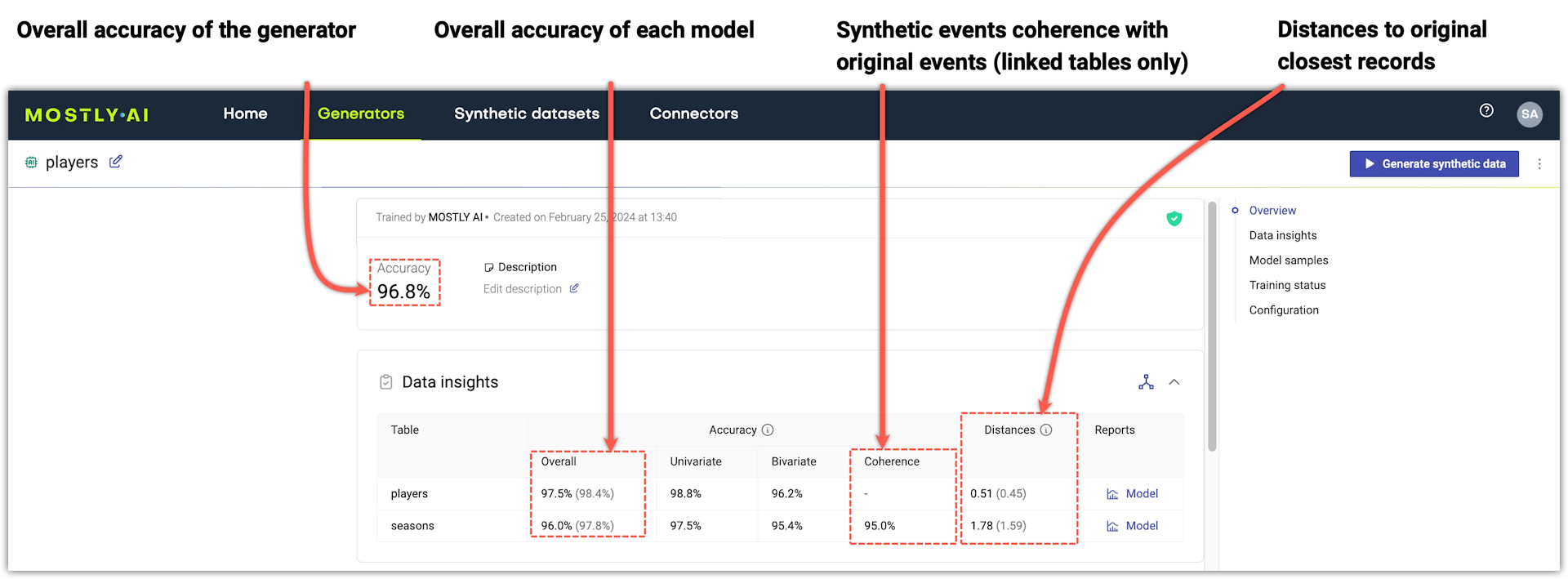
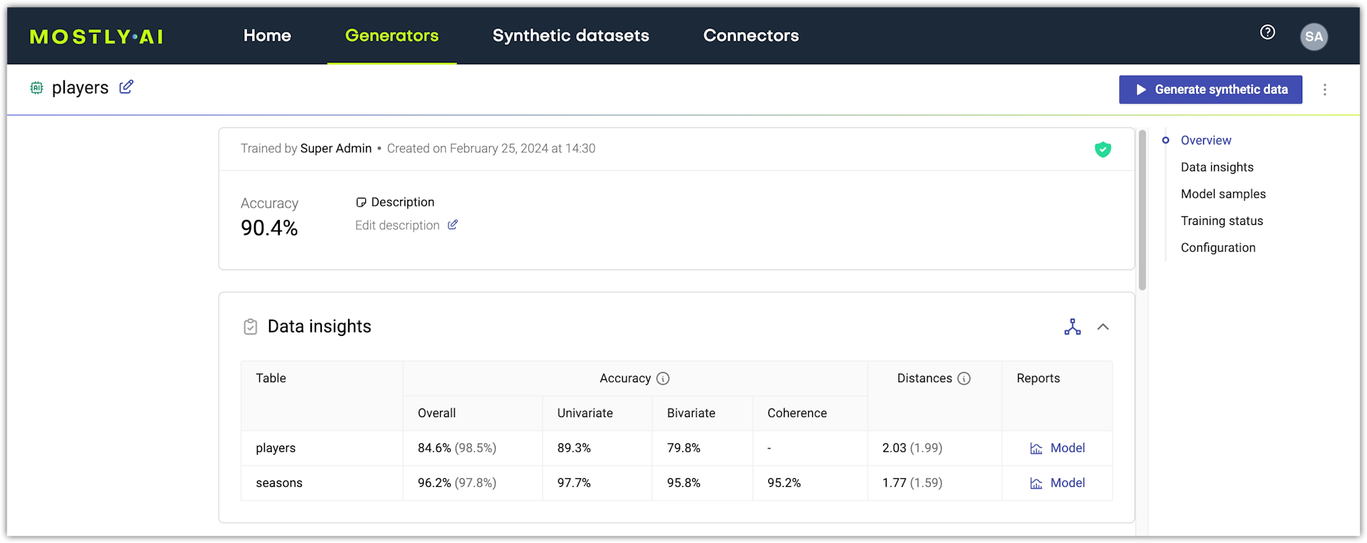
The generator overall accuracy is an average of the overall accuracies of all models.
The model overall accuracy is an aggregated statistic that is the mean of the univariate accuracy, the bivariate accuracy, and (only for linked tables) the coherence of a model.
| Univariate | The overall accuracy of the table’s univariate distributions. An aggregated statistic that shows the mean of the univariate accuracies of all columns. |
| Bivariate | The overall accuracy of the table’s bivariate distributions. An aggregated statistic that shows the mean of the bivariate accuracies of all columns. |
| Coherence | (Only for linked tables) The temporal coherence of time series data between the original and synthetic data as well as the preservation of the average sequence length (or the average number of linked table records that are related to a subject table record). |
Privacy metrics
MOSTLY AI generates synthetic data in a privacy-safe way. The privacy of data subjects is protected as a result of the privacy-protection mechanisms that are in place for every generated synthetic dataset. For each new dataset, MOSTLY AI trains AI models that learn only the general patters of the original dataset and never memorize data points. The AI models then generate data with random draws which is a process that ensures that no 1:1 relationship exists between the original and synthetic datasets. For more information, see Privacy-protection mechanisms.
In addition, for each synthetic dataset MOSTLY AI provides metrics demonstrating how the privacy of the original data subjects is preserved.
The privacy metrics assert that the synthetic data can be close, but not too close to the original data.
Distances
The Distances metric represents the average distance between synthetic samples and their nearest neighbors from the original data. Next to the distances metric for each model, in light gray is the average distance between the original samples and their nearest neighbors from the original data.
The values in the distances metrics depend on your original data and can, therefore, differ significantly between different sets of original data. By comparing the synthetic and original data distances you can evaluate if the synthetic data is not "too close" to the original data.
For each synthetic data point, the distances metric looks at the closest data point in the original dataset and compares that distribution of the closest distances to the observed distribution within the original data.
The measure indicates if, for the synthetic distribution of the closest records, low quantiles are not statistically below original data quantiles.
A threshold is defined for each quantile by the confidence interval generated via bootstrapping on the difference between original data and synthetic data set distribution.
Identical matches
A measure of exact matches between synthetic and original data.
This metric counts the number of identical data points (copies) within the original data and compares it with the number of copies between the original dataset and the synthetic dataset.
The measure indicates if the number of copies in the synthetic dataset is less (or not significantly more) than within the original data itself.
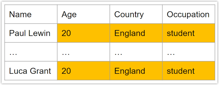
You can find the Identical matches metric in the model report.
Model report
You can find more details in the model report for each table. To open, click Model in the Reports column under Data insights.
MOSTLY AI generates a model report for each model in a generator and a data report for each model when you generate a synthetic dataset. The data report is especially important when you use data augmentation features, such as Rebalancing. For example, when you use Rebalancing, the changes in the distribution of the synthetic data will be visible only in the data report. For more information, see Evaluate synthetic data quality.
Each model contains a breakdown and visualization for the following quality metrics:
- Dataset statistics
- Correlations
- Univariate distributions
- Bivariate distributions
- Coherence (linked tables only)
- Accuracy
- Distances
To reduce computational time, the model report is calculated on a maximum of 100,000 samples that are randomly selected from the original and synthetic data. If smaller, the entire dataset is used.
Dataset statistics
At the top of the model report, the first card on the left shows the original dataset statistics of this model.
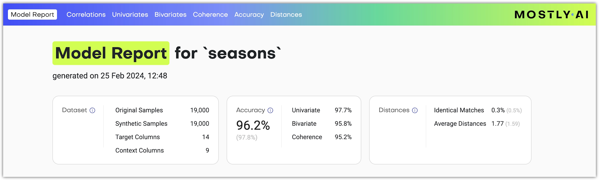
| Dataset statistic | Description |
|---|---|
| Original samples | The number of original data samples (aka rows or records) |
| Synthetic samples | The number of synthetic data samples (aka rows or records) generated to calculate the model report |
| Target columns | The number of columns included in the model training |
| Context columns | The number of columns in the tables to which the current table has a context relationships |
Accuracy
The accuracy metrics as described in the Accuracy metrics section above appear in the middle card of the top section.
Distances
The Distances and Identical Matches metrics as described in the Privacy section above appear in the right card of the top section.
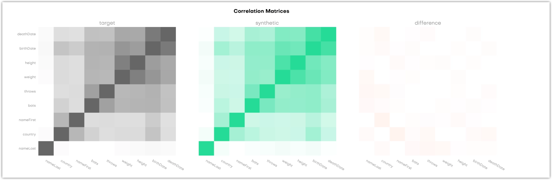
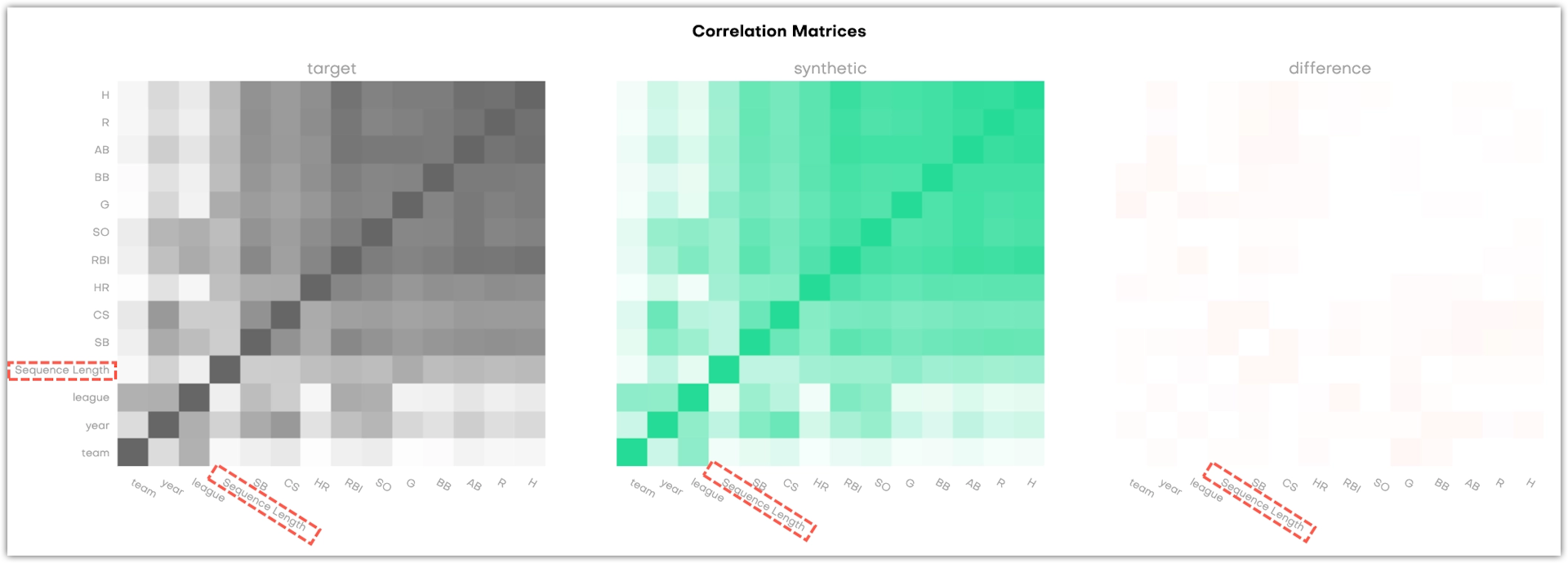
Correlations
The Correlations is the first available section in the model report.
This section shows three correlation matrices. They provide a way to assess whether the synthetic dataset retained the correlation structure of the original data set. This gives you an additional way to assess the quality of the synthetic data, but does not have an impact on the calculated overall accuracy score.
Both the X and Y-axis refer to the columns in the table that is evaluated, and each cell in the matrix correlates to a variable pair: the more two variables are correlated, the darker the cell becomes. This is obvious in the dark 45 degree diagonal which shows the correlations of single variables with themselves. Naturally, their correlation coefficient is 1. The third matrix shows the difference between the original and the synthetic data.
For subject tables, the charts display all columns.
For linked tables, the charts display the correlations between all columns as well as the correlations between each column and the Sequence Length.
Technical reference
The correlations are calculated by binning all variables into a maximum of 10 groups. For categorical columns, the 10 most common categories are used and for numerical columns, the deciles are chosen as cut-offs. Then, a correlation coefficient Φκ is calculated for each combination of variable pairs. The Φκ coefficient provides a stable solution when combining numerical and categorical variables and also captures non-linear dependencies. The resulting correlation matrix is then color-coded as a heatmap to indicate the strength of variable interdependencies, once for the actual and once for the synthetic data with scaling between 0 and 1.
Details about the Φκ coefficient can be found in the following paper: A new correlation coefficient between categorical, ordinal and interval variables with Pearson characteristics (opens in a new tab)
Univariate distributions
Univariate distributions describe the probability of a variable having a particular value. You can find four types of plots in this section of the QA report: categorical , continuous and datetime, but there’s also a Sequence Length plot if you synthesized a linked table.
For each variable, there’s a distribution and binned plot. These show the distributions of the original and the synthetic dataset in green and black, respectively. The percentage next to the title shows how accurately the original column is represented by the synthetic column.
You can search by column name to find a univariate chart.
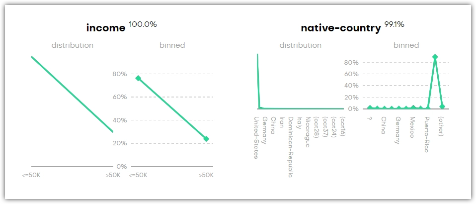
You may find categories that are not present in the original dataset (for example, _RARE_). These categories appear as a means of rare category protection, ensuring privacy protection of subjects with rare or unique features.
Technical reference
All variables are binned into a maximum of 10 groups. For categorical columns, the 10 most common categories are used and for numerical and datetime columns, the deciles are chosen as cut-offs. One additional group is used to show empty values: (empty) for categorical and (n/a) for numerical and datetime columns. This presented accuracy is the Manhattan distance (L1) calculated on the binned datasets.
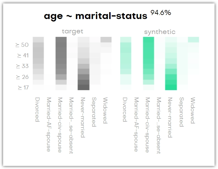
Bivariate distributions
Bivariate distributions help you understand the conditional relationship between the content of two columns in your original dataset and how it is preserved in the synthetic dataset.
For each variable pair, there is a target and a synthetic plot. These show the relationships of the variables in the original and the synthetic dataset in green and black, respectively. Again, the percentage next to the title shows how accurately the original column is represented by the synthetic column.
The bivariate distribution below shows, for instance, that the age group of forty years and older is most likely to be married, and anyone below thirty is most likely to have never been married. You can see that this is the same in the synthetic dataset.
If it’s a QA report for a linked table, then you can find the plots with the context table’s columns by looking for context:[column-name]. The word context here refers to either the subject table or another linked table with which this linked table has been synthesized.
You can search by column name to find a bivariate chart.
You may find categories that are not present in the original dataset (for example, _RARE_). These categories appear as a means of rare category protection, ensuring privacy protection of subjects with rare or unique features.
Technical reference
All variables are binned into a maximum of 10 groups. For categorical columns, the 10 most common categories are used and for numerical and datetime columns, the deciles are chosen as cut-offs. One additional group is used to show empty values: (empty) for categorical and (n/a) for numerical and datetime columns.
In the downloadable HTML, only a selection of bivariate plots are shown, half of which are the most accurate and the other half the least accurate.
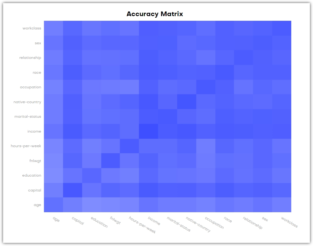
Accuracy
The Accuracy tab is a summary of the Univariate distributions and Bivariate distributions tabs. It displays a table of all variables and in the second column lists the respective univariate accuracies. You can find the same values in the respective Univariate distribution charts. In parenthesis is the value, that can be expected if we compared the original data with a holdout dataset of the original data itself. It is important to point out that one would not necessarily expect to see 100% when comparing a random sample of original data with a random sample of original data itself. The third column contains the average bivariate accuracy of the variable with all other variables. And again in parentheses the value we would expect to see when comparing the original data to a holdout dataset.
At the bottom is an Accuracy Matrix that shows the bivariate accuries between pairs of variables. You can also find these values in the respective Bivariate distribution charts. The diagonal values of the chart that only belong to one variable are the univariate accuracies of that variable.
How the accuracy is calculated
The accuracy of synthetic data can be assessed by measuring statistical distances between the synthetic and the original data. The metric of choice for the statistical distance is the total variation distance (TVD), which is calculated for the discretized empirical distributions. Subtracting the TVD from 100% then yields the reported accuracy measure. These are being calculated for all univariate and all bivariate distributions. The latter is done for all pair-wise combinations within the original data, as well as between the context and the target. For sequential data, an additional coherence metric is calculated that assesses the bivariate accuracy between the value of a column, and the succeeding value of a column. All of these individual-level statistics are then averaged across to provide a single informative quantitative measure. The full list of calculated accuracies is provided as a separate downloadable file.
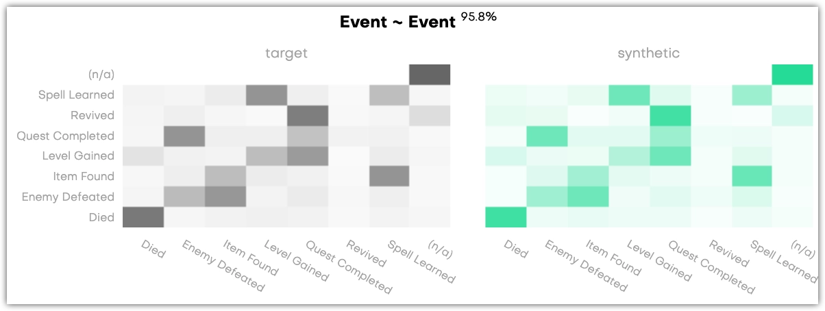
Coherence
Coherence charts compare original and synthetic time series data and their inherent correlations. A coherence chart is a bivariate plot of a column of data that is split into two columns, where the first column contains the sequence of former events and the second columns contains the sequence of latter events. You can use coherence charts to check the probability of one type of event being followed by another.
Coherence charts are available only for linked tables. You can review the coherence of linked tables on the Coherence tab of the Model QA report and Data QA report.
To interpret coherence charts, you can review the following example where a color with a higher saturation indicates higher probability that an event from the Y axis comes after an event from the X axis.