In this tutorial, you will learn the key concepts behind MOSTLY AI’s synthetic data Quality Assurance (QA) framework. This will enable you to efficiently and reliably assess the quality of your generated synthetic datasets. It will also give you the skills to confidently explain the quality metrics to any interested stakeholders.
Using the code in this tutorial, you will replicate key parts of both the accuracy and privacy metrics that you will find in any MOSTLY AI QA Report. For a full-fledged exploration of the topic including a detailed mathematical explanation, see our peer-reviewed journal paper as well as the accompanying benchmarking study.
The Python code for this tutorial is publicly available and runnable in this Google Colab notebook.
QA reports for synthetic data sets
If you have run any synthetic data generation jobs with MOSTLY AI, chances are high that you’ve already encountered the QA Report. To access it, click on any completed synthesization job and select the “QA Report” tab:
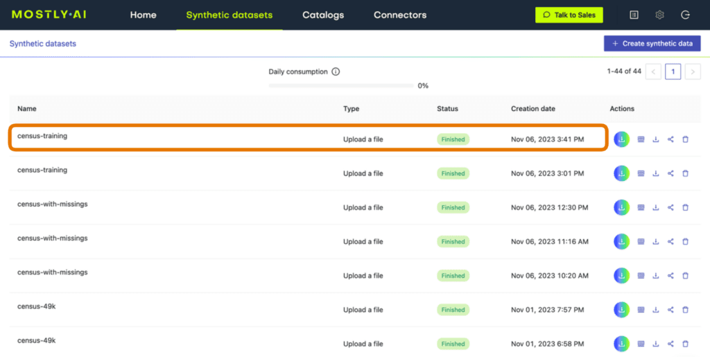
Fig 1 - Click on a completed synthesization job.
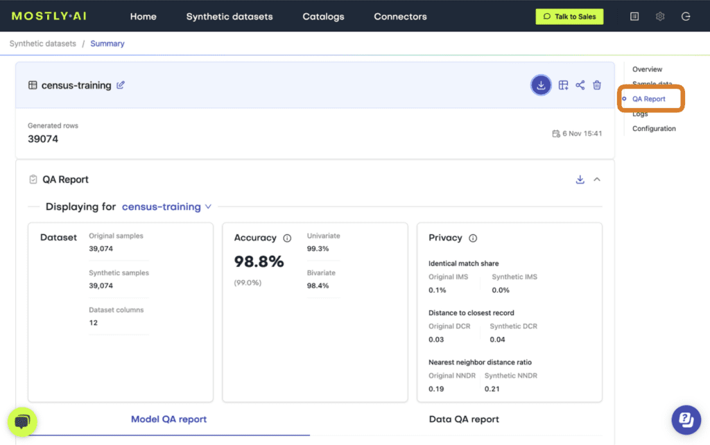
Fig 2 - Select the “QA Report” tab.
At the top of the QA Report you will find some summary statistics about the dataset as well as the average metrics for accuracy and privacy of the generated dataset. Further down, you can toggle between the Model QA Report and the Data QA Report. The Model QA reports on the accuracy and privacy of the trained Generative AI model. The Data QA, on the other hand, visualizes the distributions not of the underlying model but of the outputted synthetic dataset. If you generate a synthetic dataset with all the default settings enabled, the Model and Data QA Reports should look the same.
Exploring either of the QA reports you will discover various performance metrics, such as univariate and bivariate distributions for each of the columns and well as more detailed privacy metrics. You can use these metrics to precisely evaluate the quality of your synthetic dataset.
So how does MOSTLY AI calculate these quality assurance metrics?
In the following sections you will replicate the accuracy and privacy metrics. The code is almost exactly the code that MOSTLY AI runs under the hood to generate the QA Reports – it has been tweaked only slightly to improve legibility and usability. Working through this code will give you a hands-on insight into how MOSTLY AI evaluates synthetic data quality.
Preprocessing the data
The first step in MOSTLY AI’s synthetic data quality evaluation methodology is to take the original dataset and split it in half to yield two subsets: a training dataset and a holdout dataset. We then use only the training samples (so only 50% of the original dataset) to train our synthesizer and generate synthetic data samples. The holdout samples are never exposed to the synthesis process but are kept aside for evaluation.

Fig 3 - The first step is to split the original dataset in two equal parts and train the synthesizer on only one of the halves.
Distance-based quality metrics for synthetic data generation
Both the accuracy and privacy metrics are measured in terms of distance. Remember that we split the original dataset into two subsets: a training and a holdout set. Since these are all samples from the same dataset, these two sets will exhibit the same statistics and the same distributions. However, as the split was made at random we can expect a slight difference in the statistical properties of these two datasets. This difference is normal and is due to sampling variance.
The difference (or, to put it mathematically: the distance) between the training and holdout samples will serve us as a reference point: in an ideal scenario, the synthetic data we generate should be no different from the training dataset than the holdout dataset is. Or to put it differently: the distance between the synthetic samples and the training samples should approximate the distance we would expect to occur naturally within the training samples due to sampling variance.
If the synthetic data is significantly closer to the training data than the holdout data, this means that some information specific to the training data has leaked into the synthetic dataset. If the synthetic data is significantly farther from the training data than the holdout data, this means that we have lost information in terms of accuracy or fidelity.
For more context on this distance-based quality evaluation approach, check out our benchmarking study which dives into more detail.
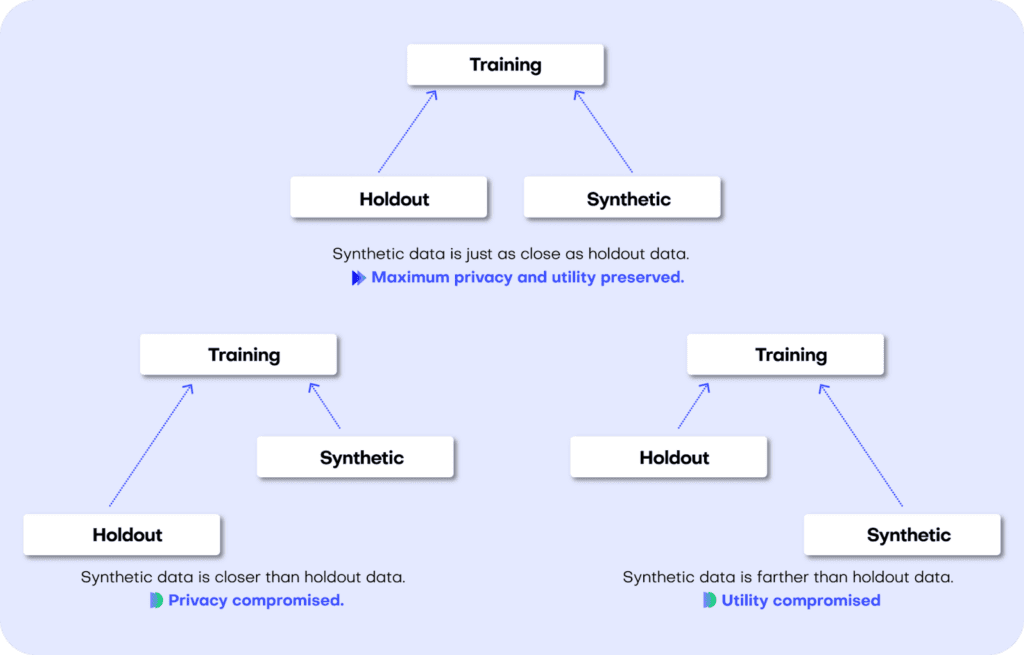
Fig 4 - A perfect synthetic data generator creates data samples that are just as different from the training data as the holdout data. If this is not the case, we are compromising on either privacy or utility.
Let’s jump into replicating the metrics for both accuracy and privacy 👇
Synthetic data accuracy
The accuracy of MOSTLY AI’s synthetic datasets is measured as the total variational distance between the empirical marginal distributions. It is calculated by treating all the variables in the dataset as categoricals (by binning any numerical features) and then measuring the sum of all deviations between the empirical marginal distributions.
The code below performs the calculation for all univariate and bivariate distributions and then averages across to determine the simple summary statistics you see in the QA Report.
First things first: let’s access the data. You can fetch both the original and the synthetic datasets directly from the Github repo:
repo = (
    "https://github.com/mostly-ai/mostly-tutorials/raw/dev/quality-assurance"
)
tgt = pd.read_parquet(f"{repo}/census-training.parquet")
print(
    f"fetched original data with {tgt.shape[0]:,} records and {tgt.shape[1]} attributes"
)
syn = pd.read_parquet(f"{repo}/census-synthetic.parquet")
print(
    f"fetched synthetic data with {syn.shape[0]:,} records and {syn.shape[1]} attributes"
)
fetched original data with 39,074 records and 12 attributes
fetched synthetic data with 39,074 records and 12 attributes
We are working with a version of the UCI Adult Income dataset. This dataset has just over 39K records and 12 columns. Go ahead and sample 5 random records to get a sense of what the data looks like:
tgt.sample(n=5)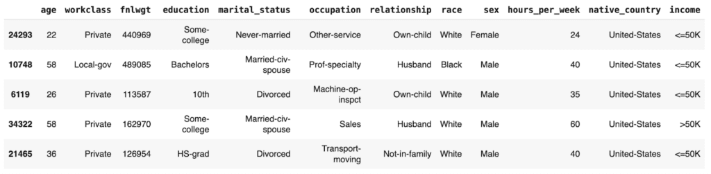
Let’s define a helper function to bin the data in order treat any numerical features as categoricals:
def bin_data(dt1, dt2, bins=10):
    dt1 = dt1.copy()
    dt2 = dt2.copy()
    # quantile binning of numerics
    num_cols = dt1.select_dtypes(include="number").columns
    cat_cols = dt1.select_dtypes(
        include=["object", "category", "string", "bool"]
    ).columns
    for col in num_cols:
        # determine breaks based on `dt1`
        breaks = dt1[col].quantile(np.linspace(0, 1, bins + 1)).unique()
        dt1[col] = pd.cut(dt1[col], bins=breaks, include_lowest=True)
        dt2_vals = pd.to_numeric(dt2[col], "coerce")
        dt2_bins = pd.cut(dt2_vals, bins=breaks, include_lowest=True)
        dt2_bins[dt2_vals < min(breaks)] = "_other_"
        dt2_bins[dt2_vals > max(breaks)] = "_other_"
        dt2[col] = dt2_bins
    # top-C binning of categoricals
    for col in cat_cols:
        dt1[col] = dt1[col].astype("str")
        dt2[col] = dt2[col].astype("str")
        # determine top values based on `dt1`
        top_vals = dt1[col].value_counts().head(bins).index.tolist()
        dt1[col].replace(
            np.setdiff1d(dt1[col].unique().tolist(), top_vals),
            "_other_",
            inplace=True,
        )
        dt2[col].replace(
            np.setdiff1d(dt2[col].unique().tolist(), top_vals),
            "_other_",
            inplace=True,
        )
    return dt1, dt2
And a second helper function to calculate the univariate and bivariate accuracies:
def calculate_accuracies(dt1_bin, dt2_bin, k=1):
    # build grid of all cross-combinations
    cols = dt1_bin.columns
    interactions = pd.DataFrame(
        np.array(np.meshgrid(cols, cols)).reshape(2, len(cols) ** 2).T
    )
    interactions.columns = ["col1", "col2"]
    if k == 1:
        interactions = interactions.loc[
            (interactions["col1"] == interactions["col2"])
        ]
    elif k == 2:
        interactions = interactions.loc[
            (interactions["col1"] < interactions["col2"])
        ]
    else:
        raise ("k>2 not supported")

    results = []
    for idx in range(interactions.shape[0]):
        row = interactions.iloc[idx]
        val1 = (
            dt1_bin[row.col1].astype(str) + "|" + dt1_bin[row.col2].astype(str)
        )
        val2 = (
            dt2_bin[row.col1].astype(str) + "|" + dt2_bin[row.col2].astype(str)
        )
        # calculate empirical marginal distributions (=relative frequencies)
        freq1 = val1.value_counts(normalize=True, dropna=False).to_frame(
            name="p1"
        )
        freq2 = val2.value_counts(normalize=True, dropna=False).to_frame(
            name="p2"
        )
        freq = freq1.join(freq2, how="outer").fillna(0.0)
        # calculate Total Variation Distance between relative frequencies
        tvd = np.sum(np.abs(freq["p1"] - freq["p2"])) / 2
        # calculate Accuracy as (100% - TVD)
        acc = 1 - tvd
        out = pd.DataFrame(
            {
                "Column": [row.col1],
                "Column 2": [row.col2],
                "TVD": [tvd],
                "Accuracy": [acc],
            }
        )
        results.append(out)

    return pd.concat(results)
Then go ahead and bin the data. We restrict ourselves to 100K records for efficiency.
# restrict to max 100k records
tgt = tgt.sample(frac=1).head(n=100_000)
syn = syn.sample(frac=1).head(n=100_000)
# bin data
tgt_bin, syn_bin = bin_data(tgt, syn, bins=10)
Now you can go ahead and calculate the univariate accuracies for all the columns in the dataset:
# calculate univariate accuracies
acc_uni = calculate_accuracies(tgt_bin, syn_bin, k=1)[['Column', 'Accuracy']]
Go ahead and inspect the first 5 columns:
acc_uni.head()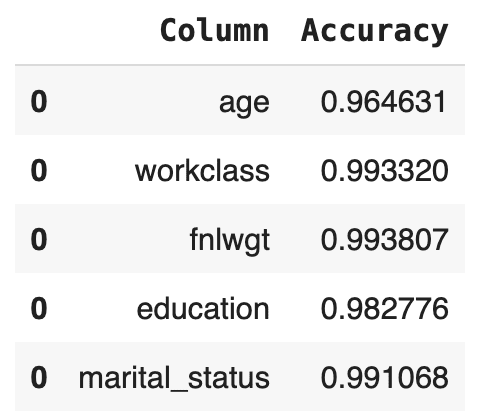
Now let’s calculate the bivariate accuracies as well. This measures how well the relationships between all the sets of two columns are maintained.
# calculate bivariate accuracies
acc_biv = calculate_accuracies(tgt_bin, syn_bin, k=2)[
    ["Column", "Column 2", "Accuracy"]
]
acc_biv = pd.concat(
    [
        acc_biv,
        acc_biv.rename(columns={"Column": "Column 2", "Column 2": "Column"}),
    ]
)
acc_biv.head()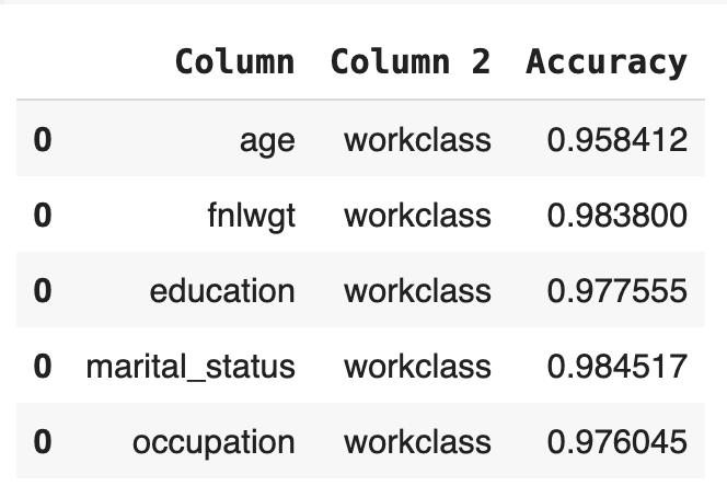
The bivariate accuracy that is reported for each column in the MOSTLY AI QA Report is an average over all of the bivariate accuracies for that column with respect to all the other columns in the dataset. Let’s calculate that value for each column and then create an overview table with the univariate and average bivariate accuracies for all columns:
# calculate the average bivariate accuracy
acc_biv_avg = (
    acc_biv.groupby("Column")["Accuracy"]
    .mean()
    .to_frame("Bivariate Accuracy")
    .reset_index()
)
# merge to univariate and avg. bivariate accuracy to single overview table
acc = pd.merge(
    acc_uni.rename(columns={"Accuracy": "Univariate Accuracy"}),
    acc_biv_avg,
    on="Column",
).sort_values("Univariate Accuracy", ascending=False)
# report accuracy as percentage
acc["Univariate Accuracy"] = acc["Univariate Accuracy"].apply(
    lambda x: f"{x:.1%}"
)
acc["Bivariate Accuracy"] = acc["Bivariate Accuracy"].apply(
    lambda x: f"{x:.1%}"
)
acc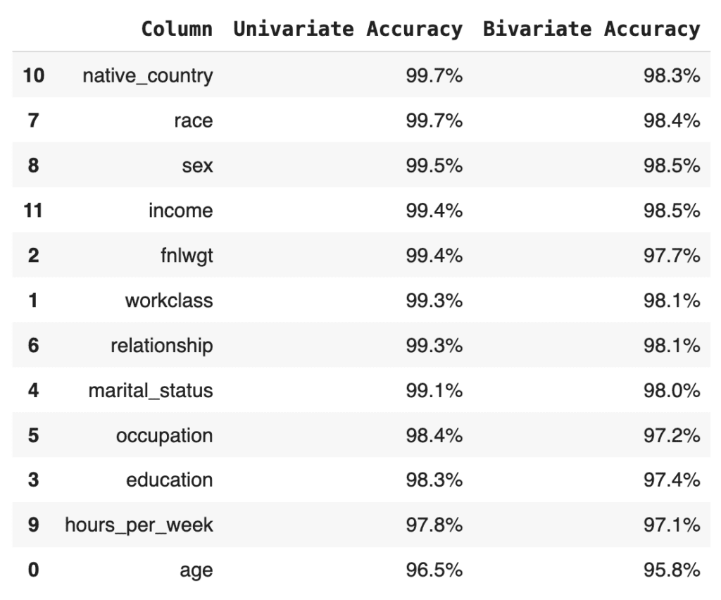
Finally, let’s calculate the summary statistic values that you normally see at the top of any MOSTLY AI QA Report: the overall accuracy as well as the average univariate and bivariate accuracies. We take the mean of the univariate and bivariate accuracies for all the columns and then take the mean of the result to arrive at the overall accuracy score:
print(f"Avg. Univariate Accuracy: {acc_uni['Accuracy'].mean():.1%}")
print(f"Avg. Bivariate Accuracy:  {acc_biv['Accuracy'].mean():.1%}")
print(f"-------------------------------")
acc_avg = (acc_uni["Accuracy"].mean() + acc_biv["Accuracy"].mean()) / 2
print(f"Avg. Overall Accuracy:    {acc_avg:.1%}")
Avg. Univariate Accuracy: 98.9%
Avg. Bivariate Accuracy: 97.7%
------------------------------
Avg. Overall Accuracy: 98.3%
If you’re curious how this compares to the values in the MOSTLY AI QA Report, go ahead and download the tgt dataset and synthesize it using the default settings. The overall accuracy reported will be close to 98%.
Next, let’s see how MOSTLY AI generates the visualization segments of the accuracy report. The code below defines two helper functions: one for the univariate and one for the bivariate plots. Getting the plots right for all possible edge cases is actually rather complicated, so while the code block below is lengthy, this is in fact the trimmed-down version of what MOSTLY AI uses under the hood. You do not need to worry about the exact details of the implementation here; just getting an overall sense of how it works is enough:
import plotly.graph_objects as go


def plot_univariate(tgt_bin, syn_bin, col, accuracy):
    freq1 = (
        tgt_bin[col].value_counts(normalize=True, dropna=False).to_frame("tgt")
    )
    freq2 = (
        syn_bin[col].value_counts(normalize=True, dropna=False).to_frame("syn")
    )
    freq = freq1.join(freq2, how="outer").fillna(0.0).reset_index()
    freq = freq.sort_values(col)
    freq[col] = freq[col].astype(str)

    layout = go.Layout(
        title=dict(
            text=f"<b>{col}</b> <sup>{accuracy:.1%}</sup>", x=0.5, y=0.98
        ),
        autosize=True,
        height=300,
        width=800,
        margin=dict(l=10, r=10, b=10, t=40, pad=5),
        plot_bgcolor="#eeeeee",
        hovermode="x unified",
        yaxis=dict(
            zerolinecolor="white",
            rangemode="tozero",
            tickformat=".0%",
        ),
    )
    fig = go.Figure(layout=layout)
    trn_line = go.Scatter(
        mode="lines",
        x=freq[col],
        y=freq["tgt"],
        name="target",
        line_color="#666666",
        yhoverformat=".2%",
    )
    syn_line = go.Scatter(
        mode="lines",
        x=freq[col],
        y=freq["syn"],
        name="synthetic",
        line_color="#24db96",
        yhoverformat=".2%",
        fill="tonexty",
        fillcolor="#ffeded",
    )
    fig.add_trace(trn_line)
    fig.add_trace(syn_line)
    fig.show(config=dict(displayModeBar=False))


def plot_bivariate(tgt_bin, syn_bin, col1, col2, accuracy):
    x = (
        pd.concat([tgt_bin[col1], syn_bin[col1]])
        .drop_duplicates()
        .to_frame(col1)
    )
    y = (
        pd.concat([tgt_bin[col2], syn_bin[col2]])
        .drop_duplicates()
        .to_frame(col2)
    )
    df = pd.merge(x, y, how="cross")
    df = pd.merge(
        df,
        pd.concat([tgt_bin[col1], tgt_bin[col2]], axis=1)
        .value_counts()
        .to_frame("target")
        .reset_index(),
        how="left",
    )
    df = pd.merge(
        df,
        pd.concat([syn_bin[col1], syn_bin[col2]], axis=1)
        .value_counts()
        .to_frame("synthetic")
        .reset_index(),
        how="left",
    )
    df = df.sort_values([col1, col2], ascending=[True, True]).reset_index(
        drop=True
    )
    df["target"] = df["target"].fillna(0.0)
    df["synthetic"] = df["synthetic"].fillna(0.0)
    # normalize values row-wise (used for visualization)
    df["target_by_row"] = df["target"] / df.groupby(col1)["target"].transform(
        "sum"
    )
    df["synthetic_by_row"] = df["synthetic"] / df.groupby(col1)[
        "synthetic"
    ].transform("sum")
    # normalize values across table (used for accuracy)
    df["target_by_all"] = df["target"] / df["target"].sum()
    df["synthetic_by_all"] = df["synthetic"] / df["synthetic"].sum()
    df["y"] = df[col1].astype("str")
    df["x"] = df[col2].astype("str")

    layout = go.Layout(
        title=dict(
            text=f"<b>{col1} ~ {col2}</b> <sup>{accuracy:.1%}</sup>",
            x=0.5,
            y=0.98,
        ),
        autosize=True,
        height=300,
        width=800,
        margin=dict(l=10, r=10, b=10, t=40, pad=5),
        plot_bgcolor="#eeeeee",
        showlegend=True,
        # prevent Plotly from trying to convert strings to dates
        xaxis=dict(type="category"),
        xaxis2=dict(type="category"),
        yaxis=dict(type="category"),
        yaxis2=dict(type="category"),
    )
    fig = go.Figure(layout=layout).set_subplots(
        rows=1,
        cols=2,
        horizontal_spacing=0.05,
        shared_yaxes=True,
        subplot_titles=("target", "synthetic"),
    )
    fig.update_annotations(font_size=12)
    # plot content
    hovertemplate = (
        col1[:10] + ": `%{y}`<br />" + col2[:10] + ": `%{x}`<br /><br />"
    )
    hovertemplate += "share target vs. synthetic<br />"
    hovertemplate += "row-wise: %{customdata[0]} vs. %{customdata[1]}<br />"
    hovertemplate += "absolute: %{customdata[2]} vs. %{customdata[3]}<br />"
    customdata = df[
        [
            "target_by_row",
            "synthetic_by_row",
            "target_by_all",
            "synthetic_by_all",
        ]
    ].apply(lambda x: x.map("{:.2%}".format))
    heat1 = go.Heatmap(
        x=df["x"],
        y=df["y"],
        z=df["target_by_row"],
        name="target",
        zmin=0,
        zmax=1,
        autocolorscale=False,
        colorscale=["white", "#A7A7A7", "#7B7B7B", "#666666"],
        showscale=False,
        customdata=customdata,
        hovertemplate=hovertemplate,
    )
    heat2 = go.Heatmap(
        x=df["x"],
        y=df["y"],
        z=df["synthetic_by_row"],
        name="synthetic",
        zmin=0,
        zmax=1,
        autocolorscale=False,
        colorscale=["white", "#81EAC3", "#43E0A5", "#24DB96"],
        showscale=False,
        customdata=customdata,
        hovertemplate=hovertemplate,
    )
    fig.add_trace(heat1, row=1, col=1)
    fig.add_trace(heat2, row=1, col=2)
    fig.show(config=dict(displayModeBar=False))
Now you can create the plots for the univariate distributions:
for idx, row in acc_uni.sample(n=5, random_state=0).iterrows():
    plot_univariate(tgt_bin, syn_bin, row["Column"], row["Accuracy"])
    print("")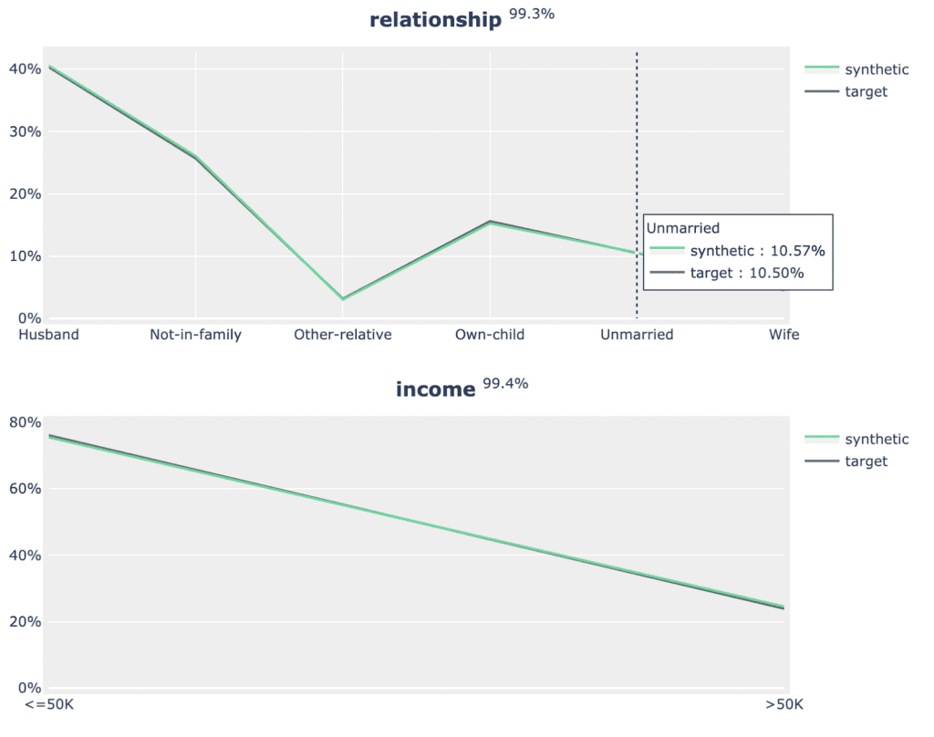
Fig 5 - Sample of 2 univariate distribution plots.
As well as the bivariate distribution plots:
for idx, row in acc_biv.sample(n=5, random_state=0).iterrows():
    plot_bivariate(
        tgt_bin, syn_bin, row["Column"], row["Column 2"], row["Accuracy"]
    )
    print("")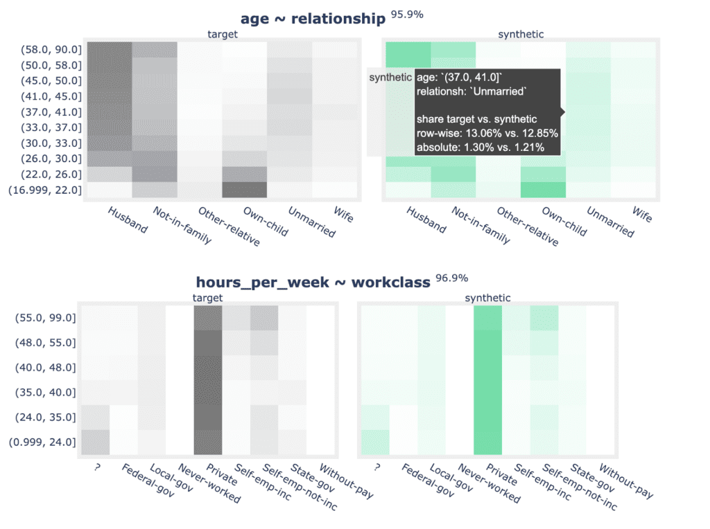
Fig 6 - Sample of 2 bivariate distribution plots.
Now that you have replicated the accuracy component of the QA Report in sufficient detail, let’s move on to the privacy section.
Synthetic data privacy
Just like accuracy, the privacy metric is also calculated as a distance-based value. To gauge the privacy risk of the generated synthetic data, we calculate the distances between the synthetic samples and their "nearest neighbor" (i.e., their most similar record) from the original dataset. This nearest neighbor could be either in the training split or in the holdout split. We then tally the ratio of synthetic samples that are closer to the holdout and the training set. Ideally, we will see an even split, which would mean that the synthetic samples are not systematically any closer to the original dataset than the original samples are to each other.
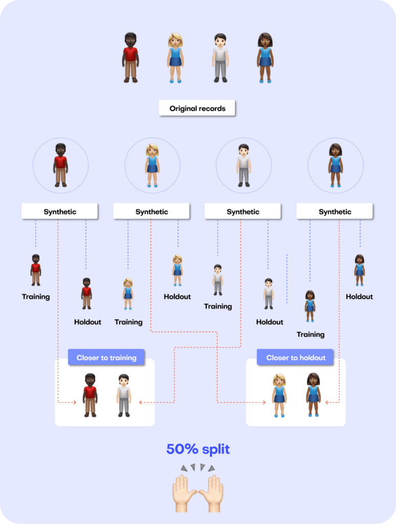
Fig 7 - A perfect synthetic data generator creates synthetic records that are just as different from the training data as from the holdout data.
The code block below uses the scikit-learn library to perform a nearest-neighbor search across the synthetic and original datasets. We then use the results from this search to calculate two different distance metrics: the Distance to the Closest Record (DCR) and the Nearest Neighbor Distance Ratio (NNDR), both at the 5-th percentile.
from sklearn.compose import make_column_transformer
from sklearn.neighbors import NearestNeighbors
from sklearn.preprocessing import OneHotEncoder
from sklearn.impute import SimpleImputer


no_of_records = min(tgt.shape[0] // 2, syn.shape[0], 10_000)
tgt = tgt.sample(n=2 * no_of_records)
trn = tgt.head(no_of_records)
hol = tgt.tail(no_of_records)
syn = syn.sample(n=no_of_records)


string_cols = trn.select_dtypes(exclude=np.number).columns
numeric_cols = trn.select_dtypes(include=np.number).columns
transformer = make_column_transformer(
    (SimpleImputer(missing_values=np.nan, strategy="mean"), numeric_cols),
    (OneHotEncoder(), string_cols),
    remainder="passthrough",
)
transformer.fit(pd.concat([trn, hol, syn], axis=0))
trn_hot = transformer.transform(trn)
hol_hot = transformer.transform(hol)
syn_hot = transformer.transform(syn)


# calculcate distances to nearest neighbors
index = NearestNeighbors(
    n_neighbors=2, algorithm="brute", metric="l2", n_jobs=-1
)
index.fit(trn_hot)
# k-nearest-neighbor search for both training and synthetic data, k=2 to calculate DCR + NNDR
dcrs_hol, _ = index.kneighbors(hol_hot)
dcrs_syn, _ = index.kneighbors(syn_hot)
dcrs_hol = np.square(dcrs_hol)
dcrs_syn = np.square(dcrs_syn)
Now calculate the DCR for both datasets:
dcr_bound = np.maximum(np.quantile(dcrs_hol[:, 0], 0.95), 1e-8)
ndcr_hol = dcrs_hol[:, 0] / dcr_bound
ndcr_syn = dcrs_syn[:, 0] / dcr_bound
print(
    f"Normalized DCR 5-th percentile original  {np.percentile(ndcr_hol, 5):.3f}"
)
print(
    f"Normalized DCR 5-th percentile synthetic {np.percentile(ndcr_syn, 5):.3f}"
)
Normalized DCR 5-th percentile original 0.001
Normalized DCR 5-th percentile synthetic 0.009
As well as the NNDR:
print(
    f"NNDR 5-th percentile original  {np.percentile(dcrs_hol[:,0]/dcrs_hol[:,1], 5):.3f}"
)
print(
    f"NNDR 5-th percentile synthetic {np.percentile(dcrs_syn[:,0]/dcrs_syn[:,1], 5):.3f}"
)
NNDR 5-th percentile original 0.019
NNDR 5-th percentile synthetic 0.058
For both privacy metrics, the distance value for the synthetic dataset should be similar but not smaller. This gives us confidence that our synthetic record has not learned privacy-revealing information from the training data.
Quality assurance for synthetic data with MOSTLY AI
In this tutorial, you have learned the key concepts behind MOSTLY AI’s Quality Assurance framework. You have gained insight into the preprocessing steps that are required as well as a close look into exactly how the accuracy and privacy metrics are calculated. With these newly acquired skills, you can now confidently and efficiently interpret any MOSTLY AI QA Report and explain it thoroughly to any interested stakeholders.
For a more in-depth exploration of these concepts and the mathematical principles behind them, check out the benchmarking study or the peer-reviewed academic research paper to dive deeper.
You can also check out the other Synthetic Data Tutorials:
- Tackle missing data with smart data imputation
- Generate synthetic text data
- Explainable AI with synthetic data
- Perform conditional data generation
- Rebalancing your data for ML classification problems
- Optimize your training sample size for synthetic data accuracy
- Build a “fake vs real” ML classifier
Synthetic data holds the promise of addressing the underrepresentation of minority classes in tabular data sets by adding new, diverse, and highly realistic synthetic samples. In this post, we'll benchmark AI-generated synthetic data for upsampling highly unbalanced tabular data sets. Specifically, we compare the performance of predictive models trained on data sets upsampled with synthetic records to that of well-known upsampling methods, such as naive oversampling or SMOTE-NC.
Our experiments are conducted on multiple data sets and different predictive models. We demonstrate that synthetic data can improve predictive accuracy for minority groups as it creates diverse data points that fill gaps in sparse regions in feature space.
Our results highlight the potential of synthetic data upsampling as a viable method for improving predictive accuracy on highly unbalanced data sets. We show that upsampled synthetic training data consistently results in top-performing predictive models, in particular for mixed-type data sets containing a very low number of minority samples, where it outperforms all other upsampling techniques.
Try upsampling on MOSTLY AI's synthetic data platform!
The definition of synthetic data
AI-generated synthetic data, which we refer to as synthetic data throughout, is created by training a generative model on the original data set. In the inference phase, the generative model creates statistically representative, synthetic records from scratch.
The use of synthetic data has gained increasing importance in various industries, particularly due to its primary use case of enhancing data privacy. Beyond privacy, synthetic data offers the possibility to modify and tailor data sets to our specific needs. In this blog post, we investigate the potential of synthetic data to improve the performance of machine learning algorithms on data sets with unbalanced class distributions, specifically through the synthetic upsampling of minority classes.
Upsampling for class imbalance
Class imbalance is a common problem in many real-world tabular data sets where the number of samples in one or more classes is significantly lower than the others. Such imbalances can lead to poor prediction performance for the minority classes, often of greatest interest in many applications, such as detecting fraud or extreme insurance claims.
Traditional upsampling methods, such as naive oversampling or SMOTE, have shown some success in mitigating this issue. However, the effectiveness of these methods is often limited, and they may introduce biases in the data, leading to poor model performance. In recent years, synthetic data has emerged as a promising alternative to traditional upsampling methods. By creating highly realistic samples for minority classes, synthetic data can significantly improve the accuracy of predictive models.
While upsampling methods like naive oversampling and SMOTE are effective in addressing unbalanced data sets, they also have their limitations. Naive oversampling mitigates class imbalance effects by simply duplicating minority class examples. Due to this strategy, they bear the risk of overfitting the model to the training data, resulting in poor generalization in the inference phase.
SMOTE, on the other hand, generates new records by interpolating between existing minority-class samples, leading to higher diversity. However, SMOTE’s ability to increase diversity is limited when the absolute number of minority records is very low. This is especially true when generating samples for mixed-type data sets containing categorical columns. For mixed-type data sets, SMOTE-NC is commonly used as an extension for handling categorical columns.
SMOTE-NC may not work well with non-linear decision boundaries, as it only linearly interpolates between minority records. This can lead to SMOTE-NC examples being generated in an “unfavorable” region of feature space, far from where additional samples would help the predictive model place a decision boundary.
All these limitations highlight the need for exploring alternative upsampling methods, such as synthetic data upsampling, that can overcome these challenges and improve the accuracy of minority group predictions.
The strength of upsampling minority classes with AI-generated synthetic data is that the generative model is not limited to upsampling or interpolating between existing minority classes. Most AI-based generators can create realistic synthetic data examples in any region of feature space and, thus, considerably increase diversity. Because they are not tied to existing minority samples, AI-based generators can also leverage and learn from the properties of (parts of) the majority samples that are transferable to minority examples.
An additional strength of using AI-based upsampling is that it can be easily extended to more complex data structures, such as sequential data, where not only one but many rows in a data set belong to a single data subject. This aspect of synthetic data upsampling is, however, out of the scope of this study.
In this post, we present a comprehensive benchmark study comparing the performance of predictive models trained on unbalanced data upsampled with AI-generated synthetic data, naive upsampling, and SMOTE-NC upsampling. Our experiments are carried out on various data sets and using different predictive models.
The upsampling experiment
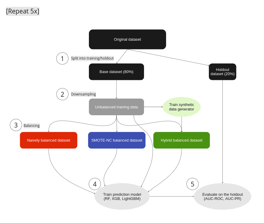
Figure 1: Experimental Setup: (1) We split the original data set into a base data set and a holdout. (2) Strong imbalances are introduced in the base data set by downsampling the minority classes to fractions as low as 0.05% to yield the unbalanced training data. (3) We test different mitigation strategies: balancing through naive upsampling, SMOTE-NC upsampling, and upsampling with AI-generated synthetic records (the hybrid data set). (4) We train LGBM, RandomForest, and XGB classifiers on the balanced and unbalanced training data. (5) We evaluate the properties of the upsampling techniques by measuring the performance of the trained classifier on the holdout set. Steps 1–5 are repeated five times, and we report the mean AUC-ROC as well as the AUC-PR.
For every data set we use in our experiments, we run through the following steps (see Fig. 1):
- We split the original data set into a base and a holdout set by using a five-fold stratified sampling approach to ensure that each class is represented proportionally.
- All of the original data sets have a binary target column and only a rather moderate imbalance with the fraction of the minority class ranging from 6% to 24% (see table 1 for data set details). We artificially induce different levels of strong imbalances to the base set by randomly down-sampling the minority class, resulting in unbalanced training data sets with minority fractions of 0.05%, 0.1%, 0.2%, 0.5%, 1%, 2%, and 5%.
- To mitigate the strong imbalances in the training data sets, we apply three different upsampling techniques:
- naive oversampling (red box in fig. 1) duplicating existing examples of the minority classes (scikit-learn, RandomOverSampler)
- SMOTE-NC (blue box in fig. 1): applying the SMOTE-NC upsampling technique (scikit-learn, SMOTENC)
- Hybrid (green box in fig. 1): The hybrid data set represents the concept of enriching unbalanced training data with AI-generated synthetic data. It is composed of the training data (including majority samples and a limited number of minority samples) along with additional synthetic minority samples that are created using an AI-based synthetic data generator. This generator is trained on the highly unbalanced training data set. In this study, we use the MOSTLY AI synthetic data platform. It is freely accessible for generating highly realistic AI-based synthetic data.
In all cases, we upsample the minority class to achieve a 50:50 balance between the majority and minority classes, resulting in the naively balanced, the SMOTE-NC balanced, and the balanced hybrid data set.
- We assess the benefits of the different upsampling techniques by training three popular classifiers: RandomForest, XGB, and LightGBM, on the balanced data sets. Additionally, we train the classifiers on the heavily unbalanced training data sets as a baseline in the evaluation of the predictive model performance.
- The classifiers are scored on the holdout set, and we calculate the AUC-ROC score and AUC-PR score across all upsampling techniques and initial imbalance ratios for all 5 folds. We report the average scores over five different samplings and model predictions. We opt for AUC metrics to eliminate dependencies on thresholds, as seen in, e.g., F1 scores.
The results of upsampling
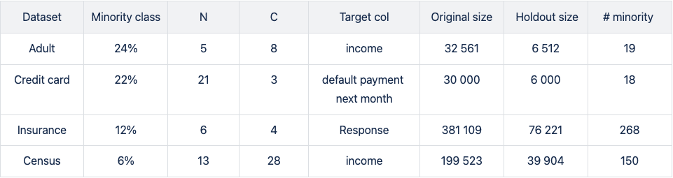
We run four publicly available data sets (Figure 1) of varying sizes through steps 1–5: Adult, Credit Card, Insurance, and Census (Kohavi and Becker). All data sets tested are of mixed type (categorical and numerical features) with a binary, that is, a categorical target column.
In step 2 (Fig. 1), we downsample minority classes to induce strong imbalances. For the smaller data sets with ~30k records, downsampling to minority-class fractions of 0.1% results in extremely low numbers of minority records.
The downsampled Adult and Credit Card unbalanced training data sets contain as little as 19 and 18 minority records, respectively. This scenario mimics situations where data is limited and extreme cases occur rarely. Such setups create significant challenges for predictive models, as they may encounter difficulty making accurate predictions and generalizing well on unseen data.
Please note that the holdout sets on which the trained predictive models are scored are not subject to extreme imbalances as they are sampled from the original data before downsampling is applied. The imbalance ratios of the holdout set are moderate and vary from 6 to 24%.
In the evaluation, we report both the AUC-ROC and the AUC-PR due to the moderate but inhomogeneous distribution of minority fractions in the holdout set. The AUC-ROC is a very popular and expressive metric, but it is known to be overly optimistic on unbalanced optimization problems. While the AUC-ROC considers both classes, making it susceptible to neglecting the minority class, the AUC-PR focuses on the minority class as it is built up by precision and recall.
Upsampling the Adult income dataset
The largest differences between upsampling techniques are observed in the AUC-ROC when balancing training sets with a substantial class imbalance of 0.05% to 0.5%. This scenario involves a very limited number of minority samples, down to 19 for the Adult unbalanced training data set.
For the RF and the LGBM classifiers trained on the balanced hybrid data set, the AUC-ROC is larger than the ones obtained with other upsampling techniques. Differences can go up to 0.2 (RF classifier, minority fraction of 0.05%) between the AI-based synthetic upsampling and the second-best method.
The AUC-PR shows similar yet less pronounced differences. LGBM and XGB classifiers trained on the balanced hybrid data set perform best throughout almost all minority fractions. Interestingly, results for the RF classifier are mixed. Upsampling with synthetic data does not always lead to better performance, but it is always among the best-performing methods.
While synthetic data upsampling improves results through most of the minority fractions for the XGB classifier, too, the differences in performance are less pronounced. Especially the XGB classifier trained on the highly unbalanced training data performs surprisingly well. This suggests that the XGB classifier is better suited for handling unbalanced data.
The reason for the performance differences in the AUC-ROC and AUC-PR is due to the low diversity and, consequently, overfitting when using naive or SMOTE-NC upsampling. These effects are visible in, e.g., the ROC and PR curves of the LGBM classifier for a minority fraction of 0.1% (fig. 3).
Every point on these curves corresponds to a specific prediction threshold for the classifier. The set of threshold values is defined by the variance of probabilities predicted by the models when scored on the holdout set. For both the highly unbalanced training data and the naively upsampled one, we observe very low diversity, with more than 80% of the holdout samples predicted to have an identical, very low probability of belonging to the minority class.
In the plot of the PR curve, this leads to an accumulation of points in the area with high precision and low recall, which means that the model is very conservative in making positive predictions and only makes a positive prediction when it is very confident that the data point belongs to the positive, that is, the minority class. This demonstrates the effect of overfitting on a few samples in the minority group.
SMOTE-NC has a much higher but still limited diversity, resulting in a smoother PR curve which, however, still contains discontinuities and has a large segment where precision and recall change rapidly with small changes in the prediction threshold.
The hybrid data set offers high diversity during model training, resulting in almost every holdout sample being assigned an unique probability of belonging to the minority class. Both ROC and PR curves are smooth and have a threshold of ~0.5 at the center, the point that is closest to the perfect classifier.
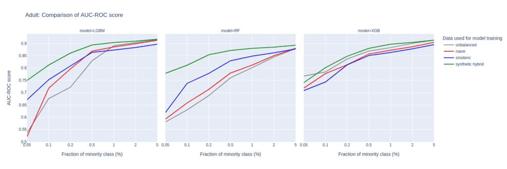
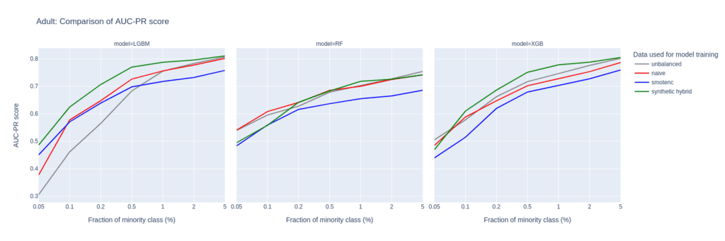
Figure 2: AUC-ROC (top) and AUC-PR (bottom) of classifiers LGBM, RandomForest (RF), and XGB trained on the Adult data set to predict the target feature income. The classifiers are trained on unbalanced data sets (grey) and data sets that are upsampled naively (red), with the SMOTE-NC algorithm (blue), and with AI-generated synthetic records (green). AUC values are reported for different fractions of the minority class in the unbalanced training data (x-axis).
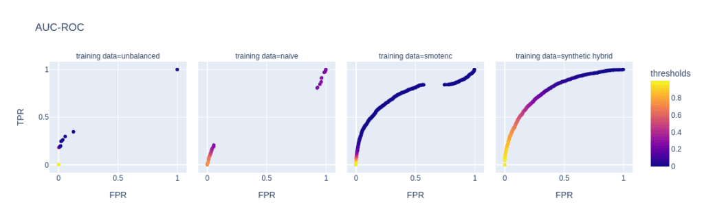
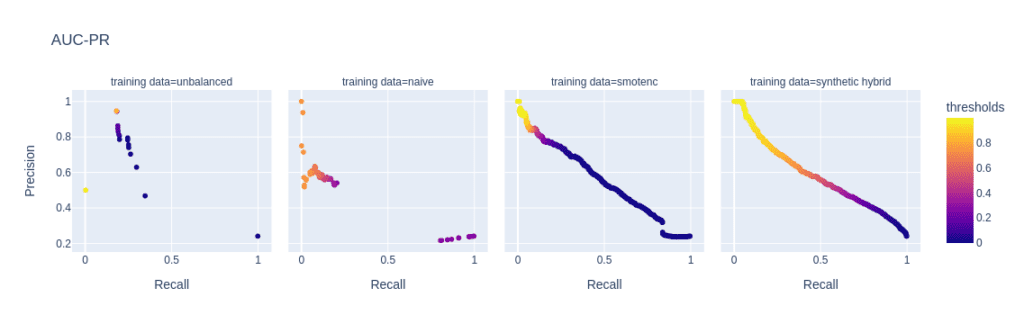
Figure 3: ROC (top) and PR (bottom) curves of the Light GBM classifier trained on different versions of the adult data set (from left to right): unbalanced training data (minority class fraction 0.1%), naively upsampled training data, training data upsampled with SMOTE-NC, and training data enriched with AI-generated synthetic records (synthetic hybrid). Every point on the plots corresponds to a specific prediction threshold for the classifier.
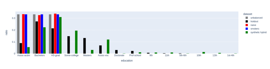
Figure 4: Distribution of the feature education for the female subgroup (sex equals female) of the minority class (income equals high). The distributions of the unbalanced (grey, minority class fraction of 0.1%), the naively upsampled (red), and the SMOTE-NC upsampled (blue) considerably differ from the holdout distribution. Only the data set upsampled with AI-generated synthetic records (synthetic hybrid) recovers the holdout distribution to a satisfactory degree and captures its diversity.
The limited power in creating diverse samples in situations where the minority class is severely underrepresented stems from naive upsampling and SMOTE-NC being limited to duplicating and interpolating between existing minority samples. Both methods are bound to a limited region in feature space.
Upsampling with AI-based synthetic minority samples, on the other hand, can, in principle, populate any region in feature space and can leverage and learn from properties of the majority samples which are transferable to minority examples, resulting in more diverse and realistic synthetic minority samples.
We analyze the difference in diversity by further “drilling down” the minority class (feature “income” equals “high”) and comparing the distribution of the feature “education” for the female subgroup (feature “sex” equals “female”) in the upsampled data sets (fig. 4).
For a minority fraction of 0.1%, this results in only three female minority records. Naive upsampling and SMOTE-NC have a very hard time generating diversity in such settings. Both just duplicate the existing categories “Bachelors”, “HS-grade”, and "Assoc-acdm,” resulting in a strong distortion of the distribution of the “education” feature as compared to the distribution in the holdout data set.
The distribution of the hybrid data has some imperfections, too, but it recovers the holdout distribution to a much better degree. Many more “education” categories are populated, and, with a few exceptions, the frequencies of the holdout data set are recovered to a satisfactory level. This ultimately leads to a larger diversity in the hybrid data set than in the naively balanced or SMOTE-NC balanced one.
Diversity assessment with the Shannon entropy
We quantitatively assess diversity with the Shannon entropy, which measures the variability within a data set particularly for categorical data. It provides a measure of how uniformly the different categories of a specific feature are distributed within the data set.
The Shannon Entropy (SE) of a specific feature is defined as
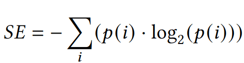
where p(i) represents the probability of occurrence, i.e. the relative frequency of category i. SE ranges from 0 to log2(N), where N is the total number of categories. A value of 0 indicates maximum certainty with only one category, while higher entropy implies greater diversity and uncertainty, indicating comparable probabilities p(i) across categories.
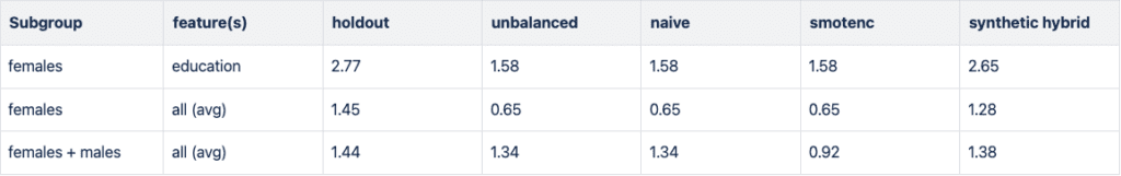
In Figure 5, we report the Shannon entropy for different features and subgroups of the high-income population. In all cases, data diversity is the largest for the holdout data set. The downsampled training data set (unbalanced) has a strongly reduced SE, especially when focusing on the small group of high-income women. Naive and SMOTE-NC upsampling cannot recover any of the diversity in the holdout as both are limited to the categories present in the minority class. In line with the results presented in the paragraph above, synthetic data recovers the SE, i.e., the diversity of the holdout data set, to a large degree.
Upsampling the Credit Card data set
The Credit Card data set has similar properties as the Adult data set. The number of records, features, and the original, moderate imbalance are comparable. This again results in a very small number of minority records (18) after downsampling to a 0.1% minority fraction.
The main difference between them is the fact that Credit Card consists of more numeric features. The performance of different upsampling techniques on the unbalanced Credit Card training data set shows similar results to the Adult Data set, too. AUC-ROC and AUC-PR for both LGBM and RF classifiers improve over naive upsampling and SMOTE-NC when using the hybrid data set.
Again, the performance of the XGB model is more comparable between the different balanced data sets and we find very good performance for the highly-unbalanced training data set. Here, too, the hybrid data set is always among the best-performing upsampling techniques.
Interestingly, SMOTE-NC performs worst almost throughout all the metrics. This is surprising because we expect this data set, consisting mainly of numerical features, to be favorable for the SMOTE-NC upsampling technique.
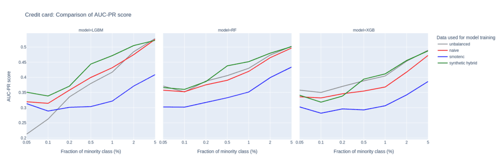
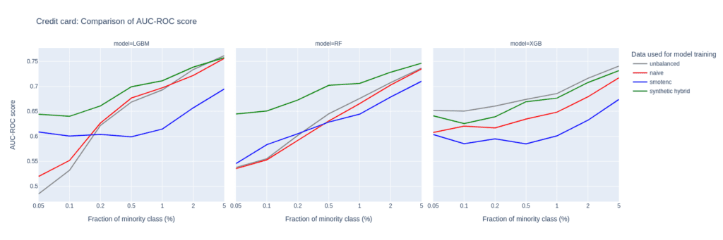
Figure 6: AUC-ROC (top) and AUC-PR (bottom) of classifiers LGBM, RandomForest (RF), and XGB trained on the Credit Card data set to predict the target feature default payment. The classifiers are trained on unbalanced data sets (grey) and data sets that are upsampled naively (red), with the SMOTE-NC algorithm (blue), and with AI-generated synthetic records (green). AUC values are reported for different fractions of the minority class in the unbalanced training data (x-axis).
Upsampling the Insurance data set
The Insurance data set is larger than Adult and Census resulting in a larger number of minority records (268) when downsampling to the 0.1% minority fraction. This leads to a much more balanced performance between different upsampling techniques.
A notable difference in performance only appears for very small minority fractions. For minority fractions below 0.5%, both the AUC-ROC and AUC-PR of LGBM and XGB classifiers trained on the hybrid data set are consistently larger than for classifiers trained on other balanced data sets. The maximum performance gains, however, are smaller than those observed for “Adult” and “Credit Card”.
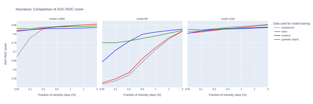
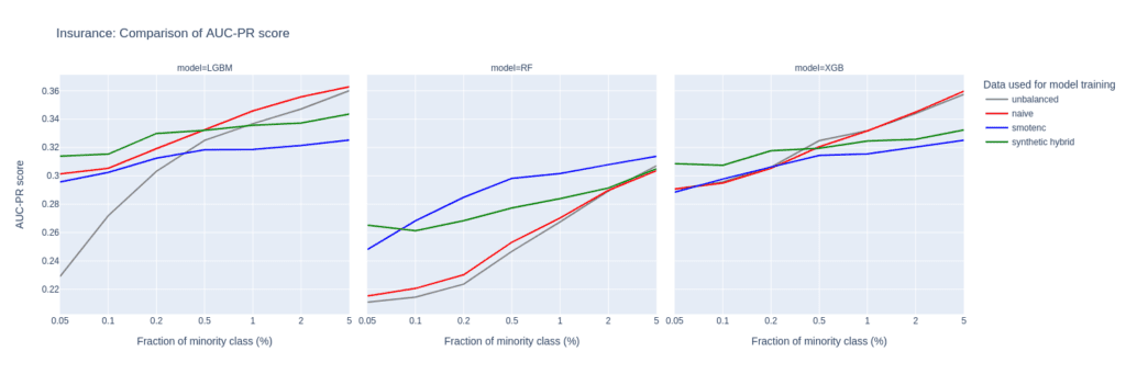
Figure 7: AUC-ROC (top) and AUC-PR (bottom) of classifiers LGBM, RandomForest (RF), and XGB trained on the Insurance data set to predict the target feature Response. The classifiers are trained on unbalanced data sets (grey) and data sets that are upsampled naively (red), with the SMOTE-NC algorithm (blue), and with AI-generated synthetic records (green). AUC values are reported for different fractions of the minority class in the unbalanced training data (x-axis).
Upsampling the Census data set
The Census data set has the largest number of features of all the data sets tested in this study. Especially, the 28 categorical features pose a challenge for SMOTE-NC, leading to poor performance in terms of AUC-PR.
Comparably to the Insurance data set, the performance of the LGBM classifier severely deteriorates when trained on highly unbalanced data sets. On the other hand, the XGB model excels and performs very well even on unbalanced training sets.
The Census data set highlights the importance of carefully selecting the appropriate model and upsampling technique when working with data sets that have high dimensionality and unbalanced class distributions, as performances can vary a lot.
Upsampling with synthetic data mitigates this variance, as all models trained on the hybrid data set are among the best performers across all classifiers and ranges of minority fractions.
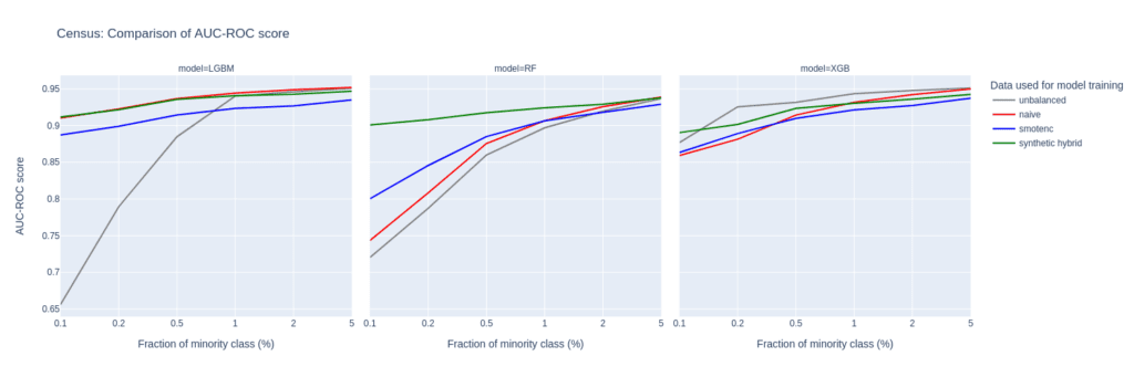
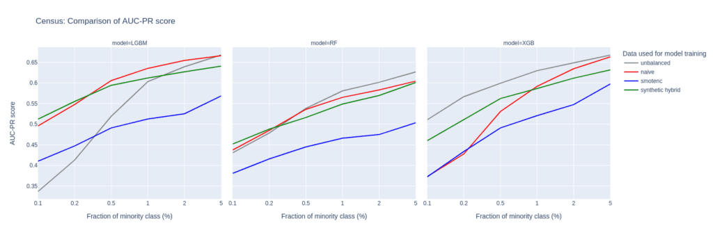
Figure 8: AUC-ROC (top) and AUC-PR (bottom) of classifiers LGBM, RandomForest (RF), and XGB trained on the Census data set to predict the target feature income. The classifiers are trained on unbalanced data sets (grey) and data sets that are upsampled naively (red), with the SMOTE-NC algorithm (blue), and with AI-generated synthetic records (green). AUC values are reported for different fractions of the minority class in the unbalanced training data (x-axis).
Synthetic data for upsampling
AI-based synthetic data generation can provide an effective solution to the problem of highly unbalanced data sets in machine learning. By creating diverse and realistic samples, upsampling with synthetic data generation can improve the performance of predictive models. This is especially true for cases where not only the minority fraction is low but also the absolute number of minority records is at a bare minimum. In such extreme settings, training on data upsampled with AI-generated synthetic records leads to better performance of prediction models than upsampling with SMOTE-NC or naive upsampling. Across all parameter settings explored in this study, synthetic upsampling resulted in predictive models which rank among the top-performing ones.
In this tutorial, you will learn how to use synthetic rebalancing to improve the performance of machine-learning (ML) models on imbalanced classification problems. Rebalancing can be useful when you want to learn more of an otherwise small or underrepresented population segment by generating more examples of it. Specifically, we will look at classification ML applications in which the minority class accounts for less than 0.1% of the data.
We will start with a heavily imbalanced dataset. We will use synthetic rebalancing to create more high-quality, statistically representative instances of the minority class. We will compare this method against 2 other types of rebalancing to explore their advantages and pitfalls. We will then train a downstream machine learning model on each of the rebalanced datasets and evaluate their relative predictive performance. The Python code for this tutorial is publicly available and runnable in this Google Colab notebook.
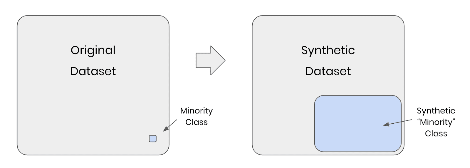
Fig 1 - Synthetic rebalancing creates more statistically representative instances of the minority class
Why should I rebalance my dataset?
In heavily imbalanced classification projects, a machine learning model has very little data to effectively learn patterns about the minority class. This will affect its ability to correctly class instances of this minority class in the real (non-training) data when the model is put into production. A common real-world example is credit card fraud detection: the overwhelming majority of credit card transactions are perfectly legitimate, but it is precisely the rare occurrences of illegitimate use that we would be interested in capturing.
Let’s say we have a training dataset with 100,000 credit card transactions which contains 999,900 legitimate transactions and 100 fraudulent ones. A machine-learning model trained on this dataset would have ample opportunity to learn about all the different kinds of legitimate transactions, but only a small sample of 100 records in which to learn everything it can about fraudulent behavior. Once this model is put into production, the probability is high that fraudulent transactions will occur that do not follow any of the patterns seen in the small training sample of 100 fraudulent records. The machine learning model is unlikely to classify these fraudulent transactions.
So how can we address this problem? We need to give our machine learning model more examples of fraudulent transactions in order to ensure optimal predictive performance in production. This can be achieved through rebalancing.
Rebalancing Methods
We will explore three types of rebalancing:
- Random (or “naive”) oversampling
- SMOTE upsampling
- Synthetic rebalancing
The tutorial will give you hands-on experience with each type of rebalancing and provide you with in-depth understanding of the differences between them so you can choose the right method for your use case. We’ll start by generating an imbalanced dataset and showing you how to perform synthetic rebalancing using MOSTLY AI's synthetic data generator. We will then compare performance metrics of each rebalancing method on a downstream ML task.
But first things first: we need some data.
Generate an Imbalanced Dataset
For this tutorial, we will be using the UCI Adult Income dataset, as well as the same training and validation split, that was used in the Train-Synthetic-Test-Real tutorial. However, for this tutorial we will work with an artificially imbalanced version of the dataset containing only 0.1% of high-income (>50K) records in the training data, by downsampling the minority class. The downsampling has already been done for you, but if you want to reproduce it yourself you can use the code block below:
def create_imbalance(df, target, ratio):
    val_min, val_maj = df[target].value_counts().sort_values().index
    df_maj = df.loc[df[target]==val_maj]
    n_min = int(df_maj.shape[0]/(1-ratio)*ratio)
    df_min = df.loc[df[target]==val_min].sample(n=n_min, random_state=1)
    df_maj = df.loc[df[target]==val_maj]
    df_imb = pd.concat([df_min, df_maj]).sample(frac=1, random_state=1)
    return df_imb

df_trn = pd.read_csv(f'{repo}/census-training.csv')
df_trn_imb = create_imbalance(df_trn, 'income', 1/1000)
df_trn_imb.to_csv('census-training-imbalanced.csv', index=False)
Let’s take a quick look at this imbalanced dataset by randomly sampling 10 rows. For legibility let’s select only a few columns, including the income column as our imbalanced feature of interest:
trn = pd.read_csv(f'{repo}/census-training-imbalanced.csv')
trn.sample(n=10)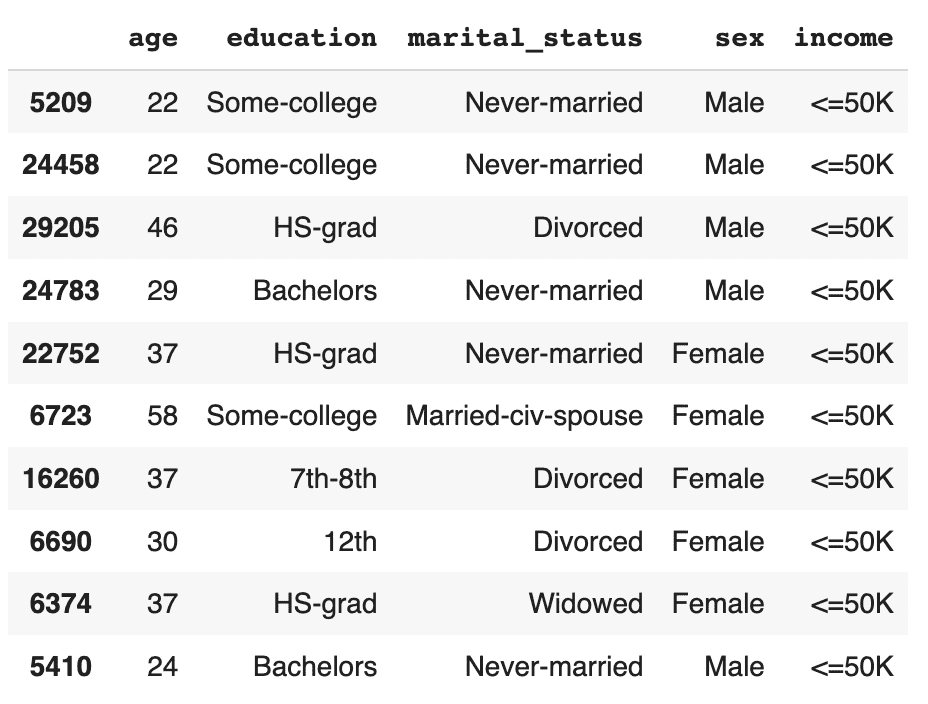
You can try executing the line above multiple times to see different samples. Still, due to the strong class imbalance, the chance of finding a record with high income in a random sample of 10 is minimal. This would be problematic if you were interested in creating a machine learning model that could accurately classify high-income records (which is precisely what we’ll be doing in just a few minutes).
The problem becomes even more clear when we try to sample a specific sub-group in the population. Let’s sample all the female doctorates with a high income in the dataset. Remember, the dataset contains almost 30 thousand records.
trn[
    (trn['income']=='>50K')
    & (trn.sex=='Female')
    & (trn.education=='Doctorate')
]
It turns out there are actually no records of this type in the training data. Of course, we know that these kinds of individuals exist in the real world and so our machine learning model is likely to encounter them when put in production. But having had no instances of this record type in the training data, it is likely that the ML model will fail to classify this kind of record correctly. We need to provide the ML model with a higher quantity and more varied range of training samples of the minority class to remedy this problem.
Synthetic rebalancing with MOSTLY AI
MOSTLY AI offers a synthetic rebalancing feature that can be used with any categorical column. Let’s walk through how this works:
- Download the imbalanced dataset here if you haven’t generated it yourself already. Use Ctrl+S or Cmd+S to save the file locally.
- Go to your MOSTLY AI account and navigate to “Synthetic Datasets”. Upload
census-training-imbalanced.csvand click “Proceed”.
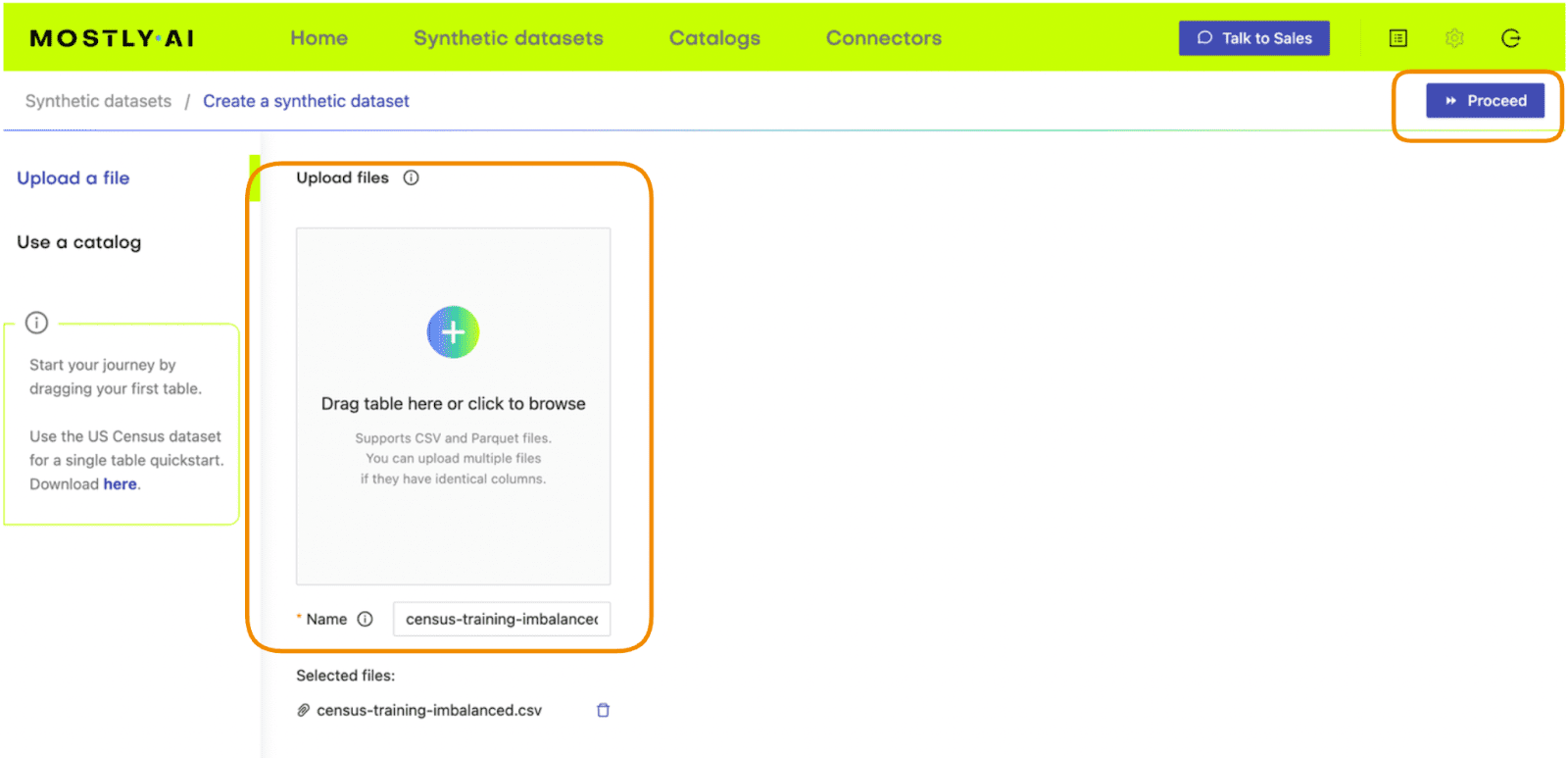
Fig 2 - Upload the original dataset to MOSTLY AI’s synthetic data generator.
- On the next page, click “Data Settings” and then click on the “Income” column
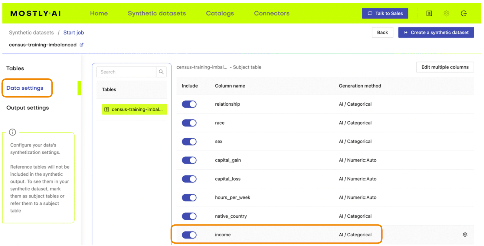
Fig 3 - Navigate to the Data Settings of the Income column.
- Set the Encoding Type to “Categorical” and select the option to “Use this column to rebalance the table”. Then add a new row and rebalance the “>50K” column to be “50%” of the dataset. This will synthetically upsample the minority class to create an even split between high-income and low-income records.
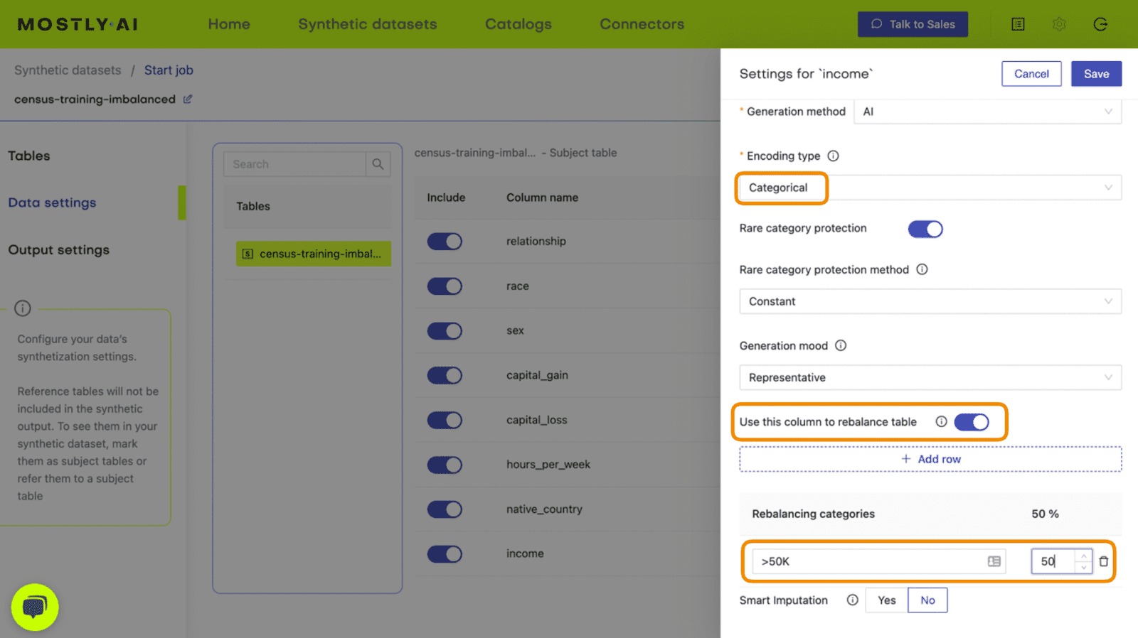
Fig 4 - Set the relevant settings to rebalance the income column.
- Click “Save” and on the next page click “Create a synthetic dataset” to launch the job.
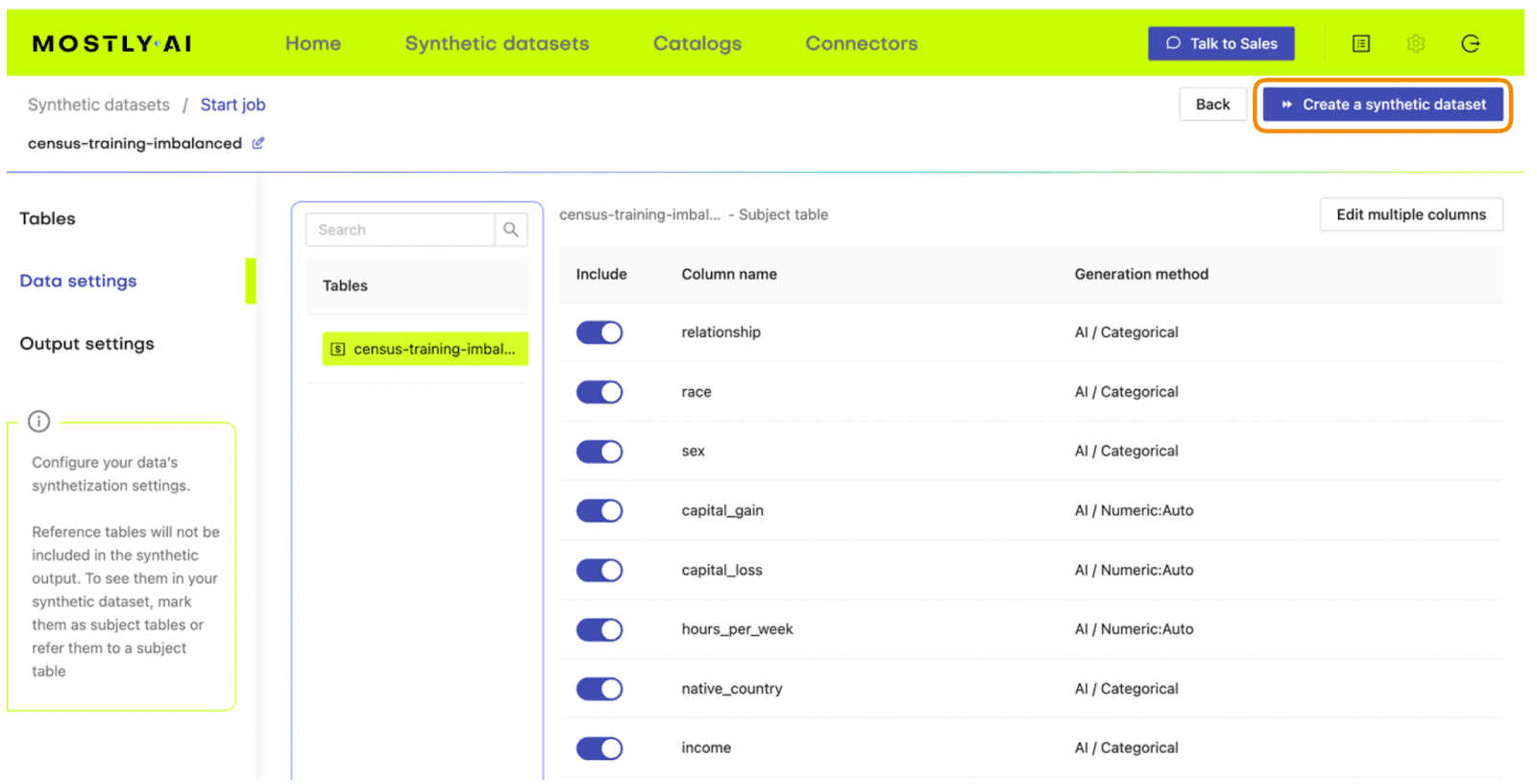
Fig 5 - Launch the synthetic data generation
Once the synthesization is complete, you can download the synthetic dataset to disk. Then return to wherever you are running your code and use the following code block to create a DataFrame containing the synthetic data.
# upload synthetic dataset
import pandas as pd

try:
    # check whether we are in Google colab
    from google.colab import files
    print("running in COLAB mode")
    repo = 'https://github.com/mostly-ai/mostly-tutorials/raw/dev/rebalancing'
    import io
    uploaded = files.upload()
    syn = pd.read_csv(io.BytesIO(list(uploaded.values())[0]))
    print(f"uploaded synthetic data with {syn.shape[0]:,} records and {syn.shape[1]:,} attributes")
except:
    print("running in LOCAL mode")
    repo = '.'
    print("adapt `syn_file_path` to point to your generated synthetic data file")
    syn_file_path = './census-synthetic-balanced.csv'
    syn = pd.read_csv(syn_file_path)
    print(f"read synthetic data with {syn.shape[0]:,} records and {syn.shape[1]:,} attributes")
Let's now repeat the data exploration steps we performed above with the original, imbalanced dataset. First, let’s display 10 randomly sampled synthetic records. We'll subset again for legibility. You can run this line multiple times to get different samples.
# sample 10 random records
syn_sub = syn[['age','education','marital_status','sex','income']]
syn_sub.sample(n=10)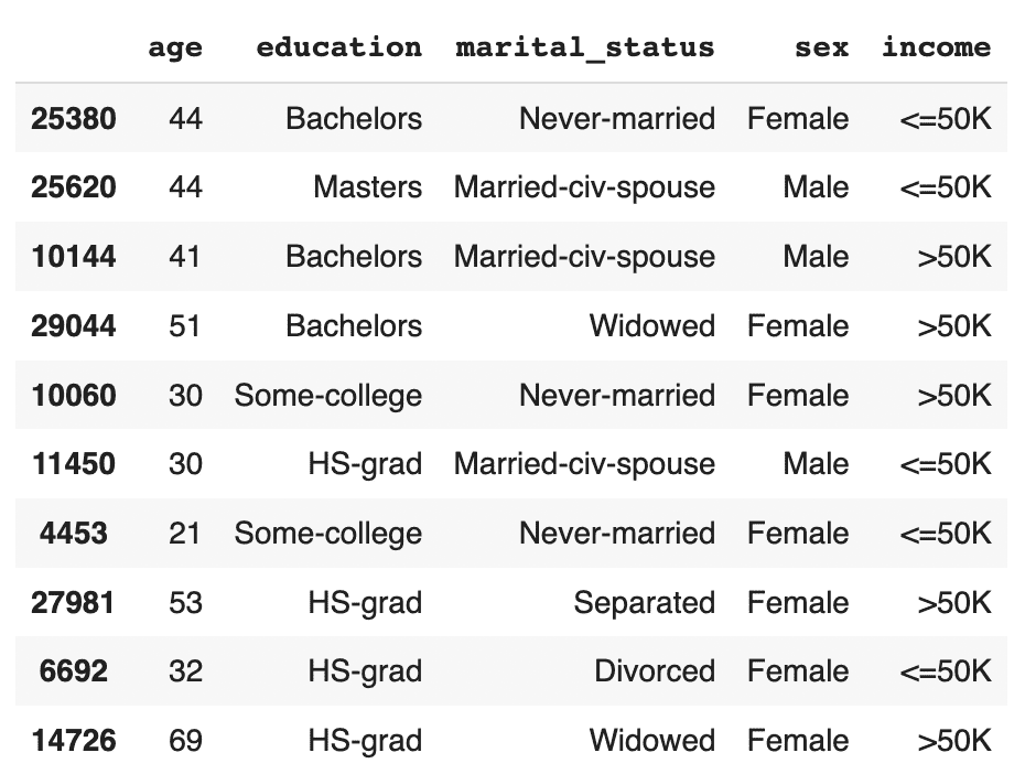
This time, you should see that the records are evenly distributed across the two income classes.
Let's now investigate all female doctorates with a high income in the synthetic, rebalanced dataset:
syn_sub[
    (syn_sub['income']=='>50K')
    & (syn_sub.sex=='Female')
    & (syn_sub.education=='Doctorate')
].sample(n=10)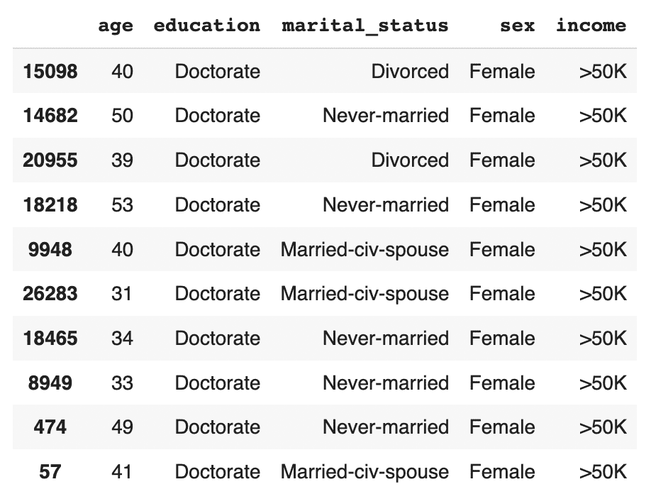
The synthetic data contains a list of realistic, statistically sound female doctorates with a high income. This is great news for our machine learning use case because it means that our ML model will have plenty of data to learn about this particular important subsegment.
Evaluate ML performance using TSTR
Let’s now compare the quality of different rebalancing methods by training a machine learning model on the rebalanced data and evaluating the predictive performance of the resulting models.
We will investigate and compare 3 types of rebalancing:
- Random (or “naive”) oversampling
- SMOTE upsampling
- Synthetic rebalancing
The code block below defines the functions that will preprocess your data, train a LightGBM model and evaluate its performance using a holdout dataset. For more detailed descriptions of this code, take a look at the Train-Synthetic-Test-Real tutorial.
# import necessary libraries
import lightgbm as lgb
from lightgbm import early_stopping
from sklearn.model_selection import train_test_split
from sklearn.metrics import roc_auc_score, f1_score
import seaborn as sns
import matplotlib.pyplot as plt

# define target column and value
target_col = 'income'
target_val = '>50K'

# define preprocessing function
def prepare_xy(df: pd.DataFrame):
    y = (df[target_col]==target_val).astype(int)
    str_cols = [
        col for col in df.select_dtypes(['object', 'string']).columns if col != target_col
    ]
    for col in str_cols:
        df[col] = pd.Categorical(df[col])
    cat_cols = [
        col for col in df.select_dtypes('category').columns if col != target_col
    ]
    num_cols = [
        col for col in df.select_dtypes('number').columns if col != target_col
    ]
    for col in num_cols:
        df[col] = df[col].astype('float')
    X = df[cat_cols + num_cols]
    return X, y

# define training function
def train_model(X, y):
    cat_cols = list(X.select_dtypes('category').columns)
    X_trn, X_val, y_trn, y_val = train_test_split(X, y, test_size=0.2, random_state=1)
    ds_trn = lgb.Dataset(
        X_trn,
        label=y_trn,
        categorical_feature=cat_cols,
        free_raw_data=False
    )
    ds_val = lgb.Dataset(
        X_val,
        label=y_val,
        categorical_feature=cat_cols,
        free_raw_data=False
    )
    model = lgb.train(
        params={
            'verbose': -1,
            'metric': 'auc',
            'objective': 'binary'
         },
         train_set=ds_trn,
         valid_sets=[ds_val],
         callbacks=[early_stopping(5)],
    )
    return model

# define evaluation function
def evaluate_model(model, hol):
    X_hol, y_hol = prepare_xy(hol)
    probs = model.predict(X_hol)
    preds = (probs >= 0.5).astype(int)
    auc = roc_auc_score(y_hol, probs)
    f1 = f1_score(y_hol, probs>0.5, average='macro')
    probs_df = pd.concat([
        pd.Series(probs, name='probability').reset_index(drop=True),
        pd.Series(y_hol, name=target_col).reset_index(drop=True)
    ], axis=1)
    sns.displot(
        data=probs_df,
        x='probability',
        hue=target_col,
        bins=20,
        multiple="stack"
     )
    plt.title(f"AUC: {auc:.1%}, F1 Score: {f1:.2f}", fontsize = 20)
    plt.show()
    return auc

# create holdout dataset
df_hol = pd.read_csv(f'{repo}/census-holdout.csv')
df_hol_min = df_hol.loc[df_hol['income']=='>50K']
print(f"Holdout data consists of {df_hol.shape[0]:,} records",
f"with {df_hol_min.shape[0]:,} samples from the minority class")
ML performance of imbalanced dataset
Let’s now train a LightGBM model on the original, heavily imbalanced dataset and evaluate its predictive performance. This will give us a baseline against which we can compare the performance of the different rebalanced datasets.
X_trn, y_trn = prepare_xy(trn)
model_trn = train_model(X_trn, y_trn)
auc_trn = evaluate_model(model_trn, df_hol)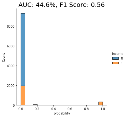
With an AUC of about 50%, the model trained on the imbalanced dataset is just as good as a flip of a coin, or, in other words, not worth very much at all. The downstream LightGBM model is not able to learn any signal due to the low number of minority-class samples.
Let’s see if we can improve this using rebalancing.
Naive rebalancing
First, let’s rebalance the dataset using the random oversampling method, also known as “naive rebalancing”. This method simply takes the minority class records and copies them to increase their quantity. This increases the number of records of the minority class but does not increase the statistical diversity. We will use the imblearn library to perform this step, feel free to check out their documentation for more context.
The code block performs the naive rebalancing, trains a LightGBM model using the rebalanced dataset and evaluates its predictive performance:
from imblearn.over_sampling import RandomOverSampler

X_trn, y_trn = prepare_xy(trn)
sm = RandomOverSampler(random_state=1)
X_trn_up, y_trn_up = sm.fit_resample(X_trn, y_trn)
model_trn_up = train_model(X_trn_up, y_trn_up)
auc_trn_up = evaluate_model(model_trn_up, df_hol)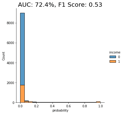
We see a clear improvement in predictive performance, with an AUC score of around 70%. This is better than the baseline model trained on the imbalanced dataset, but still not great. We see that a significant portion of the “0” class (low-income) is being incorrectly classified as “1” (high-income).
This is not surprising because, as stated above, this rebalancing method just copies the existing minority class records. This increases their quantity but does not add any new statistical information into the model and therefore does not offer the model much data that it can use to learn about minority-class instances that are not present in the training data.
Let’s see if we can improve on this using another rebalancing method.
SMOTE rebalancing
SMOTE upsampling is a state-of-the art upsampling method which, unlike the random oversampling seen above, does create novel, statistically representative samples. It does so by interpolating between neighboring samples. It’s important to note, however, that SMOTE upsampling is non-privacy-preserving.
The following code block performs the rebalancing using SMOTE upsampling, trains a LightGBM model on the rebalanced dataset, and evaluates its performance:
from imblearn.over_sampling import SMOTENC

X_trn, y_trn = prepare_xy(trn)
sm = SMOTENC(
    categorical_features=X_trn.dtypes=='category',
    random_state=1
)
X_trn_smote, y_trn_smote = sm.fit_resample(X_trn, y_trn)
model_trn_smote = train_model(X_trn_smote, y_trn_smote)
auc_trn_smote = evaluate_model(model_trn_smote, df_hol)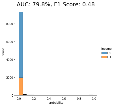
We see another clear jump in performance: the SMOTE upsampling boosts the performance of the downstream model to close to 80%. This is clearly an improvement from the random oversampling we saw above, and for this reason, SMOTE is quite commonly used.
Let’s see if we can do even better.
Synthetic rebalancing with MOSTLY AI
In this final step, let’s take the synthetically rebalanced dataset that we generated earlier using MOSTLY AI to train a LightGBM model. We’ll then evaluate the performance of this downstream ML model and compare it against those we saw above.
The code block below prepares the synthetically rebalanced data, trains the LightGBM model, and evaluates it:
X_syn, y_syn = prepare_xy(syn)
model_syn = train_model(X_syn, y_syn)
auc_syn = evaluate_model(model_syn, df_hol)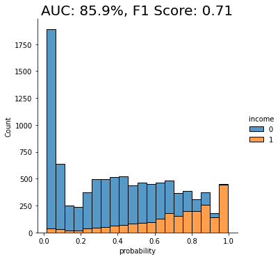
Both performance measures, the AUC as well as the macro-averaged F1 score, are significantly better for the model that was trained on synthetic data than if it were trained on any of the other methods. We can also see that the portion of “0”s incorrectly classified as “1”s has dropped significantly.
The synthetically rebalanced dataset has enabled the model to make fine-grained distinctions between the high-income and low-income records. This is strong proof of the value of synthetic rebalancing for learning more about a small sub-group within the population.
The value of synthetic rebalancing
In this tutorial, you have seen firsthand the value of synthetic rebalancing for downstream ML classification problems. You have gained an understanding of the necessity of rebalancing when working with imbalanced datasets in order to provide the machine learning model with more samples of the minority class. You have learned how to perform synthetic rebalancing with MOSTLY AI and observed the superior performance of this rebalancing method when compared against other methods on the same dataset. Of course, the actual lift in performance may vary depending on the dataset, the predictive task, and the chosen ML model.
What’s next?
In addition to walking through the above instructions, we suggest experimenting with the following in order to get an even better grasp of synthetic rebalancing:
- repeat the experiments for different class imbalances,
- repeat the experiments for different datasets, ML models, and predictive tasks.
In this tutorial, you will explore the relationship between the size of your training sample and synthetic data accuracy. This is an important concept to master because it can help you significantly reduce the runtime and computational cost of your training runs while maintaining the optimal accuracy you require.
We will start with a single real dataset, which we will use to create 5 different synthetic datasets, each with a different training sample size. We will then evaluate the accuracy of the 5 resulting synthetic datasets by looking at individual variable distributions, by verifying rule-adherence and by evaluating their performance on a downstream machine-learning (ML) task. The Python code for this tutorial is runnable and publicly available in this Google Colab notebook.
Size vs synthetic data accuracy tradeoff
Our working hypothesis is that synthetic data accuracy will increase as the number of training samples increases: the more data the generative AI model has to learn from, the better it will perform.
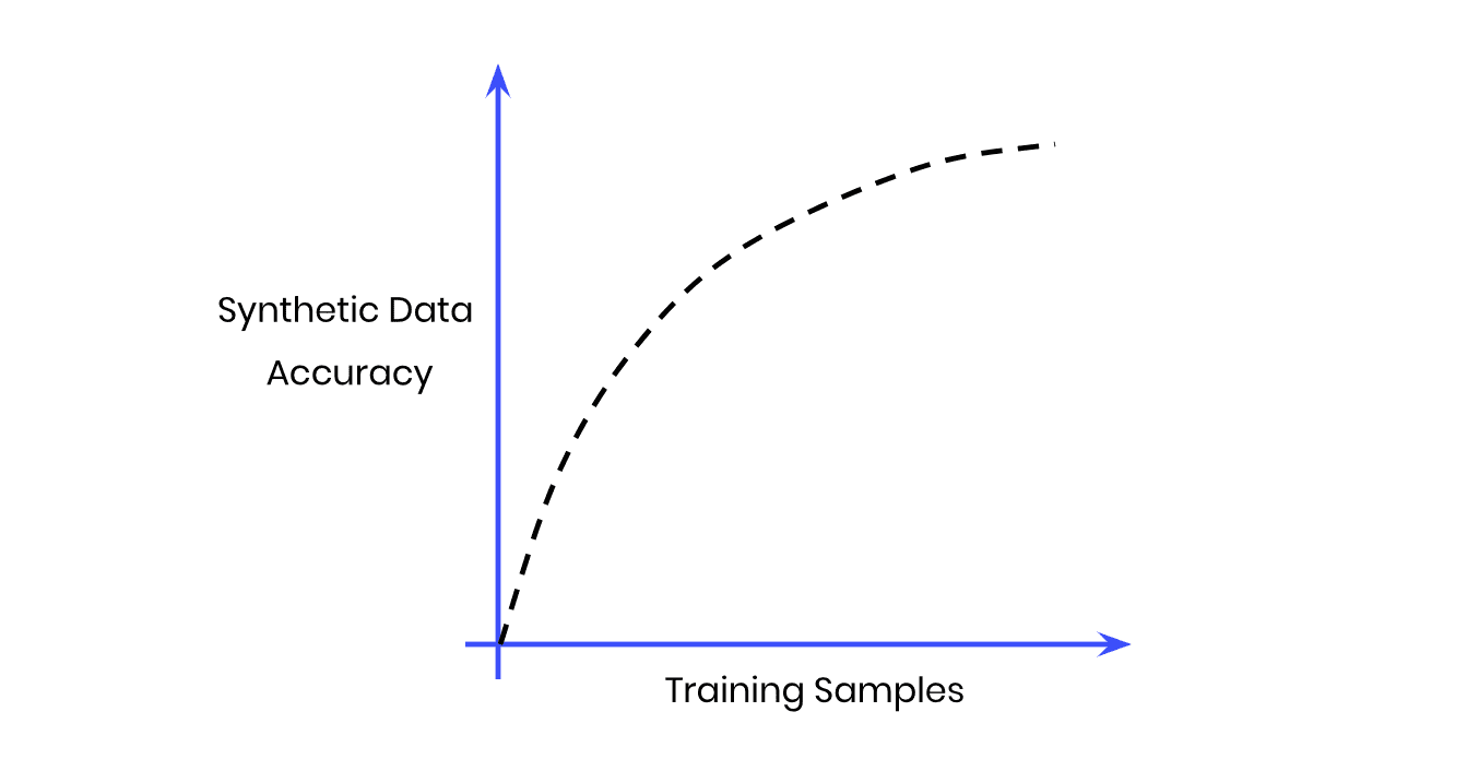
Fig 1 - The Size vs Accuracy Tradeoff
But more training samples also means more data to crunch; i.e. more computational cost and a longer runtime. Our goal, then, will be to find the sweet spot at which we achieve optimal accuracy with the lowest number of training samples possible.
Note that we do not expect synthetic data to ever perfectly match the original data. This would only be satisfied by a copy of the data, which obviously would neither satisfy any privacy requirements nor would provide any novel samples. That being said, we shall expect that due to sampling variance the synthetic data can deviate. Ideally this deviation will be just as much, and not more, than the deviation that we would observe by analyzing an actual holdout dataset.
Synthesize your data
For this tutorial, we will be using the same UCI Adult Income dataset, as well as the same training and validation split, that was used in the Train-Synthetic-Test-Real tutorial. This means we have a total of 48,842 records across 15 attributes, and will be using up to 39,074 (=80%) of those records for the synthesis.
- Download the training data
census-training.csvby clicking here and pressing Ctrl+S or Cmd+S to save the file locally. This is an 80% sample of the full dataset. The remaining 20% sample (which we’ll use for evaluation later) can be fetched from here.
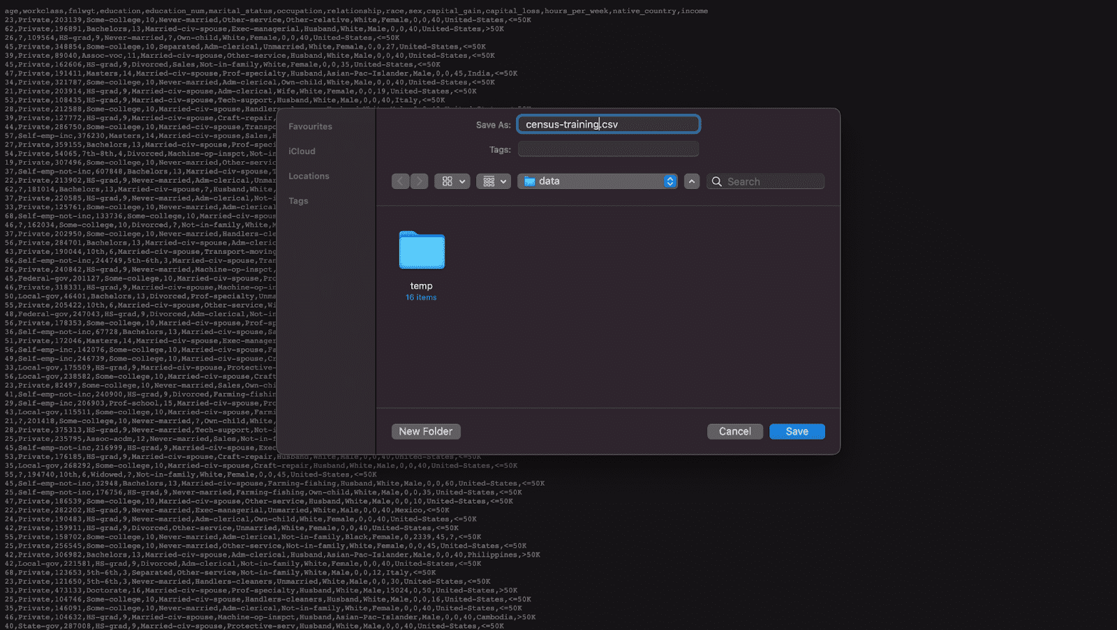
Fig 2 - Download the original training data and save it to disk.
- Synthesize census-training.csv via MOSTLY AI's synthetic data generator multiple times, each time with a different number of maximum training samples. We will use the following training sample sizes in this tutorial: 100, 400, 1600, 6400, 25600. Always generate a consistent number of subjects, e.g. 10,000. You can leave all other settings at their default.
- Download the generated datasets from MOSTLY AI as CSV files, and rename each CSV file with an appropriate name (eg. syn_00100.csv, syn_00400.csv, etc.)
- Now ensure you can access the synthetic datasets from wherever you are running the code for this tutorial. If you are working from the Colab notebook, you can upload the synthetic datasets by executing the code block below:
# upload synthetic dataset
import pandas as pd
try:
    # check whether we are in Google colab
    from google.colab import files
    print("running in COLAB mode")
    repo = 'https://github.com/mostly-ai/mostly-tutorials/raw/dev/size-vs-accuracy'
    import io
    uploaded = files.upload()
    synthetic_datasets = {
        file_name: pd.read_csv(io.BytesIO(uploaded[file_name]), skipinitialspace=True)
        for file_name in uploaded
    }
except:
    print("running in LOCAL mode")
    repo = '.'
    print("upload your synthetic data files to this directory via Jupyter")
    from pathlib import Path
    syn_files = sorted(list(Path('.').glob('syn*csv')))
    synthetic_datasets = {
        file_name.name: pd.read_csv(file_name)
        for file_name in syn_files
    }


for k, df in synthetic_datasets.items():
    print(f"Loaded Dataset `{k}` with {df.shape[0]:,} records and {df.shape[1]:,} attributes")
Evaluate synthetic data accuracy
Now that you have your 5 synthetic datasets (each trained on a different training sample size) let’s take a look at the high-level accuracy scores of these synthetic datasets.
- Navigate to your MOSTLY AI account and note the reported overall synthetic data accuracy as well as the runtime of each job:
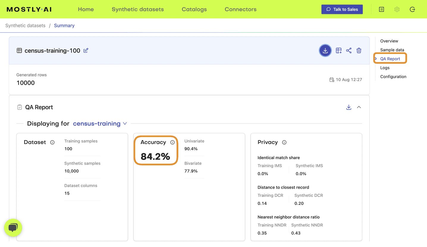
Fig 3 - Note the accuracy score in the QA Report tab of your completed synthetic dataset job.
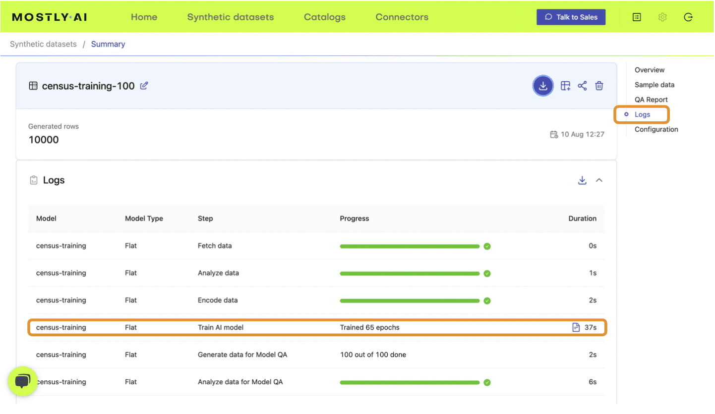
Fig 4 - Note the training time from the Logs tab.
- Update the following DataFrame accordingly:
results = pd.DataFrame([
{'file': 'syn_00100.csv', 'samples': 100, 'accuracy': 0.830, 'runtime': 37},
{'file': 'syn_00400.csv', 'samples': 400, 'accuracy': 0.914, 'runtime': 45},
{'file': 'syn_01600.csv', 'samples': 1600, 'accuracy': 0.956, 'runtime': 48},
{'file': 'syn_06400.csv', 'samples': 6400, 'accuracy': 0.972, 'runtime': 54},
{'file': 'syn_25600.csv', 'samples': 25600, 'accuracy': 0.980, 'runtime': 75},
])
results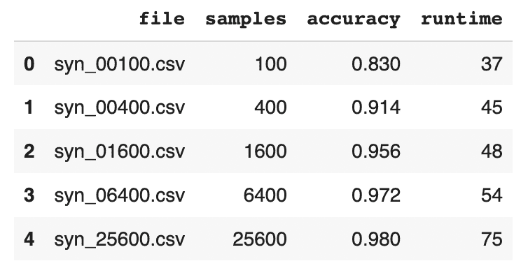
- Visualize the results using the code block below:
import seaborn as sns
import matplotlib.pyplot as plt

sns.catplot(data=results, y='accuracy', x='file', kind='point', color='black')
plt.xticks(rotation=45)
plt.xlabel('')
plt.title('QA Report - Overall Accuracy')
plt.show()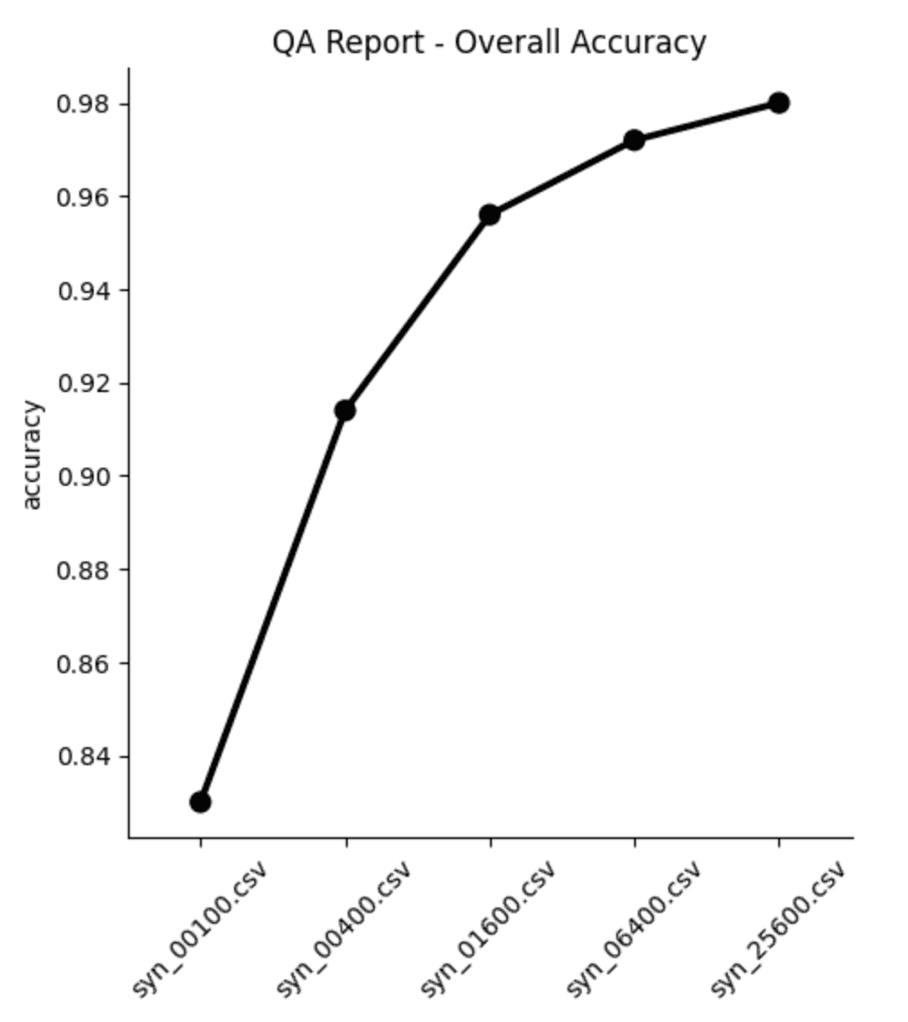
From both the table and the plot we can see that, as expected, the overall accuracy of the synthetic data improves as we increase the number of training samples. But notice that the increase is not strictly linear: while we see big jumps in accuracy performance between the first three datasets (100, 400 and 1,600 samples, respectively), the jumps get smaller as the training samples increase in size. Between the last two datasets (trained on 6,400 and 25,600 samples, respectively) the increase in accuracy is less than 0.1%, while the runtime increases by more than 35%.
Synthetic data quality deep-dive
The overall accuracy score is a great place to start when assessing the quality of your synthetic data, but let’s now dig a little deeper to see how the synthetic dataset compares to the original data from a few different angles. We’ll take a look at:
- Distributions of individual variables
- Rule adherence
- Performance on a downstream ML task
Before you jump into the next sections, run the code block below to concatenate all the 5 synthetic datasets together in order to facilitate comparison:
# combine synthetics
df = pd.concat([d.assign(split=k) for k, d in synthetic_datasets.items()], axis=0)
df['split'] = pd.Categorical(df['split'], categories=df["split"].unique())
df.insert(0, 'split', df.pop('split'))

# combine synthetics and original
df_trn = pd.read_csv(f'{repo}/census-training.csv')
df_hol = pd.read_csv(f'{repo}/census-holdout.csv')
dataset = synthetic_datasets | {'training': df_trn, 'holdout': df_hol}
df_all = pd.concat([d.assign(split=k) for k, d in dataset.items()], axis=0)
df_all['split'] = pd.Categorical(df_all['split'], categories=df_all["split"].unique())
df_all.insert(0, 'split', df_all.pop('split'))
Single variable distributions
Let’s explore the distributions of some individual variables.
The more training samples have been used for the synthesis, the closer the synthetic distributions are expected to be to the original ones. Note that we can also see deviations within statistics between the target and the holdout data. This is expected due to the sampling variance. The smaller the dataset, the larger the sampling variance will be. The ideal synthetic dataset would deviate from the original dataset just as much as the holdout set does.
Start by taking a look at the average age, split by marital status:
stats = (
    df_all.groupby(['split', 'marital_status'])['age']
    .mean().round().to_frame().reset_index(drop=False)
)
stats = (
    stats.loc[~stats['marital_status']
    .isin(['_RARE_', 'Married-AF-spouse', 'Married-spouse-absent', 'Separated'])]
)
stats = (
    stats.pivot_table(index='split', columns=['marital_status'])
    .reset_index(drop=False)
)
stats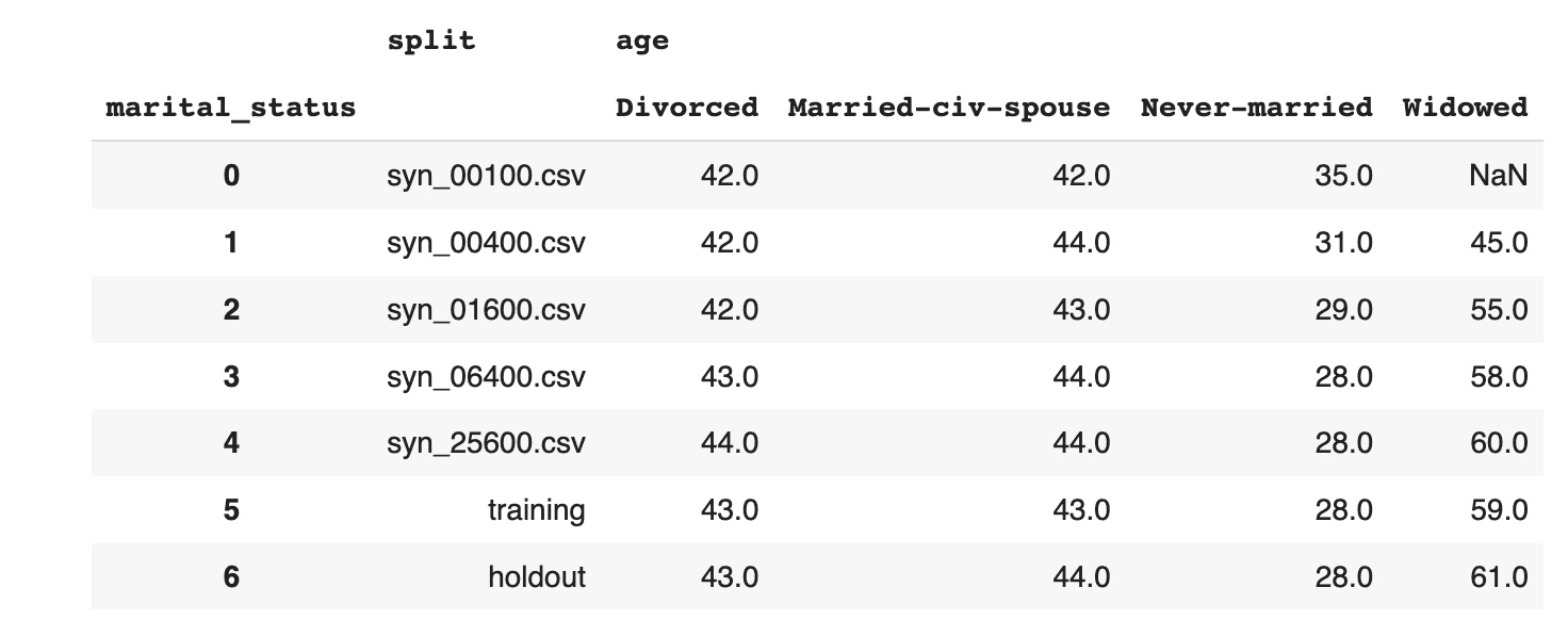
Then explore the age distribution, split by income:
sns.catplot(
    data=df_all,
    x='age',
    y='split',
    hue='income',
    kind='violin',
    split=True,
    legend=None
)
plt.legend(loc='upper right', title='', prop={'size': 8})
plt.show()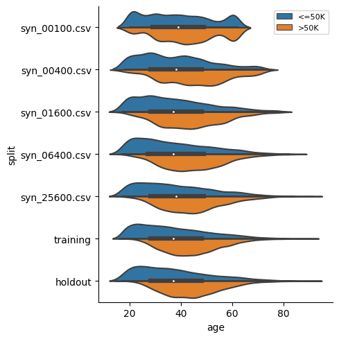
In both of these cases we see, again, that the synthetic datasets trained on more training samples resemble the original dataset more closely. We also see that the difference between the dataset trained on 6,400 samples and that trained on 25,600 seems to be minimal. This means that if the accuracy of these specific individual variable distributions is most important to you, you could confidently train your synthetic data generation model using just 6,400 samples (rather than the full 39,074 records). This will save you significantly in computational costs and runtime.
Rule Adherence
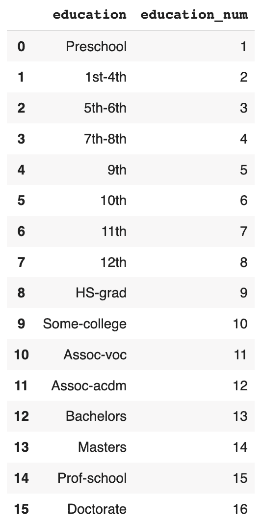
The original data has a 1:1 relationship between the education and education_num columns: each textual education level in the education column has a corresponding numerical value in the education_num column.
Let's check in how many cases the generated synthetic data has correctly retained that specific rule between these two columns.
First, display the matching columns in the original training data:
# display unique combinations of `education` and `education_num`
(df_trn[['education', 'education_num']]
 .drop_duplicates()
 .sort_values('education_num')
 .reset_index(drop=True)
)
Now, convert the education column to Categorical dtype, sort and calculate the ratio of correct matches:
# convert `education` to Categorical with proper sort order
df['education'] = pd.Categorical(
    df['education'],
    categories=df_trn.sort_values('education_num')['education'].unique())

# calculate correct match
stats = (
    df.groupby('split')
    .apply(lambda x: (x['education'].cat.codes+1 == x['education_num']).mean())
)
stats = stats.to_frame('matches').reset_index()
stats
Visualize the results:
sns.catplot(
    data=stats,
    y='matches',
    x='split',
    kind='point',
    color='black'
)
plt.xticks(rotation=45)
plt.xlabel('')
plt.title('Share of Matches')
plt.show()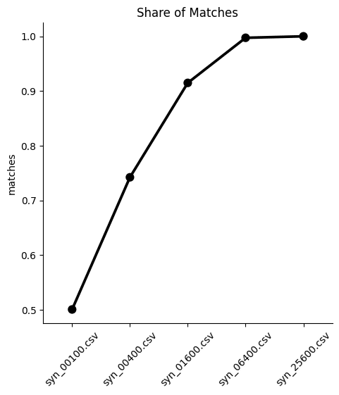
We can see from both the table and the plot that the dataset trained on just 100 samples severely underperforms, matching the right values in the columns only half of the time. While performance improves as the training samples increase, only the synthetic dataset generated using 25,600 samples is able to reproduce this rule adherence 100%. This means that if rule adherence for these columns is crucial to the quality of your synthetic data, you should probably opt for a training size of 25,600.
Downstream ML task
Finally, let’s evaluate the 5 synthetic datasets by evaluating their performance on a downstream machine learning task. This is also referred to as the Train-Synthetic-Test-Real evaluation methodology. You will train a ML model on each of the 5 synthetic datasets and then evaluate them on their performance against an actual holdout dataset containing real data which the ML model has never seen before (the remaining 20% of the dataset, which can be downloaded here).
The code block below defines the functions that will preprocess your data, train a LightGBM model and evaluate its performance. For more detailed descriptions of this code, take a look at the Train-Synthetic-Test-Real tutorial.
# import necessary libraries
import lightgbm as lgb
from lightgbm import early_stopping
from sklearn.model_selection import train_test_split
from sklearn.metrics import roc_auc_score

# define target column and value
target_col = 'income'
target_val = '>50K'

# prepare data, and split into features `X` and target `y`
def prepare_xy(df: pd.DataFrame):
    y = (df[target_col]==target_val).astype(int)
    str_cols = [
        col for col in df.select_dtypes(['object', 'string']).columns if col != target_col
    ]
    for col in str_cols:
        df[col] = pd.Categorical(df[col])
    cat_cols = [
        col for col in df.select_dtypes('category').columns if col != target_col
    ]
    num_cols = [
        col for col in df.select_dtypes('number').columns if col != target_col
    ]
    for col in num_cols:
        df[col] = df[col].astype('float')
    X = df[cat_cols + num_cols]
    return X, y


# train ML model with early stopping
def train_model(X, y):
    cat_cols = list(X.select_dtypes('category').columns)
    X_trn, X_val, y_trn, y_val = train_test_split(X, y, test_size=0.2, random_state=1)
    ds_trn = lgb.Dataset(
        X_trn,
        label=y_trn,
        categorical_feature=cat_cols,
        free_raw_data=False
    )
    ds_val = lgb.Dataset(
        X_val,
        label=y_val,
        categorical_feature=cat_cols,
        free_raw_data=False
    )
    model = lgb.train(
        params={
            'verbose': -1,
            'metric': 'auc',
            'objective': 'binary'
        },
        train_set=ds_trn,
        valid_sets=[ds_val],
        callbacks=[early_stopping(5)],
    )
    return model


# apply ML Model to some holdout data, report key metrics, and visualize scores
def evaluate_model(model, hol):
    X_hol, y_hol = prepare_xy(hol)
    probs = model.predict(X_hol)
    preds = (probs >= 0.5).astype(int)
    auc = roc_auc_score(y_hol, probs)
    return auc


def train_and_evaluate(df):
    X, y = prepare_xy(df)
    model = train_model(X, y)
    auc = evaluate_model(model, df_hol)
    return auc
Now calculate the performance metric for each of the 5 ML models:
aucs = {k: train_and_evaluate(df) for k, df in synthetic_datasets.items()}
aucs = pd.Series(aucs).round(3).to_frame('auc').reset_index()
And visualize the results:
sns.catplot(
    data=aucs,
    y='auc',
    x='index',
    kind='point',
    color='black'
)
plt.xticks(rotation=45)
plt.xlabel('')
plt.title('Predictive Performance (AUC) on Holdout')
plt.show()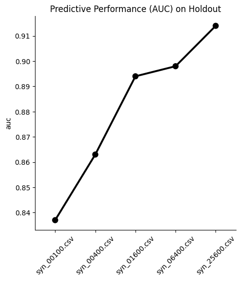
We see, again, that optimal performance is achieved with the largest training sample size. Interestingly, the difference in performance between the dataset trained on 1,600 samples and the one trained on 6,400 samples is minimal in this case. This means that if your use case allows you to sacrifice a fraction of ML performance, you could train your synthetic data generator on just 1,600 samples and still get pretty great results.
In most cases, however, a 1% difference in ML accuracy is crucial to preserve and so most likely you would end up training on 25,600 samples. A worthwhile exercise here would be to train a synthetic generator using the full 39,074 training samples to see whether that performs even better.
Optimize your training sample size for synthetic data accuracy
In this tutorial you have seen first-hand the relationship between the size of your training samples and the resulting synthetic data quality. You have quantified and evaluated this relationship from multiple angles and with various use cases in mind, including looking at single variable distributions, rule adherence and ML utility. For the given dataset and the given synthesizer we can clearly observe an increase in synthetic data quality with a growing number of training samples across the board.
We have also observed that a holdout dataset will exhibit deviations from the training data due to sampling variance. With the holdout data being actual data that hasn't been seen before, it serves as a north star in terms of maximum achievable synthetic data accuracy. Read our blog post on benchmarking synthetic data generators for more on this topic.
What’s next?
In addition to walking through the above instructions, we suggest experimenting with the following in order to get an even better grasp of the relationship between training sample size and synthetic data accuracy:
- to limit model training to a few epochs, e.g. by setting the maximum number of epochs to 1 or 5 and study its impact on runtime and quality.
- to synthesize with different model_sizes: Small, Medium and Large, and study its impact on runtime and quality.
- to synthesize with the same settings several times to study the variability in quality across several runs.
- to calculate and compare your own statistics, and then compare the deviations between synthetic and training. The deviations between holdout and training can serve as a benchmark.
AI-generated data synthesis is on the rise and the number of software solutions available on the market is growing. Users of synthetic data have to make important decisions about which solution to use. But evaluating the quality of AI-generated synthetic datasets is challenging. How should you go about comparing different solutions?
MOSTLY AI co-developed a research-based empirical framework for evaluating the quality of mixed-type tabular synthetic data. This framework provides empirical methods to quantify both the accuracy (utility) and privacy of a synthetic dataset. This article explains how the methodology works and presents the benchmarking results of 8 synthetic data generators on 4 different datasets.
The evaluation framework allows you to confidently make the switch to generative AI synthetic data by comparing the performance of different solutions so that you can choose the best platform for your use case. You can reproduce the results or compare other solutions for yourself using the code in this public Github repository.
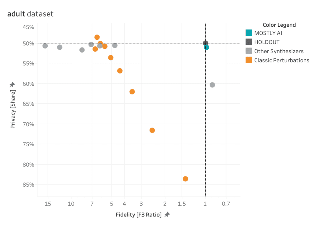
The black dot in the top-right corner is the ‘North Star’ of maximum privacy and utility preservation.
Privacy vs. Utility
Traditional data anonymization techniques struggle with the privacy-utility tradeoff for today’s datasets, which consist of more than just a handful of attributes per individual. Let’s illustrate this fundamental tradeoff with an example: you could easily add enough noise to a dataset to guarantee its privacy. However, except for the most trivial cases, the resulting data will then no longer be realistic nor representative of the original dataset. An analysis performed or a model trained on this kind of perturbed data will yield totally inaccurate results. You’ve lost your data utility.
On the other hand, you could decide to only add a marginal amount of noise. This would preserve the data utility, but would not protect against even the most basic forms of re-identification attacks. Thus, while you maintain utility, you offer no meaningful privacy protection.
Of course the ideal goal would be to achieve both: maximum data utility and maximum privacy - the "North Star" to the top right as shown in the chart below.
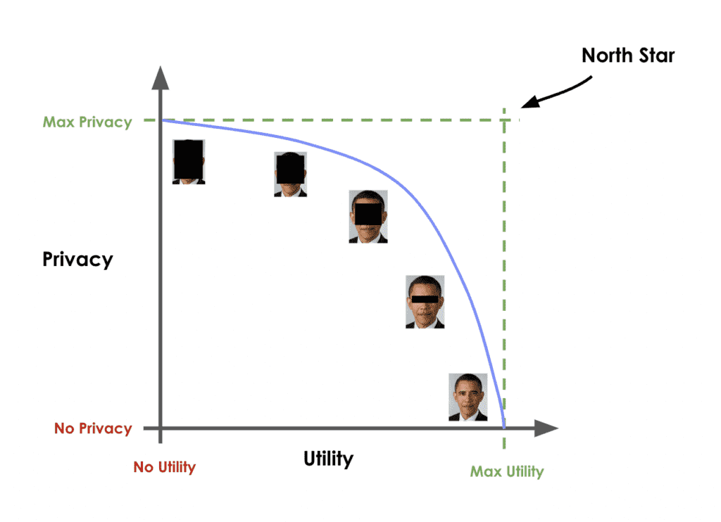
AI-generated synthetic data promises to be better than these conventional data anonymization techniques. But how can you quantify their ability to deliver on this promise?
How to benchmark synthetic data generators
Building a robust evaluation methodology for synthetic data generators is no easy task. This technical section will walk you through a specific evaluation framework, co-developed by MOSTLY AI. This section guides you step by step so that you gain an understanding of how the framework is built and can confidently use it to evaluate different synthetic data solutions for yourself. If you are not interested in the technical details, you can skip straight to the results.
A perfect data synthesizer should be capable of generating data samples that closely resemble actual data points that the model has never seen before. The synthetic dataset should have the same statistical characteristics as the original dataset; without revealing any private information. To assess this property, we therefore split the original data into a training and a holdout set. The generated synthetic data samples should then be just as close to the training dataset as the points in the holdout set, which are real data records that the model has never seen before.
So how does it work?
The first step is taking the original dataset and splitting it in half to yield the training and the holdout datasets. The synthesizer is only trained on the training samples (50% of the original dataset) and is then used to generate synthetic data samples. The holdout samples are never exposed to the synthesis process but kept aside for the evaluation.
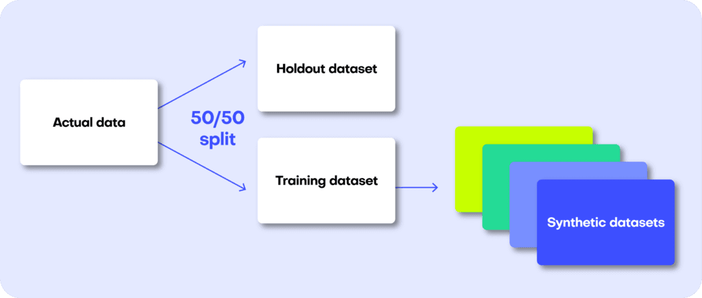
We can then evaluate the quality of this generated synthetic data by evaluating whether the synthetic samples created by the trained generator are any “closer” to the training data than the holdout data.
If the synthetic data is significantly closer to the training data than to the holdout, the generative model has likely been overfitted. This would indicate that the synthetic data potentially contains information that is specific to the individuals of the training data and that does not generalize beyond those individuals. On the other hand, if the synthetic data is significantly farther away from the training data than the holdout set, we are apparently not representative of the actual data. In that scenario, we would be compromising the fidelity of the data, which negatively impacts the utility of our downstream models trained on this data.
So how do we quantify this fidelity “closeness”?
Remember that the benchmark model starts out by randomly splitting the original dataset into 2 equal halves: a training set and a holdout set. Since these are all samples from the same dataset, these two sets will exhibit the same statistics and the same distributions. Naturally, however, there will be some difference between the training and holdout sets, simply because they consist of different samples. This difference in statistics is thus due to the so-called sampling variance.
After training our synthetic data generator on the training dataset, we will then use it to generate some new, synthetic data samples. Ideally, these synthetic data should be just as far from the training data as the holdout data in terms of accuracy. In other words, there should be just as much difference between the statistics of the synthetic samples and the statistics of the training samples as between the corresponding statistics of the training samples and the statistics of the holdout samples (the difference being the magnitude of the sampling variance).
If the synthetic data is significantly closer to the training data than the holdout data, this means that some information specific to the training data has leaked into the synthetic dataset. If the synthetic data is significantly farther from the training data than the holdout data, this means that we have lost information in terms of accuracy or fidelity.
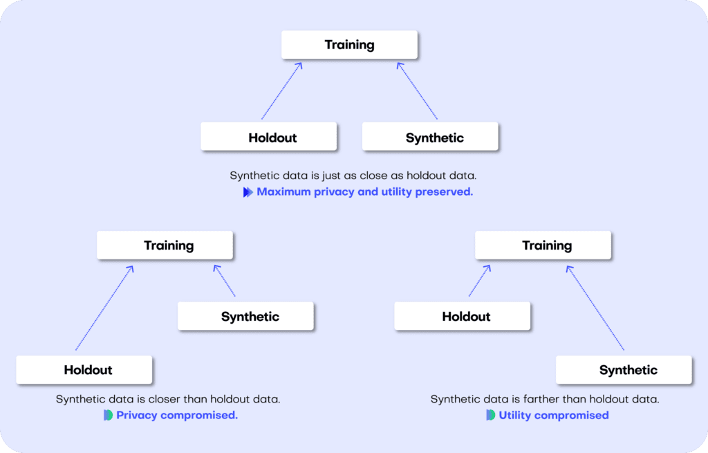
The specific distance metric we use to evaluate the fidelity of the synthetic dataset is the Total Variational Distance (TVD) between the empirical marginal distributions. It is calculated by treating all the variables in the dataset as categoricals (and thus binning any numerical features) and then measuring the sum of all deviations between the empirical marginal distributions.
This can be done for univariate, bivariate, and to some extent, also for all higher-dimensional marginal distributions. For more details on the exact implementation, read the original paper published in Frontiers in Big Data or take a look at the reproducible code in the dedicated Github repository. An Accuracy metric can then be easily defined as 1 - TVD to yield a percentage value: a synthetic dataset with a TVD of 0.05 from the holdout dataset thus translates to an accuracy of 95%, which is also reported as part of MOSTLY AI’s Quality Assurance report.
Synthetic data should match the original real-world datasets as closely as possible. This is true not only for the distribution of individual attributes or features but also for their multivariate combinations and the relationships among the set of attributes. This becomes complex very fast due to the curse of dimensionality: a dataset of 50 attributes (or columns in a traditional tabular dataset) will have 1,225 bivariate interactions and 19,600 three-way interactions (!) How do we quantify the closeness of the synthetic dataset across so many dimensions?
The solution proposed in the framework co-developed by MOSTLY AI is a non-parametric, model- and assumption-free approach to empirically measure the fidelity as the Total Variational Distance of the empirical marginal distributions.
This may sound complex but becomes intuitive when translated into a visualization such as the one below. It’s relatively easy to identify which distributions resemble that of the HOLDOUT set and which don’t. The copulagan distribution for age by “widowed”, for example, is clearly deviating significantly from the distribution in the HOLDOUT set.
For each multivariate combination, the framework evaluates the similarity between the distributions as the Total Variational Distance and measures an average of all these similarities to report a single summary metric.
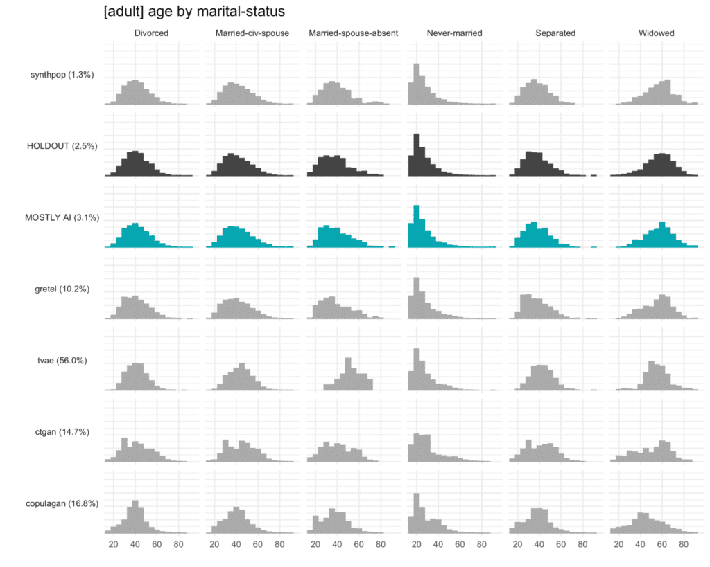
Privacy
Just as for accuracy, we start by splitting the dataset into equal training and holdout sets, train the generator on the training set and then use the generator to create a synthetic dataset.
For each individual in the synthetic dataset, we then find its nearest neighbor in the training dataset. The nearest neighbor is the individual in the training set which most closely resembles it. We measure the distance between these two neighbors using the Distance to Closest Record method and compare the distance to its nearest neighbor in the holdout dataset. We repeat this for every synthetic sample to calculate the share of records that are closer to a training than to a holdout record.
A resulting share of 50% would mean that the synthetic dataset is just as different from the original training data as from the holdout set. This would give a strong signal that no private information from the training dataset has made it into the synthetic dataset.
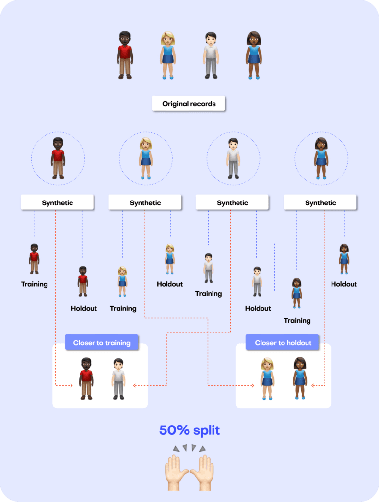
Benchmark results
To see the benchmarking framework in action, we used it to evaluate 8 publicly accessible synthetic data generators on 4 unique datasets.
The following generators are included in the benchmark:
- 4 generators contained as part of MIT’s Synthetic Data Vault (SDV) library, specifically the CopulaGAN, CTGAN, Gaussian Copula, and TVAE synthesizers;
- the synthcity RTVAE generator;
- the synthpop R package;
- an open-sourced generator by Gretel;
- MOSTLY AI’s proprietary generator.
Both Gretel and MOSTLY AI were accessed through their web-based browser applications. The other generators were accessed using their respective Python and R APIs. All generators were used with their default settings, so no parameter-tuning was performed. The code to reproduce the benchmarks is available on Github.
The datasets included in the benchmarks are:
- adult: 48,842 records with 15 attributes (6 numerical, 9 categorical)
- bank-marketing: 45,211 records with 17 attributes (7 numerical, 10 categorical)
- credit-default: 30,000 records with 24 attributes (20 numerical, 4 categorical)
- online-shoppers: 12,330 records with 18 attributes (4 numerical, 14 categorical)
Fidelity performance on a single dataset
The plot below shows the Total Variational Distance of each synthetic dataset trained on the adult dataset, measured once for all univariate distributions, once for all bivariate distributions, and once for all 3-way interactions. The higher the TVD value, the further away the synthetic data points are from the training data, indicating a loss in terms of accuracy.
Only MOSTLY AI and synthpop achieve proximity to the original data, measured as their distance from the holdout dataset. All other synthesizers seem significantly less performant in terms of accuracy, resulting in insights or ML models that are not necessarily representative of the real world. If one looks close, then one can see that synthpop actually seems to do its job too well – its synthetic samples are closer to the training data than the holdout which may be a sign of an overfitted model.
Many of the synthetic data generators create data that is significantly different from the holdout adult dataset, indicating a loss of data utility. Only MOSTLY AI and synthpop closely resemble the holdout dataset.
Fidelity Performance on all Four Datasets
The table below shows the performance of the 8 data synthesizers on all 4 benchmarked datasets, measured as the TVD. The HOLDOUT row shows the deviation measured for the holdout dataset, and serves us as a reference to quantify deviations expected due to the sampling variance. The synthetic datasets should match the Holdout fidelity score as closely as possible.
Many of the synthetic data generators create data that is significantly different from the holdout data, indicating a loss of data utility. The copulagan synthesizer failed to complete the online-shoppers benchmark. Only MOSTLY AI and synthpop closely resemble the holdout dataset.
The patterns seen on the adult dataset above are consistent across synthesizers and datasets. The Synthetic Data Vault and Synthcity generators compromise significantly on accuracy. The Gretel synthesizer does better but is still quite far (different) from the holdout set, especially for the bivariate and three-way interactions. Only MOSTLY AI and synthpop closely resemble the distribution of the holdout dataset, with synthpop consistently being closer to the training dataset than the holdout (i.e. potentially overfitting the training data).
Privacy Performance on a Single Dataset
The plot below shows the privacy evaluation of the 8 benchmarked synthetic data generators, as well as for a varying degree of classic perturbation techniques, on the adult dataset. On the one hand, we report the ratio of the distance to the closest record (DCR) with respect to the training samples vs. with respect to the holdout samples. Here, a ratio of 1 would indicate that the synthetic samples are not any closer to the training samples than to the holdout samples. On the other hand, we also report the share of samples that is closer to a training sample than to a holdout sample. A share of 50% would indicate that the synthetic samples are just as likely to be closer to training than to a holdout record.
Almost all of the synthetic data generators are able to achieve a Privacy Share close to 50% (respectively a DCR Ratio close to 1) indicating that they are doing a good job of preserving the privacy of the records in the training dataset. Only synthpop seems to be slightly overfitting on the training data, confirming the previously reported results. All of the synthesizers seem fair to excellent when compared to the classic perturbation techniques that simply try to protect data by randomly substituting values.
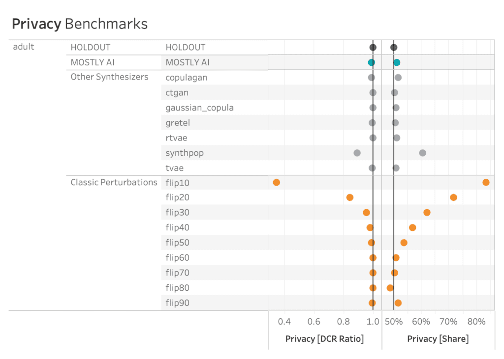
AI-driven synthesizers outperform classic perturbation techniques in terms of privacy measures.
Privacy Performance on all Four Datasets
The patterns seen on the adult dataset above are again consistent across synthesizers and datasets, with some greater variability on the credit-default and online-shoppers datasets. See below for full details. However, as argued before, privacy is only half the picture, and cannot be looked at in isolation. For that reason, it’s crucial to evaluate privacy and fidelity together, as shown in this final section.
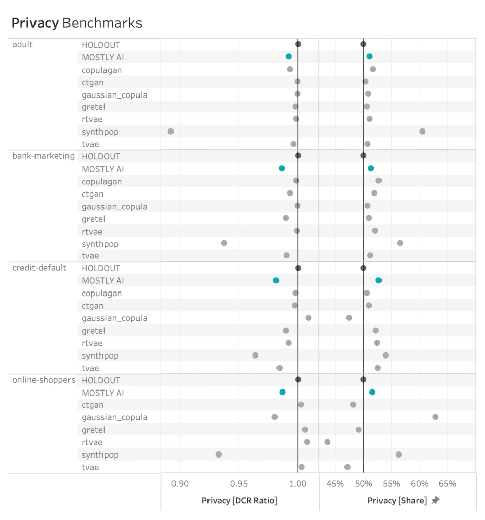
MOSTLY AI consistently ranks among the best synthesizers in terms of privacy measures.
The Full Picture
AI-driven synthetic data generators promise to deliver synthetic data that overcomes the classic privacy-utility tradeoff: preserving maximum data utility without compromising on the privacy of the training data. The visualizations below show to what extent the benchmarked synthetic data generators deliver on this promise.
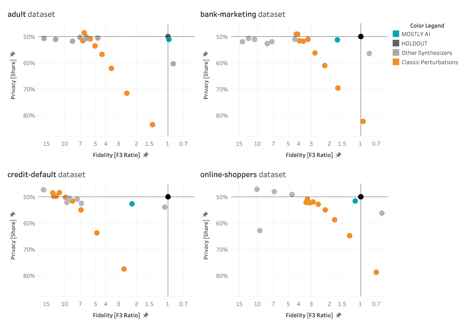
MOSTLY AI consistently ranks at the top of the benchmarked synthetic data generators in terms of both accuracy and privacy.
The black dot in the top right corner is the North Star of maximum utility and privacy preservation. The orange dots represented traditional anonymization techniques using various degrees of data perturbation. The grey dots represent the various synthetic data generators. The turqoise dot is MOSTLY AI which consistently ranks at the top of the benchmark results, both in terms of accuracy and privacy.
If you’re looking for a synthetic data generator that is able to consistently deliver optimal privacy and utility performance, give MOSTLY AI a try today and let us know what you think – the first 100K rows of synthetic data are on us!
TL;DR We present a reproducible case study on synthesizing large-scale population data to gain granular-level insights without compromising on privacy. Accordingly, MOSTLY AI’s unparalleled accuracy combined with its ease-of-use allows any organization to generate highly realistic synthetic replicas of their own customer base. These allow the privacy-safe utilization of data assets - across teams, across borders, across corporate boundaries. See also here for a slideset version of this blog post.
Intro
The UCI Adult dataset is a widely used resource for machine learning and data analysis. It contains detailed information on over 48,000 individuals, including their age, education, income, and other demographic characteristics. The dataset is often used to test and develop algorithms for predicting income levels based on these various factors. Over the past years it has also become the go-to standard to test-drive, showcase and benchmark synthetic data solutions. And any new user of our highly popular free version is guided through the synthetization of that very same dataset as part of their onboarding tutorial. With just a few clicks, and within less than a minute, a highly realistic, statistically representative, and yet truly novel synthetic replica is being generated [Make sure to give it a try!].
But just as AI advances, we also need to advance the datasets it’s being tested on. For years MNIST, a collection of hand-written digits, served as the go-to dataset to test-drive image recognition algorithms, but by now has become “too easy” of a task. Accordingly, it’s also high time to level up the game for structured data synthesis, and publicly showcase its capabilities on bigger, wider and more complex datasets. This shall allow for a more realistic demonstration of capabilities, as any of the real-word datasets of our customers, is orders of magnitudes richer than the commonly demo-ed “toy datasets”. Thus, let’s use the handy Python package folktables to extract a significantly larger and also more recent version of the UCI Adult dataset directly from the US Census Bureau. For this blog post we pulled records from the 2018 American community survey (ACS) on 1,476,217 working individuals of age 17 or older, together with 4 numerical and 28 categorical attributes.
Synthesize data
No matter whether your dataset is small or large in size, using MOSTLY AI to synthesize it, is always the same easy 3-step process. You first upload or connect to your dataset, you then configure and launch the synthetization, and once the job is completed, you then access and freely use your generated synthetic data. Yes, it's that easy!
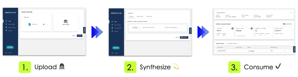
Using our free version, the complete end-to-end process of our introduced dataset takes less than 12 minutes. This includes the fully automated steps of data analysis, data encoding, model training, synthetic data generation as well as the creation of the quality assurance report. The resulting 1,476,217 synthetic records are shown to be statistically representative, highly realistic, truly anonymous, and yet at granular level. These records therefore serve as a safe drop-in alternative to the original data, and allow for any type of data exploration, analysis as well as machine learning task. All without compromising the privacy of any individual.
Explore data
Let’s start out by analyzing MOSTLY AI’s generated synthetic data with Tableau, a popular data visualization platform. Note, that deriving statistical insights should not be understood as an exercise in reporting metrics with excess precision. Deriving statistical insights is much rather the art and science of exploring and spotting relationships and trends within the data, that were previously unknown. And this ability, to explore data in any way needed, is the major benefit of synthetic data when compared to any other privacy-enhancing technology. As a data consumer one is NOT restricted to pre-selected subsets of data attributes, to pre-defined numeric buckets, or to pre-calculated data aggregates, that all severely limit the scope of an analysis. As a data consumer one can freely combine, transform and tabulate any dimension and any measure.
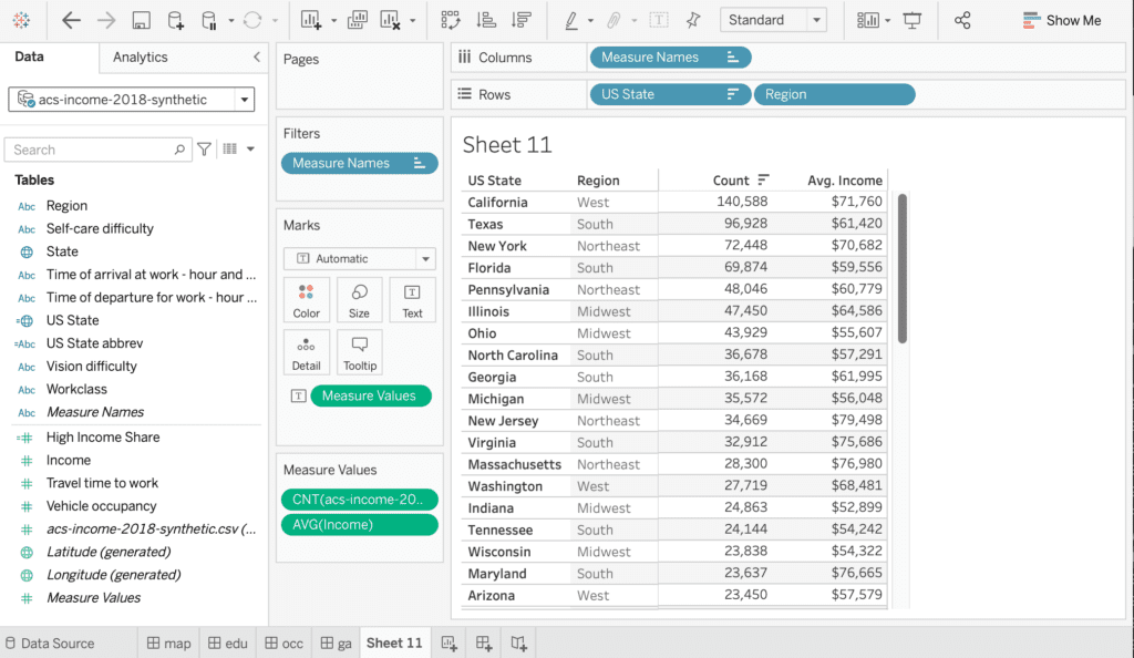
One of the 32 captured attributes within the dataset is information about the surveyed state, representing geographical information, that can be nicely visualized on a map. Figure 3 shows the share of respondents, with an annual income of $50,000 or more, displayed as a choropleth map. The darker the color, the higher the share of high income earners. And one can immediately see, side-by-side, that the very same patterns emerge. States on the west, respectively on the north east coast exhibit significantly higher incomes than other states.
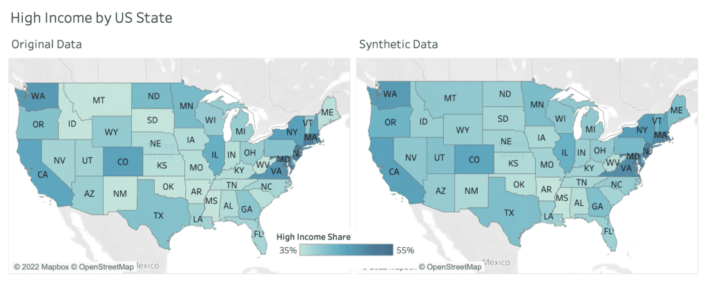
Figure 4 exhibits the share of high income earners across education level and age group, and displays similarly strong, yet consistent patterns. The higher the educational level, the higher the likelihood to earn more than $50k per year. And in addition, there is a significant difference between people below 25 years, people between 26 and 35 years, as well as people of 36 years of age and older.
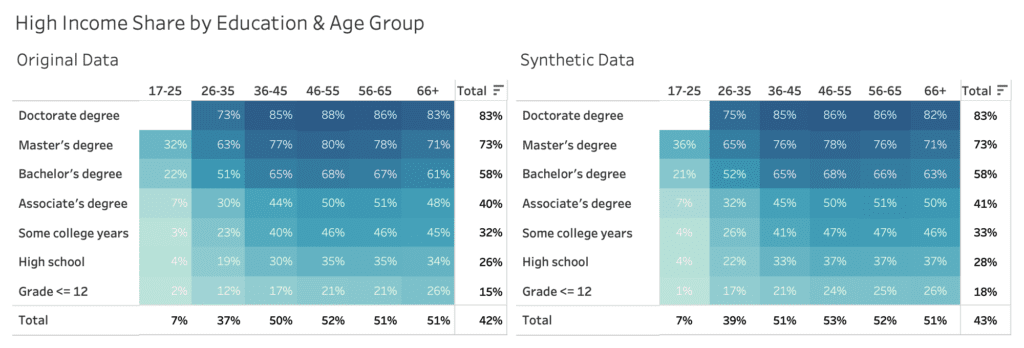
Let’s next explore income across genders, and across occupation, which is an attribute consisting of over 500 (!) distinct values. Most other synthesization solutions struggle with capturing the signals for high cardinality features like these. Figure 5 shows side-by-side the large income gap across occupation, discriminating between high income jobs like physicians and software developers on the one end of the spectrum, and cashiers and fast food workers on the other end. Plus, it also shows a consistent gender pay gap across all occupation. Thus, the analysis shows that men are consistently more likely to earn a high income than women, even when controlling for the type of occupation. Synthetic data can play a pivotal role in uncovering such types of systematic injustices, that are currently locked up due to the private nature of the underlying datasets.
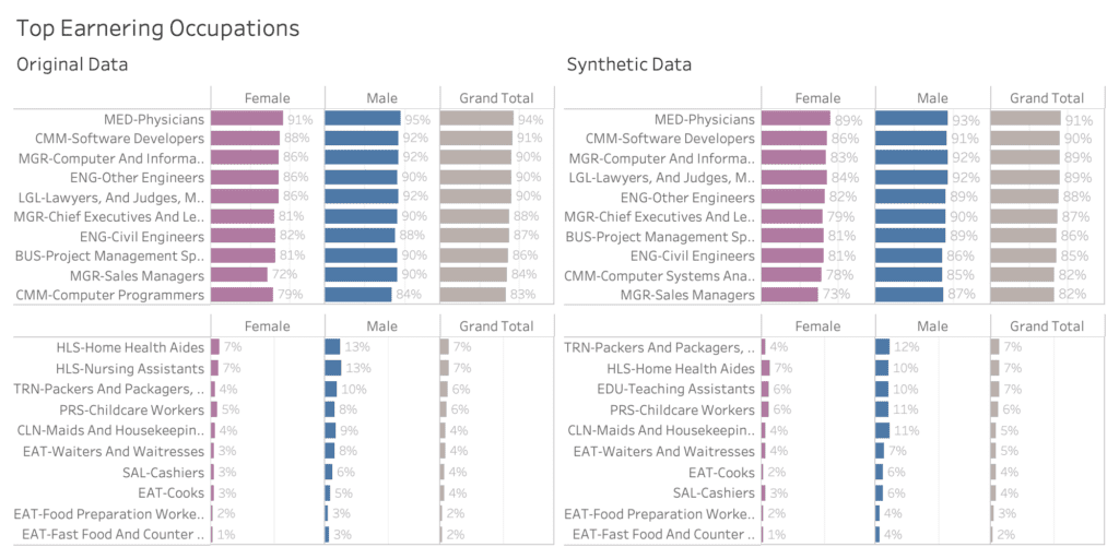
The complete analytical workbook, and each of the presented interactive visualizations, can be accessed through this link hosted on Tableau Public.
Build models
Visual analytics, as shown in the previous section, is an excellent and essential mean to quickly gain a deeper understanding of a dataset and its inherent patterns. However, at the same time it also requires some level of caution, in order to avoid misinterpreting spurious relations by overlooking confounding factors. Machine learning models, that are trained to predict a specific target attribute of interest based on a wide range of other variables, help to mitigate this problem. These models can account for the combined effect of attributes, and with that can report the net impact of individual attributes.
Let’s therefore train a state-of-the-art ML model on top of the synthetic data 1) to benchmark its overall predictive performance with respect to real data, and 2) to identify the key drivers, and their net effect on the attribute of interest, in our case the likelihood of a respondent earning a high income salary. The model of our choice is LightGBM, a gradient boosting machine learning algorithm, that is fast to train and evaluate, even for larger datasets. In our case, training the model on over 1 million records for 31 attributes to predict high income takes less than 1 minute on a commodity laptop.
In order to assess the model’s predictive accuracy on a true holdout dataset, we need to split the original dataset into a training and a holdout set. We randomly assign 80% of the original records to the former, and the remaining 20% to the latter. The synthetic dataset is generated based on the 80% training set. The LightGBM model is then trained on the synthetic data, and finally evaluated on the 20% holdout data, that wasn’t being accessed before. Similarly, the same model is being trained on the original training data, and evaluated on the same holdout as well. This serves us as a very strong benchmark for the ML performance of synthetic data. See figure 6 for a schematic representation of the setup. The holdout, the training as well as a synthetic dataset can be accessed via our Github repository for popular public datasets. There you will also find a corresponding Jupyter notebook that, in combination with our free version, allows anyone to easily reproduce all results from this blog post.
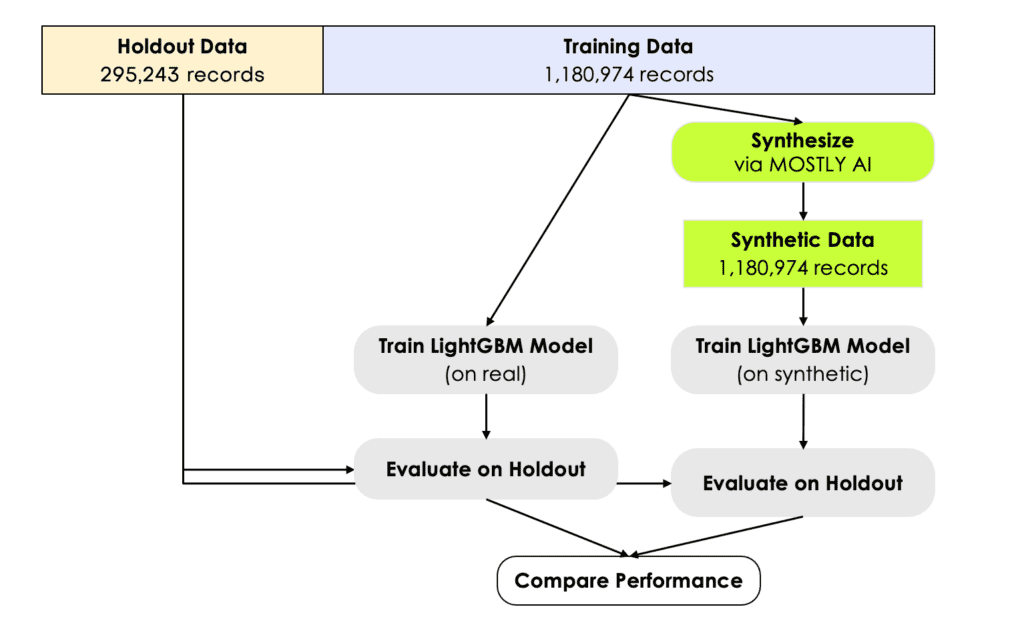
Figure 7 visualizes the distribution of the predicted scores for each of the models, split by income group. We can see that the model can discriminate well between these two groups, and assigns higher probabilities to high income earners, and vice versa. This can be also quantified via the ROC Area-Under-Curve measure, which reflects the probability of the model to correctly recognize the high income earner among a pair of two subjects. We can see that training a state-of-the-art ML model on synthetic data yields identical results, both in terms of scores as well as accuracy. The model trained on synthetic data, with an AUC of 0.881, is on-par with the model trained on real data (AUC: 0.885). This is a particularly strong and robust result, considering that we’ve used nearly 300,000 holdout records for the evaluation.
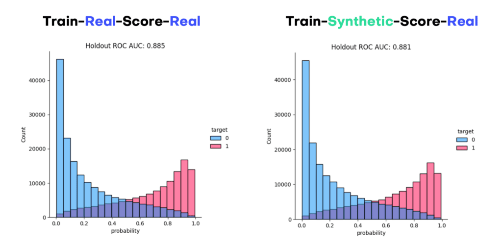
In order to explore the trained models further, we turn towards SHAP, a highly popular framework to explain ML models. Below we show the SHAP summary plot side-by-side, which already reveals the key attributes for predicting income. As one can see, occupation, age, and education are the top 3 drivers that allow to determine whether a person earns a high income or not. After that it is the information on insurance, gender, state and marital status. Further features contribute less to the model predictions. And note again, that these findings are identical for real and for synthetic data, with the key advantage that none of the private information is getting exposed while using the latter.
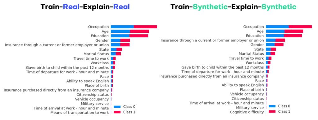
Aside from the overall impact of an attribute with respect to the predicted target, it is of great interest to study the value-dependent net effect of each of those attributes in details. These can be visualized via SHAP dependency plots, and show for each attribute the shift in predictions given their attribute value. Figure 9 displays the corresponding plots for age, state as well as gender. The x-axes show attribute values, and the y-axes the shift in predicted score. Thus, it is for example very unlikely for a young person below 25 years to be in the high income class, no matter what occupation, education or other features that person has. But once a person has reached 40 years, any further age increase does not change his or her likelihood to earn more. On the other hand, we can also see that, all other things being equal, male respondents are significantly more likely to earn a high income than their female counterparts. I.e., even for the same job, the same location, the same age, the same education, etc., women systematically earn less than men.
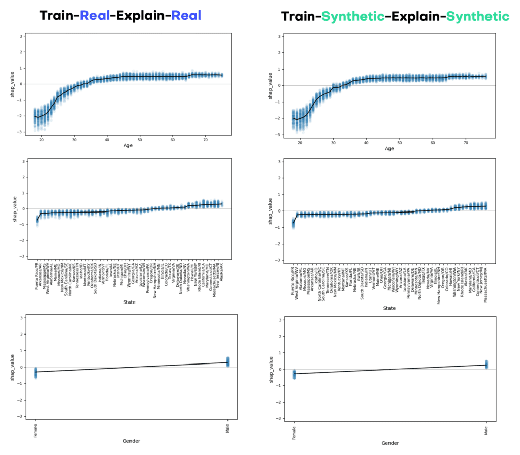
The power (and beauty) of synthetic data is the ability to drill down to granular level at any time. So, even though the generated subjects do not exist in real life, but “merely” are statistically representative, they do allow to reason about machine learning models by studying their impact on individual samples. This is a key enabler for involving a broader community of stakeholders (within and across organizations) in a much needed debate on machine learning models. Everyone - engineers, designers, lawyers, managers, customers all alike - is capable to argue a case based on representative samples. Yet, without access to samples, any discussion remains abstract. Figure 10 shows the SHAP values for our predictive income model, that has been trained on synthetic data, then evaluated and explained on synthetic, yet realistic samples. The randomly sampled case is for a 50-year old married woman from New Hampshire, who has a Master’s Degree and works in Education. The model assesses her to have an annual income of more than $50k with 85% likelihood, with her combination of education, occupation and age contribute the most for this assessment. The same type of analysis can be easily done not just for one sample, but for any of the millions of generated synthetic samples, and thus allows to test in detail the behavior as well as the robustness of the developed model, without exposing the privacy of any individuals.
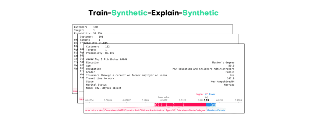
Summary
It’s the dawn of a new era. Generative AI is being recognized for its immense power to inform us all, humans and algorithms alike. And high-quality structured synthetic data, as delivered by MOSTLY AI, is key to overcome the privacy hurdles of data access. It’s key to help us see and understand the world as it is, as well as it could be.
In this blog post we’ve provided a new, publicly reproducible benchmark for state-of-the-art structured synthetic data at scale. We’ve shown how MOSTLY AI allows to easily synthesize large-scale population data, and how the generated data reliably yields identical statistical insights without compromising on privacy. It’s this level of accuracy, its reliability, and last but not least its ease of use, that makes MOSTLY AI stand out on the market. But don’t take our word for it. Go ahead, and start generating synthetic data today!
Here at MOSTLY AI, we are big fans of open-source software. We are leveraging more than 90 open-source software packages for our synthetic data generator. It is safe to say that without open-source software libraries, it would have been impossible to get where we are today so quickly. We sometimes get asked by prospects why they should choose MOSTLY AI’s Synthetic Data Platform over freely available open-source solutions, like MIT’s Synthetic Data Vault, to synthesize data. This blog post provides an answer.
Update: SDV changed their license model in 2023, and is NOT open-source anymore.
SDV vs MOSTLY AI: Synthetic data quality
The answer is multifaceted, but the main point is the quality of the synthetic data you can generate. We pride ourselves on delivering synthetic data that is so close to the real data that it can be used as a drop-in replacement without sacrificing any meaningful quality. And, of course, all while guaranteeing full privacy.
Already two years ago, we looked at the quality of synthetic data generated with two popular open-source models: CTGAN and TVAE. Back then, we showed how MOSTLY AI’s synthetic data had higher accuracy on multiple dimensions. This time we look more broadly at the open-source software library developed by MIT, the Synthetic Data Vault (SDV). It was initially released in 2018 based on research work led by Kalyan Veeramachaneni. SDV is a Python library that supports three types of data: single table data, relational data, and time series data. In addition, SDV provides an evaluation and benchmarking framework, SDGym, and comes with 100+ datasets that can be used to explore the functionality.
For this benchmarking exercise, we picked five of the 19 provided single table datasets to get a good variety of data in terms of size and structure:
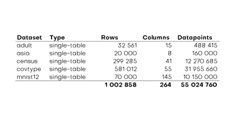
Currently, SDV offers five different models for synthesizing single table data: Tabular Preset (FAST_ML), GaussianCopula, CTGAN, CopulaGAN, and TVAE. To get a proper overview of the state of the art of open-source data synthesis, we spun up some virtual machines and synthesized all five datasets with all available models. And of course, we used the latest release of the MOSTLY AI Synthetic Data Platform to synthesize these datasets to compare. For the record – we used the standard configurations of all models and of our platform. We did not specifically try to tune any dataset. In total, we created more than 5 million rows of synthetic data or 300 million synthetic data points.
The big picture of quality includes the functionality of the synthetic data
Since we wanted to check out SDV more broadly, we also had a look at the functionality to evaluate the quality of generated synthetic data. SDV’s Evaluation Framework takes a real and a synthetic dataset as input and then calculates up to 29 different metrics comparing these two. It returns the average of the scores of the individual metrics, which results in an overall score from 0 to 1, with 0 being the worst and 1 being the best (= the synthetic data is really close to the real data).
For our benchmark, we picked three metrics that worked without any further configuration (LogisticDetection, CSTest, and KSTest) and had SDV report the aggregate score. CSTest (Chi-Squared test) and KSTest (two-sample Kolmogorov–Smirnov test) are statistical metrics that compare the tables by running different statistical tests. LogisticDetection is part of the detection metrics, which evaluate how hard it is to distinguish the synthetic data from the real data by using an ML model (in this case a LogisticRegression classifier).
The results are summarized in the chart below:
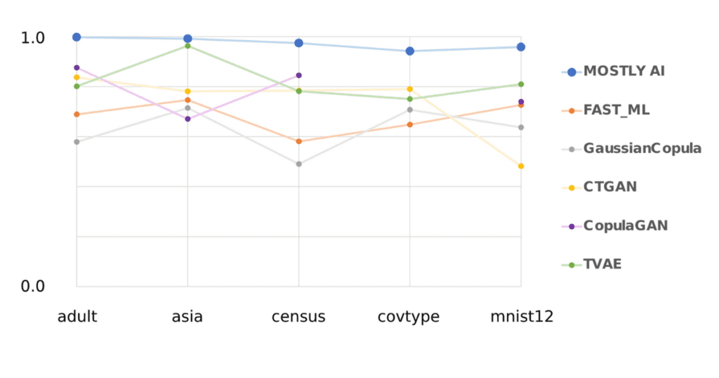
* Please note that no synthetic data for covtype could be created with CopulaGAN due to time-out issues, even on a VM with 224 vCPUs
In short: MOSTLY AI beat every single open-source model for every single dataset. Unsurprisingly the less compute intense FAST_ML, and GaussianCopula models cannot create highly realistic synthetic data with average scores of 0.68 and 0.63, respectively. From the more sophisticated models, TVAE performs best with an average score of 0.82, followed by CopulaGAN (0.78) and CTGAN (0.74). MOSTLY AI’s average score is 0.97.
SDV vs MOSTLY AI: Beyond the hard metrics & further evaluations on synthetic data generation
In practice, you will want to evaluate synthetic data on more dimensions than statistical and detection metrics. High-level metrics give you a first assessment of the quality of the created synthetic data, but the real deal is when synthetic data is actually evaluated by performing the exact same downstream tasks you would have performed using the real data.
Again and again, these analyses confirm what we already know: MOSTLY AI’s Synthetic Data Platform delivers the most accurate synthetic data consistently. But don’t take my word for it: you can find all the created synthetic datasets as a download here to perform whatever kind of analysis you wish.
The heart of our synthetic data platform is where we do not rely on open source but instead have developed our own proprietary IP. The approach and the deep learning architecture used to train a generative model. We have done so because this is what really matters when it comes to achievable synthetic data quality.
There are other reasons to consider when choosing a synthetic data generator. In addition to unmatched synthetic data quality, some of the reasons for choosing MOSTLY AI’s Synthetic Data Platform include:
- Ease of use: Our platform is so simple to use, practically anyone can synthesize data. You do not have to write a single line of code. You do not have to worry about choosing the generative model or about hyperparameter tuning. Just provide the data you want to synthesize, and the platform takes care of the rest – making sure to deliver the highest quality synthetic data.
- Speed: Training sophisticated generative models is compute-intense, and takes time and money. We waited several hours for some CTAN and TVAE models to train on strong VMs. With our platform on a lightweight VM, the synthesizations never took longer than an hour. In production, this can lead to significant cost savings.
- Flexible data ingestion: Instead of being limited to ingesting CSV files, you can connect directly to various data sources, including cloud buckets (e.g., AWS S3) or relational databases like Oracle, MySQL, and PostgreSQL. This saves time and pre- and post-processing steps that are otherwise necessary.
- Privacy guarantees: Synthetic data is not, per default, fully anonymous. For example, you need to make sure to handle outliers and extreme values properly. MOSTLY AI’s synthetic data generator takes care of all that automatically.
- Dedicated support: We have been working in this space for more than five years and know synthetic data inside out. If you encounter any issues, we are there to provide support – for our enterprise clients with guaranteed SLAs.
SDV vs MOSTLY AI: In conclusion
In conclusion, at MOSTLY AI, we are enthusiastic supporters of open-source software and recognize its significant contribution to our synthetic data generator. Our rapid progress and success can be attributed to leveraging over 90 open-source software packages. However, when prospects inquire about why they should choose our Synthetic Data Platform over freely available open-source solutions like Synthetic Data Vault (SDV), we have compelling reasons to offer.
The key factor that sets us apart is the exceptional quality of the synthetic data we generate. We take great pride in delivering synthetic data that closely resembles real data, allowing for seamless integration without compromising privacy or sacrificing quality. In a previous analysis, we compared the accuracy of synthetic data generated using two popular open-source models, CTGAN and TVAE, and demonstrated that MOSTLY AI's synthetic data exhibited superior accuracy across multiple dimensions. This time, we conducted a broader evaluation by examining SDV, an open-source software library developed by MIT.
To assess the quality of the generated synthetic data, we utilized SDV's evaluation framework, which employs various metrics to compare real and synthetic datasets. The results were consistently in our favor, highlighting the superiority of MOSTLY AI's Synthetic Data Platform.
Beyond statistical and detection metrics, we firmly believe in evaluating synthetic data through practical applications. Repeated analyses have validated that our platform consistently delivers the most accurate synthetic data. However, we don't expect you to take our word for it. We invite you to explore and analyze the synthetic datasets we have created, which are available for download.
While open-source software plays a crucial role in our work, we have developed our proprietary intellectual property to ensure the highest possible synthetic data quality. The heart of our Synthetic Data Platform lies in our unique approach and deep learning architecture for training generative models.
In addition to exceptional data quality, there are other reasons to consider our Synthetic Data Platform. We prioritize user experience, offering a straightforward and code-free platform that eliminates the need for choosing generative models or fine-tuning hyperparameters. Moreover, our platform ensures speed and efficiency, leading to significant cost savings compared to training sophisticated generative models using open-source solutions. We also provide flexible data ingestion capabilities, enabling direct connections to various data sources, saving time and effort on pre- and post-processing steps.
Privacy is of utmost importance, and our synthetic data generator automatically handles outliers and extreme values, ensuring privacy. Lastly, we offer dedicated support, leveraging our extensive experience in the synthetic data domain to provide assistance to our enterprise clients with guaranteed service level agreements (SLAs).
If you would like to experience the power of the MOSTLY AI Synthetic Data Platform, we encourage you to sign up and generate synthetic data for free. We are confident that our platform's capabilities and the quality of synthetic data it produces will exceed your expectations.
Experience the power of the MOSTLY AI Synthetic Data Platform for yourself and sign up to generate synthetic data for free.
The choice for mankind lies between freedom and happiness and for the great bulk of mankind, happiness is better.
The above is my favorite quote from George Orwell's dystopian classic, 1984. This is one among several chilling quotes that can be revisited and newly interpreted to provide searing insight into present-day events.
With a slight tweak, this quote can be re-imagined by encapsulating the challenge of big data privacy.
The choice for mankind lies between
freedomprivacy andhappinessutility, and for the great bulk of mankind,happinessutility is better.
The key here is choice.
From an individual perspective, the choice is between privacy and convenience. We share our personal data because we receive something of value in return.
For the modern enterprise, the choice comes down to two ingredients of digital transformation:
- protecting its customers' privacy,
- and unlocking the valuable insights contained within customer data.
It is a difficult choice when framed as a zero-sum game, but does it have to be so?
This is the question that compelled me to join the MOSTLY AI team. MOSTLY AI is reshaping the paradigm with realistic and representative synthetic data. We are creating a data ecosystem in which privacy and utility can co-exist.
In this blog, we will look at privacy vs. utility in personalized digital banking.
Digital transformation in banking with personalized customer experience
The COVID-19 pandemic has accelerated the shift to digital banking. In this new world, personalized customer experiences are sacrosanct.
'The goal of digital banking is to offer easily understandable client-focused services that help customers to improve their financial health,' says Tomas Balint, Data Chapter Lead at the George digital banking team at Erste Group. 'To achieve this goal, banks need to translate complex customer interactions into clear data evidence and use this evidence to provide simple and relevant advice to their customers.'
Data-driven personalization analyzes customer data in real time. Machine-learning models provide personalized services based on the customer's financial profile. These machine-learning models need quality data—and lots of it. Models learn what is important to the customer. This is how banks can provide relevant and timely advice during the digital banking experience. However, accessing customer data for the purposes of analytics requires specific consent.
Is it possible to provide personalized customer experiences without personal data? And if so, would that constitute the perfect balance of privacy and utility?
Digital banking personalization drives business impact
In the latest World Retail Banking Report, 57% of consumers say they now prefer internet (online) banking to traditional branch banking. 55% of consumers now prefer using mobile banking apps to stay on top of their finances, up from 47% in the pre-pandemic era.
The shift to digital banking was well underway before the pandemic, driven in large part by changing customer expectations. As customers, we expect the same level of personalization in our digital banking experience that we have become accustomed to in other aspects of our life. Our mobile banking app should make it simple to understand how much money we have, how we spend our money, and what we can do with our money. Customers are embracing personalized insights, achieving satisfaction scores of 4.4 out of 5, according to Personetics' 2020 global banking analysis. Better experiences equal happier customers, and happier customers make the bank more money.
There are several powerful incentives for banks to accelerate digital transformation, including:
- increased value of sales per customer,
- improved customer acquisition rates,
- reduced customer churn,
- lower servicing costs, and
- an enhanced halo effect.
To put this into perspective, BCG estimates that for every $100 billion in assets that a bank has, it can achieve as much as $300 million in revenue growth by personalizing its customer interactions.
The privacy–personalization paradox
The challenge for banks is that they must contend with two opposing truths in their quest to develop this lucrative personalized customer experience.
- Customers expect personalized digital banking experiences.
- Customers are increasingly skeptical about how their data is used.
Balancing these two opposing truths is no easy feat and goes straight to the heart of the privacy vs. utility trade-off. We have previously spoken on this blog about how privacy kills data-driven innovation for banks. Furthermore, our colleagues on Mobey's AI and Data Privacy Expert Group have recently spoken at length about how operating with data at scale without sacrificing privacy along the way is a major challenge in banking.
Power your personalization in banking with synthetic data
So, we have established that personalized customer experiences drive business impact. However, banks must contend with privacy obstacles in the form of customer consent.
How it works: Data lifecycle
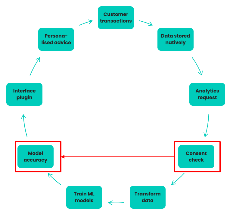
1. Customer generates transaction data through digital banking activity
2. Data stored natively in Elasticsearch for easy search & retrieval
3. Data analytics team requests data for predictive analysis
4. Compliance team verifies specific consent obtained for 30% of data
5. That data is transferred to Hadoop, transformed to tabular format
6. Data is used to train ML algorithms on what’s important to customers
7. The accuracy of the ML models are assessed by the business team
8. Interface team inserts accurate models into application plug-ins
9. Mobile app delivers personalized insights and advice to customers
Challenge: Only 30% of customers give specific consent to use their transactional data for the purposes of data analytics, therefore the quality and coverage of the ML models is suboptimal.
Let's take a look at a sample data lifecycle involved in creating personalized customer experiences. As we can see from figure 1, there are a number of steps involved:
- taking customer transactional data,
- analyzing customer transactional data,
- learning patterns from the data, and
- delivering it back to customers in the form of relevant advice and opportunities.
Machine learning underpins the data-driven workflow and enables complex, holistic, and predictive analyses of customer behavior.
As we know, the performance and accuracy of machine learning models are predicated on the quality and volume of data available to train them. A lack of data covering the full breadth and depth of real-life conditions is often a reason why a machine-learning model performs poorly.
We can assume that only 30% of customers (a generous assumption in our experience) provide consent to use their data for analytic purposes. The bank must operate within the bounds of those privacy constraints, even if it's to the detriment of the machine learning model's accuracy. From speaking with our banking customers, we know that commercial teams are constantly pushing their counterparts in data analytics teams for more accurate models. Their goal is to create more personalized recommendations and ultimately generate more revenue for the bank. The constant drive for improvement is understandable as every granular increase in model accuracy can equate to significant downstream revenue.
For those banks striving for granular improvements in accuracy, they should cast their eye at synthetic data. Synthetic data can provide those granular improvements in your machine learning accuracy and then some. We have previously demonstrated how you can boost your machine learning accuracy with synthetic data. By leveraging synthetic data in your machine learning algorithms, you can unlock the insights contained within the data you cannot access (i.e., data that you do not have consent to process).
Figure 2 shows a simple workflow where a bank creates a mixed dataset of original data and synthetic data. This creates 100% coverage of the customer transactional data, ready to supercharge your machine learning accuracy.
A sufficient amount of accurate training data is critical for the success of any machine learning initiative. There is no more important machine learning initiative in digital banking than creating a personalized customer experience.
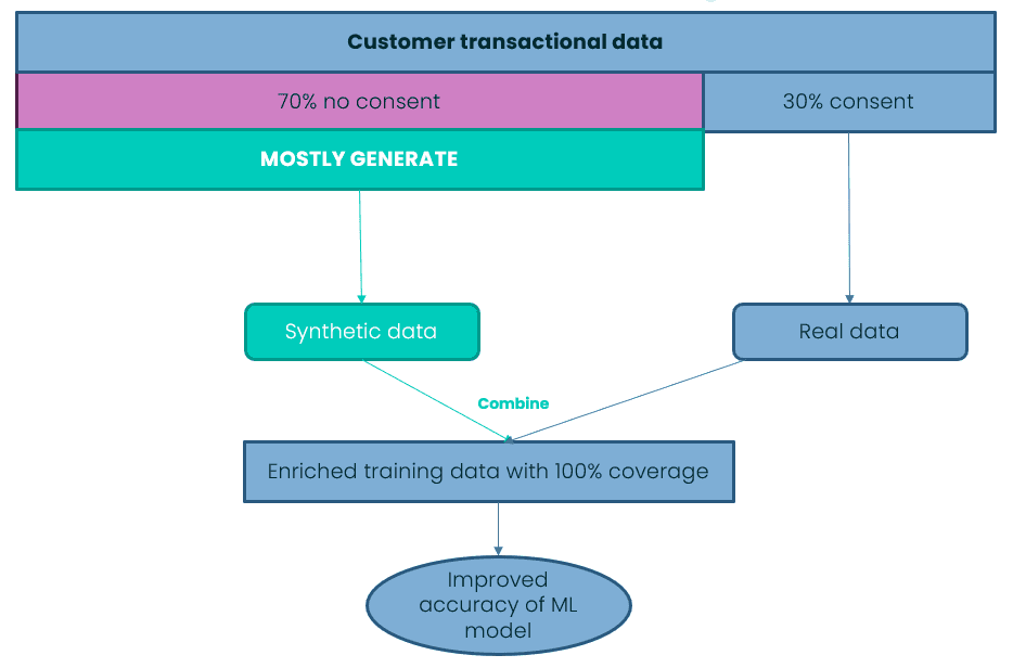
Data-driven personalization means greater market share for banks
Banks who master data-driven personalization will continue to achieve higher levels of digital-enabled sales and greater market share. Personalization has become a competitive imperative. Banks need to think outside of the box in order to survive; they need to go synthetic.
I will sign off with another one of my favorite quotes from George Orwell's 1984.
'Sanity is not statistical.'
The majority does not always determine what is right or correct. The prevailing wisdom in the modern bank maintains that you can achieve privacy or utility, privacy or personalization, but not both. Here at MOSTLY AI, we disagree.
TL;DR The broad adoption of connected devices equipped with GPS sensors adds geo context to nearly all customer data assets. However, location data—in particular, location traces—are nearly impossible to anonymize with legacy techniques as they allow for easy re-identification. The latest release of MOSTLY GENERATE ships with geo data support, thus allowing any organization to synthesize and truly anonymize their geo enriched data assets at scale.
The rise of geo data
Every phone knows its own location. And every watch, car, bicycle, and connected device will soon know its own location too. This creates a huge trove of geospatial data, enabling smart, context-aware services as well as increasing location intelligence for better planning and decision-making across all industries. Footprint data, a valuable asset of telecommunications companies, is a sought-after data type helping businesses and governments optimize urban services and find the best locations for facilities. This geospatial data can help fight pandemics, allowing governments and health experts to relate regional spread to other sociodemographic attributes. Financial institutions and insurance companies can improve their risk assessment. For example, home insurance prices can be improved through the mapping of climate features. The list of geo data use cases is long already but likely to get longer the more we continue tracking locations.
Yet, all of these devices are used by people. Thus, that data more often than not represents highly sensitive personal data—i.e., private information that is to be protected. It's not the movements of the phones but the movements of the people using the phones that are being tracked. That's where modern-day privacy regulations come into play and impose restrictions for what kind of data may be utilized and how such data may be utilized. In addition, these regulations are accompanied by significant fines to ensure that the rules are being adhered to.
These privacy regulations indisputably state that the sheer masking of direct identifiers (like names or e-mail addresses) does NOT render your data assets anonymous if the remaining attributes still allow for re-identification. For geo data, which yields a characteristic digital fingerprint for each and every one of us, the process of re-identification can be as simple as a mere database lookup. Montjoye et al. have demonstrated in their seminal 2013 Nature article that two coarse spatio-temporal data points are all that it takes to re-identify over half of the population. But more importantly, the authors demonstrate that further coarsening the data provides little to no help if multiple locations are being captured per individual, a finding that exposes a fundamental constraint to legacy data anonymization techniques.
For that reason, many of the public data-sharing initiatives, which started out with the best of intentions to foster data-driven innovation, had to stop their activities related to geo data. See the following note regarding Austin's shared mobility services, which ceased their granular-level data sharing in 2019, when the privacy implications were brought to their attention:
** Note About Location Data and Privacy (Apr 12, 2019) **
After discussion with colleagues and industry experts, we have decided to remove the latitude and longitude data from our public shared micromobility trips dataset in order to protect user privacy. [...] There is no consensus from the community on how best to share this kind of location data [...]
So, Austin, and other smart cities alike, look no further—we've developed the right solution for you.
Geo support within MOSTLY AI 1.5
At MOSTLY AI, we've been dedicated to solving the long-standing challenge of anonymization with AI-based synthetic data ever since our foundation. And, geo data, despite or because of its high demands, has been a focal part of our research activities. In particular, as we increasingly encountered this data type residing within nearly any enterprise data landscape across a broad range of industries.
Thus, fast forward to 2021, we are filled with joy and pride to finally announce that our industry-leading synthetic data platform, now ships with direct geo data support. So, aside from categorical, numeric, temporal, and textual data attributes, users can now also explicitly declare an arbitrary number of attributes to contain geo coordinates. The synthesized dataset will then faithfully represent the original data asset, with statistical relationships between the geo and non-geo attributes all being retained.
Internally, our patent-pending technique provides an efficient representation of geo information that adaptively scales its granularity to the provided dataset. This allows the generated synthetic data to represent regional just as well as local characteristics, all happening in a fully automated fashion.
Case study for synthetic geo positions
For the purpose of demonstration, let's start out with a basic example on top of 2019 Airbnb listings for New York City. That dataset consists of close to 50,000 records, with 10 measures each, whereas one of them represents the listing location encoded as latitude/longitude coordinates. While this dataset is rather small in terms of its shape and size when compared to typical customer datasets, it still shall provide us a good first understanding of the newly added geo support.
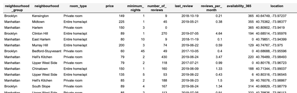
Synthesizing a geo-enriched dataset is as simple as synthesizing any other dataset thanks to MOSTLY AI's easy-to-use user interface. One simply needs to provide the dataset (in this case, we uploaded the dataset as a CSV file) to then inform the system about the geo-encoded attribute. All that is left to do is trigger the synthesis process, which then executes the encoding, the training, and the generation stages. Once the job is completed, users of the platform can then download the synthesized dataset, as well as a corresponding quality assurance report.
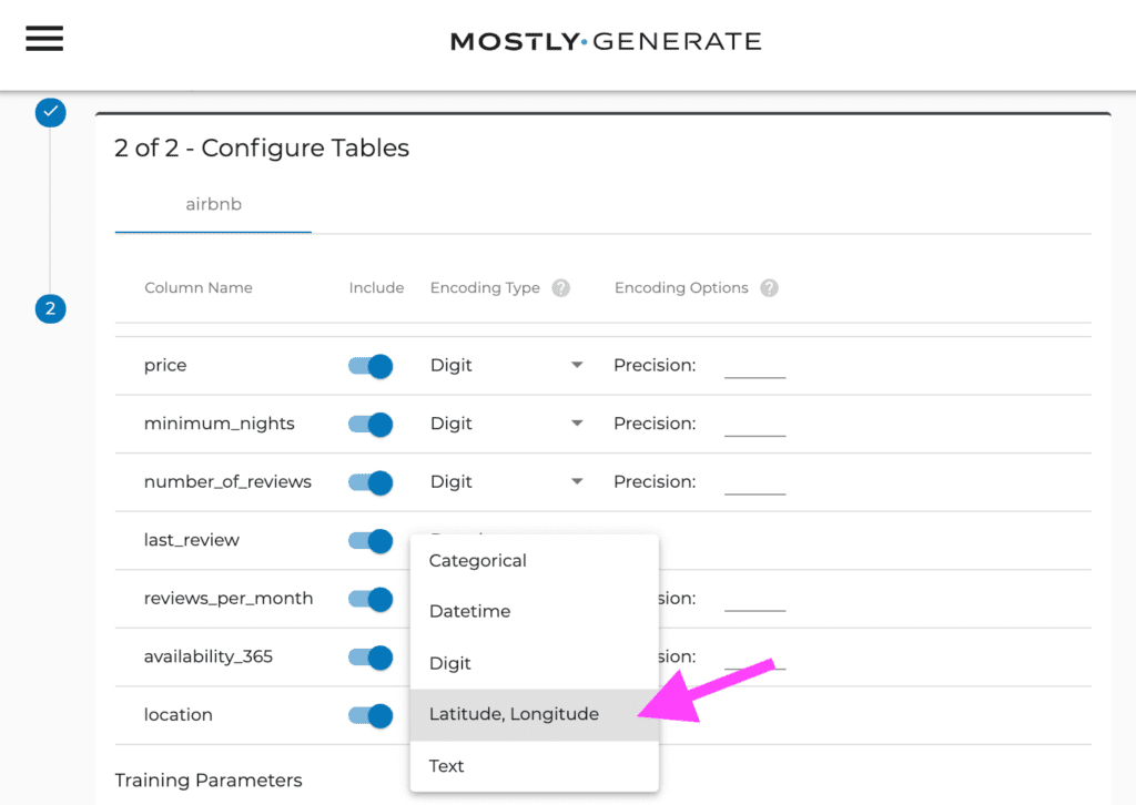
A quick check shows that the basic statistics are well retained. For example, the average price per night is ~$212 for an entire home, compared to ~$70 for a shared room. The average minimum stay is ~8.5 nights in Manhattan vs. 5 nights in Queens. All these are perfectly reflected within the synthetic data. With the focus of this article being on the geo properties, we continue our analysis leveraging Tableau, a popular data visualization solution. Like any other analytical tool, it can process synthetic data in exactly the same way as the original data. However, any analysis on the synthetic data will be private by design, even though it operates on granular-level data.
Figure 4 provides a side-by-side comparison of the overall geo distribution of listings, where these are color-coded either corresponding to their listing price (red values represent high prices) or corresponding to their required minimum stay (dark blue represent longer stays). As can be seen, the distinct relationship between location and price is just as well retained as the relationship between location and minimum nights of stay. One can publicly share the synthetic geo data to allow for similar insights as with the original data, but without running the risk of exposing an individual's privacy.
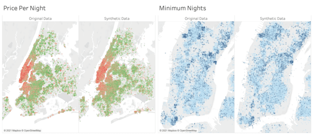
Case study for synthetic geo traces
As a second demonstration, we will turn to the Porto Taxi dataset. It consists of over a million taxi trips, together with their detailed geo location captured at 15-second intervals. Thus, depending on the overall duration of the trip, we see a varying sequence length of recorded geo locations. The total amount of available data provides plenty of opportunities for the generative model to learn and retain detailed level characteristics of the dataset, while the general ease of use remains unchanged.
Figure 5 already visualizes the results side by side; i.e., both the recorded original and the generated synthetic taxi locations, showcasing the great out-of-the-box detail and adaptive resolution of MOSTLY AI's synthetic data platform. As one can see, even though each and every taxi trip has been generated from scratch, the emerging traffic patterns are identical at the city, district, and even block levels (see the roundabout zoomed in to focus on the bottom right corner of Figure 5).
Further, Figure 6 shows randomly selected taxi trips as well as trip level statistics. All of these plots clearly show that not only the location but also the consistency of trips is faithfully represented. Synthetic trip trajectories remain coherent and do not erratically jump from one location to another. This thus yields a near-perfect representation of overall trip length, as well as of the distance between the trip origin and its destination. Note that the quality of the synthetic trips can be easily further improved, as we've only trained on ~10% of the original data and restrained from any dataset-specific parameter tuning.
Finally, Figure 7 depicts each 50 randomly selected taxi trips to the International Airport of Porto. Once more, we see both the spatial distribution and the overall increased length of airport trips well reflected within the synthetic trips.
The future of geo data sharing is bright
Precise geolocation information is considered to be one of the hardest things to anonymize. This hampers many customer data assets that contain geographic references to be easily shared and utilized across teams. But with the value of customer trust and the value of customer data being increasingly recognized, we are thrilled to deliver the presented geo support within MOSTLY AI 1.5. It will provide you with truly anonymous yet highly accurate representations of your data assets and will help you on your mission to reduce wasteful operations and build context-aware smarter services. Thanks to AI-powered synthetic data, the future of open sharing of geo data is becoming bright again.
Acknowledgment
This research and development on synthetic mobility data is supported by a grant of the Vienna Business Agency (Wirtschaftsagentur Wien), a fund of the City of Vienna.