Table of Contents
What is data bias?
Data bias is the systematic error introduced into data workflows and machine learning (ML) models due to inaccurate, missing, or incorrect data points which fail to accurately represent the population. Data bias in AI systems can lead to poor decision-making, costly compliance issues as well as drastic societal consequences. Amazon’s gender-biased HR model and Google’s racially-biased hate speech detector are some well-known examples of data bias with significant repercussions in the real world. It is no surprise, then, that 54% of top-level business leaders in the AI industry say they are “very to extremely concerned about data bias”.
With the massive new wave of interest and investment in Large Language Models (LLMs) and Generative AI, it is crucial to understand how data bias can affect the quality of these applications and the strategies you can use to mitigate this problem.
In this article, we will dive into the nuances of data bias. You will learn all about the different types of data bias, explore real-world examples involving LLMs and Generative AI applications, and learn about effective strategies for mitigation and the crucial role of synthetic data.
Data bias types and examples
There are many different types of data bias that you will want to watch out for in your LLM or Generative AI projects. This comprehensive Wikipedia list contains over 100 different types, each covering a very particular instance of biased data. For this discussion, we will focus on 5 types of data bias that are highly relevant to LLMs and Generative AI applications.
- Selection bias
- Automation bias
- Temporal bias
- Implicit bias
- Social bias
Selection bias
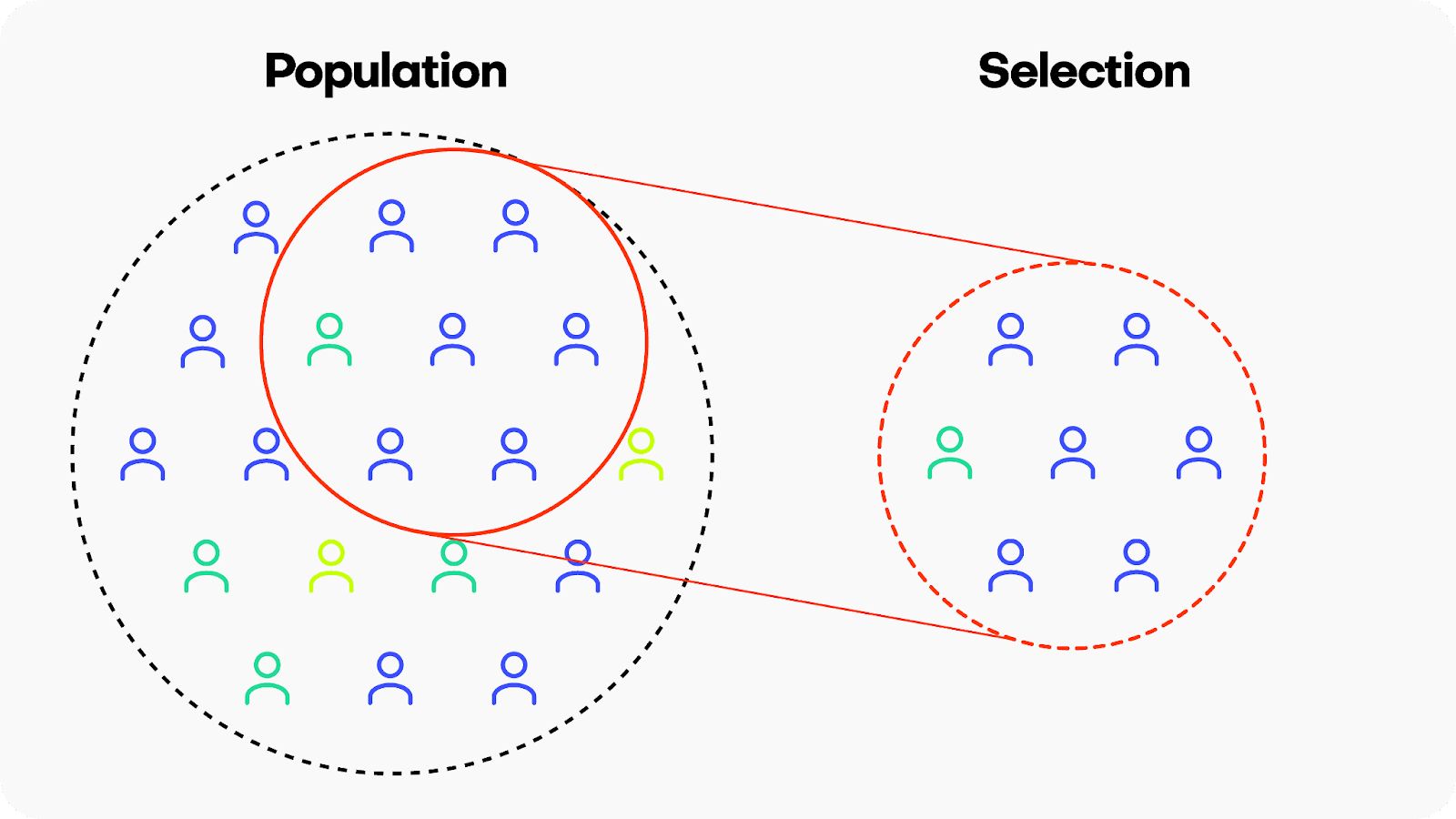
Selection bias occurs when the data used for training a machine learning model is not representative of the population it is intended to generalize to. This means that certain groups or types of data are either overrepresented or underrepresented, leading the model to learn patterns that may not accurately reflect the broader population. There are many different kinds of selection bias, such as sampling bias, participation bias and coverage bias.
Example: Google’s hate-speech detection algorithm Perspective is reported to exhibit bias against black American speech patterns, among other groups. Because the training data did not include sufficient examples of the linguistic patterns typical of the black American community, the model ended up flagging common slang used by black Americans as toxic. Leading generative AI companies like OpenAI, Anthropic and others are using Perspective daily at massive scale to determine the toxicity of their LLMs, potentially perpetuating these biased predictions.
Solution: Invest in high-quality, diverse data sources. When your data still has missing values or imbalanced categories, consider using synthetic data with rebalancing and smart imputation methods.
Automation bias

Automation bias is the tendency to favor results generated by automated systems over those generated by non-automated systems, irrespective of the relative quality of their outputs. This is becoming an increasingly relevant type of bias to watch out for as people, including top-level business leaders, may rush to implement automatically generated AI applications with the underlying assumption that simply because these applications use the latest, most popular tech their output will be inherently more trustworthy or performant.
Example: In a somewhat ironic overlap of generative technologies, a 2023 study found that some Mechanical Turk workers were using LLMs to generate the data which they were being paid to generate themselves. Later studies have since shown that training generative models on generated data can create a negative loop, also called “the curse of recursion”, which can significantly reduce output quality.
Solution: Include human supervision safeguards in any mission-critical AI application.
Temporal or historical bias
Temporal or historical bias arises when the training data is not representative of the current context in terms of time. Imagine a language model trained on a dataset from a specific time period, adopting outdated language or perspectives. This temporal bias can limit the model's ability to generate content that aligns with current information.

Example: ChatGPT’s long-standing September 2021 cut-off date is a clear example of a temporal bias that we have probably all encountered. Until recently, the LLM could not access training data after this date, severely limiting its applicability for use cases that required up-to-date data. Fortunately, in most cases the LLM was aware of its own bias and communicated it clearly with responses like "'I'm sorry, but I cannot provide real-time information".
Solution: Invest in high-quality data, up-to-date data sources. If you are still lacking data records, it may be possible to simulate them using synthetic data’s conditional generation feature.
Implicit bias
Implicit bias can happen when the humans involved in ML building or testing operate based on unconscious assumptions or preexisting judgments that do not accurately match the real world. Implicit biases are typically ingrained in individuals based on societal and cultural influences and can impact perceptions and behaviors without conscious awareness. Implicit biases operate involuntarily and can influence judgments and actions even when an individual consciously holds no biased beliefs. Because of the implied nature of this bias, it is a particularly challenging type of bias to address.

Example: LLMs and generative AI applications require huge amounts of labeled data. This labeling or annotation is largely done by human workers. These workers may operate with implicit biases. For example, in assigning a toxicity score for specific language prompts, a human annotation worker may assign an overly cautious or liberal score depending on personal experiences related to that specific word or phrase.
Solution: Invest in fairness and data bias training for your team. Whenever possible, involve multiple, diverse individuals in important data processing tasks to balance possible implicit biases.
Social bias
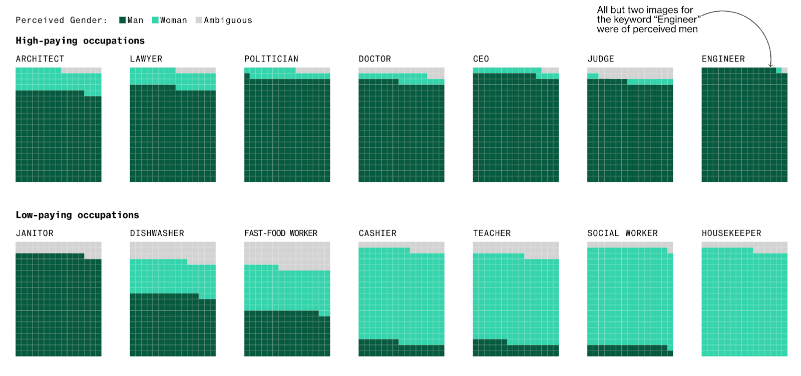
Social bias occurs when machine learning models reinforce existing social stereotypes present in the training data, such as negative racial, gender or age-dependent biases. Generative AI applications can inadvertently perpetuate biased views if their training data includes data that reflects societal prejudices. This can result in responses that reinforce harmful societal narratives. As ex-Google researcher Timit Gebru and colleagues cautioned in their 2021 paper: “In accepting large amounts of web text as ‘representative’ of ‘all’ of humanity [LLMs] risk perpetuating dominant viewpoints, increasing power imbalances and further reifying inequality.”
Example: Stable Diffusion and other generative AI models have been reported to exhibit socially biased behavior due to the quality of their training datasets. One study reported that the platform tends to underrepresent women in images of high-performing occupations and overrepresent darker-skinned people in images of low-wage workers and criminals. Part of the problem here seems to be the size of the training data. Generative AI models require massive amounts of training data and in order to achieve this data volume, the selection controls are often relaxed leading to poorer quality (i.e. more biased) input data.
Solution: Invest in high-quality, diverse data sources as well as data bias training for your team. It may also be possible to build automated safeguarding checks that will spot social bias in model outputs.
Perhaps more than any other type of data bias, social bias shows us the importance of the quality of the data you start with. You may build the perfect generative AI model but if your training data contains implicit social biases (simply because these biases existed in the subjects who generated the data) then your final model will most likely reproduce or even amplify these biases. For this reason, it’s crucial to invest in high-quality training data that is fair and unbiased.
Strategies for reducing data bias
Recognizing and acknowledging data bias is of course just the first step. Once you have identified data bias in your project you will also want to take concrete action to mitigate it. Sometimes, identifying data bias while your project is ongoing is already too late; for this reason it’s important to consider preventive strategies as well.
To mitigate data bias in the complex landscape of AI applications, consider:
- Investing in dataset diversity and data collection quality assurances.
- Performing regular algorithmic auditing to identify and rectify bias.
- Including humans in the loop for supervision.
- Investing in model explainability and transparency.
Let’s dive into more detail for each strategy.
Diverse dataset curation
There is no way around the old adage: “garbage in, garbage out”. Because of this, the cornerstone of combating bias is curating high-quality, diverse datasets. In the case of LLMs, this involves exposing the model to a wide array of linguistic styles, contexts, and cultural nuances. For Generative AI models more generally, it means ensuring to the best of your ability that training data sets are sourced from as varied a population as possible and actively working to identify and rectify any implicit social biases. If, after this, your data still has missing values or imbalanced categories, consider using synthetic data with rebalancing and smart imputation methods.
Algorithmic auditing
Regular audits of machine learning algorithms are crucial for identifying and rectifying bias. For both LLMs and generative AI applications in general, auditing involves continuous monitoring of model outputs for potential biases and adjusting the training data and/or the model’s architecture accordingly.
Humans in the loop
When combating data bias it is ironically easy to fall into the trap of automation bias by letting programs do all the work and trusting them blindly to recognize bias when it occurs. This is the core of the problem with the widespread use of Google’s Perspective to avoid toxic LLM output. Because the bias-detector in this case is not fool-proof, its application is not straightforward. This is why the builders of Perspective strongly recommend continuing to include human supervision in the loop.
Explainability and transparency
Some degree of data bias is unavoidable. For this reason, it is crucial to invest in the explainability and transparency of your LLMs and Generative AI models. For LLMs, providing explanations and sources for generated text can offer insights into the model's decision-making process. When done right, model explainability and transparency will give users more context on the generated output and allow them to understand and potentially contest biased outputs.
Synthetic data reduces data bias
Synthetic data can help you mitigate data bias. During the data synthesization process, it is possible to introduce different kinds of constraints, such as fairness. The result is fair synthetic data, without any bias. You can also use synthetic data to improve model explainability and transparency by removing privacy concerns and significantly expanding the group of users you can share the training data with.
More specifically, you can mitigate the following types of data bias using synthetic data:
Selection Bias
If you are dealing with imbalanced datasets due to selection bias, you can use synthetic data to rebalance your datasets to include more samples of the minority population. For example, you can use this feature to provide more nuanced responses for polarizing topics (e.g. book reviews, which generally tend to be overly positive or negative) to train your LLM app.
Social Bias
Conditional data generation enables you to take a gender- or racially-biased dataset and simulate what it would look like without the biases included. For example, you can simulate what the UCI Adult Income dataset would look like without a gender income gap. This can be a powerful tool in combating social biases.
Reporting or Participation Bias
If you are dealing with missing data points due to reporting or participation bias, you can use smart imputation to impute the missing values in a high-quality, statistically representative manner. This allows you to avoid data loss by allowing you to use all the records available. Using MOSTLY AI’s Smart Imputation feature it is possible to recover the original population distribution which means you can continue to use the dataset as if there were no missing values to begin with.
Mitigating data bias in LLM and generative AI applications
Data bias is a pervasive and multi-faceted problem that can have significant negative impacts if not dealt with appropriately. The real-world examples you have seen in this article show clearly that even the biggest players in the field of AI struggle to get this right. With tightening government regulations and increasing social pressure to ensure fair and responsible AI applications, the urgency to identify and rectify data bias at all points of the LLM and Generative AI lifecycle is only becoming stronger.
In this article you have learned how to recognise the different kinds of data bias that can affect your LLM or Generative AI applications. You have explored the impact of data bias through real-world examples and learned about some of the most effective strategies for mitigating data bias. You have also seen the role synthetic data can play in addressing this problem.
If you’d like to put this new knowledge to use directly, take a look at our hands-on coding tutorials on conditional data generation, rebalancing, and smart imputation. MOSTLY AI's free, state-of-the-art synthetic data generator allows you to try these advanced data augmentation techniques without the need to code.
For a more in-depth study on the importance of fairness in AI and the role that synthetic data can play, read our series on fair synthetic data.
In this tutorial, you will learn the key concepts behind MOSTLY AI’s synthetic data Quality Assurance (QA) framework. This will enable you to efficiently and reliably assess the quality of your generated synthetic datasets. It will also give you the skills to confidently explain the quality metrics to any interested stakeholders.
Using the code in this tutorial, you will replicate key parts of both the accuracy and privacy metrics that you will find in any MOSTLY AI QA Report. For a full-fledged exploration of the topic including a detailed mathematical explanation, see our peer-reviewed journal paper as well as the accompanying benchmarking study.
The Python code for this tutorial is publicly available and runnable in this Google Colab notebook.
QA reports for synthetic data sets
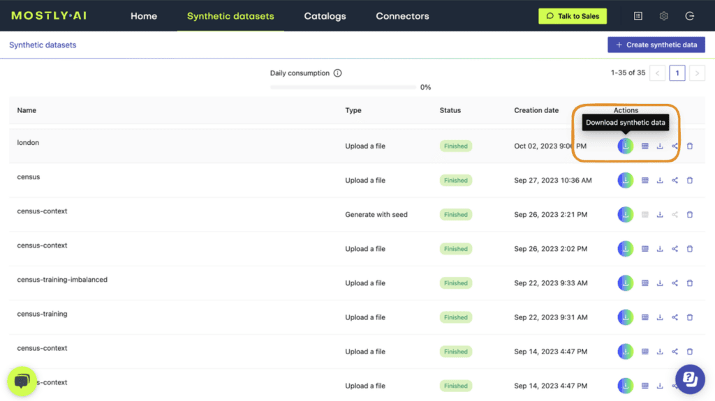
If you have run any synthetic data generation jobs with MOSTLY AI, chances are high that you’ve already encountered the QA Report. To access it, click on any completed synthesization job and select the “QA Report” tab:
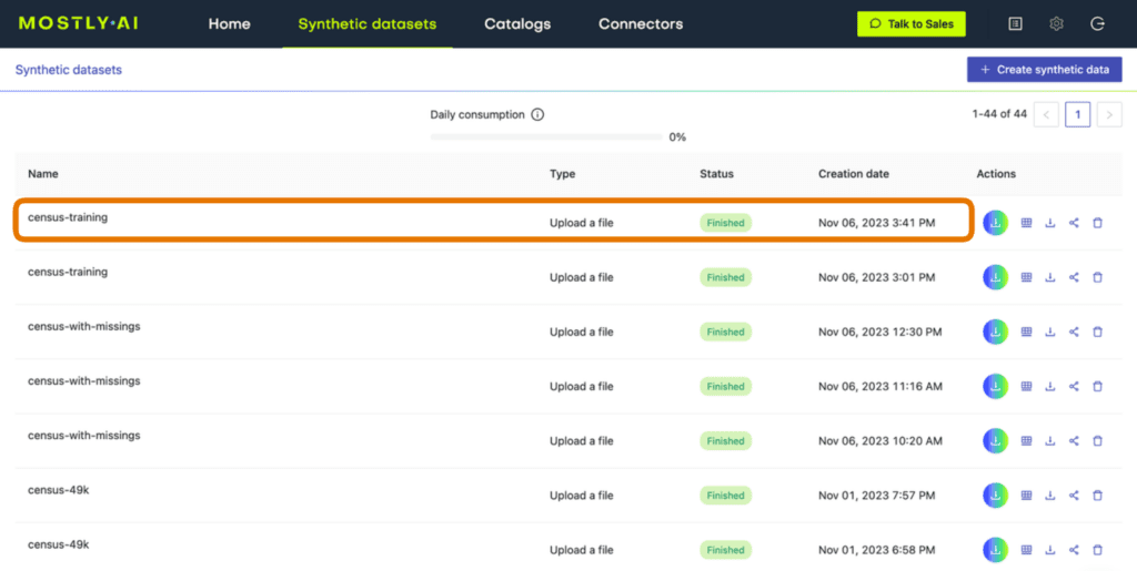
Fig 1 - Click on a completed synthesization job.
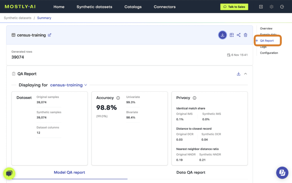
Fig 2 - Select the “QA Report” tab.
At the top of the QA Report you will find some summary statistics about the dataset as well as the average metrics for accuracy and privacy of the generated dataset. Further down, you can toggle between the Model QA Report and the Data QA Report. The Model QA reports on the accuracy and privacy of the trained Generative AI model. The Data QA, on the other hand, visualizes the distributions not of the underlying model but of the outputted synthetic dataset. If you generate a synthetic dataset with all the default settings enabled, the Model and Data QA Reports should look the same.
Exploring either of the QA reports you will discover various performance metrics, such as univariate and bivariate distributions for each of the columns and well as more detailed privacy metrics. You can use these metrics to precisely evaluate the quality of your synthetic dataset.
So how does MOSTLY AI calculate these quality assurance metrics?
In the following sections you will replicate the accuracy and privacy metrics. The code is almost exactly the code that MOSTLY AI runs under the hood to generate the QA Reports – it has been tweaked only slightly to improve legibility and usability. Working through this code will give you a hands-on insight into how MOSTLY AI evaluates synthetic data quality.
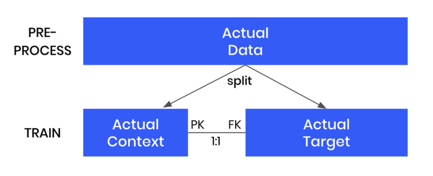
Preprocessing the data
The first step in MOSTLY AI’s synthetic data quality evaluation methodology is to take the original dataset and split it in half to yield two subsets: a training dataset and a holdout dataset. We then use only the training samples (so only 50% of the original dataset) to train our synthesizer and generate synthetic data samples. The holdout samples are never exposed to the synthesis process but are kept aside for evaluation.
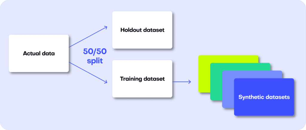
Fig 3 - The first step is to split the original dataset in two equal parts and train the synthesizer on only one of the halves.
Distance-based quality metrics for synthetic data generation
Both the accuracy and privacy metrics are measured in terms of distance. Remember that we split the original dataset into two subsets: a training and a holdout set. Since these are all samples from the same dataset, these two sets will exhibit the same statistics and the same distributions. However, as the split was made at random we can expect a slight difference in the statistical properties of these two datasets. This difference is normal and is due to sampling variance.
The difference (or, to put it mathematically: the distance) between the training and holdout samples will serve us as a reference point: in an ideal scenario, the synthetic data we generate should be no different from the training dataset than the holdout dataset is. Or to put it differently: the distance between the synthetic samples and the training samples should approximate the distance we would expect to occur naturally within the training samples due to sampling variance.
If the synthetic data is significantly closer to the training data than the holdout data, this means that some information specific to the training data has leaked into the synthetic dataset. If the synthetic data is significantly farther from the training data than the holdout data, this means that we have lost information in terms of accuracy or fidelity.
For more context on this distance-based quality evaluation approach, check out our benchmarking study which dives into more detail.
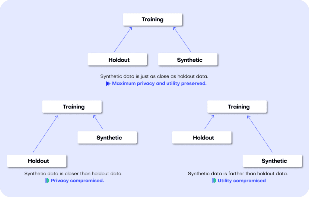
Fig 4 - A perfect synthetic data generator creates data samples that are just as different from the training data as the holdout data. If this is not the case, we are compromising on either privacy or utility.
Let’s jump into replicating the metrics for both accuracy and privacy 👇
Synthetic data accuracy
The accuracy of MOSTLY AI’s synthetic datasets is measured as the total variational distance between the empirical marginal distributions. It is calculated by treating all the variables in the dataset as categoricals (by binning any numerical features) and then measuring the sum of all deviations between the empirical marginal distributions.
The code below performs the calculation for all univariate and bivariate distributions and then averages across to determine the simple summary statistics you see in the QA Report.
First things first: let’s access the data. You can fetch both the original and the synthetic datasets directly from the Github repo:
repo = (
    "https://github.com/mostly-ai/mostly-tutorials/raw/dev/quality-assurance"
)
tgt = pd.read_parquet(f"{repo}/census-training.parquet")
print(
    f"fetched original data with {tgt.shape[0]:,} records and {tgt.shape[1]} attributes"
)
syn = pd.read_parquet(f"{repo}/census-synthetic.parquet")
print(
    f"fetched synthetic data with {syn.shape[0]:,} records and {syn.shape[1]} attributes"
)
fetched original data with 39,074 records and 12 attributes
fetched synthetic data with 39,074 records and 12 attributes
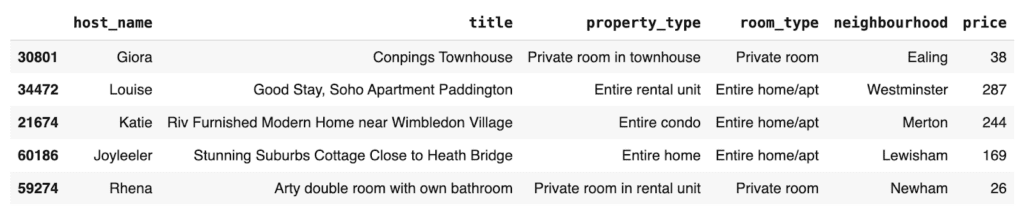
We are working with a version of the UCI Adult Income dataset. This dataset has just over 39K records and 12 columns. Go ahead and sample 5 random records to get a sense of what the data looks like:
tgt.sample(n=5)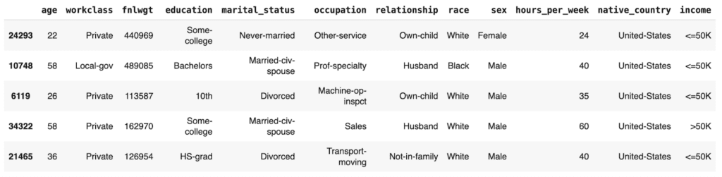
Let’s define a helper function to bin the data in order treat any numerical features as categoricals:
def bin_data(dt1, dt2, bins=10):
    dt1 = dt1.copy()
    dt2 = dt2.copy()
    # quantile binning of numerics
    num_cols = dt1.select_dtypes(include="number").columns
    cat_cols = dt1.select_dtypes(
        include=["object", "category", "string", "bool"]
    ).columns
    for col in num_cols:
        # determine breaks based on `dt1`
        breaks = dt1[col].quantile(np.linspace(0, 1, bins + 1)).unique()
        dt1[col] = pd.cut(dt1[col], bins=breaks, include_lowest=True)
        dt2_vals = pd.to_numeric(dt2[col], "coerce")
        dt2_bins = pd.cut(dt2_vals, bins=breaks, include_lowest=True)
        dt2_bins[dt2_vals < min(breaks)] = "_other_"
        dt2_bins[dt2_vals > max(breaks)] = "_other_"
        dt2[col] = dt2_bins
    # top-C binning of categoricals
    for col in cat_cols:
        dt1[col] = dt1[col].astype("str")
        dt2[col] = dt2[col].astype("str")
        # determine top values based on `dt1`
        top_vals = dt1[col].value_counts().head(bins).index.tolist()
        dt1[col].replace(
            np.setdiff1d(dt1[col].unique().tolist(), top_vals),
            "_other_",
            inplace=True,
        )
        dt2[col].replace(
            np.setdiff1d(dt2[col].unique().tolist(), top_vals),
            "_other_",
            inplace=True,
        )
    return dt1, dt2
And a second helper function to calculate the univariate and bivariate accuracies:
def calculate_accuracies(dt1_bin, dt2_bin, k=1):
    # build grid of all cross-combinations
    cols = dt1_bin.columns
    interactions = pd.DataFrame(
        np.array(np.meshgrid(cols, cols)).reshape(2, len(cols) ** 2).T
    )
    interactions.columns = ["col1", "col2"]
    if k == 1:
        interactions = interactions.loc[
            (interactions["col1"] == interactions["col2"])
        ]
    elif k == 2:
        interactions = interactions.loc[
            (interactions["col1"] < interactions["col2"])
        ]
    else:
        raise ("k>2 not supported")

    results = []
    for idx in range(interactions.shape[0]):
        row = interactions.iloc[idx]
        val1 = (
            dt1_bin[row.col1].astype(str) + "|" + dt1_bin[row.col2].astype(str)
        )
        val2 = (
            dt2_bin[row.col1].astype(str) + "|" + dt2_bin[row.col2].astype(str)
        )
        # calculate empirical marginal distributions (=relative frequencies)
        freq1 = val1.value_counts(normalize=True, dropna=False).to_frame(
            name="p1"
        )
        freq2 = val2.value_counts(normalize=True, dropna=False).to_frame(
            name="p2"
        )
        freq = freq1.join(freq2, how="outer").fillna(0.0)
        # calculate Total Variation Distance between relative frequencies
        tvd = np.sum(np.abs(freq["p1"] - freq["p2"])) / 2
        # calculate Accuracy as (100% - TVD)
        acc = 1 - tvd
        out = pd.DataFrame(
            {
                "Column": [row.col1],
                "Column 2": [row.col2],
                "TVD": [tvd],
                "Accuracy": [acc],
            }
        )
        results.append(out)

    return pd.concat(results)
Then go ahead and bin the data. We restrict ourselves to 100K records for efficiency.
# restrict to max 100k records
tgt = tgt.sample(frac=1).head(n=100_000)
syn = syn.sample(frac=1).head(n=100_000)
# bin data
tgt_bin, syn_bin = bin_data(tgt, syn, bins=10)
Now you can go ahead and calculate the univariate accuracies for all the columns in the dataset:
# calculate univariate accuracies
acc_uni = calculate_accuracies(tgt_bin, syn_bin, k=1)[['Column', 'Accuracy']]
Go ahead and inspect the first 5 columns:
acc_uni.head()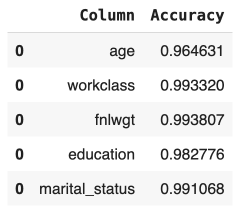
Now let’s calculate the bivariate accuracies as well. This measures how well the relationships between all the sets of two columns are maintained.
# calculate bivariate accuracies
acc_biv = calculate_accuracies(tgt_bin, syn_bin, k=2)[
    ["Column", "Column 2", "Accuracy"]
]
acc_biv = pd.concat(
    [
        acc_biv,
        acc_biv.rename(columns={"Column": "Column 2", "Column 2": "Column"}),
    ]
)
acc_biv.head()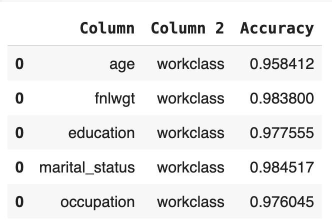
The bivariate accuracy that is reported for each column in the MOSTLY AI QA Report is an average over all of the bivariate accuracies for that column with respect to all the other columns in the dataset. Let’s calculate that value for each column and then create an overview table with the univariate and average bivariate accuracies for all columns:
# calculate the average bivariate accuracy
acc_biv_avg = (
    acc_biv.groupby("Column")["Accuracy"]
    .mean()
    .to_frame("Bivariate Accuracy")
    .reset_index()
)
# merge to univariate and avg. bivariate accuracy to single overview table
acc = pd.merge(
    acc_uni.rename(columns={"Accuracy": "Univariate Accuracy"}),
    acc_biv_avg,
    on="Column",
).sort_values("Univariate Accuracy", ascending=False)
# report accuracy as percentage
acc["Univariate Accuracy"] = acc["Univariate Accuracy"].apply(
    lambda x: f"{x:.1%}"
)
acc["Bivariate Accuracy"] = acc["Bivariate Accuracy"].apply(
    lambda x: f"{x:.1%}"
)
acc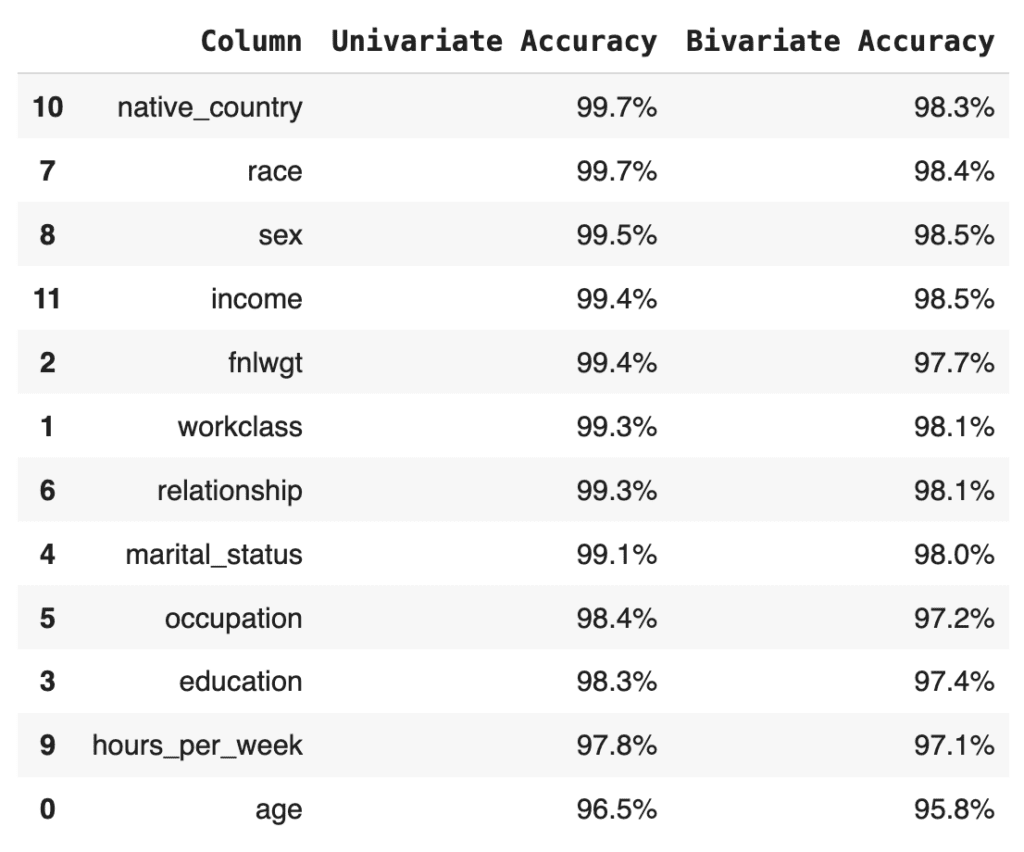
Finally, let’s calculate the summary statistic values that you normally see at the top of any MOSTLY AI QA Report: the overall accuracy as well as the average univariate and bivariate accuracies. We take the mean of the univariate and bivariate accuracies for all the columns and then take the mean of the result to arrive at the overall accuracy score:
print(f"Avg. Univariate Accuracy: {acc_uni['Accuracy'].mean():.1%}")
print(f"Avg. Bivariate Accuracy:  {acc_biv['Accuracy'].mean():.1%}")
print(f"-------------------------------")
acc_avg = (acc_uni["Accuracy"].mean() + acc_biv["Accuracy"].mean()) / 2
print(f"Avg. Overall Accuracy:    {acc_avg:.1%}")
Avg. Univariate Accuracy: 98.9%
Avg. Bivariate Accuracy: 97.7%
------------------------------
Avg. Overall Accuracy: 98.3%
If you’re curious how this compares to the values in the MOSTLY AI QA Report, go ahead and download the tgt dataset and synthesize it using the default settings. The overall accuracy reported will be close to 98%.
Next, let’s see how MOSTLY AI generates the visualization segments of the accuracy report. The code below defines two helper functions: one for the univariate and one for the bivariate plots. Getting the plots right for all possible edge cases is actually rather complicated, so while the code block below is lengthy, this is in fact the trimmed-down version of what MOSTLY AI uses under the hood. You do not need to worry about the exact details of the implementation here; just getting an overall sense of how it works is enough:
import plotly.graph_objects as go


def plot_univariate(tgt_bin, syn_bin, col, accuracy):
    freq1 = (
        tgt_bin[col].value_counts(normalize=True, dropna=False).to_frame("tgt")
    )
    freq2 = (
        syn_bin[col].value_counts(normalize=True, dropna=False).to_frame("syn")
    )
    freq = freq1.join(freq2, how="outer").fillna(0.0).reset_index()
    freq = freq.sort_values(col)
    freq[col] = freq[col].astype(str)

    layout = go.Layout(
        title=dict(
            text=f"<b>{col}</b> <sup>{accuracy:.1%}</sup>", x=0.5, y=0.98
        ),
        autosize=True,
        height=300,
        width=800,
        margin=dict(l=10, r=10, b=10, t=40, pad=5),
        plot_bgcolor="#eeeeee",
        hovermode="x unified",
        yaxis=dict(
            zerolinecolor="white",
            rangemode="tozero",
            tickformat=".0%",
        ),
    )
    fig = go.Figure(layout=layout)
    trn_line = go.Scatter(
        mode="lines",
        x=freq[col],
        y=freq["tgt"],
        name="target",
        line_color="#666666",
        yhoverformat=".2%",
    )
    syn_line = go.Scatter(
        mode="lines",
        x=freq[col],
        y=freq["syn"],
        name="synthetic",
        line_color="#24db96",
        yhoverformat=".2%",
        fill="tonexty",
        fillcolor="#ffeded",
    )
    fig.add_trace(trn_line)
    fig.add_trace(syn_line)
    fig.show(config=dict(displayModeBar=False))


def plot_bivariate(tgt_bin, syn_bin, col1, col2, accuracy):
    x = (
        pd.concat([tgt_bin[col1], syn_bin[col1]])
        .drop_duplicates()
        .to_frame(col1)
    )
    y = (
        pd.concat([tgt_bin[col2], syn_bin[col2]])
        .drop_duplicates()
        .to_frame(col2)
    )
    df = pd.merge(x, y, how="cross")
    df = pd.merge(
        df,
        pd.concat([tgt_bin[col1], tgt_bin[col2]], axis=1)
        .value_counts()
        .to_frame("target")
        .reset_index(),
        how="left",
    )
    df = pd.merge(
        df,
        pd.concat([syn_bin[col1], syn_bin[col2]], axis=1)
        .value_counts()
        .to_frame("synthetic")
        .reset_index(),
        how="left",
    )
    df = df.sort_values([col1, col2], ascending=[True, True]).reset_index(
        drop=True
    )
    df["target"] = df["target"].fillna(0.0)
    df["synthetic"] = df["synthetic"].fillna(0.0)
    # normalize values row-wise (used for visualization)
    df["target_by_row"] = df["target"] / df.groupby(col1)["target"].transform(
        "sum"
    )
    df["synthetic_by_row"] = df["synthetic"] / df.groupby(col1)[
        "synthetic"
    ].transform("sum")
    # normalize values across table (used for accuracy)
    df["target_by_all"] = df["target"] / df["target"].sum()
    df["synthetic_by_all"] = df["synthetic"] / df["synthetic"].sum()
    df["y"] = df[col1].astype("str")
    df["x"] = df[col2].astype("str")

    layout = go.Layout(
        title=dict(
            text=f"<b>{col1} ~ {col2}</b> <sup>{accuracy:.1%}</sup>",
            x=0.5,
            y=0.98,
        ),
        autosize=True,
        height=300,
        width=800,
        margin=dict(l=10, r=10, b=10, t=40, pad=5),
        plot_bgcolor="#eeeeee",
        showlegend=True,
        # prevent Plotly from trying to convert strings to dates
        xaxis=dict(type="category"),
        xaxis2=dict(type="category"),
        yaxis=dict(type="category"),
        yaxis2=dict(type="category"),
    )
    fig = go.Figure(layout=layout).set_subplots(
        rows=1,
        cols=2,
        horizontal_spacing=0.05,
        shared_yaxes=True,
        subplot_titles=("target", "synthetic"),
    )
    fig.update_annotations(font_size=12)
    # plot content
    hovertemplate = (
        col1[:10] + ": `%{y}`<br />" + col2[:10] + ": `%{x}`<br /><br />"
    )
    hovertemplate += "share target vs. synthetic<br />"
    hovertemplate += "row-wise: %{customdata[0]} vs. %{customdata[1]}<br />"
    hovertemplate += "absolute: %{customdata[2]} vs. %{customdata[3]}<br />"
    customdata = df[
        [
            "target_by_row",
            "synthetic_by_row",
            "target_by_all",
            "synthetic_by_all",
        ]
    ].apply(lambda x: x.map("{:.2%}".format))
    heat1 = go.Heatmap(
        x=df["x"],
        y=df["y"],
        z=df["target_by_row"],
        name="target",
        zmin=0,
        zmax=1,
        autocolorscale=False,
        colorscale=["white", "#A7A7A7", "#7B7B7B", "#666666"],
        showscale=False,
        customdata=customdata,
        hovertemplate=hovertemplate,
    )
    heat2 = go.Heatmap(
        x=df["x"],
        y=df["y"],
        z=df["synthetic_by_row"],
        name="synthetic",
        zmin=0,
        zmax=1,
        autocolorscale=False,
        colorscale=["white", "#81EAC3", "#43E0A5", "#24DB96"],
        showscale=False,
        customdata=customdata,
        hovertemplate=hovertemplate,
    )
    fig.add_trace(heat1, row=1, col=1)
    fig.add_trace(heat2, row=1, col=2)
    fig.show(config=dict(displayModeBar=False))
Now you can create the plots for the univariate distributions:
for idx, row in acc_uni.sample(n=5, random_state=0).iterrows():
    plot_univariate(tgt_bin, syn_bin, row["Column"], row["Accuracy"])
    print("")
Fig 5 - Sample of 2 univariate distribution plots.
As well as the bivariate distribution plots:
for idx, row in acc_biv.sample(n=5, random_state=0).iterrows():
    plot_bivariate(
        tgt_bin, syn_bin, row["Column"], row["Column 2"], row["Accuracy"]
    )
    print("")
Fig 6 - Sample of 2 bivariate distribution plots.
Now that you have replicated the accuracy component of the QA Report in sufficient detail, let’s move on to the privacy section.
Synthetic data privacy
Just like accuracy, the privacy metric is also calculated as a distance-based value. To gauge the privacy risk of the generated synthetic data, we calculate the distances between the synthetic samples and their "nearest neighbor" (i.e., their most similar record) from the original dataset. This nearest neighbor could be either in the training split or in the holdout split. We then tally the ratio of synthetic samples that are closer to the holdout and the training set. Ideally, we will see an even split, which would mean that the synthetic samples are not systematically any closer to the original dataset than the original samples are to each other.
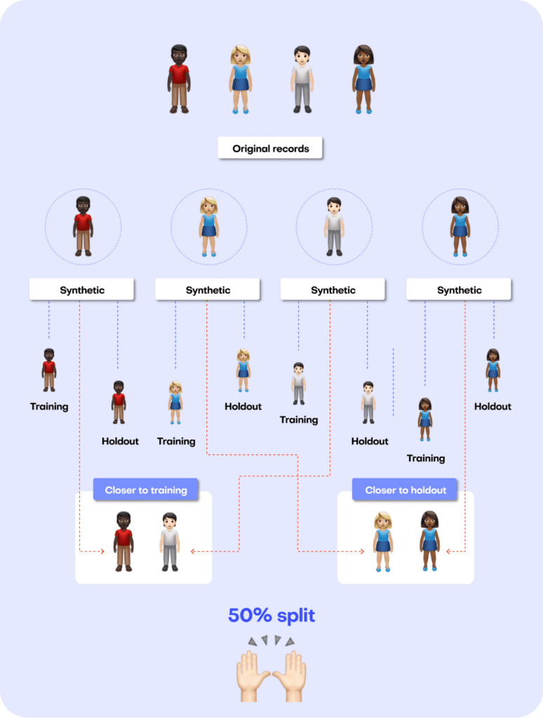
Fig 7 - A perfect synthetic data generator creates synthetic records that are just as different from the training data as from the holdout data.
The code block below uses the scikit-learn library to perform a nearest-neighbor search across the synthetic and original datasets. We then use the results from this search to calculate two different distance metrics: the Distance to the Closest Record (DCR) and the Nearest Neighbor Distance Ratio (NNDR), both at the 5-th percentile.
from sklearn.compose import make_column_transformer
from sklearn.neighbors import NearestNeighbors
from sklearn.preprocessing import OneHotEncoder
from sklearn.impute import SimpleImputer


no_of_records = min(tgt.shape[0] // 2, syn.shape[0], 10_000)
tgt = tgt.sample(n=2 * no_of_records)
trn = tgt.head(no_of_records)
hol = tgt.tail(no_of_records)
syn = syn.sample(n=no_of_records)


string_cols = trn.select_dtypes(exclude=np.number).columns
numeric_cols = trn.select_dtypes(include=np.number).columns
transformer = make_column_transformer(
    (SimpleImputer(missing_values=np.nan, strategy="mean"), numeric_cols),
    (OneHotEncoder(), string_cols),
    remainder="passthrough",
)
transformer.fit(pd.concat([trn, hol, syn], axis=0))
trn_hot = transformer.transform(trn)
hol_hot = transformer.transform(hol)
syn_hot = transformer.transform(syn)


# calculcate distances to nearest neighbors
index = NearestNeighbors(
    n_neighbors=2, algorithm="brute", metric="l2", n_jobs=-1
)
index.fit(trn_hot)
# k-nearest-neighbor search for both training and synthetic data, k=2 to calculate DCR + NNDR
dcrs_hol, _ = index.kneighbors(hol_hot)
dcrs_syn, _ = index.kneighbors(syn_hot)
dcrs_hol = np.square(dcrs_hol)
dcrs_syn = np.square(dcrs_syn)
Now calculate the DCR for both datasets:
dcr_bound = np.maximum(np.quantile(dcrs_hol[:, 0], 0.95), 1e-8)
ndcr_hol = dcrs_hol[:, 0] / dcr_bound
ndcr_syn = dcrs_syn[:, 0] / dcr_bound
print(
    f"Normalized DCR 5-th percentile original  {np.percentile(ndcr_hol, 5):.3f}"
)
print(
    f"Normalized DCR 5-th percentile synthetic {np.percentile(ndcr_syn, 5):.3f}"
)
Normalized DCR 5-th percentile original 0.001
Normalized DCR 5-th percentile synthetic 0.009
As well as the NNDR:
print(
    f"NNDR 5-th percentile original  {np.percentile(dcrs_hol[:,0]/dcrs_hol[:,1], 5):.3f}"
)
print(
    f"NNDR 5-th percentile synthetic {np.percentile(dcrs_syn[:,0]/dcrs_syn[:,1], 5):.3f}"
)
NNDR 5-th percentile original 0.019
NNDR 5-th percentile synthetic 0.058
For both privacy metrics, the distance value for the synthetic dataset should be similar but not smaller. This gives us confidence that our synthetic record has not learned privacy-revealing information from the training data.
Quality assurance for synthetic data with MOSTLY AI
In this tutorial, you have learned the key concepts behind MOSTLY AI’s Quality Assurance framework. You have gained insight into the preprocessing steps that are required as well as a close look into exactly how the accuracy and privacy metrics are calculated. With these newly acquired skills, you can now confidently and efficiently interpret any MOSTLY AI QA Report and explain it thoroughly to any interested stakeholders.
For a more in-depth exploration of these concepts and the mathematical principles behind them, check out the benchmarking study or the peer-reviewed academic research paper to dive deeper.
You can also check out the other Synthetic Data Tutorials:
- Tackle missing data with smart data imputation
- Generate synthetic text data
- Explainable AI with synthetic data
- Perform conditional data generation
- Rebalancing your data for ML classification problems
- Optimize your training sample size for synthetic data accuracy
- Build a “fake vs real” ML classifier
In this tutorial, you will learn how to build a machine-learning model that is trained to distinguish between synthetic (fake) and real data records. This can be a helpful tool when you are given a hybrid dataset containing both real and fake records and want to be able to distinguish between them. Moreover, this model can serve as a quality evaluation tool for any synthetic data you generate. The higher the quality of your synthetic data records, the harder it will be for your ML discriminator to tell these fake records apart from the real ones.
You will be working with the UCI Adult Income dataset. The first step will be to synthesize the original dataset. We will start by intentionally creating synthetic data of lower quality in order to make it easier for our “Fake vs. Real” ML classifier to detect a signal and tell the two apart. We will then compare this against a synthetic dataset generated using MOSTLY AI's default high-quality settings to see whether the ML model can tell the fake records apart from the real ones.
The Python code for this tutorial is publicly available and runnable in this Google Colab notebook.
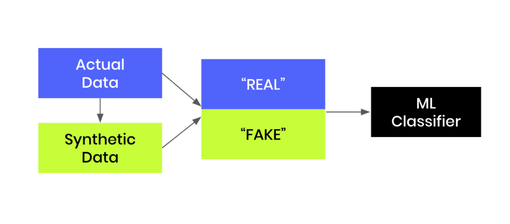
Fig 1 - Generate synthetic data and join this to the original dataset in order to train an ML classifier.
Create synthetic training data
Let’s start by creating our synthetic data:
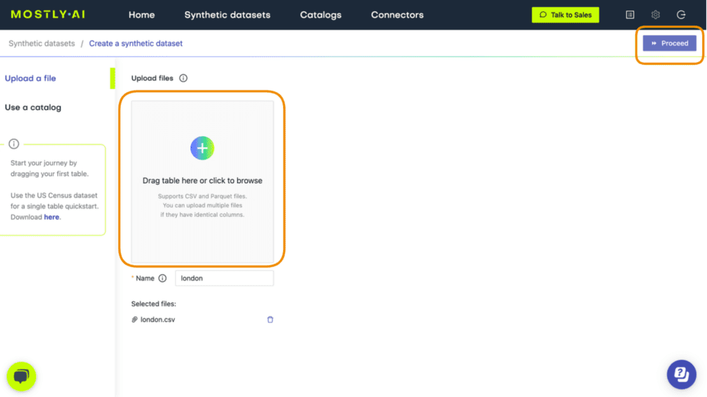
- Download the original dataset here. Depending on your operating system, use either Ctrl+S or Cmd+S to save the file locally.
- Go to your MOSTLY AI account and navigate to “Synthetic Datasets”. Upload the CSV file you downloaded in the previous step and click “Proceed”.
- Set the Training Size to 1000. This will intentionally lower the quality of the resulting synthetic data. Click “Create a synthetic dataset” to launch the job.

Fig 2 - Set the Training Size to 1000.
- Once the synthetic data is ready, download it to disk as CSV and use the following code to upload it if you’re running in Google Colab or to access it from disk if you are working locally:
# upload synthetic dataset
import pandas as pd

try:
    # check whether we are in Google colab
    from google.colab import files

    print("running in COLAB mode")
    repo = "https://github.com/mostly-ai/mostly-tutorials/raw/dev/fake-or-real"
    import io

    uploaded = files.upload()
    syn = pd.read_csv(io.BytesIO(list(uploaded.values())[0]))
    print(
        f"uploaded synthetic data with {syn.shape[0]:,} records"
        " and {syn.shape[1]:,} attributes"
    )
except:
    print("running in LOCAL mode")
    repo = "."
    print("adapt `syn_file_path` to point to your generated synthetic data file")
    syn_file_path = "./census-synthetic-1k.csv"
    syn = pd.read_csv(syn_file_path)
    print(
        f"read synthetic data with {syn.shape[0]:,} records"
        " and {syn.shape[1]:,} attributes"
    )
Train your “fake vs real” ML classifier
Now that we have our low-quality synthetic data, let’s use it together with the original dataset to train a LightGBM classifier.
The first step will be to concatenate the original and synthetic datasets together into one large dataset. We will also create a split column to label the records: the original records will be labeled as REAL and the synthetic records as FAKE.
# concatenate FAKE and REAL data together
tgt = pd.read_csv(f"{repo}/census-49k.csv")
df = pd.concat(
    [
        tgt.assign(split="REAL"),
        syn.assign(split="FAKE"),
    ],
    axis=0,
)
df.insert(0, "split", df.pop("split"))
Sample some records to take a look at the complete dataset:
df.sample(n=5)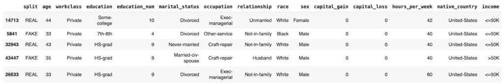
We see that the dataset contains both REAL and FAKE records.
By grouping by the split column and verifying the size, we can confirm that we have an even split of synthetic and original records:
df.groupby('split').size()split
FAKE 48842
REAL 48842
dtype: int64
The next step will be to train your LightGBM model on this complete dataset. The following code contains two helper scripts to preprocess the data and train your model:
import lightgbm as lgb
from lightgbm import early_stopping
from sklearn.model_selection import train_test_split

def prepare_xy(df, target_col, target_val):
    # split target variable `y`
    y = (df[target_col] == target_val).astype(int)
    # convert strings to categoricals, and all others to floats
    str_cols = [
        col
        for col in df.select_dtypes(["object", "string"]).columns
        if col != target_col
    ]
    for col in str_cols:
        df[col] = pd.Categorical(df[col])
    cat_cols = [
        col
        for col in df.select_dtypes("category").columns
        if col != target_col
    ]
    num_cols = [
        col for col in df.select_dtypes("number").columns if col != target_col
    ]
    for col in num_cols:
        df[col] = df[col].astype("float")
    X = df[cat_cols + num_cols]
    return X, y

def train_model(X, y):
    cat_cols = list(X.select_dtypes("category").columns)
    X_trn, X_val, y_trn, y_val = train_test_split(
        X, y, test_size=0.2, random_state=1
    )
    ds_trn = lgb.Dataset(
        X_trn, label=y_trn, categorical_feature=cat_cols, free_raw_data=False
    )
    ds_val = lgb.Dataset(
        X_val, label=y_val, categorical_feature=cat_cols, free_raw_data=False
    )
    model = lgb.train(
        params={"verbose": -1, "metric": "auc", "objective": "binary"},
        train_set=ds_trn,
        valid_sets=[ds_val],
        callbacks=[early_stopping(5)],
    )
    return model
Before training, make sure to set aside a holdout dataset for evaluation. Let’s reserve 20% of the records for this:
trn, hol = train_test_split(df, test_size=0.2, random_state=1)Now train your LightGBM classifier on the remaining 80% of the combined original and synthetic data:
X_trn, y_trn = prepare_xy(trn, 'split', 'FAKE')
model = train_model(X_trn, y_trn)
Training until validation scores don't improve for 5 rounds
Early stopping, best iteration is:
[30] valid_0's auc: 0.594648
Next, score the model’s performance on the holdout dataset. We will include the model’s predicted probability for each record. A score of 1.0 indicates that the model is fully certain that the record is FAKE. A score of 0.0 means the model is certain the record is REAL.
Let’s sample some random records to take a look:
hol.sample(n=5)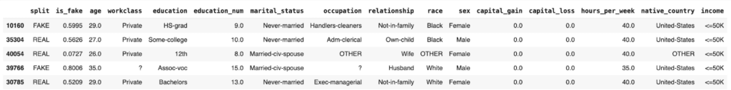
We see that the model assigns varying levels of probability to the REAL and FAKE records. In some cases it is not able to predict with much confidence (scores around 0.5) and in others it is quite confident and also correct: see the 0.0727 for a REAL record and 0.8006 for a FAKE record.
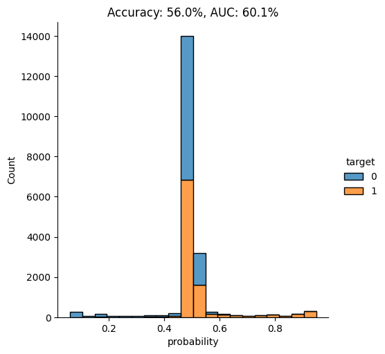
Let’s visualize the model’s overall performance by calculating the AUC and Accuracy scores and plotting the probability scores:
import seaborn as sns
import matplotlib.pyplot as plt
from sklearn.metrics import roc_auc_score, accuracy_score


auc = roc_auc_score(y_hol, hol.is_fake)
acc = accuracy_score(y_hol, (hol.is_fake > 0.5).astype(int))
probs_df = pd.concat(
    [
        pd.Series(hol.is_fake, name="probability").reset_index(drop=True),
        pd.Series(y_hol, name="target").reset_index(drop=True),
    ],
    axis=1,
)
fig = sns.displot(
    data=probs_df, x="probability", hue="target", bins=20, multiple="stack"
)
fig = plt.title(f"Accuracy: {acc:.1%}, AUC: {auc:.1%}")
plt.show()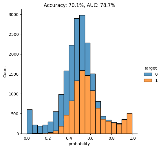
As you can see from the chart above, the discriminator has learned to pick up some signals that allow it with a varying level of confidence to determine whether a record is FAKE or REAL. The AUC can be interpreted as the percentage of cases in which the discriminator is able to correctly spot the FAKE record, given a set of a FAKE and a REAL record.
Let’s dig a little deeper by looking specifically at records that seem very fake and records that seem very real. This will give us a better understanding of the type of signals the model is learning.
Go ahead and sample some random records which the model has assigned a particularly high probability of being FAKE:
hol.sort_values('is_fake').tail(n=100).sample(n=5)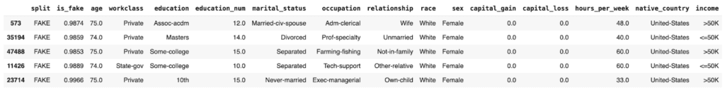
In these cases, it seems to be the mismatch between the education and education_num columns that gives away the fact that these are synthetic records. In the original data, these two columns have a 1:1 mapping of numerical to textual values. For example, the education value Some-college is always mapped to the numerical education_num value 10.0. In this poor-quality synthetic data, we see that there are multiple numerical values for the Some-college value, thereby giving away the fact that these records are fake.
Now let’s take a closer look at records which the model is especially certain are REAL:
hol.sort_values('is_fake').head(n=100).sample(n=5)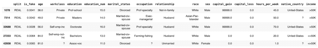
These “obviously real” records are types of records which the synthesizer has apparently failed to create. Thus, as they are then absent from the synthetic data, the discriminator recognizes these as REAL.
Generate high-quality synthetic data with MOSTLY AI
Now, let’s proceed to synthesize the original dataset again but this time using MOSTLY AI’s default settings for high-quality synthetic data. Run the same steps as before to synthesize the dataset except this time leave the Training Sample field blank. This will use all the records for the model training, ensuring the highest-quality synthetic data is generated.
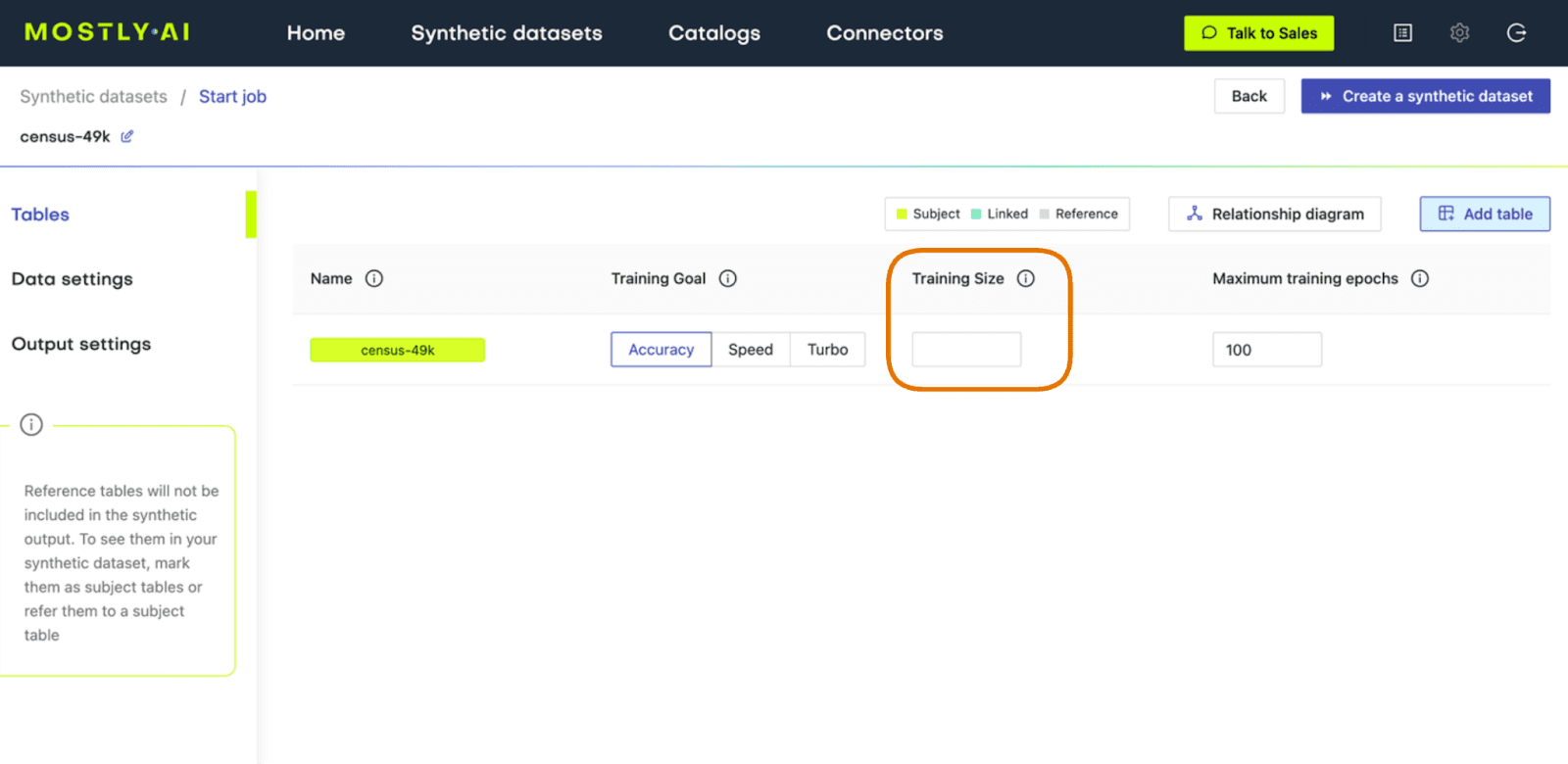
Fig 3 - Leave the Training Size blank to train on all available records.
Once the job has completed, download the high-quality data as CSV and then upload it to wherever you are running your code.
Make sure that the syn variable now contains the new, high-quality synthesized data. Then re-run the code you ran earlier to concatenate the synthetic and original data together, train a new LightGBM model on the complete dataset, and evaluate its ability to tell the REAL records from FAKE.
Again, let’s visualize the model’s performance by calculating the AUC and Accuracy scores and by plotting the probability scores:
This time, we see that the model’s performance has dropped significantly. The model is not really able to pick up any meaningful signal from the combined data and assigns the largest share of records a probability around the 0.5 mark, which is essentially the equivalent of flipping a coin.
This means that the data you have generated using MOSTLY AI’s default high-quality settings is so similar to the original, real records that it is almost impossible for the model to tell them apart.
Classifying “fake vs real” records with MOSTLY AI
In this tutorial, you have learned how to build a machine learning model that can distinguish between fake (i.e. synthetic) and real data records. You have synthesized the original data using MOSTLY AI and evaluated the resulting model by looking at multiple performance metrics. By comparing the model performance on both an intentionally low-quality synthetic dataset and MOSTLY AI’s default high-quality synthetic data, you have seen firsthand that the synthetic data MOSTLY AI delivers is so statistically representative of the original data that a top-notch LightGBM model was practically unable to tell these synthetic records apart from the real ones.
If you are interested in comparing performance across various data synthesizers, you may want to check out our benchmarking article which surveys 8 different synthetic data generators.
What’s next?
In addition to walking through the above instructions, we suggest:
- measuring the Discriminator's AUC if more training samples are used,
- using a different dataset,
- using a different ML model for the discriminator, eg. a RandomForest model,
- generate synthetic data with MOSTLY using your own dataset,
- using a different synthesizer, eg. SynthCity, SDV, etc.
You can also head straight to the other synthetic data tutorials:
- Generate synthetic text data
- Explainable AI with synthetic data
- Perform conditional data generation
- Rebalancing your data for ML classification problems
- Optimize your training sample size for synthetic data accuracy
In this tutorial, you will learn how to generate synthetic text using MOSTLY AI's synthetic data generator. While synthetic data generation is most often applied to structured (tabular) data types, such as numbers and categoricals, this tutorial will show you that you can also use MOSTLY AI to generate high-quality synthetic unstructured data, such as free text.
You will learn how to use the MOSTLY AI platform to synthesize text data and also how to evaluate the quality of the synthetic text that you will generate. For context, you may want to check out the introductory article which walks through a real-world example of using synthetic text when working with voice assistant data.
You will be working with a public dataset containing AirBnB listings in London. We will walk through how to synthesize this dataset and pay special attention to the steps needed to successfully synthesize the columns containing unstructured text data. We will then proceed to evaluate the statistical quality of the generated text data by inspecting things like the set of characters, the distribution of character and term frequencies and the term co-occurrence.
We will also perform a privacy check by scanning for exact matches between the original and synthetic text datasets. Finally, we will evaluate the correlations between the synthesized text columns and the other features in the dataset to ensure that these are accurately preserved. The Python code for this tutorial is publicly available and runnable in this Google Colab notebook.
Synthesize text data
Synthesizing text data with MOSTLY AI can be done through a single step before launching your data generation job. We will indicate which columns contain unstructured text and let MOSTLY AI’s generative algorithm do the rest.
Let’s walk through how this works:
- Download the original AirBnB dataset. Depending on your operating system, use either Ctrl+S or Cmd+S to save the file locally.
- Go to your MOSTLY AI account and navigate to “Synthetic Datasets”. Upload the CSV file you downloaded in the previous step and click “Proceed”.
- Navigate to “Data Settings” in order to specify which columns should be synthesized as unstructured text data.
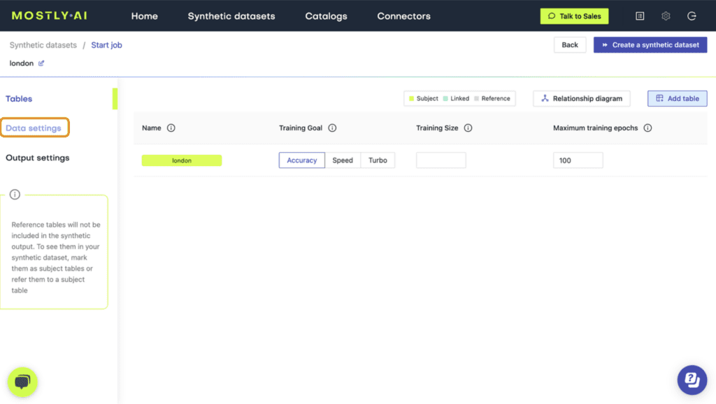
- Click on the host_name and title columns and set the Generation Method to “Text”.
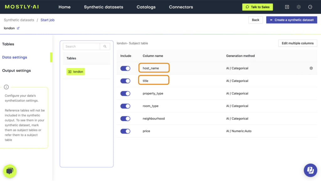
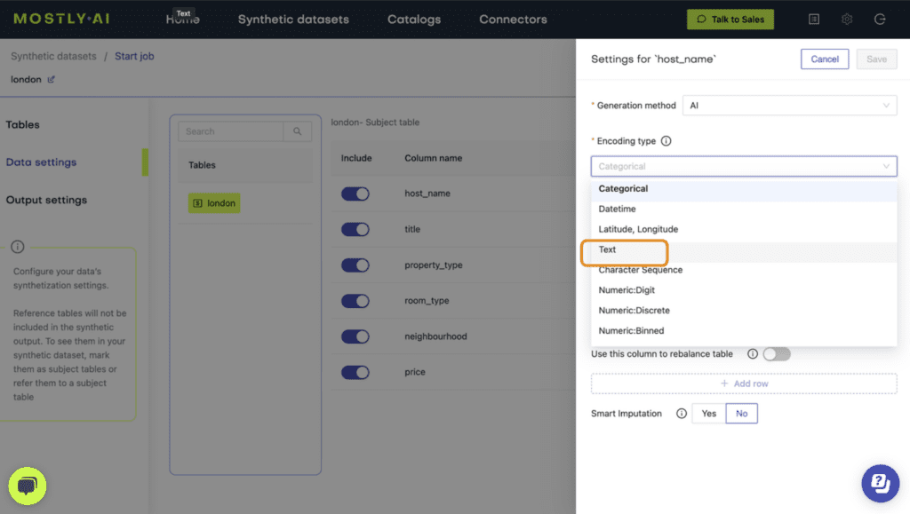
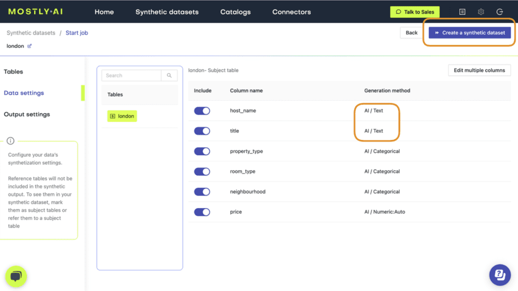
- Verify that both columns are set to Generation Method “AI / Text” and then launch the job by clicking “Create a synthetic dataset”. Synthetic text generation is compute-intensive, so this may take up to an hour to complete.
- Once completed, download the synthetic dataset as CSV.
And that’s it! You have successfully synthesized unstructured text data using MOSTLY AI.
You can now poke around the synthetic data you’ve created, for example, by sampling 5 random records:
syn.sample(n=5)
And compare this to 5 random records sampled from the original dataset:
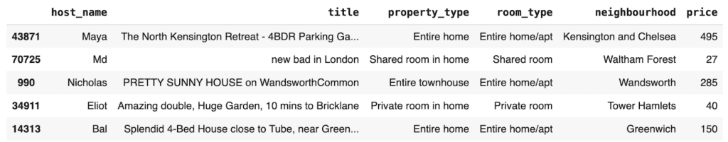
But of course, you shouldn’t just take our word for the fact that this is high-quality synthetic data. Let’s be a little more critical and evaluate the data quality in more detail in the next section.
Evaluate statistical integrity
Let’s take a closer look at how statistically representative the synthetic text data is compared to the original text. Specifically, we’ll investigate four different aspects of the synthetic data: (1) the character set, (2) the character and (3) term frequency distributions, and (4) the term co-occurrence. We’ll explain the technical terms in each section.
Character set
Let’s start by taking a look at the set of all characters that occur in both the original and synthetic text. We would expect to see a strong overlap between the two sets, indicating that the same kinds of characters that appear in the original dataset also appear in the synthetic version.
The code below generates the set of characters for the original and synthetic versions of the title column:
print(
    "## ORIGINAL ##\n",
    "".join(sorted(list(set(tgt["title"].str.cat(sep=" "))))),
    "\n",
)
print(
    "## SYNTHETIC ##\n",
    "".join(sorted(list(set(syn["title"].str.cat(sep=" "))))),
    "\n",
)
The output is quite long and is best inspected by running the code in the notebook yourself.
We see a perfect overlap in the character set for all characters up until the “£” symbol. These are all the most commonly used characters. This is a good first sign that the synthetic data contains the right kinds of characters.
From the “£” symbol onwards, you will note that the character set of the synthetic data is shorter. This is expected and is due to the privacy mechanism called rare category protection within the MOSTLY AI platform, which removes very rare tokens in order to prevent their presence giving away information on the existence of individual records in the original dataset.
Character frequency distribution
Next, let’s take a look at the character frequency distribution: how many times each letter shows up in the dataset. Again, we will compare this statistical property between the original and synthetic text data in the title column.
The code below creates a list of all characters that occur in the datasets along with the percentage that character constitutes of the whole dataset:
title_char_freq = (
    pd.merge(
        tgt["title"]
        .str.split("")
        .explode()
        .value_counts(normalize=True)
        .to_frame("tgt")
        .reset_index(),
        syn["title"]
        .str.split("")
        .explode()
        .value_counts(normalize=True)
        .to_frame("syn")
        .reset_index(),
        on="index",
        how="outer",
    )
    .rename(columns={"index": "char"})
    .round(5)
)
title_char_freq.head(10)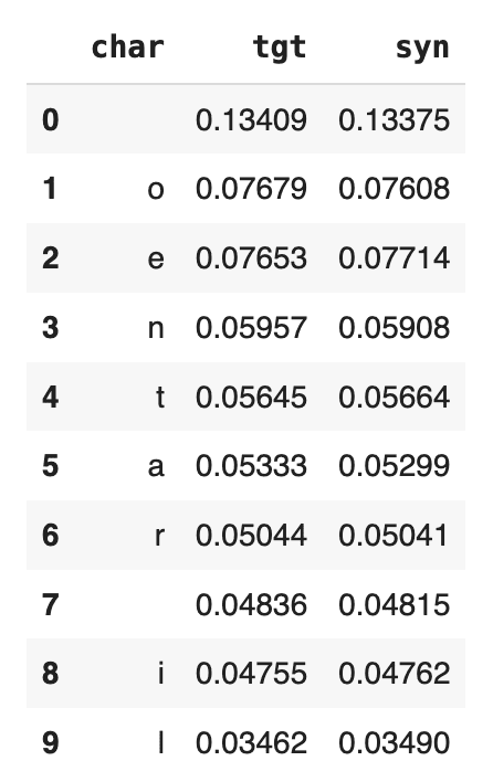
We see that “o” and “e” are the 2 most common characters (after the whitespace character), both showing up a little more than 7.6% of the time in the original dataset. If we inspect the syn column, we see that the percentages match up nicely. There are about as many “o”s and “e”s in the synthetic dataset as there are in the original now. And this goes for the other characters in the list as well.
For a visualization of all the distributions of the 100 most common characters, you can run the code below:
import matplotlib.pyplot as plt
ax = title_char_freq.head(100).plot.line()
plt.title('Distribution of Char Frequencies')
plt.show()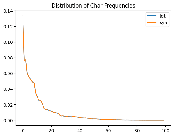
We see that the original distribution (in light blue) and the synthetic distribution (orange) are almost identical. This is another important confirmation that the statistical properties of the original text data are being preserved during the synthetic text generation.
Term frequency distribution
Let’s now do the same exercise we did above but with words (or “terms”) instead of characters. We will look at the term frequency distribution: how many times each term shows up in the dataset and how this compares across the synthetic and original datasets.
The code below performs some data cleaning and then performs the analysis and displays the 10 most frequently used terms.
import re

def sanitize(s):
    s = str(s).lower()
    s = re.sub('[\\,\\.\\)\\(\\!\\"\\:\\/]', " ", s)
    s = re.sub("[ ]+", " ", s)
    return s

tgt["terms"] = tgt["title"].apply(lambda x: sanitize(x)).str.split(" ")
syn["terms"] = syn["title"].apply(lambda x: sanitize(x)).str.split(" ")
title_term_freq = (
    pd.merge(
        tgt["terms"]
        .explode()
        .value_counts(normalize=True)
        .to_frame("tgt")
        .reset_index(),
        syn["terms"]
        .explode()
        .value_counts(normalize=True)
        .to_frame("syn")
        .reset_index(),
        on="index",
        how="outer",
    )
    .rename(columns={"index": "term"})
    .round(5)
)
display(title_term_freq.head(10))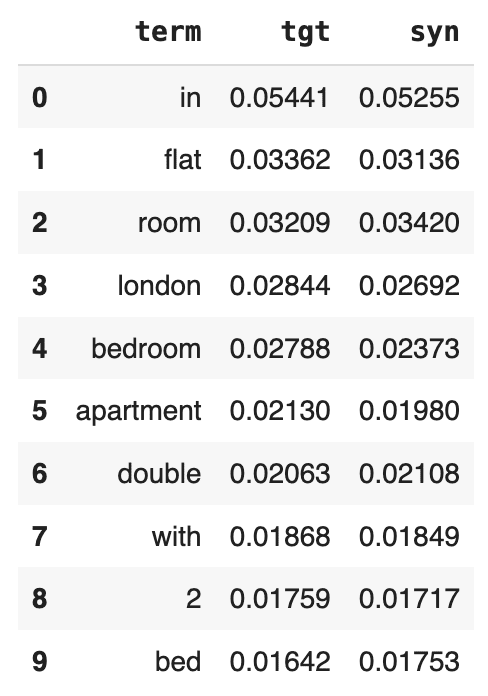
You can also take a look at the 10 least-common words:
display(title_term_freq.head(200).tail(10))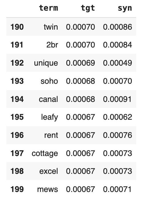
And again, plot the entire distribution for a comprehensive overview:
ax = title_term_freq.head(100).plot.line()
plt.title('Distribution of Term Frequencies')
plt.show()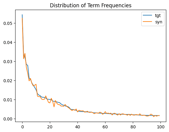
Just as we saw above with the character frequency distribution, we see a close match between the original and synthetic term frequency distributions. The statistical properties of the original dataset are being preserved.
Term co-occurrence
As a final statistical test, let’s take a look at the term co-occurrence: how often a word appears in a given listing title given the presence of another word. For example, how many words that contain the word “heart” also contain the word “London”?
The code below defines a helper function to calculate the term co-occurrence given two words:
def calc_conditional_probability(term1, term2):
    tgt_beds = tgt["title"][
        tgt["title"].str.lower().str.contains(term1).fillna(False)
    ]
    syn_beds = syn["title"][
        syn["title"].str.lower().str.contains(term1).fillna(False)
    ]
    tgt_beds_double = tgt_beds.str.lower().str.contains(term2).mean()
    syn_beds_double = syn_beds.str.lower().str.contains(term2).mean()
    print(
        f"{tgt_beds_double:.0%} of actual Listings, that contain `{term1}`, also contain `{term2}`"
    )
    print(
        f"{syn_beds_double:.0%} of synthetic Listings, that contain `{term1}`, also contain `{term2}`"
    )
    print("")
Let’s run this function for a few different examples of word combinations:
calc_conditional_probability('bed', 'double')
calc_conditional_probability('bed', 'king')
calc_conditional_probability('heart', 'london')
calc_conditional_probability('london', 'heart')
14% of actual Listings, that contain `bed`, also contain `double`
13% of synthetic Listings, that contain `bed`, also contain `double`
7% of actual Listings, that contain `bed`, also contain `king`
6% of synthetic Listings, that contain `bed`, also contain `king`
28% of actual Listings, that contain `heart`, also contain `london`
26% of synthetic Listings, that contain `heart`, also contain `london`
4% of actual Listings, that contain `london`, also contain `heart`
4% of synthetic Listings, that contain `london`, also contain `heart`
Once again, we see that the term co-occurrences are being accurately preserved (with some minor variation) during the process of generating the synthetic text.
Now you might be asking yourself: if all of these characteristics are maintained, what are the chances that we'll end up with exact matches, i.e., synthetic records with the exact same title value as a record in the original dataset? Or perhaps even a synthetic record with the exact same values for all the columns?
Let's start by trying to find an exact match for 1 specific synthetic title value. Choose a title_value from the original title column and then use the code below to search for an exact match in the synthetic title column.
title_value = "Airy large double room"
tgt.loc[tgt["title"].str.contains(title_value, case=False, na=False)]
We see that there is an exact (partial) match in this case. Depending on the value you choose, you may or may not find an exact match. But how big of a problem is it that we find an exact partial match? Is this a sign of a potential privacy breach? It’s hard to tell from a single row-by-row validation, and, more importantly, this process doesn't scale very well to the 71K rows in the dataset.
Evaluate the privacy of synthetic text
Let's perform a more comprehensive check for privacy by looking for exact matches between the synthetic and the original.
To do that, first split the original data into two equally-sized sets and measure the number of matches between those two sets:
n = int(tgt.shape[0]/2)
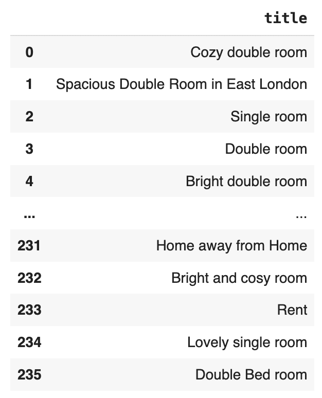
pd.merge(tgt[['title']][:n].drop_duplicates(), tgt[['title']][n:].drop_duplicates())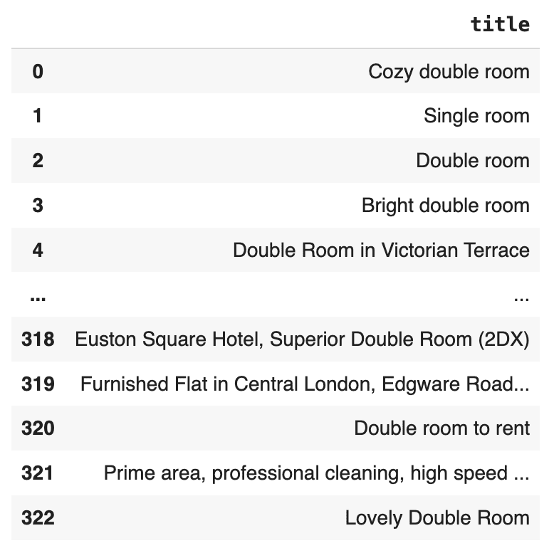
This is interesting. There are 323 cases of duplicate title values in the original dataset itself. This means that the appearance of one of these duplicate title values in the synthetic dataset would not point to a single record in the original dataset and therefore does not constitute a privacy concern.
What is important to find out here is whether the number of exact matches between the synthetic dataset and the original dataset exceeds the number of exact matches within the original dataset itself.
Let’s find out.
Take an equally-sized subset of the synthetic data, and again measure the number of matches between that set and the original data:
pd.merge(
    tgt[["title"]][:n].drop_duplicates(), syn[["title"]][:n].drop_duplicates()
)
There are 236 exact matches between the synthetic dataset and the original, but significantly less than the number of exact matches that exist within the original dataset itself. Moreover, we can see that they occur only for the most commonly used descriptions.
It’s important to note that matching values or matching complete records are by themselves not a sign of a privacy leak. They are only an issue if they occur more frequently than we would expect based on the original dataset. Also note that removing those exact matches via post-processing would actually have a detrimental contrary effect. The absence of a value like "Lovely single room" in a sufficiently large synthetic text corpus would, in this case, actually give away the fact that this sentence was present in the original. See our peer-reviewed academic paper for more context on this topic.
Correlations between text and other columns
So far, we have inspected the statistical quality and privacy preservation of the synthesized text column itself. We have seen that both the statistical properties and the privacy of the original dataset are carefully maintained.
But what about the correlations that exist between the text columns and other columns in the dataset? Are these correlations also maintained during synthesization?
Let’s take a look by inspecting the relationship between the title and price columns. Specifically, we will look at the median price of listings that contain specific words that we would expect to be associated with a higher (e.g., “luxury”) or lower (e.g., “small”) price. We will do this for both the original and synthetic datasets and compare.
The code below prepares the data and defines a helper function to print the results:
tgt_term_price = (
    tgt[["terms", "price"]]
    .explode(column="terms")
    .groupby("terms")["price"]
    .median()
)
syn_term_price = (
    syn[["terms", "price"]]
    .explode(column="terms")
    .groupby("terms")["price"]
    .median()
)

def print_term_price(term):
    print(
        f"Median Price of actual Listings, that contain `{term}`: ${tgt_term_price[term]:.0f}"
    )
    print(
        f"Median Price of synthetic Listings, that contain `{term}`: ${syn_term_price[term]:.0f}"
    )

print("")
Let’s then compare the median price for specific terms across the two datasets:
print_term_price("luxury")
print_term_price("stylish")
print_term_price("cozy")
print_term_price("small")
Median Price of actual Listings, that contain `luxury`: $180
Median Price of synthetic Listings, that contain `luxury`: $179
Median Price of actual Listings, that contain `stylish`: $134
Median Price of synthetic Listings, that contain `stylish`: $140
Median Price of actual Listings, that contain `cozy`: $70
Median Price of synthetic Listings, that contain `cozy`: $70
Median Price of actual Listings, that contain `small`: $55
Median Price of synthetic Listings, that contain `small`: $60
We can see that correlations between the text and price features are very well retained.
Generate synthetic text with MOSTLY AI
In this tutorial, you have learned how to generate synthetic text using MOSTLY AI by simply specifying the correct Generation Method for the columns in your dataset that contain unstructured text. You have also taken a deep dive into evaluating the statistical integrity and privacy preservation of the generated synthetic text by looking at character and term frequencies, term co-occurrence, and the correlations between the text column and other features in the dataset. These statistical and privacy indicators are crucial components for creating high-quality synthetic data.
What’s next?
In addition to walking through the above instructions, we suggest experimenting with the following in order to get even more hands-on experience generating synthetic text data:
- analyzing further correlations, also for host_name
- using a different generation mood, e.g., conservative sampling. Take a look at the end of the video tutorial for a quick walkthrough.
- using a different dataset, e.g., the Austrian First Name dataset
You can also head straight to the other synthetic data tutorials:
- Evaluate synthetic data quality using downstream ML
- Optimize your training sample size for synthetic data accuracy
- Rebalancing your data for ML classification problems
- Perform conditional data generation
- Explainable AI with synthetic data
- How to generate synthetic data
In this tutorial, you will learn how to perform conditional data generation. As the name suggests, this method of synthetic data generation is useful when you want to have more fine-grained control over the statistical distributions of your synthetic data by setting certain conditions in advance. This can be useful across a range of use cases, such as performing data simulation, tackling data drift, or when you want to retain certain columns as they are during synthesization.
You will work through two use cases in this tutorial. In the first use case, you will be working with the UCI Adult Income dataset in order to simulate what this dataset would look like if there was no gender income gap. In the second use case, you will be working with Airbnb accommodation data for Manhattan, which contains geolocation coordinates for each accommodation.
To gain useful insights from this dataset, this geolocation data will need to remain exactly as it is in the original dataset during synthesization. In both cases, you will end up with data that is partially pre-determined by the user (to either remain in its original form or follow a specific distribution) and partially synthesized.
It’s important to note that the synthetic data you generate using conditional data generation is still statistically representative within the conditional context that you’ve created. The degree of privacy preservation of the resulting synthetic dataset is largely dependent on the privacy of the provided fixed attributes.
The Python code for this tutorial is publicly available and runnable in this Google Colab notebook.
How does conditional data generation work?
We’ve broken down the process of conditional data generation with MOSTLY AI into 5 steps below. We’ll describe the steps here first, and in the following sections, you will get a chance to implement them yourself.
- We’ll start by splitting the original data table into two tables. The first table should contain all the columns that you want to hold fixed, the conditions based on which you want to generate your partially synthetic data. The second table will contain all the other columns, which will be synthesized within the context of the first table.
- We’ll then define the relationship between these two tables. The first table (containing the context data) should be set as a subject table, and the second table (containing the target data to be synthesized) as a linked table.
- Next, we will train a MOSTLY AI synthetic data generation model using this two-table setup. Note that this is just an intermediate step that will, in fact, create fully synthetic data since we are using the full original dataset (just split into two) and have not set any specific conditions yet.
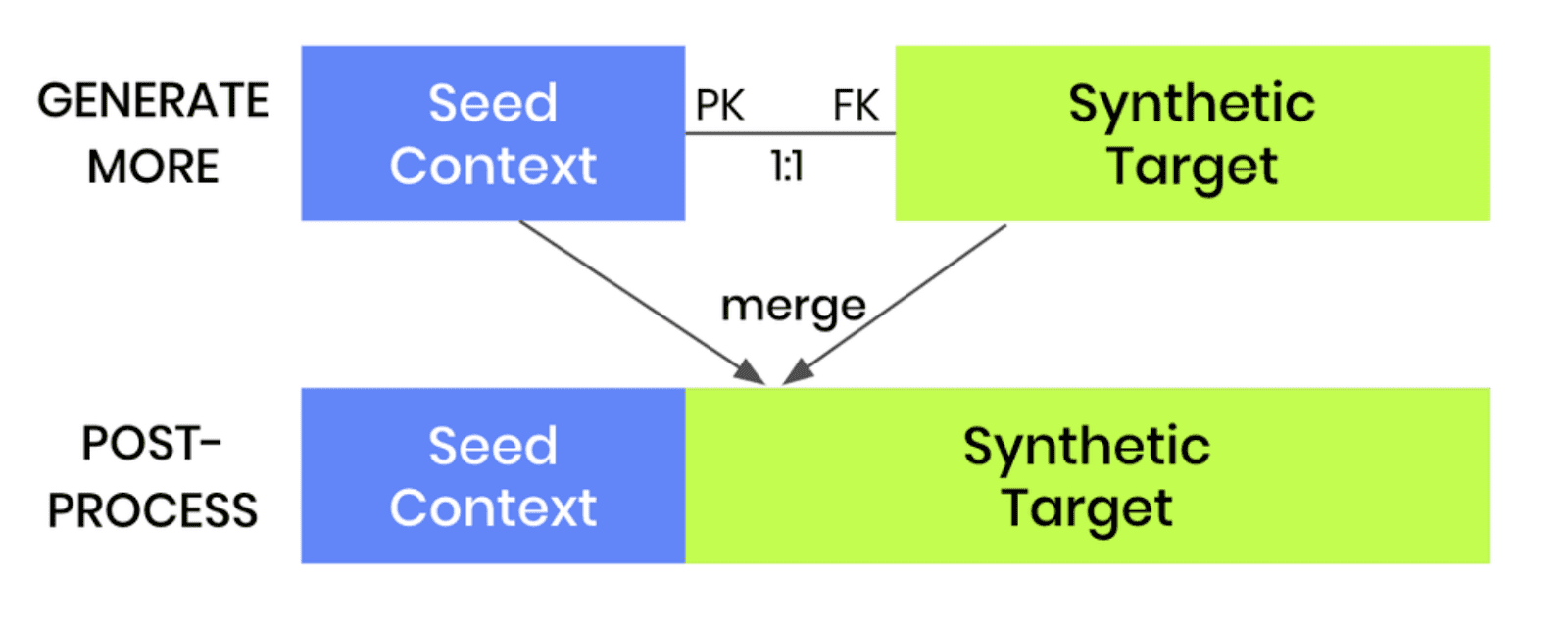
- Once the model is trained, we can then use it to generate more data by selecting the “Generate with seed” option. This option allows you to set conditions within which to create partially synthetic data. Any data you upload as the seed context will be used as fixed attributes that will appear as they are in the resulting synthetic dataset. Note that your seed context dataset must contain a matching ID column. The output of this step will be your synthetic target data.
- As a final post-processing step, we’ll merge the seed context with fixed attribute columns to your synthetic target data to get the complete, partially synthetic dataset created using conditional data generation.
Note that this same kind of conditional data generation can also be performed for two-table setups. The process is even easier in that case, as the pre-and post-processing steps are not required. Once a two-table model is trained, one can simply generate more data and provide a new subject table as the seed for the linked table.
Let’s see it in practice for our first use case: performing data simulation on the UCI Adult Income dataset to see what the data would look like if there was no gender income gap.
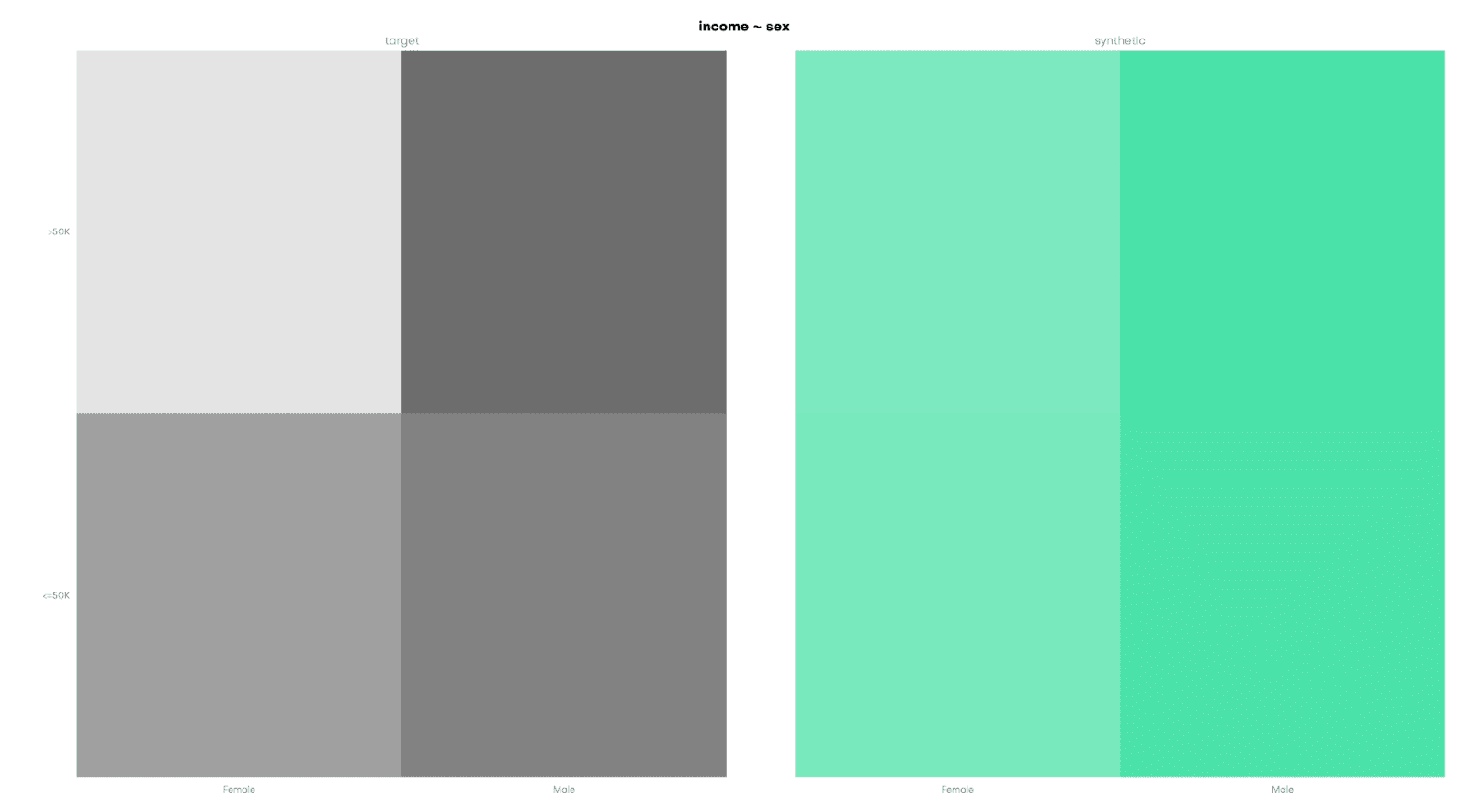
Conditional data generation for data simulation
For this use case, we will be using a subset of the UCI Adult Income dataset, consisting of 10k records and 10 attributes. Our aim here is to provide a specific distribution for the sex and income columns and see how the other columns will change based on these predetermined conditions.
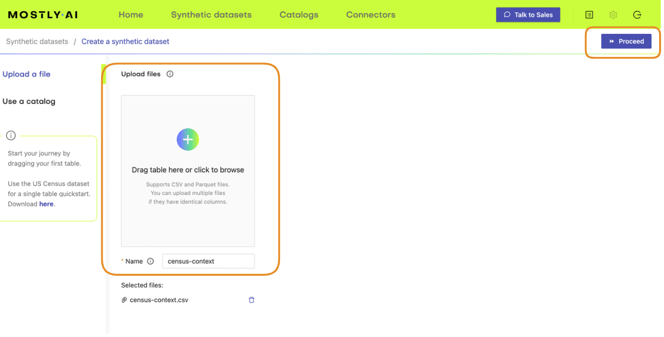
Preprocess your data
As described in the steps above, your first task will be to enrich the dataset with a unique ID column and then split the data into two tables, i.e. two CSV files. The first table should contain the columns you want to control, in this case, the sex and income columns. The second table should contain the columns you want to synthesize, in this case, all the other columns.
df = pd.read_csv(f'{repo}/census.csv')
# define list of columns, on which we want to condition on
ctx_cols = ['sex', 'income']
tgt_cols = [c for c in df.columns if c not in ctx_cols]
# insert unique ID column
df.insert(0, 'id', pd.Series(range(df.shape[0])))
# persist actual context, that will be used as subject table
df_ctx = df[['id'] + ctx_cols]
df_ctx.to_csv('census-context.csv', index=False)
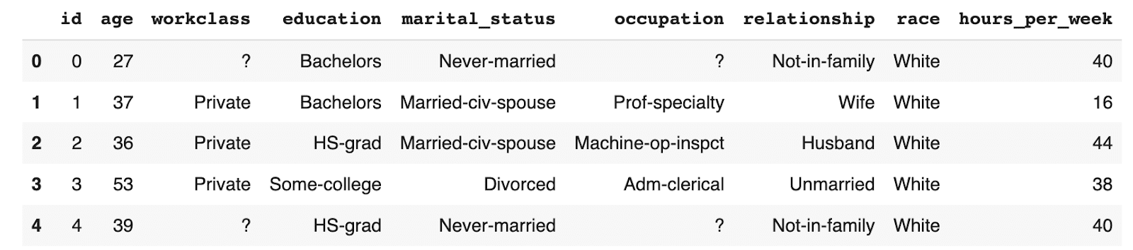
display(df_ctx.head())
# persist actual target, that will be used as linked table
df_tgt = df[['id'] + tgt_cols]
df_tgt.to_csv('census-target.csv', index=False)
display(df_tgt.head())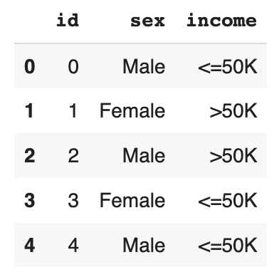
Save the resulting tables to disk as CSV files in order to upload them to MOSTLY AI in the next step. If you are working in Colab this will require an extra step (provided in the notebook) in order to download the files from the Colab server to disk.
Train a generative model with MOSTLY AI
Use the CSV files you have just created to train a synthetic data generation model using MOSTLY AI.
- Navigate to your MOSTLY AI account and go to the “Synthetic datasets” tab. Click on “Create synthetic data” to start a new job.
- Upload the census-context.csv (the file containing your context data).
- Once the upload is complete, click on “Add table” and upload census-target.csv (the file containing your target data) here.
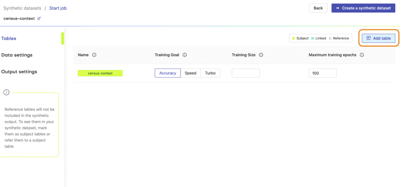
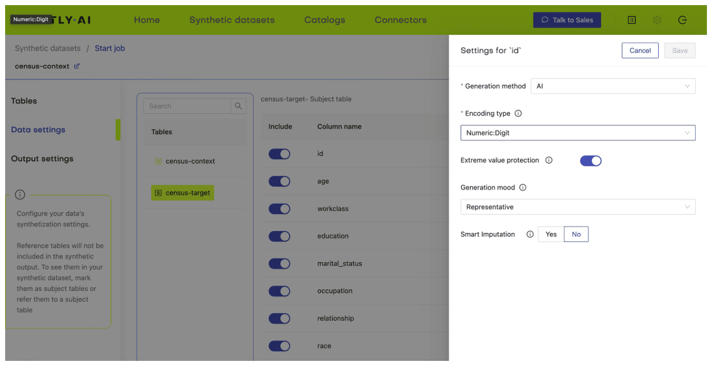
- Next, define the table relationship by navigating to “Data Settings,” selecting the ID column of the context table, and setting the following settings:
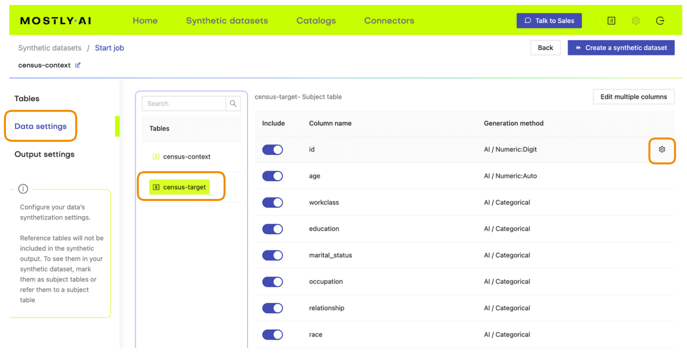
- Confirm that your census-context table is now set as the subject table and the
census-targetas linked table.
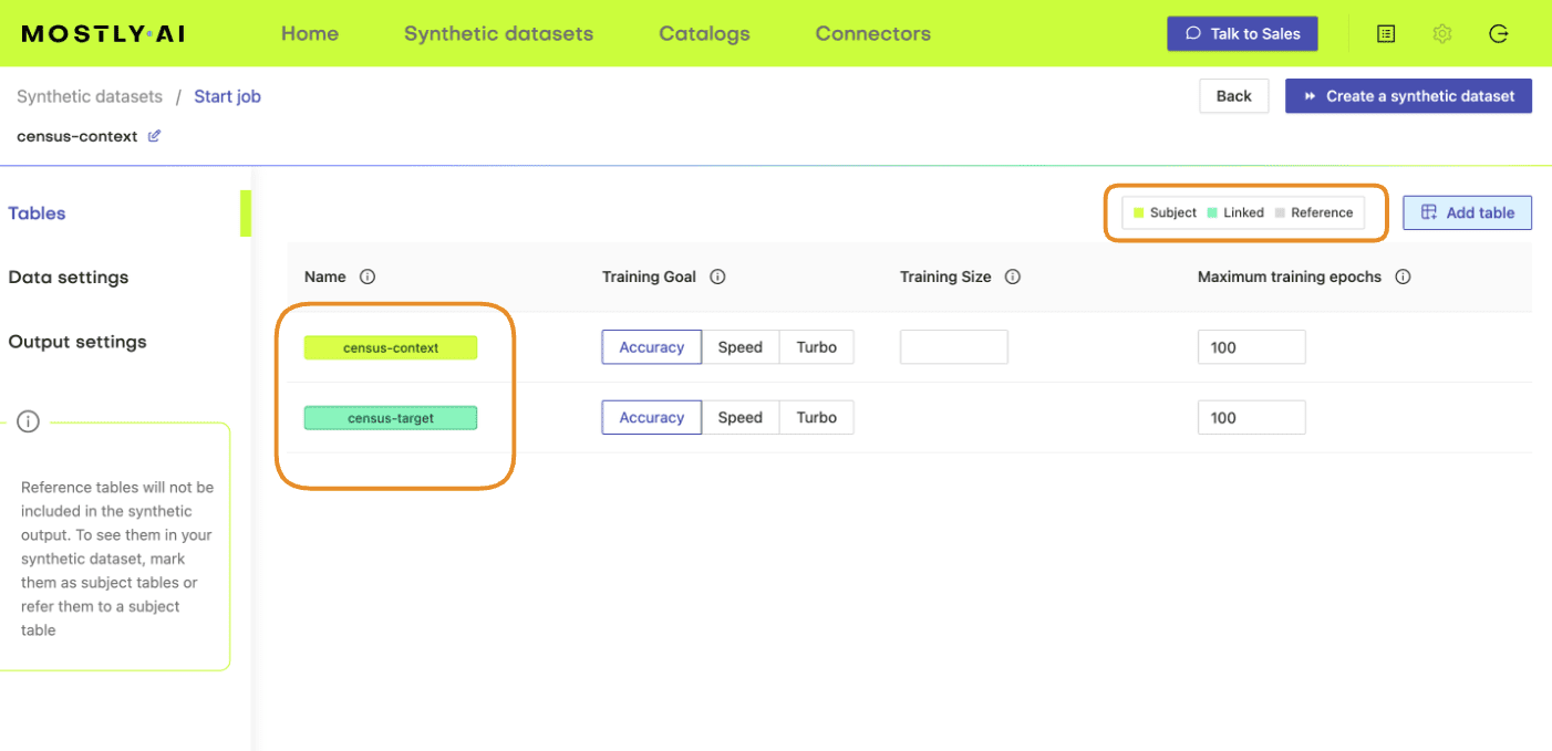
- Click “Create a synthetic dataset” to launch the job and train the model. As noted before, the resulting synthetic data is not of particular interest at the moment. We are interested in the model that is created and will use it for conditional data generation in the next section.
Conditional data generation with MOSTLY AI
Now that we have our base model, we will need to specify the conditions within which we want to create synthetic data. For this first use case, you will simulate what the dataset will look like if there was no gender income gap.
- Create a CSV file that contains the same columns as the context file but now containing the specific distributions of those variables you are interested in simulating. In this case, we’ll create a dataset containing an even split between male and female records as well as an even distribution of high- and low-income records. You can use the code block below to do this.
import numpy as np
np.random.seed(1)


n = 10_000
p_inc = (df.income=='>50K').mean()
seed = pd.DataFrame({
    'id': [f's{i:04}' for i in range(n)],
    'sex': np.random.choice(['Male', 'Female'], n, p=[.5, .5]),
    'income': np.random.choice(['<=50K', '>50K'], n, p=[1-p_inc, p_inc]),
})
seed.to_csv('census-seed.csv', index=False)
seed.sample(8)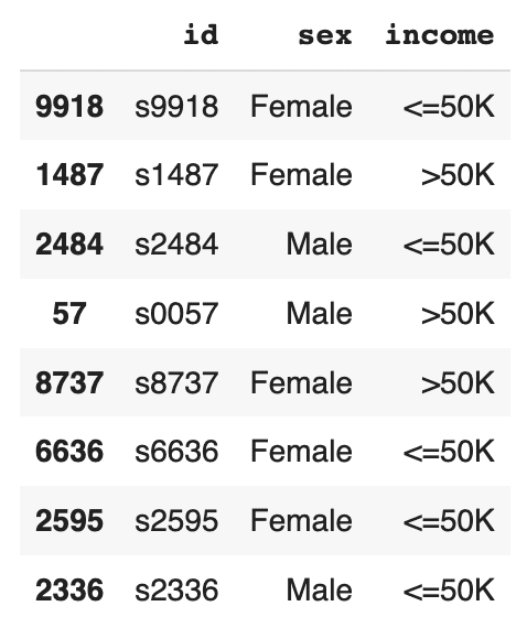
The resulting DataFrame contains an even income split between males and females, i.e. no gender income gap.
- Download this CSV to disk as
census-seed.csv
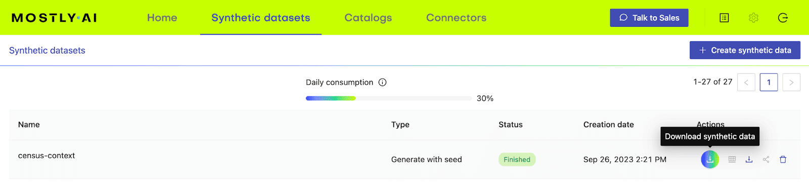
- In your MOSTLY AI account, click on the “Generate more data” button located to the right of the model that you have just trained.
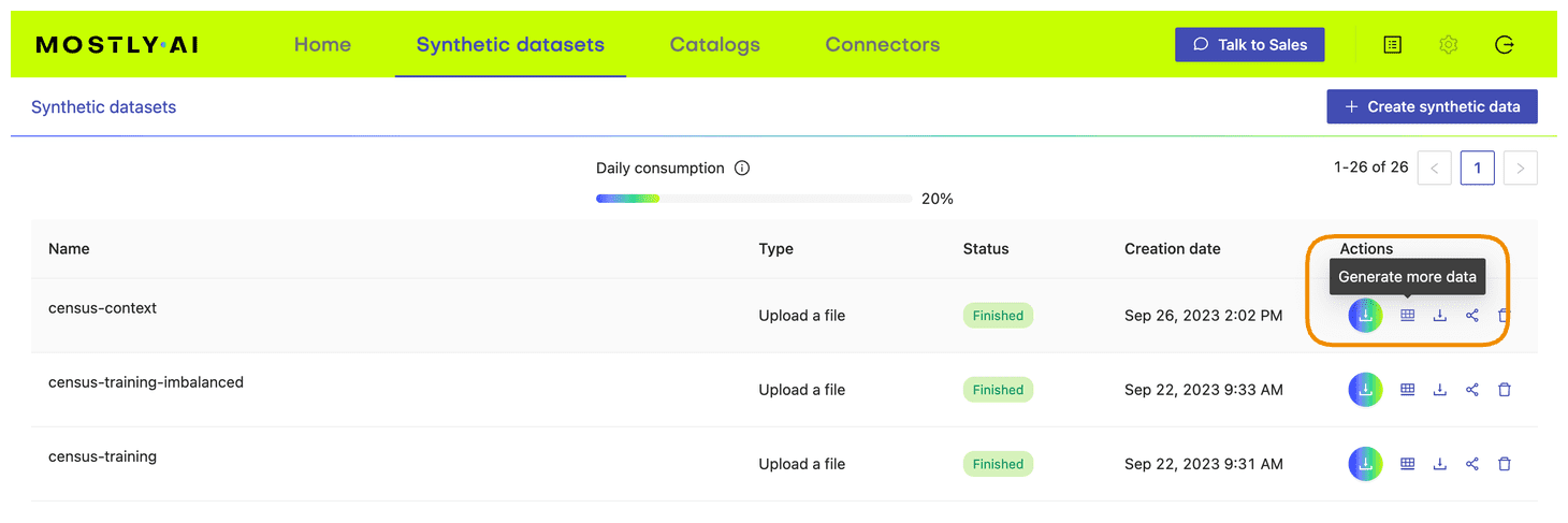
- Select the “Generate with seed” option. This allows you to specify conditions that the synthesization should respect. Upload
census-seed.csvhere.
- Generate more data by clicking on “Generate”. Once completed, download the resulting synthetic dataset as CSV.
- Merge the synthetic target data to your seed context columns to get your complete, conditionally generated dataset.
# merge fixed seed with synthetic target to
# a single partially synthetic dataset
syn = pd.read_csv(syn_file_path)
syn = pd.merge(seed, syn, on='id').drop(columns='id')
Explore synthetic data
Let’s take a look at the data you have just created using conditional data generation. Start by showing 10 randomly sampled synthetic records. You can run this line multiple times to see different samples.
syn.sample(n=10)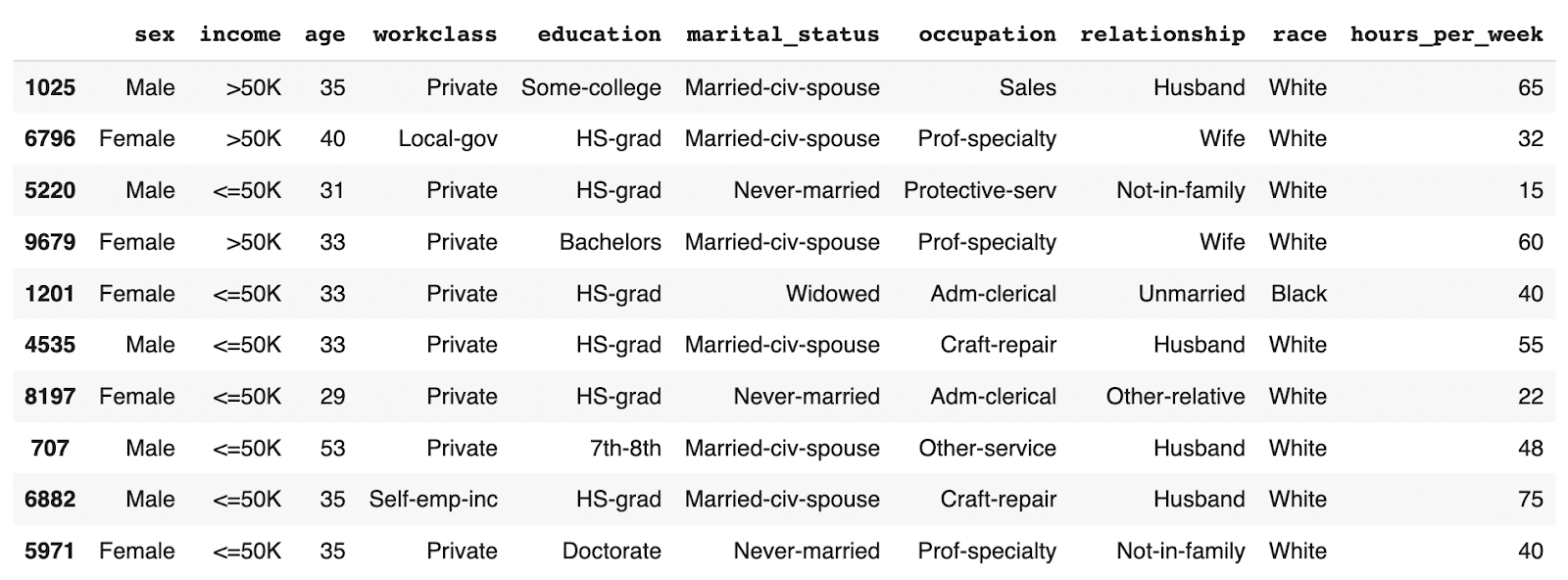
You can see that the partially synthetic dataset consists of about half male and half female records.
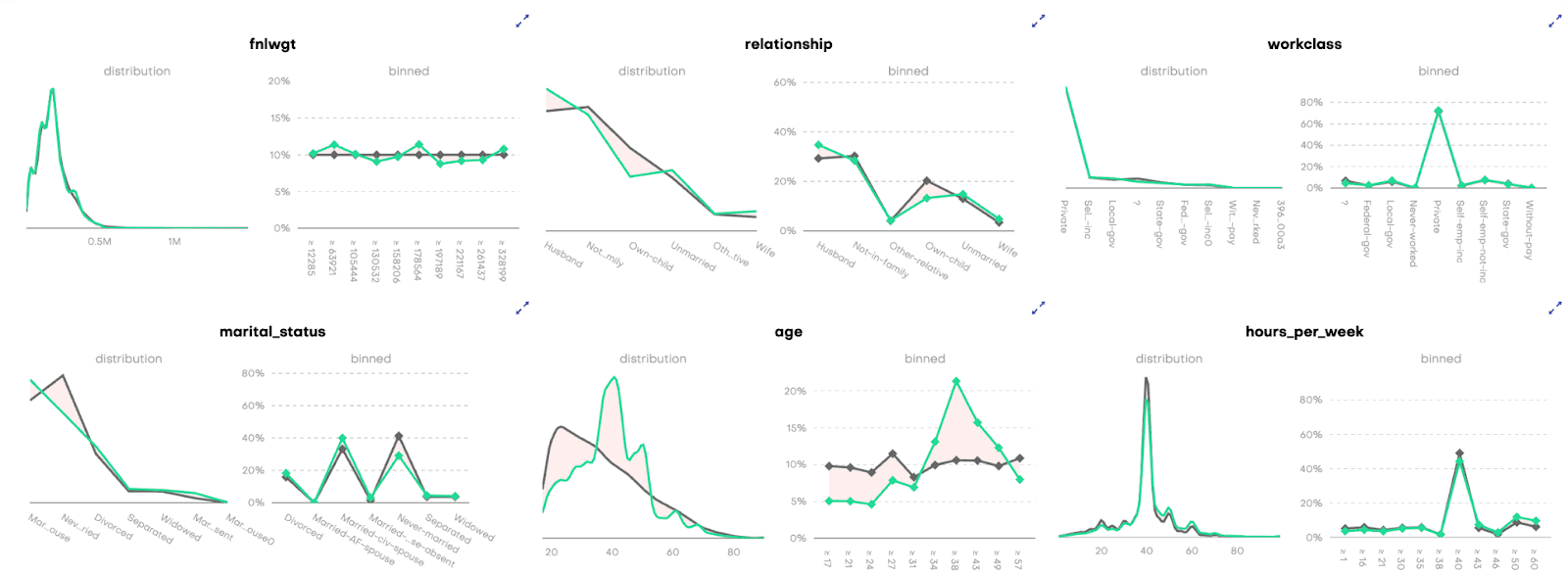
Let's now compare the age distribution of records from the original data against those from the partially synthetic data. We’ll plot both the original and synthetic distributions on a single plot to compare.
import matplotlib.pyplot as plt
plt.xlim(10, 95)
plt.title('Female Age Distribution')
plt.xlabel('Age')
df[df.sex=='Female'].age.plot.kde(color='black', bw_method=0.2)
syn[syn.sex=='Female'].age.plot.kde(color='#24db96', bw_method=0.2)
plt.legend({'original': 'black', 'synthetic': '#24db96'})
plt.show()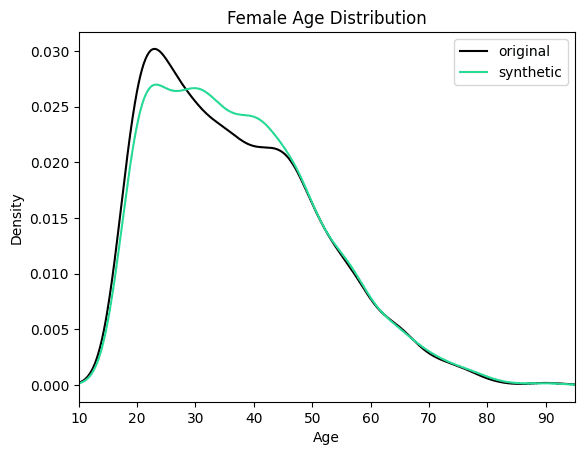
We can see clearly that the synthesized female records are now significantly older in order to meet the criteria of removing the gender income gap. Similarly, you can now study other shifts in the distributions that follow as a consequence of the provided seed data.
Conditional generation to retain original data
In the above use case, you customized your data generation process in order to simulate a particular, predetermined distribution for specific columns of interest (i.e. no gender income gap). In the following section, we will explore another useful application of conditional generation: retaining certain columns of the original dataset exactly as they are while letting the rest of the columns be synthesized. This can be a useful tool in situations when it is crucial to retain parts of the original dataset.
In this section, you will be working with a dataset containing the 2019 Airbnb listings in Manhattan. For this use case, it is crucial to preserve the exact locations of the listings in order to avoid situations in which the synthetic dataset contains records in impossible or irrelevant locations (in the middle of the Hudson River, for example, or outside of Manhattan entirely).
You need the ability to execute control over the location column to ensure the relevance and utility of your resulting synthetic dataset - and conditional data generation gives you exactly that level of control.
Let’s look at this type of conditional data generation in action. Since many of the steps will be the same as in the use case above, this section will be a bit more compact.
Preprocess your data
Start by enriching the DataFrame with an id column. Then split it into two DataFrames: airbnb-context.csv and airbnb-target.csv. Additionally, you will need to concatenate the latitude and longitude columns together into a single column. This is the format expected by MOSTLY AI, in order to improve its representation of geographical information.
df_orig = pd.read_csv(f'{repo}/airbnb.csv')

df = df_orig.copy()

# concatenate latitude and longitude to "LAT, LONG" format
df['LAT_LONG'] = (
    df['latitude'].astype(str) + ', ' + df['longitude'].astype(str)
)
df = df.drop(columns=['latitude', 'longitude'])

# define list of columns, on which we want to condition on
ctx_cols = ['neighbourhood', 'LAT_LONG']
tgt_cols = [c for c in df.columns if c not in ctx_cols]

# enricht with ID column
df.insert(0, 'id', pd.Series(range(df.shape[0])))

# persist actual context, that will be used as subject table
df_ctx = df[['id'] + ctx_cols]
df_ctx.to_csv('airbnb-locations.csv', index=False)
display(df_ctx.head())

# persist actual target, that will be used as linked table
df_tgt = df[['id'] + tgt_cols]
df_tgt.to_csv('airbnb-data.csv', index=False)
display(df_tgt.head())
Train generative model with MOSTLY AI
Follow the same steps as in the first use case to train a generative model with MOSTLY AI. Upload airbnb-locations.csv first, then add the airbnb-data.csv file and define the table relationship by setting the ID column of the airbnb-data table as the Foreign Key pointing to the ID column of the airbnb-locations file. Refer to the detailed steps in the first use case if you need a refresher on how to do that.
Additionally, you will need to configure the LAT_LONG column to the encoding type Lat, Long in order for MOSTLY AI to correctly process this geolocation data.
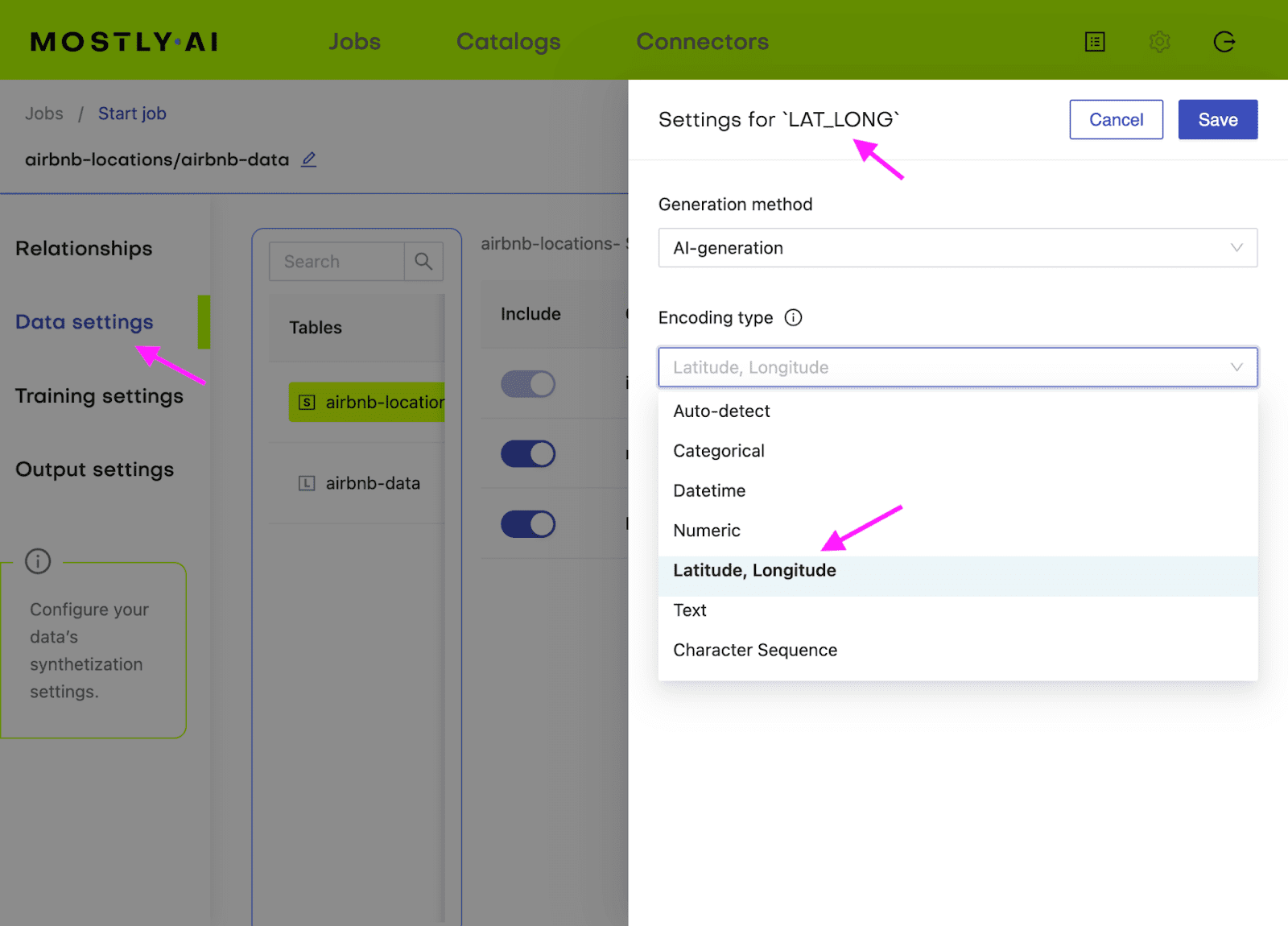
Generate more data with MOSTLY AI
Once the training has finished, you can generate your partially synthetic data. In the previous example, this is where we uploaded the seed context file that we generated. In this case, we actually want our fixed attributes to remain exactly as they are in the original dataset. This means you can simply re-upload the original airbnb-locations.csv as the seed file to the "generate more data" form. Once the data has been generated, download the data as a CSV file again. Merge the two files (seed and synthetic target) and split the LAT_LONG column back into separate latitude and longitude columns.
# merge fixed seed with synthetic target
# to a single partially synthetic dataset
syn = pd.read_csv(syn_file_path)
syn_partial = pd.merge(df_ctx, syn, on='id')

# split LAT_LONG into separate columns again
syn_partial = pd.concat([
    syn_partial,
    syn_partial.LAT_LONG.str.split(', ', n=2, expand=True).rename(columns={0: 'latitude', 1: 'longitude'}).astype(float),
], axis=1).drop(columns='LAT_LONG')

# restore column order
syn_partial = syn_partial[df_orig.columns]
Explore synthetic data
Let's compare the price distribution of listings across Manhattan. Note that while the locations in the partially synthetic data are actual locations, all other attributes, including the price per night, are randomly sampled by the generative model. Still, these prices remain statistically representative given the context, i.e. the location within Manhattan.
The code block below plots the price distribution of the original dataset as well as that of the partially synthetic dataset. We hope to see the exact same locations (so no listings in the middle of the Hudson River) and a price distribution that is statistically similar but not exactly the same.
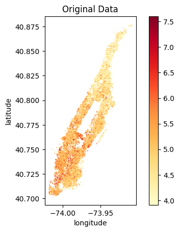
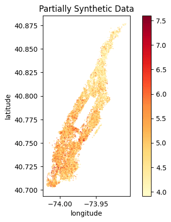
We can clearly see that the locations of the listings have been preserved and the price distribution is accurately represented. We can see a similar gradient of lower prices per night in the Northern tip of Manhattan as well as high prices per night at the Southern end of Central Park and the Financial District.
Of course, you could also create fully synthetic data for this use case, and this will yield statistically representative locations with their attributes. However, as these locations do not necessarily exist (e.g. they might end up in the Hudson River), the demonstrated approach allows you to combine the best of both worlds.
Conditional data generation with MOSTLY AI
In this tutorial, you have learned how to perform conditional data generation. You have explored the value conditional generation can provide by working through two use cases: one in which you simulated a specific distribution for a subset of the columns (the Adult Income dataset with no gender income gap) and another in which you retained certain columns of the original dataset (the locations of the Airbnb listings). In both cases, you were able to execute more fine-grained control over the statistical distributions of your synthetic data by setting certain conditions in advance.
The result is a dataset that is partially pre-determined by the user (to either remain in its original form or follow a specific distribution) and partially synthesized. You can now put your conditional data generation skill to use for data simulation, to tackle data drift, or for other relevant use cases.
What’s next?
In addition to walking through the above instructions, we suggest experimenting with the following to get an even deeper understanding of conditional data generation:
- use a different set of fixed columns for the US Census dataset
- generate a very large number of records for a fixed value set, e.g. create 1 million records of 48-year-old female Professors
- perform a fully synthetic dataset of the Airbnb Manhattan dataset
In this tutorial, you will learn how to use synthetic rebalancing to improve the performance of machine-learning (ML) models on imbalanced classification problems. Rebalancing can be useful when you want to learn more of an otherwise small or underrepresented population segment by generating more examples of it. Specifically, we will look at classification ML applications in which the minority class accounts for less than 0.1% of the data.
We will start with a heavily imbalanced dataset. We will use synthetic rebalancing to create more high-quality, statistically representative instances of the minority class. We will compare this method against 2 other types of rebalancing to explore their advantages and pitfalls. We will then train a downstream machine learning model on each of the rebalanced datasets and evaluate their relative predictive performance. The Python code for this tutorial is publicly available and runnable in this Google Colab notebook.
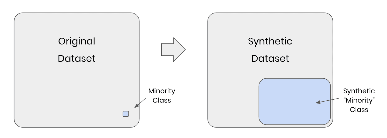
Fig 1 - Synthetic rebalancing creates more statistically representative instances of the minority class
Why should I rebalance my dataset?
In heavily imbalanced classification projects, a machine learning model has very little data to effectively learn patterns about the minority class. This will affect its ability to correctly class instances of this minority class in the real (non-training) data when the model is put into production. A common real-world example is credit card fraud detection: the overwhelming majority of credit card transactions are perfectly legitimate, but it is precisely the rare occurrences of illegitimate use that we would be interested in capturing.
Let’s say we have a training dataset with 100,000 credit card transactions which contains 999,900 legitimate transactions and 100 fraudulent ones. A machine-learning model trained on this dataset would have ample opportunity to learn about all the different kinds of legitimate transactions, but only a small sample of 100 records in which to learn everything it can about fraudulent behavior. Once this model is put into production, the probability is high that fraudulent transactions will occur that do not follow any of the patterns seen in the small training sample of 100 fraudulent records. The machine learning model is unlikely to classify these fraudulent transactions.
So how can we address this problem? We need to give our machine learning model more examples of fraudulent transactions in order to ensure optimal predictive performance in production. This can be achieved through rebalancing.
Rebalancing Methods
We will explore three types of rebalancing:
- Random (or “naive”) oversampling
- SMOTE upsampling
- Synthetic rebalancing
The tutorial will give you hands-on experience with each type of rebalancing and provide you with in-depth understanding of the differences between them so you can choose the right method for your use case. We’ll start by generating an imbalanced dataset and showing you how to perform synthetic rebalancing using MOSTLY AI's synthetic data generator. We will then compare performance metrics of each rebalancing method on a downstream ML task.
But first things first: we need some data.
Generate an Imbalanced Dataset
For this tutorial, we will be using the UCI Adult Income dataset, as well as the same training and validation split, that was used in the Train-Synthetic-Test-Real tutorial. However, for this tutorial we will work with an artificially imbalanced version of the dataset containing only 0.1% of high-income (>50K) records in the training data, by downsampling the minority class. The downsampling has already been done for you, but if you want to reproduce it yourself you can use the code block below:
def create_imbalance(df, target, ratio):
    val_min, val_maj = df[target].value_counts().sort_values().index
    df_maj = df.loc[df[target]==val_maj]
    n_min = int(df_maj.shape[0]/(1-ratio)*ratio)
    df_min = df.loc[df[target]==val_min].sample(n=n_min, random_state=1)
    df_maj = df.loc[df[target]==val_maj]
    df_imb = pd.concat([df_min, df_maj]).sample(frac=1, random_state=1)
    return df_imb

df_trn = pd.read_csv(f'{repo}/census-training.csv')
df_trn_imb = create_imbalance(df_trn, 'income', 1/1000)
df_trn_imb.to_csv('census-training-imbalanced.csv', index=False)
Let’s take a quick look at this imbalanced dataset by randomly sampling 10 rows. For legibility let’s select only a few columns, including the income column as our imbalanced feature of interest:
trn = pd.read_csv(f'{repo}/census-training-imbalanced.csv')
trn.sample(n=10)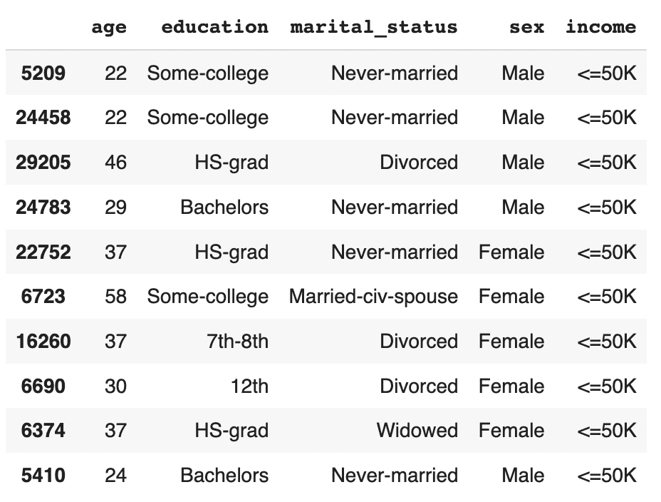
You can try executing the line above multiple times to see different samples. Still, due to the strong class imbalance, the chance of finding a record with high income in a random sample of 10 is minimal. This would be problematic if you were interested in creating a machine learning model that could accurately classify high-income records (which is precisely what we’ll be doing in just a few minutes).
The problem becomes even more clear when we try to sample a specific sub-group in the population. Let’s sample all the female doctorates with a high income in the dataset. Remember, the dataset contains almost 30 thousand records.
trn[
    (trn['income']=='>50K')
    & (trn.sex=='Female')
    & (trn.education=='Doctorate')
]
It turns out there are actually no records of this type in the training data. Of course, we know that these kinds of individuals exist in the real world and so our machine learning model is likely to encounter them when put in production. But having had no instances of this record type in the training data, it is likely that the ML model will fail to classify this kind of record correctly. We need to provide the ML model with a higher quantity and more varied range of training samples of the minority class to remedy this problem.
Synthetic rebalancing with MOSTLY AI
MOSTLY AI offers a synthetic rebalancing feature that can be used with any categorical column. Let’s walk through how this works:
- Download the imbalanced dataset here if you haven’t generated it yourself already. Use Ctrl+S or Cmd+S to save the file locally.
- Go to your MOSTLY AI account and navigate to “Synthetic Datasets”. Upload
census-training-imbalanced.csvand click “Proceed”.
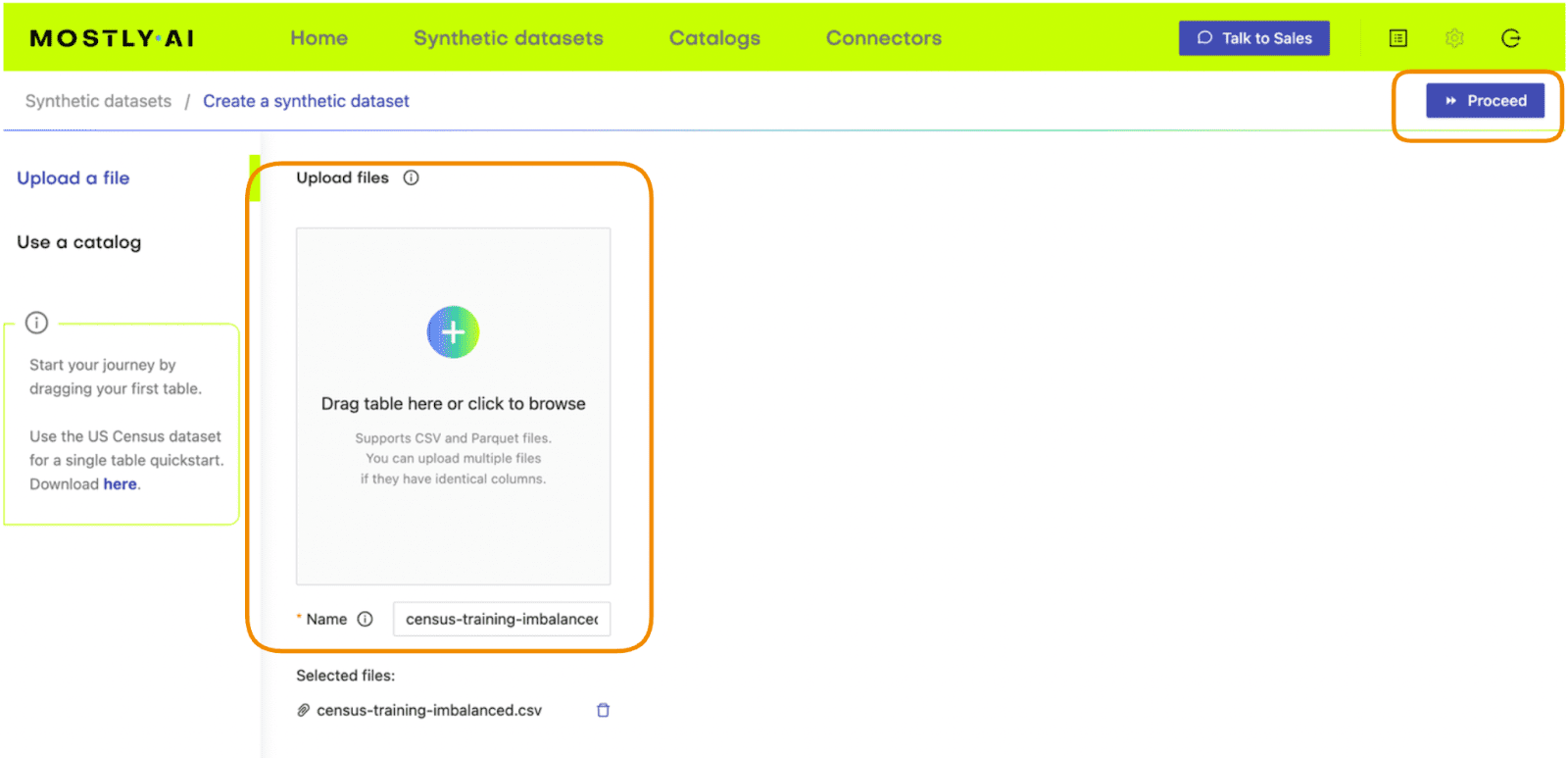
Fig 2 - Upload the original dataset to MOSTLY AI’s synthetic data generator.
- On the next page, click “Data Settings” and then click on the “Income” column
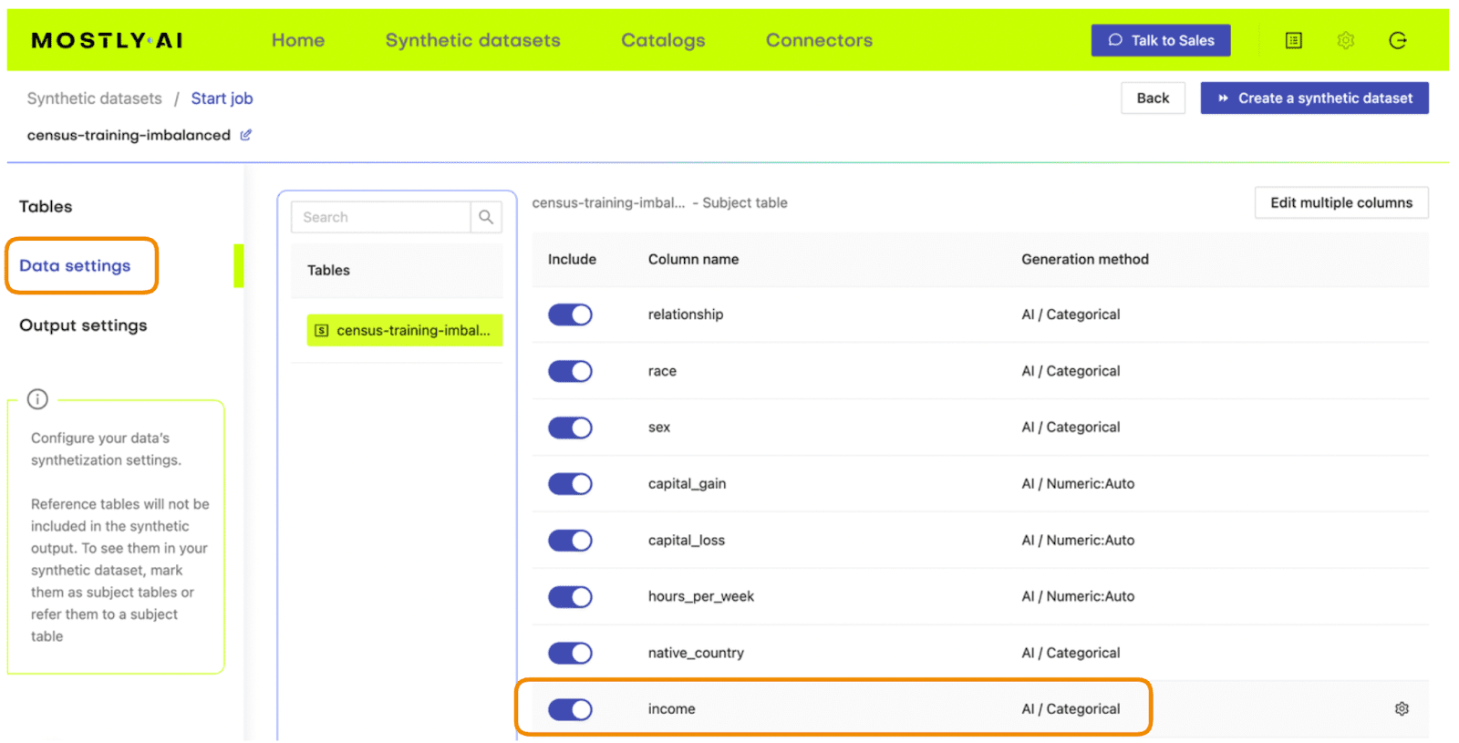
Fig 3 - Navigate to the Data Settings of the Income column.
- Set the Encoding Type to “Categorical” and select the option to “Use this column to rebalance the table”. Then add a new row and rebalance the “>50K” column to be “50%” of the dataset. This will synthetically upsample the minority class to create an even split between high-income and low-income records.
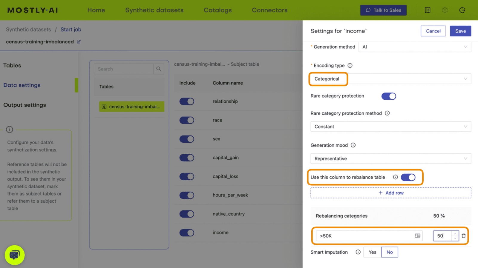
Fig 4 - Set the relevant settings to rebalance the income column.
- Click “Save” and on the next page click “Create a synthetic dataset” to launch the job.
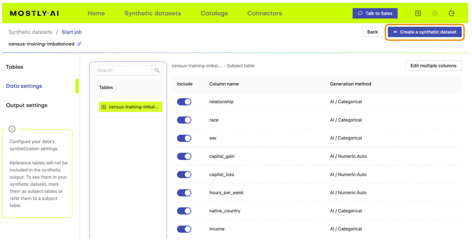
Fig 5 - Launch the synthetic data generation
Once the synthesization is complete, you can download the synthetic dataset to disk. Then return to wherever you are running your code and use the following code block to create a DataFrame containing the synthetic data.
# upload synthetic dataset
import pandas as pd

try:
    # check whether we are in Google colab
    from google.colab import files
    print("running in COLAB mode")
    repo = 'https://github.com/mostly-ai/mostly-tutorials/raw/dev/rebalancing'
    import io
    uploaded = files.upload()
    syn = pd.read_csv(io.BytesIO(list(uploaded.values())[0]))
    print(f"uploaded synthetic data with {syn.shape[0]:,} records and {syn.shape[1]:,} attributes")
except:
    print("running in LOCAL mode")
    repo = '.'
    print("adapt `syn_file_path` to point to your generated synthetic data file")
    syn_file_path = './census-synthetic-balanced.csv'
    syn = pd.read_csv(syn_file_path)
    print(f"read synthetic data with {syn.shape[0]:,} records and {syn.shape[1]:,} attributes")
Let's now repeat the data exploration steps we performed above with the original, imbalanced dataset. First, let’s display 10 randomly sampled synthetic records. We'll subset again for legibility. You can run this line multiple times to get different samples.
# sample 10 random records
syn_sub = syn[['age','education','marital_status','sex','income']]
syn_sub.sample(n=10)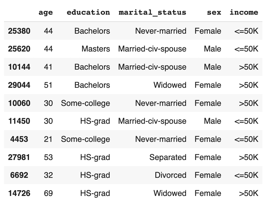
This time, you should see that the records are evenly distributed across the two income classes.
Let's now investigate all female doctorates with a high income in the synthetic, rebalanced dataset:
syn_sub[
    (syn_sub['income']=='>50K')
    & (syn_sub.sex=='Female')
    & (syn_sub.education=='Doctorate')
].sample(n=10)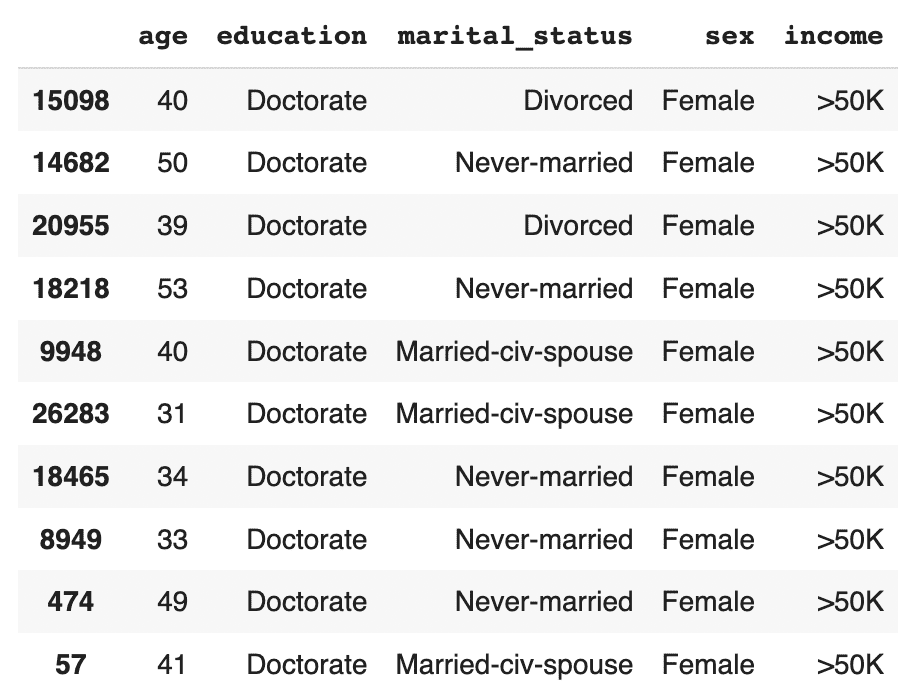
The synthetic data contains a list of realistic, statistically sound female doctorates with a high income. This is great news for our machine learning use case because it means that our ML model will have plenty of data to learn about this particular important subsegment.
Evaluate ML performance using TSTR
Let’s now compare the quality of different rebalancing methods by training a machine learning model on the rebalanced data and evaluating the predictive performance of the resulting models.
We will investigate and compare 3 types of rebalancing:
- Random (or “naive”) oversampling
- SMOTE upsampling
- Synthetic rebalancing
The code block below defines the functions that will preprocess your data, train a LightGBM model and evaluate its performance using a holdout dataset. For more detailed descriptions of this code, take a look at the Train-Synthetic-Test-Real tutorial.
# import necessary libraries
import lightgbm as lgb
from lightgbm import early_stopping
from sklearn.model_selection import train_test_split
from sklearn.metrics import roc_auc_score, f1_score
import seaborn as sns
import matplotlib.pyplot as plt

# define target column and value
target_col = 'income'
target_val = '>50K'

# define preprocessing function
def prepare_xy(df: pd.DataFrame):
    y = (df[target_col]==target_val).astype(int)
    str_cols = [
        col for col in df.select_dtypes(['object', 'string']).columns if col != target_col
    ]
    for col in str_cols:
        df[col] = pd.Categorical(df[col])
    cat_cols = [
        col for col in df.select_dtypes('category').columns if col != target_col
    ]
    num_cols = [
        col for col in df.select_dtypes('number').columns if col != target_col
    ]
    for col in num_cols:
        df[col] = df[col].astype('float')
    X = df[cat_cols + num_cols]
    return X, y

# define training function
def train_model(X, y):
    cat_cols = list(X.select_dtypes('category').columns)
    X_trn, X_val, y_trn, y_val = train_test_split(X, y, test_size=0.2, random_state=1)
    ds_trn = lgb.Dataset(
        X_trn,
        label=y_trn,
        categorical_feature=cat_cols,
        free_raw_data=False
    )
    ds_val = lgb.Dataset(
        X_val,
        label=y_val,
        categorical_feature=cat_cols,
        free_raw_data=False
    )
    model = lgb.train(
        params={
            'verbose': -1,
            'metric': 'auc',
            'objective': 'binary'
         },
         train_set=ds_trn,
         valid_sets=[ds_val],
         callbacks=[early_stopping(5)],
    )
    return model

# define evaluation function
def evaluate_model(model, hol):
    X_hol, y_hol = prepare_xy(hol)
    probs = model.predict(X_hol)
    preds = (probs >= 0.5).astype(int)
    auc = roc_auc_score(y_hol, probs)
    f1 = f1_score(y_hol, probs>0.5, average='macro')
    probs_df = pd.concat([
        pd.Series(probs, name='probability').reset_index(drop=True),
        pd.Series(y_hol, name=target_col).reset_index(drop=True)
    ], axis=1)
    sns.displot(
        data=probs_df,
        x='probability',
        hue=target_col,
        bins=20,
        multiple="stack"
     )
    plt.title(f"AUC: {auc:.1%}, F1 Score: {f1:.2f}", fontsize = 20)
    plt.show()
    return auc

# create holdout dataset
df_hol = pd.read_csv(f'{repo}/census-holdout.csv')
df_hol_min = df_hol.loc[df_hol['income']=='>50K']
print(f"Holdout data consists of {df_hol.shape[0]:,} records",
f"with {df_hol_min.shape[0]:,} samples from the minority class")
ML performance of imbalanced dataset
Let’s now train a LightGBM model on the original, heavily imbalanced dataset and evaluate its predictive performance. This will give us a baseline against which we can compare the performance of the different rebalanced datasets.
X_trn, y_trn = prepare_xy(trn)
model_trn = train_model(X_trn, y_trn)
auc_trn = evaluate_model(model_trn, df_hol)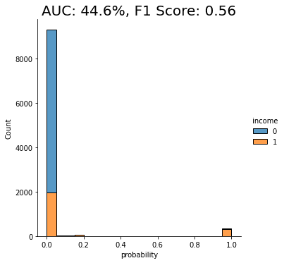
With an AUC of about 50%, the model trained on the imbalanced dataset is just as good as a flip of a coin, or, in other words, not worth very much at all. The downstream LightGBM model is not able to learn any signal due to the low number of minority-class samples.
Let’s see if we can improve this using rebalancing.
Naive rebalancing
First, let’s rebalance the dataset using the random oversampling method, also known as “naive rebalancing”. This method simply takes the minority class records and copies them to increase their quantity. This increases the number of records of the minority class but does not increase the statistical diversity. We will use the imblearn library to perform this step, feel free to check out their documentation for more context.
The code block performs the naive rebalancing, trains a LightGBM model using the rebalanced dataset and evaluates its predictive performance:
from imblearn.over_sampling import RandomOverSampler

X_trn, y_trn = prepare_xy(trn)
sm = RandomOverSampler(random_state=1)
X_trn_up, y_trn_up = sm.fit_resample(X_trn, y_trn)
model_trn_up = train_model(X_trn_up, y_trn_up)
auc_trn_up = evaluate_model(model_trn_up, df_hol)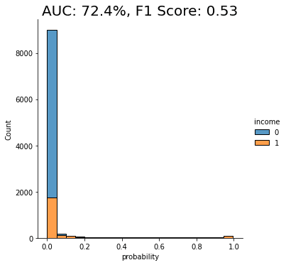
We see a clear improvement in predictive performance, with an AUC score of around 70%. This is better than the baseline model trained on the imbalanced dataset, but still not great. We see that a significant portion of the “0” class (low-income) is being incorrectly classified as “1” (high-income).
This is not surprising because, as stated above, this rebalancing method just copies the existing minority class records. This increases their quantity but does not add any new statistical information into the model and therefore does not offer the model much data that it can use to learn about minority-class instances that are not present in the training data.
Let’s see if we can improve on this using another rebalancing method.
SMOTE rebalancing
SMOTE upsampling is a state-of-the art upsampling method which, unlike the random oversampling seen above, does create novel, statistically representative samples. It does so by interpolating between neighboring samples. It’s important to note, however, that SMOTE upsampling is non-privacy-preserving.
The following code block performs the rebalancing using SMOTE upsampling, trains a LightGBM model on the rebalanced dataset, and evaluates its performance:
from imblearn.over_sampling import SMOTENC

X_trn, y_trn = prepare_xy(trn)
sm = SMOTENC(
    categorical_features=X_trn.dtypes=='category',
    random_state=1
)
X_trn_smote, y_trn_smote = sm.fit_resample(X_trn, y_trn)
model_trn_smote = train_model(X_trn_smote, y_trn_smote)
auc_trn_smote = evaluate_model(model_trn_smote, df_hol)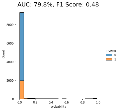
We see another clear jump in performance: the SMOTE upsampling boosts the performance of the downstream model to close to 80%. This is clearly an improvement from the random oversampling we saw above, and for this reason, SMOTE is quite commonly used.
Let’s see if we can do even better.
Synthetic rebalancing with MOSTLY AI
In this final step, let’s take the synthetically rebalanced dataset that we generated earlier using MOSTLY AI to train a LightGBM model. We’ll then evaluate the performance of this downstream ML model and compare it against those we saw above.
The code block below prepares the synthetically rebalanced data, trains the LightGBM model, and evaluates it:
X_syn, y_syn = prepare_xy(syn)
model_syn = train_model(X_syn, y_syn)
auc_syn = evaluate_model(model_syn, df_hol)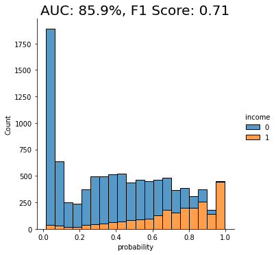
Both performance measures, the AUC as well as the macro-averaged F1 score, are significantly better for the model that was trained on synthetic data than if it were trained on any of the other methods. We can also see that the portion of “0”s incorrectly classified as “1”s has dropped significantly.
The synthetically rebalanced dataset has enabled the model to make fine-grained distinctions between the high-income and low-income records. This is strong proof of the value of synthetic rebalancing for learning more about a small sub-group within the population.
The value of synthetic rebalancing
In this tutorial, you have seen firsthand the value of synthetic rebalancing for downstream ML classification problems. You have gained an understanding of the necessity of rebalancing when working with imbalanced datasets in order to provide the machine learning model with more samples of the minority class. You have learned how to perform synthetic rebalancing with MOSTLY AI and observed the superior performance of this rebalancing method when compared against other methods on the same dataset. Of course, the actual lift in performance may vary depending on the dataset, the predictive task, and the chosen ML model.
What’s next?
In addition to walking through the above instructions, we suggest experimenting with the following in order to get an even better grasp of synthetic rebalancing:
- repeat the experiments for different class imbalances,
- repeat the experiments for different datasets, ML models, and predictive tasks.
In this tutorial, you will explore the relationship between the size of your training sample and synthetic data accuracy. This is an important concept to master because it can help you significantly reduce the runtime and computational cost of your training runs while maintaining the optimal accuracy you require.
We will start with a single real dataset, which we will use to create 5 different synthetic datasets, each with a different training sample size. We will then evaluate the accuracy of the 5 resulting synthetic datasets by looking at individual variable distributions, by verifying rule-adherence and by evaluating their performance on a downstream machine-learning (ML) task. The Python code for this tutorial is runnable and publicly available in this Google Colab notebook.
Size vs synthetic data accuracy tradeoff
Our working hypothesis is that synthetic data accuracy will increase as the number of training samples increases: the more data the generative AI model has to learn from, the better it will perform.
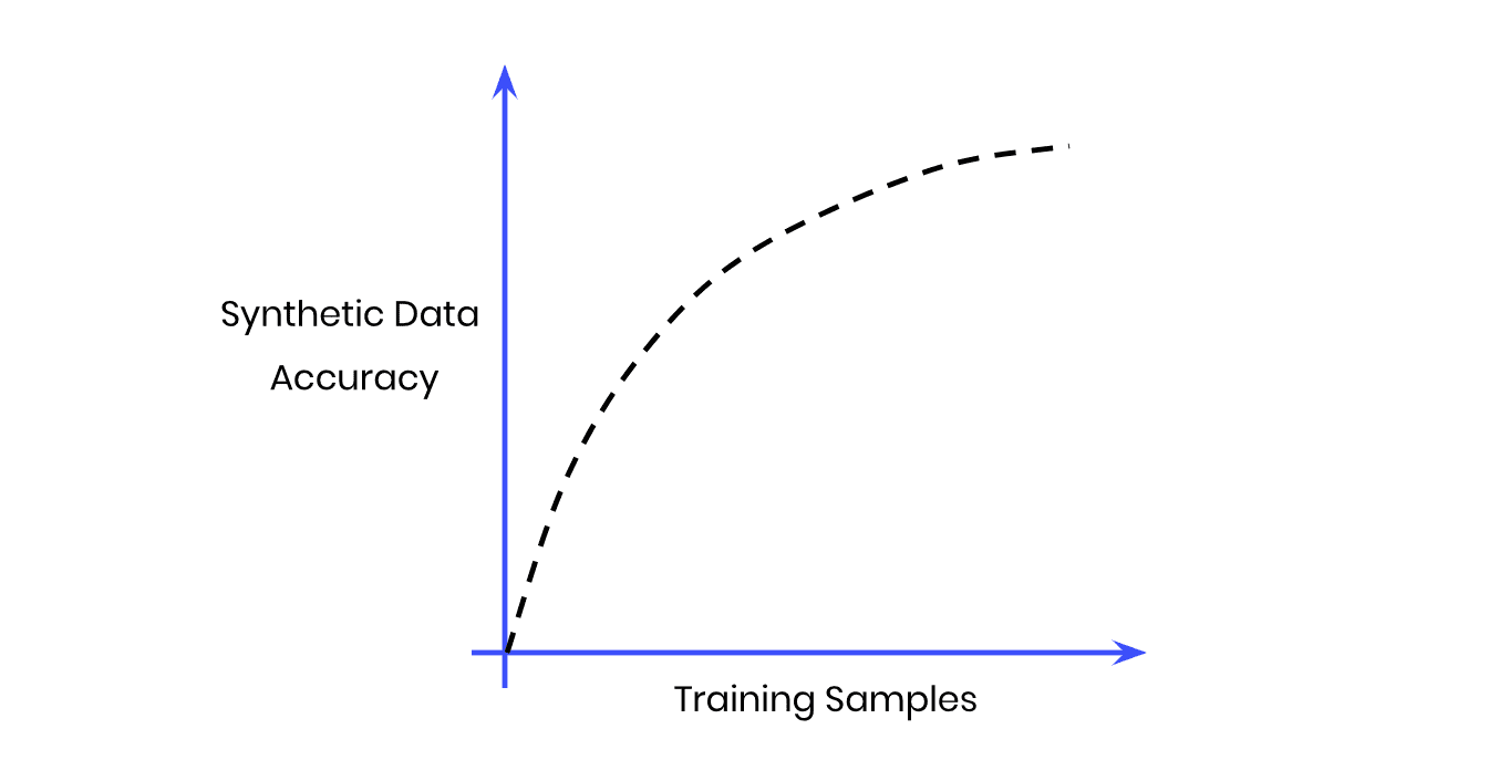
Fig 1 - The Size vs Accuracy Tradeoff
But more training samples also means more data to crunch; i.e. more computational cost and a longer runtime. Our goal, then, will be to find the sweet spot at which we achieve optimal accuracy with the lowest number of training samples possible.
Note that we do not expect synthetic data to ever perfectly match the original data. This would only be satisfied by a copy of the data, which obviously would neither satisfy any privacy requirements nor would provide any novel samples. That being said, we shall expect that due to sampling variance the synthetic data can deviate. Ideally this deviation will be just as much, and not more, than the deviation that we would observe by analyzing an actual holdout dataset.
Synthesize your data
For this tutorial, we will be using the same UCI Adult Income dataset, as well as the same training and validation split, that was used in the Train-Synthetic-Test-Real tutorial. This means we have a total of 48,842 records across 15 attributes, and will be using up to 39,074 (=80%) of those records for the synthesis.
- Download the training data
census-training.csvby clicking here and pressing Ctrl+S or Cmd+S to save the file locally. This is an 80% sample of the full dataset. The remaining 20% sample (which we’ll use for evaluation later) can be fetched from here.
Fig 2 - Download the original training data and save it to disk.
- Synthesize census-training.csv via MOSTLY AI's synthetic data generator multiple times, each time with a different number of maximum training samples. We will use the following training sample sizes in this tutorial: 100, 400, 1600, 6400, 25600. Always generate a consistent number of subjects, e.g. 10,000. You can leave all other settings at their default.
- Download the generated datasets from MOSTLY AI as CSV files, and rename each CSV file with an appropriate name (eg. syn_00100.csv, syn_00400.csv, etc.)
- Now ensure you can access the synthetic datasets from wherever you are running the code for this tutorial. If you are working from the Colab notebook, you can upload the synthetic datasets by executing the code block below:
# upload synthetic dataset
import pandas as pd
try:
    # check whether we are in Google colab
    from google.colab import files
    print("running in COLAB mode")
    repo = 'https://github.com/mostly-ai/mostly-tutorials/raw/dev/size-vs-accuracy'
    import io
    uploaded = files.upload()
    synthetic_datasets = {
        file_name: pd.read_csv(io.BytesIO(uploaded[file_name]), skipinitialspace=True)
        for file_name in uploaded
    }
except:
    print("running in LOCAL mode")
    repo = '.'
    print("upload your synthetic data files to this directory via Jupyter")
    from pathlib import Path
    syn_files = sorted(list(Path('.').glob('syn*csv')))
    synthetic_datasets = {
        file_name.name: pd.read_csv(file_name)
        for file_name in syn_files
    }


for k, df in synthetic_datasets.items():
    print(f"Loaded Dataset `{k}` with {df.shape[0]:,} records and {df.shape[1]:,} attributes")
Evaluate synthetic data accuracy
Now that you have your 5 synthetic datasets (each trained on a different training sample size) let’s take a look at the high-level accuracy scores of these synthetic datasets.
- Navigate to your MOSTLY AI account and note the reported overall synthetic data accuracy as well as the runtime of each job:
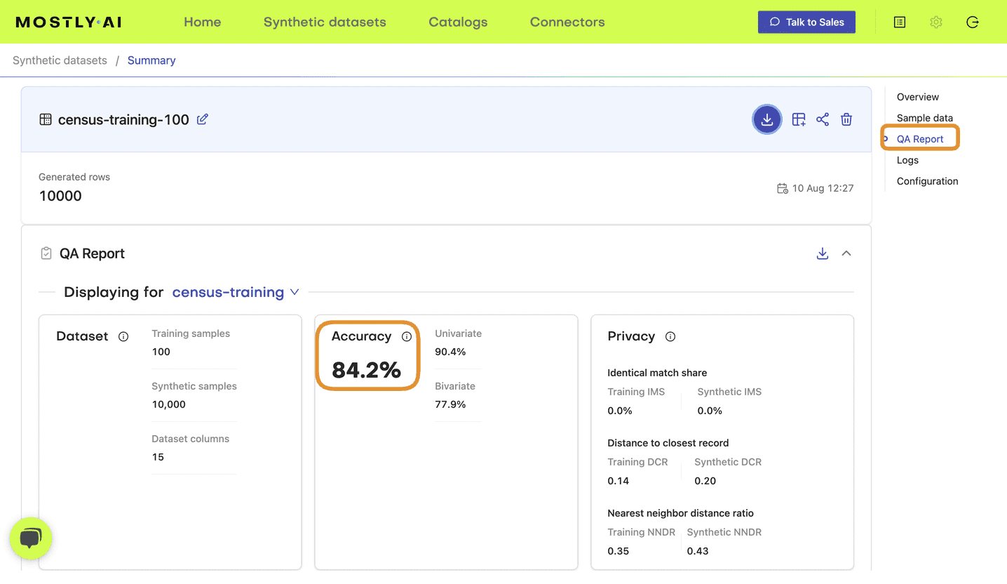
Fig 3 - Note the accuracy score in the QA Report tab of your completed synthetic dataset job.
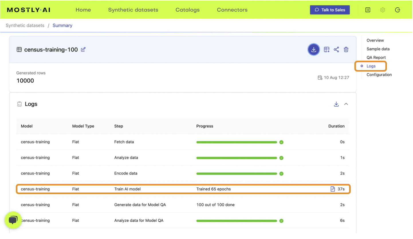
Fig 4 - Note the training time from the Logs tab.
- Update the following DataFrame accordingly:
results = pd.DataFrame([
{'file': 'syn_00100.csv', 'samples': 100, 'accuracy': 0.830, 'runtime': 37},
{'file': 'syn_00400.csv', 'samples': 400, 'accuracy': 0.914, 'runtime': 45},
{'file': 'syn_01600.csv', 'samples': 1600, 'accuracy': 0.956, 'runtime': 48},
{'file': 'syn_06400.csv', 'samples': 6400, 'accuracy': 0.972, 'runtime': 54},
{'file': 'syn_25600.csv', 'samples': 25600, 'accuracy': 0.980, 'runtime': 75},
])
results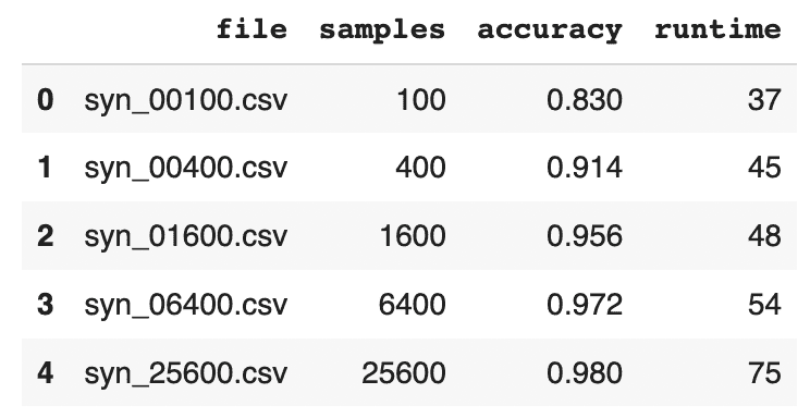
- Visualize the results using the code block below:
import seaborn as sns
import matplotlib.pyplot as plt

sns.catplot(data=results, y='accuracy', x='file', kind='point', color='black')
plt.xticks(rotation=45)
plt.xlabel('')
plt.title('QA Report - Overall Accuracy')
plt.show()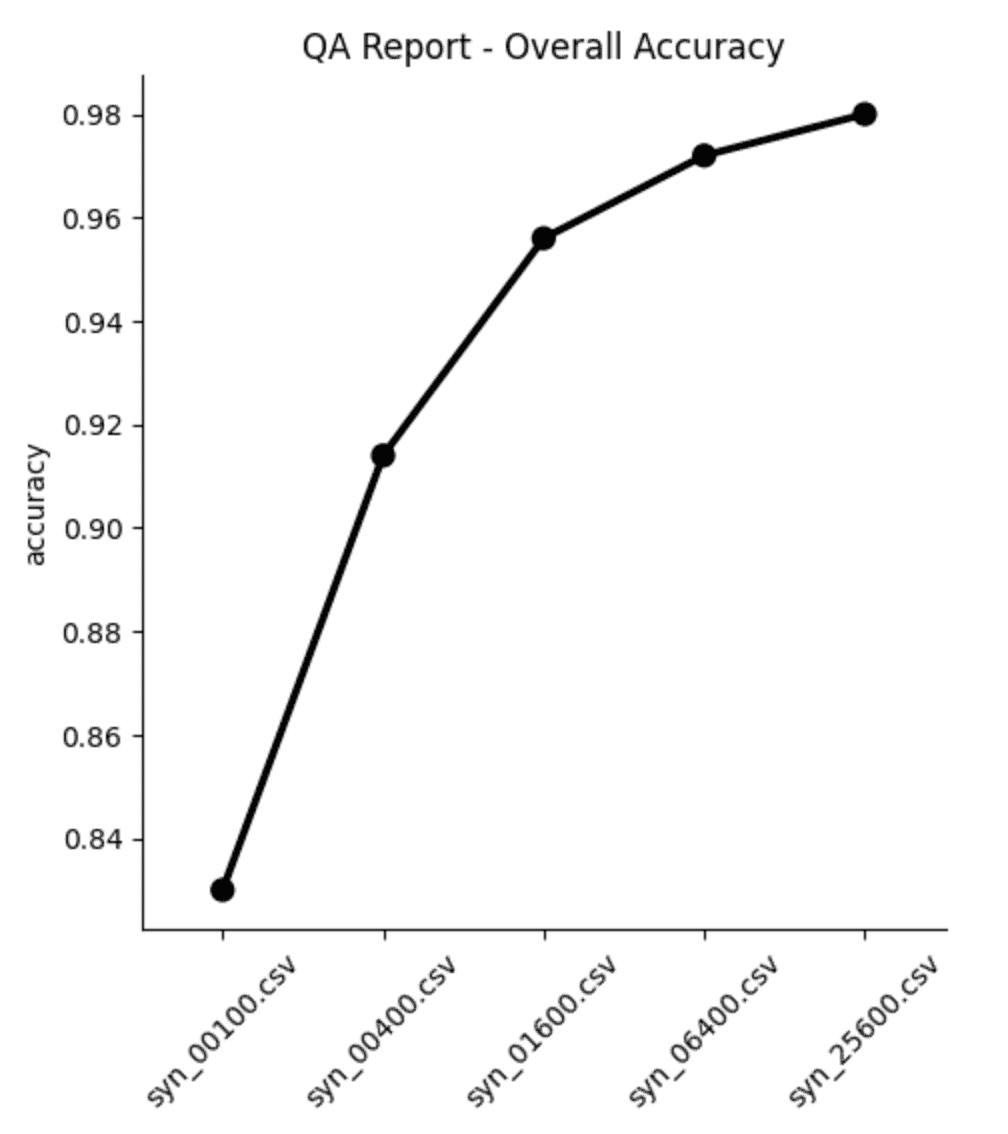
From both the table and the plot we can see that, as expected, the overall accuracy of the synthetic data improves as we increase the number of training samples. But notice that the increase is not strictly linear: while we see big jumps in accuracy performance between the first three datasets (100, 400 and 1,600 samples, respectively), the jumps get smaller as the training samples increase in size. Between the last two datasets (trained on 6,400 and 25,600 samples, respectively) the increase in accuracy is less than 0.1%, while the runtime increases by more than 35%.
Synthetic data quality deep-dive
The overall accuracy score is a great place to start when assessing the quality of your synthetic data, but let’s now dig a little deeper to see how the synthetic dataset compares to the original data from a few different angles. We’ll take a look at:
- Distributions of individual variables
- Rule adherence
- Performance on a downstream ML task
Before you jump into the next sections, run the code block below to concatenate all the 5 synthetic datasets together in order to facilitate comparison:
# combine synthetics
df = pd.concat([d.assign(split=k) for k, d in synthetic_datasets.items()], axis=0)
df['split'] = pd.Categorical(df['split'], categories=df["split"].unique())
df.insert(0, 'split', df.pop('split'))

# combine synthetics and original
df_trn = pd.read_csv(f'{repo}/census-training.csv')
df_hol = pd.read_csv(f'{repo}/census-holdout.csv')
dataset = synthetic_datasets | {'training': df_trn, 'holdout': df_hol}
df_all = pd.concat([d.assign(split=k) for k, d in dataset.items()], axis=0)
df_all['split'] = pd.Categorical(df_all['split'], categories=df_all["split"].unique())
df_all.insert(0, 'split', df_all.pop('split'))
Single variable distributions
Let’s explore the distributions of some individual variables.
The more training samples have been used for the synthesis, the closer the synthetic distributions are expected to be to the original ones. Note that we can also see deviations within statistics between the target and the holdout data. This is expected due to the sampling variance. The smaller the dataset, the larger the sampling variance will be. The ideal synthetic dataset would deviate from the original dataset just as much as the holdout set does.
Start by taking a look at the average age, split by marital status:
stats = (
    df_all.groupby(['split', 'marital_status'])['age']
    .mean().round().to_frame().reset_index(drop=False)
)
stats = (
    stats.loc[~stats['marital_status']
    .isin(['_RARE_', 'Married-AF-spouse', 'Married-spouse-absent', 'Separated'])]
)
stats = (
    stats.pivot_table(index='split', columns=['marital_status'])
    .reset_index(drop=False)
)
stats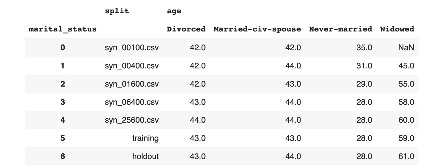
Then explore the age distribution, split by income:
sns.catplot(
    data=df_all,
    x='age',
    y='split',
    hue='income',
    kind='violin',
    split=True,
    legend=None
)
plt.legend(loc='upper right', title='', prop={'size': 8})
plt.show()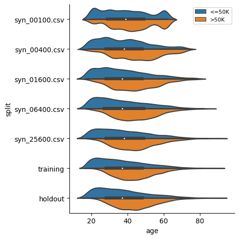
In both of these cases we see, again, that the synthetic datasets trained on more training samples resemble the original dataset more closely. We also see that the difference between the dataset trained on 6,400 samples and that trained on 25,600 seems to be minimal. This means that if the accuracy of these specific individual variable distributions is most important to you, you could confidently train your synthetic data generation model using just 6,400 samples (rather than the full 39,074 records). This will save you significantly in computational costs and runtime.
Rule Adherence
The original data has a 1:1 relationship between the education and education_num columns: each textual education level in the education column has a corresponding numerical value in the education_num column.
Let's check in how many cases the generated synthetic data has correctly retained that specific rule between these two columns.
First, display the matching columns in the original training data:
# display unique combinations of `education` and `education_num`
(df_trn[['education', 'education_num']]
 .drop_duplicates()
 .sort_values('education_num')
 .reset_index(drop=True)
)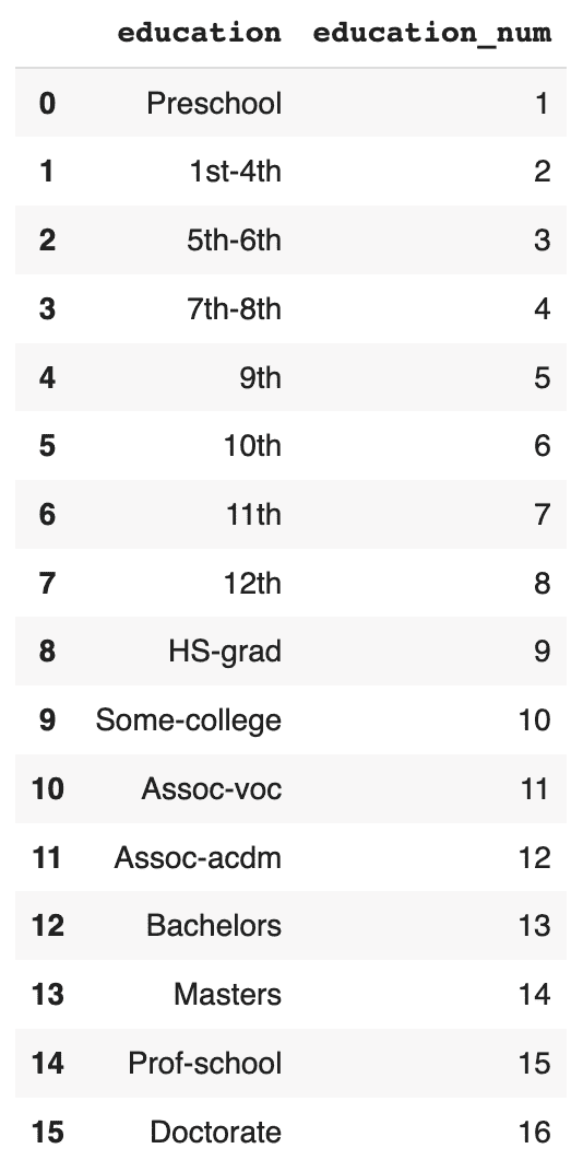
Now, convert the education column to Categorical dtype, sort and calculate the ratio of correct matches:
# convert `education` to Categorical with proper sort order
df['education'] = pd.Categorical(
    df['education'],
    categories=df_trn.sort_values('education_num')['education'].unique())

# calculate correct match
stats = (
    df.groupby('split')
    .apply(lambda x: (x['education'].cat.codes+1 == x['education_num']).mean())
)
stats = stats.to_frame('matches').reset_index()
stats
Visualize the results:
sns.catplot(
    data=stats,
    y='matches',
    x='split',
    kind='point',
    color='black'
)
plt.xticks(rotation=45)
plt.xlabel('')
plt.title('Share of Matches')
plt.show()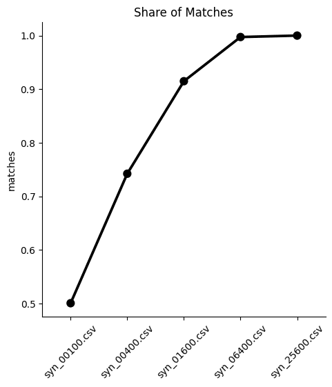
We can see from both the table and the plot that the dataset trained on just 100 samples severely underperforms, matching the right values in the columns only half of the time. While performance improves as the training samples increase, only the synthetic dataset generated using 25,600 samples is able to reproduce this rule adherence 100%. This means that if rule adherence for these columns is crucial to the quality of your synthetic data, you should probably opt for a training size of 25,600.
Downstream ML task
Finally, let’s evaluate the 5 synthetic datasets by evaluating their performance on a downstream machine learning task. This is also referred to as the Train-Synthetic-Test-Real evaluation methodology. You will train a ML model on each of the 5 synthetic datasets and then evaluate them on their performance against an actual holdout dataset containing real data which the ML model has never seen before (the remaining 20% of the dataset, which can be downloaded here).
The code block below defines the functions that will preprocess your data, train a LightGBM model and evaluate its performance. For more detailed descriptions of this code, take a look at the Train-Synthetic-Test-Real tutorial.
# import necessary libraries
import lightgbm as lgb
from lightgbm import early_stopping
from sklearn.model_selection import train_test_split
from sklearn.metrics import roc_auc_score

# define target column and value
target_col = 'income'
target_val = '>50K'

# prepare data, and split into features `X` and target `y`
def prepare_xy(df: pd.DataFrame):
    y = (df[target_col]==target_val).astype(int)
    str_cols = [
        col for col in df.select_dtypes(['object', 'string']).columns if col != target_col
    ]
    for col in str_cols:
        df[col] = pd.Categorical(df[col])
    cat_cols = [
        col for col in df.select_dtypes('category').columns if col != target_col
    ]
    num_cols = [
        col for col in df.select_dtypes('number').columns if col != target_col
    ]
    for col in num_cols:
        df[col] = df[col].astype('float')
    X = df[cat_cols + num_cols]
    return X, y


# train ML model with early stopping
def train_model(X, y):
    cat_cols = list(X.select_dtypes('category').columns)
    X_trn, X_val, y_trn, y_val = train_test_split(X, y, test_size=0.2, random_state=1)
    ds_trn = lgb.Dataset(
        X_trn,
        label=y_trn,
        categorical_feature=cat_cols,
        free_raw_data=False
    )
    ds_val = lgb.Dataset(
        X_val,
        label=y_val,
        categorical_feature=cat_cols,
        free_raw_data=False
    )
    model = lgb.train(
        params={
            'verbose': -1,
            'metric': 'auc',
            'objective': 'binary'
        },
        train_set=ds_trn,
        valid_sets=[ds_val],
        callbacks=[early_stopping(5)],
    )
    return model


# apply ML Model to some holdout data, report key metrics, and visualize scores
def evaluate_model(model, hol):
    X_hol, y_hol = prepare_xy(hol)
    probs = model.predict(X_hol)
    preds = (probs >= 0.5).astype(int)
    auc = roc_auc_score(y_hol, probs)
    return auc


def train_and_evaluate(df):
    X, y = prepare_xy(df)
    model = train_model(X, y)
    auc = evaluate_model(model, df_hol)
    return auc
Now calculate the performance metric for each of the 5 ML models:
aucs = {k: train_and_evaluate(df) for k, df in synthetic_datasets.items()}
aucs = pd.Series(aucs).round(3).to_frame('auc').reset_index()
And visualize the results:
sns.catplot(
    data=aucs,
    y='auc',
    x='index',
    kind='point',
    color='black'
)
plt.xticks(rotation=45)
plt.xlabel('')
plt.title('Predictive Performance (AUC) on Holdout')
plt.show()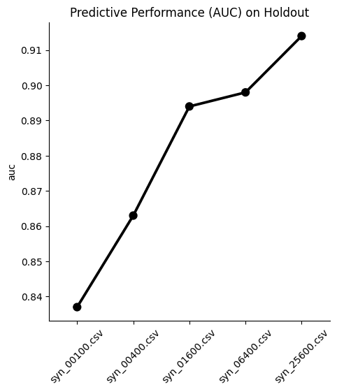
We see, again, that optimal performance is achieved with the largest training sample size. Interestingly, the difference in performance between the dataset trained on 1,600 samples and the one trained on 6,400 samples is minimal in this case. This means that if your use case allows you to sacrifice a fraction of ML performance, you could train your synthetic data generator on just 1,600 samples and still get pretty great results.
In most cases, however, a 1% difference in ML accuracy is crucial to preserve and so most likely you would end up training on 25,600 samples. A worthwhile exercise here would be to train a synthetic generator using the full 39,074 training samples to see whether that performs even better.
Optimize your training sample size for synthetic data accuracy
In this tutorial you have seen first-hand the relationship between the size of your training samples and the resulting synthetic data quality. You have quantified and evaluated this relationship from multiple angles and with various use cases in mind, including looking at single variable distributions, rule adherence and ML utility. For the given dataset and the given synthesizer we can clearly observe an increase in synthetic data quality with a growing number of training samples across the board.
We have also observed that a holdout dataset will exhibit deviations from the training data due to sampling variance. With the holdout data being actual data that hasn't been seen before, it serves as a north star in terms of maximum achievable synthetic data accuracy. Read our blog post on benchmarking synthetic data generators for more on this topic.
What’s next?
In addition to walking through the above instructions, we suggest experimenting with the following in order to get an even better grasp of the relationship between training sample size and synthetic data accuracy:
- to limit model training to a few epochs, e.g. by setting the maximum number of epochs to 1 or 5 and study its impact on runtime and quality.
- to synthesize with different model_sizes: Small, Medium and Large, and study its impact on runtime and quality.
- to synthesize with the same settings several times to study the variability in quality across several runs.
- to calculate and compare your own statistics, and then compare the deviations between synthetic and training. The deviations between holdout and training can serve as a benchmark.
In this tutorial, you will learn how to validate synthetic data quality by evaluating its performance on a downstream Machine Learning (ML) task. The method you will learn is commonly referred to as the Train-Synthetic-Test-Real (TSTR) evaluation.
In a nutshell, we will train two ML models (one on original training data and one on synthetic data) and compare the performance of these two models in order to assess how well the synthetic data retains the statistical patterns present in the original data. The Python code for this tutorial is runnable and publicly available in this Google Colab notebook.
The TSTR evaluation serves as a robust measure of synthetic data quality because ML models rely on the accurate representation of deeper underlying patterns to perform effectively on previously unseen data. As a result, this approach offers a more reliable assessment than simply evaluating higher-level statistics.
The train-synthetic-test-real methodology
The TSTR method can be broken down into 5 steps:
- We start with an actual (real) data source and split this into a main dataset for training and a holdout dataset for evaluation.
- Next, we create a synthetic dataset only based on the training data.
- Then we train a Machine Learning (ML) model, and do so once using the synthetic data and once using the actual training data.
- We then evaluate the performance of each of these two models against the actual holdout data that was kept aside all along.
- By comparing the performance of these two models, we can assess how much utility has been retained by the synthesization method with respect to a specific ML task.
In the following sections, we will walk through each of these 5 steps using a real dataset and explain the Python code in detail.
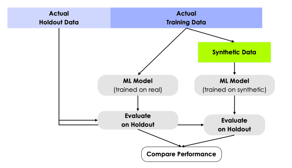
This testing framework simulates the real-world scenario in which a model is trained on historical data but has to perform in production on data it has never seen before. For this reason, it’s crucial to use a true holdout dataset for the evaluation in order to properly measure out-of-sample performance.
1. Data prep
We will be working with a pre-cleaned version of the UCI Adult Income dataset, which itself stems from the 1994 American Community Survey by the US census bureau. The dataset consists of 48,842 records, 14 mixed-type features and has 1 target variable, that indicates whether a respondent had or had not reported a high level of annual income. We will use this dataset because it's one of the go-to datasets to showcase machine learning models in action.
The following code snippet can be used to split a DataFrame into a training and a holdout dataset.
from sklearn.model_selection import train_test_split

df = pd.DataFrame({'x': range(10), 'y': range(10, 20)})
df_trn, df_hol = train_test_split(df, test_size=0.2, random_state=1)
display(df_trn)
display(df_hol)
In the repo accompanying this tutorial, the data has already been split for you to save you some precious time 🙂
- Download the training data census-training.csv by clicking here and pressing Ctrl+S or Cmd+S to save the file locally. This is an 80% sample of the full dataset. The remaining 20% sample can be fetched from here.
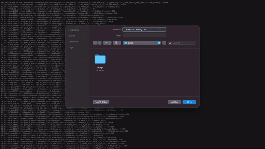
2. Data synthesis
Next, we will create the synthesized version of the training dataset. Synthesize census-training.csv via MOSTLY AI's synthetic data generator by following the steps outlined below. You can leave all settings at their default, and just proceed to launch the job.
- Navigate to “Synthetic Datasets”. Upload census-training.csv and click “Proceed”.
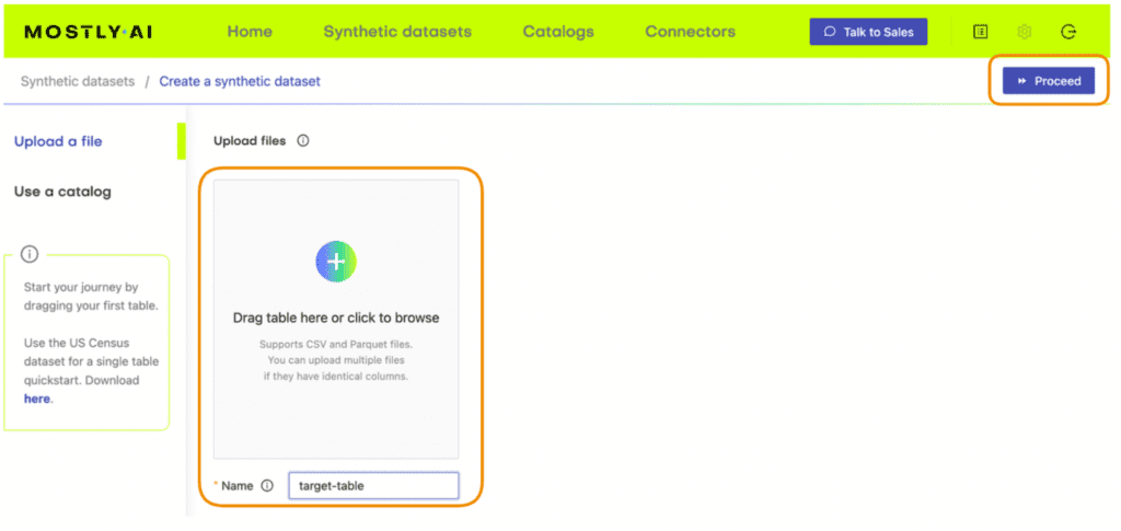
2. On the next page, click “Create a Synthetic Dataset” to launch the synthesization. You can leave all settings at their default.
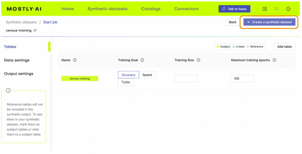
3. Follow the job’s progress using the UI and once the job has finished, download the generated synthetic data as CSV file to your computer. Optionally, you can also download a previously synthesized version here.
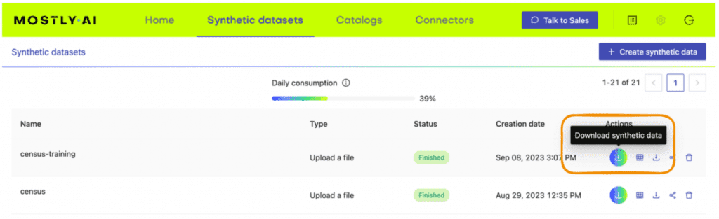
4. Return to your IDE or notebook and run the following code to create 3 DataFrames containing the training, synthesized and holdout data, respectively:
# upload synthetic dataset
import pandas as pd

try:
    # check whether we are in Google colab
    from google.colab import files
    print("running in COLAB mode")
    repo = 'https://github.com/mostly-ai/mostly-tutorials/raw/dev/train-synthetic-test-real'
    import io
    uploaded = files.upload()
    syn = pd.read_csv(io.BytesIO(list(uploaded.values())[0]))
    print(f"uploaded synthetic data with {syn.shape[0]:,} records and {syn.shape[1]:,} attributes")
except:
    print("running in LOCAL mode")
    repo = '.'
    print("adapt `syn_file_path` to point to your generated synthetic data file")
    syn_file_path = './census-synthetic.csv'
    syn = pd.read_csv(syn_file_path)
    print(f"read synthetic data with {syn.shape[0]:,} records and {syn.shape[1]:,} attributes")


# fetch training and holdout data
train = pd.read_csv(f'{repo}/census-training.csv')
print(f'fetched training data with {train.shape[0]:,} records and {train.shape[1]} attributes')
holdout = pd.read_csv(f'{repo}/census-holdout.csv')
print(f'fetched holdout data with {holdout.shape[0]:,} records and {holdout.shape[1]} attributes')
Before proceeding, let’s take a quick look at our freshly synthesized dataset by sampling 10 random records:
syn.sample(n=10)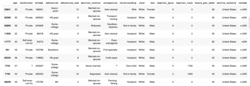
We can also get more specific by, for example, counting low-income and high-income records among the group of non-US citizens that have been divorced.
syn.loc[
    (syn["native_country"]!="United-States")
    & (syn["marital_status"]=="Divorced")
]['income'].value_counts()
<=50K 360
>50K 38
Name: income, dtype: int64Feel free to poke around the synthetic dataset more on your own to get a feel for the data.
3. ML training
Let's now train a state-of-the-art LightGBM classifier on top of the synthetic data, to then check how well it can predict whether an actual person reported an annual income of more than $50K or not. We will then compare the predictive accuracy to a model, that has been trained on the actual data, and see whether we were able to achieve a similar performance purely based on the synthetic data.
The following code block defines the target column and value and defines a function prepare_xy which preprocesses the data for ML training. The function casts the columns to the correct data types: columns containing strings are cast to categorical dtype and all numerical values are cast to float dtype. This is necessary for proper functioning of the LightGBM model. The function also splits the dataset into features X and target y.
Run the code block below to define the function.
# import necessary libraries
import lightgbm as lgb
from lightgbm import early_stopping
from sklearn.model_selection import train_test_split
from sklearn.metrics import roc_auc_score, accuracy_score
import seaborn as sns
import matplotlib.pyplot as plt

# define target column and value
target_col = 'income'
target_val = '>50K'

# define preprocessing function
def prepare_xy(df):
    y = (df[target_col]==target_val).astype(int)
    str_cols = [
        col for col in df.select_dtypes(['object', 'string'])
        .columns if col != target_col
    ]
    for col in str_cols:
        df[col] = pd.Categorical(df[col])
    cat_cols = [col for col in df.select_dtypes('category').columns if col != target_col]
    num_cols = [col for col in df.select_dtypes('number').columns if col != target_col]
    for col in num_cols:
        df[col] = df[col].astype('float')
    X = df[cat_cols + num_cols]
    return X, y
Now run the function prepare_xy to preprocess the data:
X_syn, y_syn = prepare_xy(syn)Next, we define a function train_model which will execute the ML training. The dataset is split into training and evaluation splits and the model is trained on the training dataset using some well-established base parameters. We specify early_stopping after 5 rounds without performance improvement in order to prevent overfitting.
3. Run the code block below to define the training function:
def train_model(X, y):
    cat_cols = list(X.select_dtypes('category').columns)
    X_trn, X_val, y_trn, y_val = train_test_split(X, y, test_size=0.2, random_state=1)
    ds_trn = lgb.Dataset(
        X_trn,
        label=y_trn,
        categorical_feature=cat_cols,
        free_raw_data=False
    )
    ds_val = lgb.Dataset(
        X_val,
        label=y_val,
        categorical_feature=cat_cols,
        free_raw_data=False
    )
    model = lgb.train(
        params={
            'verbose': -1,
            'metric': 'auc',
            'objective': 'binary'
        },
        train_set=ds_trn,
        valid_sets=[ds_val],
        callbacks=[early_stopping(5)],
    )
    return model
4. Now execute the training function:
model_syn = train_model(X_syn, y_syn)4. Synthetic data quality evaluation with ML
The next step is to evaluate the model’s performance on predicting the target feature y, which is whether or not a respondent had a high income. In this step we will be using the holdout dataset (which the model has never seen before) to evaluate the performance of the model trained on synthetic data: Train Synthetic, Test Real.
We’ll use two performance metrics:
- Accuracy: This is the probability to correctly predict the income class of a randomly selected record.
- AUC (Area-Under-Curve): This is the probability to correctly predict the income class, if two records, one of high-income and one of low-income are given.
Whereas the accuracy informs about the overall ability to get the class attribution correct, the AUC specifically informs about the ability to properly rank records, with respect to their probability of being within the target class or not. In both cases, the higher the metric, the better the predictive accuracy of the model.
We define a function evaluate_model which will perform the evaluation. This function first preprocesses the holdout data and then uses the model we have just trained on our synthetic data to try to predict the holdout dataset.
- Run the code block below to define the evaluation function:
def evaluate_model(model, hol):
    X_hol, y_hol = prepare_xy(hol)
    probs = model.predict(X_hol)
    preds = (probs >= 0.5).astype(int)
    auc = roc_auc_score(y_hol, probs)
    acc = accuracy_score(y_hol, preds)
    probs_df = pd.concat([
        pd.Series(probs, name='probability').reset_index(drop=True),
        pd.Series(y_hol, name=target_col).reset_index(drop=True)
    ], axis=1)
    sns.displot(
        data=probs_df,
        x='probability',
        hue=target_col,
        bins=20,
        multiple="stack"
    )
    plt.title(f"Accuracy: {acc:.1%}, AUC: {auc:.1%}", fontsize=20)
    plt.show()
    return auc
2. Now run the evaluation function:
auc_syn = evaluate_model(model_syn, holdout)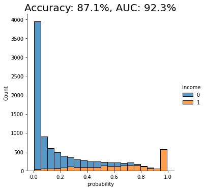
The displayed chart shows the distribution of scores that the model assigned to each of the holdout records. A score close to 0 means that model is very confident that the record is of low income. A score close to 1 means that the model is very confident that it's a high income record. These scores are further split by their actual outcome, i.e. whether they are or are not actually high income. This allows us to visually inspect the model's confidence in assigning the right scores.
We can see that the model trained on synthetic data seems to perform quite well when testing against real data it has never seen before (i.e. the holdout dataset). Both the accuracy and AUC scores give us confidence that this model may perform well in production.
But the real test is: how does the performance of this model trained on synthetic data compare against the performance of a model trained on real data? Remember: the purpose of this exercise is to discover whether we can use high-quality synthetic data to train our ML models instead of the original data (to protect data privacy) without losing significant predictive performance.
5. ML performance comparison
So let's now compare the results achieved on synthetic data with a model trained on real data. For a very good synthesizer, we expect to see a predictive performance of the two models being close to each other.
- Run the same 3 functions as we did above to prepare the data, train the model and evaluate it, but this time using the original dataset rather than the synthetic data:
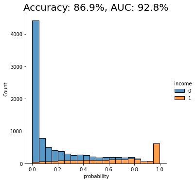
For the given dataset, and the given synthesizer, we can observe a near on-par performance of the synthetic data with respect to the given downstream ML task. Both accuracy scores are around 87% and both AUC scores are around 92%, with a maximum of 0.5% difference.
This means that in this case you can train your LightGBM machine learning model purely on synthetic data and be confident that it will yield equally performant results as if it were trained on real data, but without ever putting the privacy of any of the contained individuals at any risk.
What did we learn about synthetic data quality evaluations?
This tutorial has introduced you to the Train Synthetic Test Real methodology for synthetic data quality evaluations, specifically by measuring its utility on a downstream ML task. This evaluation method is more robust than only looking at high-level statistics because ML models rely on the accurate representation of deeper underlying patterns to perform effectively on previously unseen data.
By testing your model trained on synthetic data on a holdout dataset containing original (real) data that the model has never seen before, you can now effectively assess the quality of your synthesized datasets. With the right dataset, model and synthesizer, you can train your ML models entirely on synthetic data and be confident that you are getting maximum predictive power and privacy preservation.
What’s next?
In addition to walking through the above instructions, we suggest:
- to run the Train-Synthetic-Test-Real synthetic data quality evaluation
- using a different dataset, eg. the UCI bank-marketing dataset
- using a different downstream ML model, eg. a RandomForest model
- using a different synthesizer, eg. SynthCity, SDV, etc.
- to check the impact of synthetic upsampling by generating 10x or 100x the original data records, and see whether it improves ML accuracy.
This article explains what data drift is, how it affects machine learning models in production, what the difference between data drift and concept drift is, and what you can do to tackle data drift using synthetic data.
What is data drift?
“Data drift” is a term in machine learning that refers to the phenomenon in which a machine learning model’s performance slowly decreases over time. This happens because machine learning models are trained on historical data (i.e. “the past”) but then use current data (i.e. “the present”) when they are being used in production. In reality, the historical data and the current data may have different statistical characteristics and this is what we call “data drift”: the data used for predictions starts to drift from the data used for training. This means the machine learning model is no longer fully optimized for the data it is seeing.
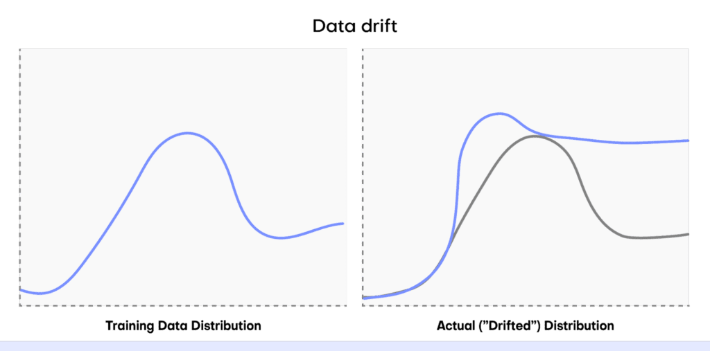
How does data drift affect ML models?
Drift can be a big problem when using machine learning models in the real world, causing a decrease in predictive power. For example, let’s say we have trained a machine learning model to accurately predict the quarterly sales of a particular fashion brand. We then put this model into production.
At first it operates well: the actual data it is receiving (from the present) resembles the data that was used to train the model (from the past). But then something unexpected happens. A popular influencer spontaneously posts about the fashion brand and the post goes viral. Sales sky-rocket in a way that the machine learning model could never have foreseen because nothing like the unexpected viral post event was present in the training data.
This causes a significant change in the statistical distribution of the input data (i.e. “data drift”) and the machine learning model no longer performs at optimum performance. The model loses accuracy and may even produce unreliable predictions if the data distributions vary significantly.
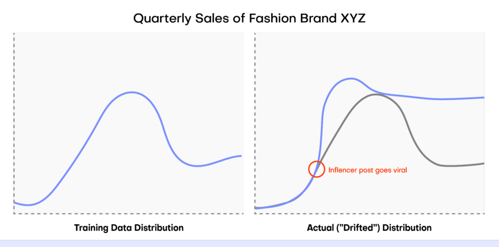
Data drift vs concept drift
There are different kinds of drift that can be observed in machine learning projects. Data drift refers specifically to the phenomenon in which the distribution of the real-world data used when the model is in production drifts from the data that was used for training.
Concept drift refers to the situation in which the relationship between features in the data changes over time. In this case, the pattern (or “concept”) that the machine learning model is trying to learn is evolving. In short, data drift deals with changes in the data that the model uses to make predictions, whereas concept drift refers to changes in the patterns between features in the data.
How can I deal with data drift?
Data drift is a complex phenomenon that generally requires a multidimensional approach to solve. Some of the most effective things you can do to deal with data drift include:
- Retrain your machine learning model on fresh data that includes the drifted distribution so that the model is performing at peak performance again.
- Perform robust feature engineering so that features are less sensitive to changes in the underlying data.
- Use ensemble methods like model blending and stacking or building a fully-online machine learning pipeline that can continuously update and retrain itself as new data comes in.
In practice, retraining a machine learning model with fresh data is one of the most common methods used to deal with data drift. However, this approach comes with some drawbacks. Acquiring new data that is ready for training a machine learning model is often:
- Expensive and time-consuming;
- Disruptive to ongoing workflows and processes;
- Difficult to execute because of privacy regulations.
Tackle data drift with synthetic data
Synthetic data generation can help you tackle data drift by providing a high-quality, low-friction source of data on which you can retrain your machine learning models. Synthetic data generators enable you to produce virtually limitless data and often give you fine-grained control over the distributions of this new data. By accurately modeling new synthetic datasets, you can then update your machine learning model to incorporate the drifted data distribution.
We’ve broken it down into 5 steps for clarity:
- Detect your data drift
- Understand your data drift
- Generate synthetic data
- Retrain your model
- Monitor and repeat

1. Detect your data drift
Detecting data drift should be a fundamental part of any machine learning life cycle. There are many ways to perform data drift detection and many resources to learn about it. This article focuses on solutions that will help you fix data drift once it has been detected.
2. Understand your data drift
Before tackling data drift, it’s important that you have a good understanding of its nature and potential causes. Analyze your model and the incoming data to identify points where the data is drifting and analyze its statistical characteristics. This will help you understand how to incorporate the data drift into your updated model.
For example, in the case of the quarterly fashion sales predictions mentioned above, the fact that we can reliably trace the data drift to the viral influencer post helps us know how to deal with the data drift. It’s reasonable to expect the influencer post to have lasting effects on the fashion brand’s perception and future sales: we should therefore adjust our data projections to include some of the ripple effects of this unexpected sales boost.
On the contrary, if we had instead seen a massive but temporary drop in sales due to a failure in the webshop’s main server, we may want to choose not to incorporate this data at all in the projections for next quarter, the assumption here being that the webshop will not experience another failure.
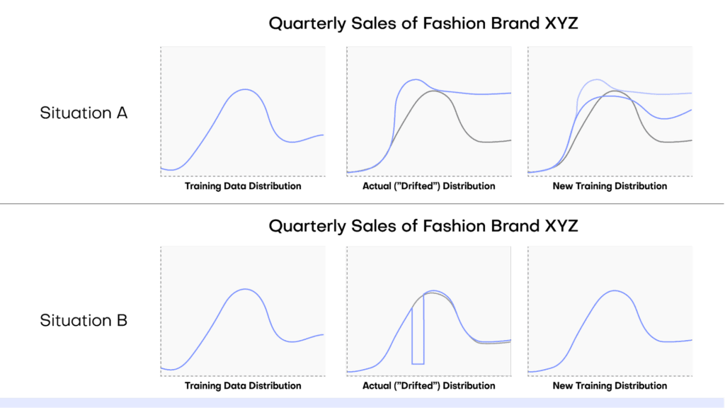
3. Generate synthetic data
Once you have a good understanding of the statistical nature and potential sources of your data drift, you can then proceed to use synthetic data generation to supplement your training dataset with cases that might occur due to data drift.
We’ll walk through how to generate the right kind of synthetic data to tackle your data drift with MOSTLY AI's synthetic data platform, using a technique called conditional generation.
- Split your dataset into two separate tables: one table containing the ID column and the columns containing your desired target features, and a second table containing the ID column along with all of the other predictor columns.
- Log in to your MOSTLY AI account.
- Launch a new job using the “Create Synthetic Data” button in the “Synthetic Datasets” tab. Upload the first table (containing the ID column and the target feature(s) to start a new job and then add the second table.
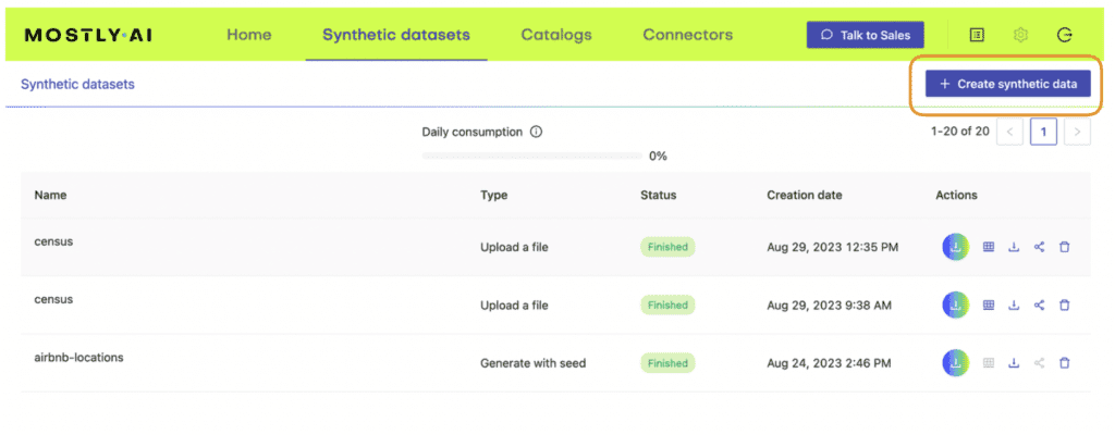
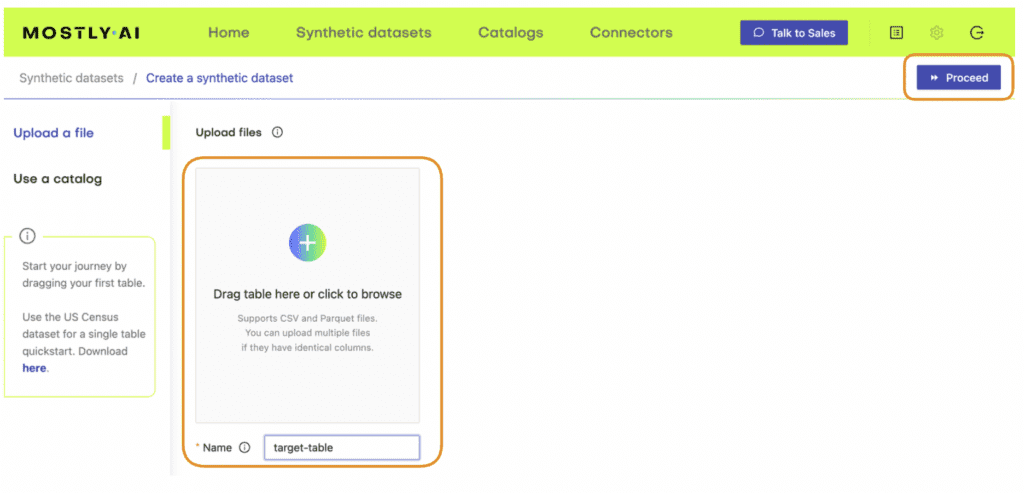
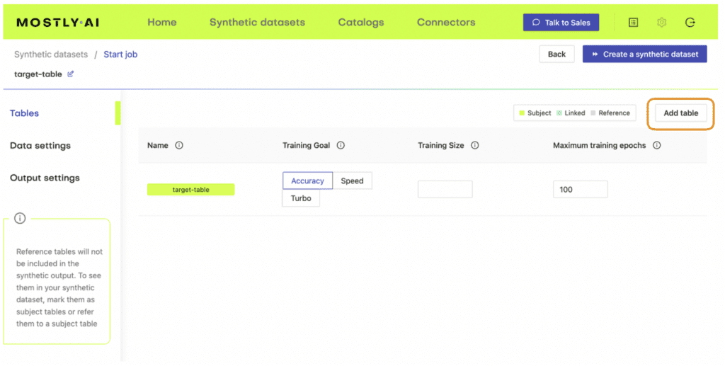
4. Define the relationship between the two tables using the Data Settings tab and navigating to the settings for the table containing the predictor columns. Click on the gear icon to the right of the ID column and set the following settings:
Generation Method: Foreign Key
Foreign Key: Type: Context
Parent Table: <your-table-with-target-column>
Parent Primary column: <id-column-of-target-table>
Save the settings. Under the “Tables” tab you should now see that the predictor table has changed into a Linked Table (lime green color coding).
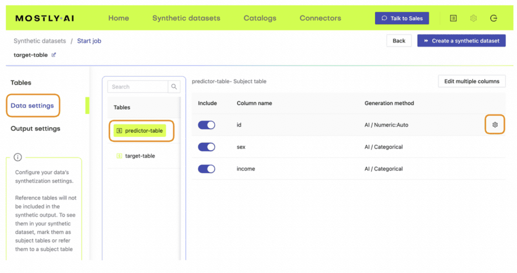
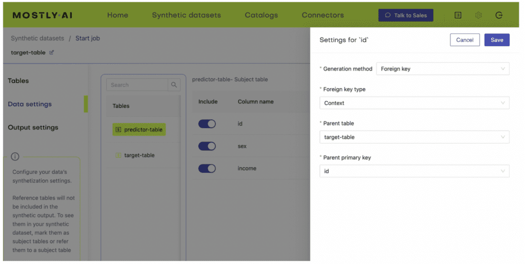
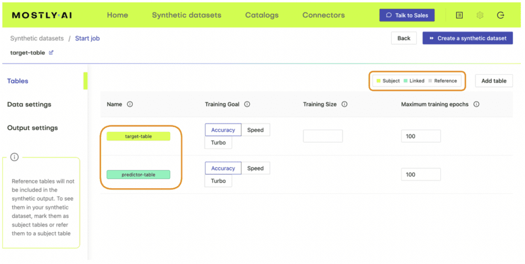
5. Once the job has been completed, select the “Generate more data” action on the right-hand side of the newly-generated dataset row and select “Generate with seed” to perform conditional generation.
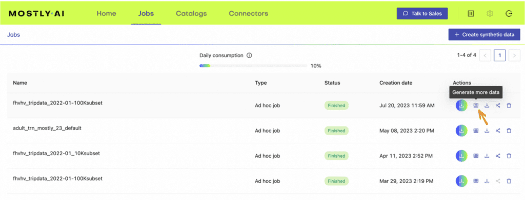
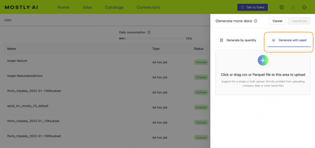
6. Now upload a subject table with a different kind of distribution.
This subject table can be generated manually or programmatically and should contain the drifted distribution. The simulated subject table (containing the drifted target feature distribution) will be used to generate a synthetic dataset (i.e. the predictor columns) that would produce the new, drifted distribution.
In our viral fashion post example, we would create a simulation of the target feature (sales) that follows the “new training distribution” depicted in Figure 4 above and use this to generate a synthetic dataset.
Open-source Python packages like NumPy or SciPy enable you to perform fine-grained data simulation. You can use MOSTLY AI’s rebalancing feature to programmatically simulate drifted target feature distributions for categorical columns.
7. Repeat for all the different scenarios you want to model.
To properly accommodate all of the possible future scenarios, you may want to create multiple simulated datasets, each with a different assumption and associated distribution. In the case of our viral fashion post, we may want to create three simulations: one in which sales continue to skyrocket at the same rate as we saw this quarter, one in which sales just go back to ‘normal’ (i.e. the influencer post has no lasting effect), and a third scenario that takes the average of these two extremes. With these 3 synthetic datasets we can then train different models to predict 3 kinds of possible future scenarios.
4. Re-train your model
With your freshly generated synthetic data ready, you can now proceed to re-train your machine learning model. You can use just the synthetic data or a mix of real and synthetic data, depending on the privacy requirements of your model.
5. Monitor model performance and repeat
Finally, make sure to put precise monitoring tools in place to continue to detect data drift. For example, you could use open-source Python libraries like Evidently or NannyML to keep track of your model performance throughout the machine learning lifecycle. When your model metrics indicate a recurrence of data drift, update your synthetic data to reflect the new distributions and re-train your model.
Tackling data drift with MOSTLY AI
Synthetic data generation can help you tackle data drift by making it easy to simulate potential future scenarios based on new statistical distributions of the data. By providing a high-quality, low-friction source of data on which you can retrain your machine learning models, synthetic data generators enable you to produce virtually limitless data to model changes in the underlying data. MOSTLY AI gives you fine-grained control over the distributions of this new data so you can accurately model new synthetic datasets that take into consideration the drifted data distributions.
Try it out today – the first 100K rows of synthetic data are on us!